Micro-SaaS & Developer Tools Comparison Website Template
Glyph is a high-performance font hosting and subsetting landing page template built for developer-focused micro-SaaS products. It combines a live animated code snippet header, a seven-metric comparison table, Core Web Vitals visualizations, and an interactive subsetting playground into a single conversion-led page designed to turn technically skeptical visitors into qualified leads.
by Rocket studio
Quick summary
Glyph is a single-page template built for a font subsetting and edge-hosting service. It opens with a live animated @font-face code snippet, walks visitors through an industry-style data study, and closes with a progressive lead capture form. The page earns trust through visible evidence before it asks for anything.
Who this template is for
This template is built for technical SaaS founders and developer-tool marketers who need to convert a performance-aware audience. Generic landing pages lose credibility with engineers immediately. This one speaks their language from the first pixel.
- Front-end engineers and web performance specialists who measure every kilobyte loaded in the browser
- Design system leads at enterprise software companies managing large, multi-weight type families across many products
- Agency developers who inherit brand font guidelines that ship at unsubsetted file sizes well above 300 kilobytes
What problem this template solves
Most landing pages for developer tools lead with marketing copy that technical buyers distrust on sight. Performance engineers want proof, not promises. This template replaces soft selling with structured evidence, turning skepticism into calculation.
- Visitors arrive already aware that unsubsetted fonts hurt load times, but have no quick way to quantify their own waste
- The template removes that friction by giving a live size counter, a benchmark comparison table, and a personal subsetting playground before asking for any contact details
- Enterprise and agency leads need different entry points; the template provides a URL-first audit form for self-serve users and a direct "Talk to an Engineer" path for complex enterprise needs
What you get with this template
You get a fully structured, single-page layout built around three escalating evidence sections. Each section adds a new layer of proof so the visitor's confidence compounds as they scroll.
- An animated header section featuring a live
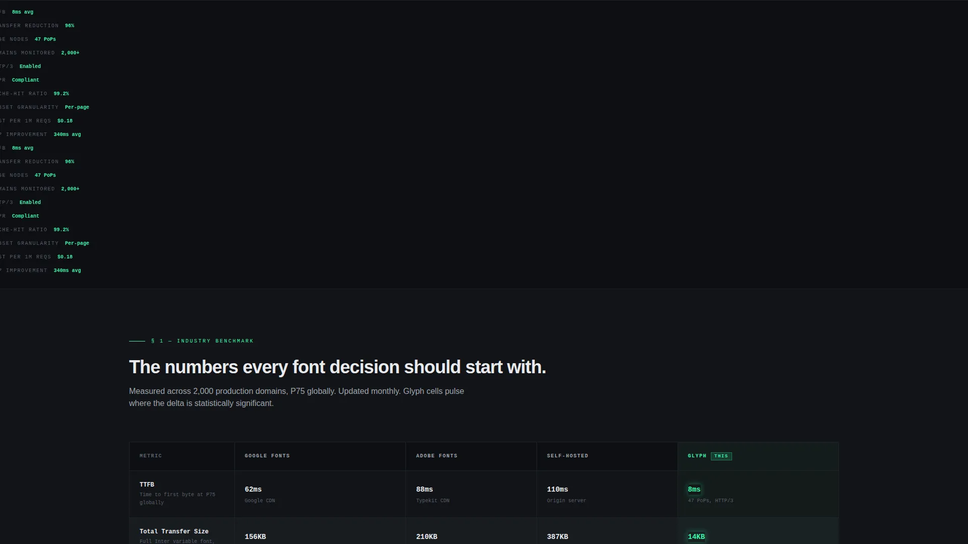
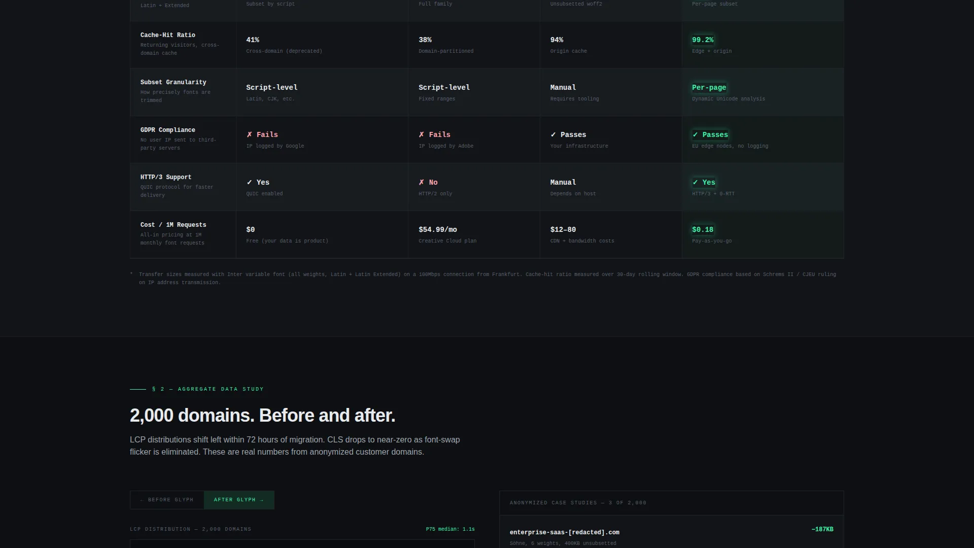
@font-facecode snippet that rewrites itssrcURL and ticks a file size counter down from 387 kilobytes to 14 kilobytes in real time - A seven-metric comparison table benchmarking four font delivery approaches across time to first byte (TTFB), total transfer size, cache-hit ratio, subset granularity, GDPR compliance, HTTP/3 support, and cost per million requests
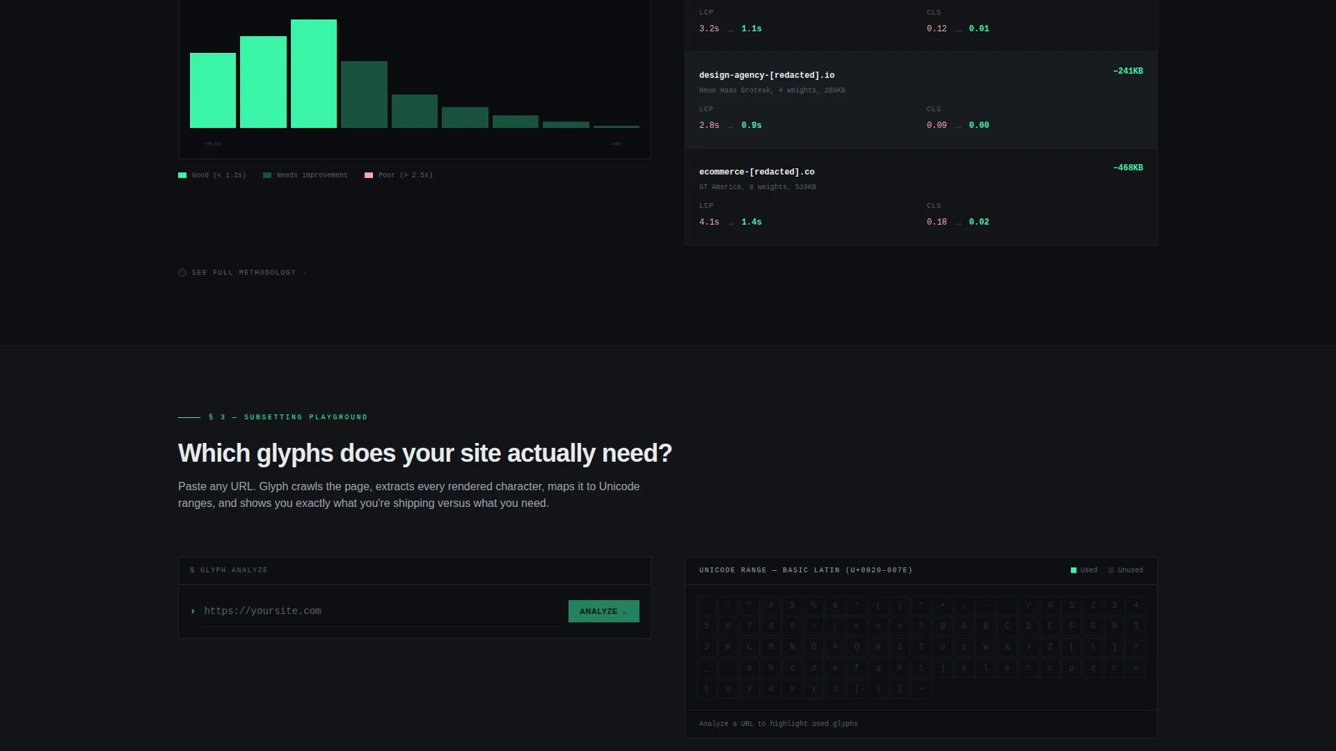
- An interactive subsetting playground where a visitor pastes a URL, sees which Unicode ranges their site actually uses, and watches unused glyphs gray out on a live character map
Feature list
This section covers the core built-in components and interaction patterns included in the Glyph template.
Live Animated Code Snippet Header
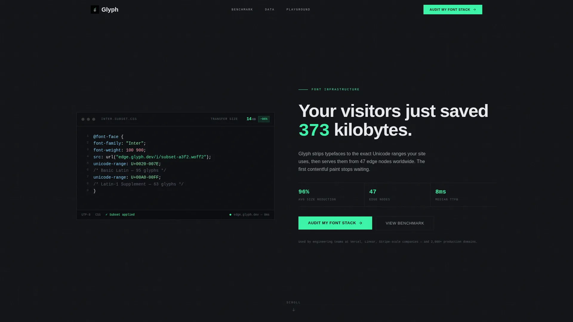
The header renders a styled @font-face declaration in a monospaced typeface on a carbon background. The unicode-range property animates line by line, the src URL rewrites from a generic content delivery network to an edge node, and a real-time file size counter ticks down from 387 kilobytes to 14 kilobytes. Below the snippet, a headline in the newly loaded font reads: "Your visitors just saved 373 kilobytes."
Seven-Metric Comparison Table
The comparison table benchmarks font delivery approaches across seven real metrics. Each cell carries actual numbers. The winning cells in the Glyph column pulse with the electric accent color, directing the eye without additional explanation.
Core Web Vitals Histogram Section
Section two visualizes Largest Contentful Paint (LCP) distributions across 2,000 anonymized customer domains. Animated histograms build as the visitor scrolls into view, showing before-and-after migration shifts that make aggregate performance improvement concrete and tangible.
Interactive Subsetting Playground
Visitors paste any URL into the playground and receive an immediate preview of which Unicode character ranges the page actually uses. Unused glyphs gray out on a live character map, making invisible waste visible in seconds.
Progressive Lead Capture Form
The primary call to action, "Audit My Font Stack," captures a single URL first. On submission it returns a preview report showing current font weight, unused glyph percentage, and estimated savings. The full report is then gated behind an email address and company name, so value is delivered before any commitment is required.
Sticky Conversion Bar and Secondary Path
After the comparison table, a sticky bar surfaces the primary call to action without interrupting the scroll. A secondary "Talk to an Engineer" conversion path sits below the playground for enterprise leads who already know they need custom subsetting rules.
Page sections overview
| Section | Purpose |
|---|---|
| Animated header snippet | Demonstrate real subsetting savings with a live file size counter |
| Comparison table section | Benchmark four font delivery methods across seven performance metrics |
| Core Web Vitals charts | Show aggregate LCP improvement data across 2,000 customer domains |
| Subsetting playground | Let visitors diagnose their own font waste with a live character map |
| Sticky audit bar | Surface the primary call to action after the comparison table without interrupting scroll |
| Audit form section | Capture a URL, return an instant preview report, then gate the full report |
| Engineer contact path | Provide a direct secondary call to action for enterprise and agency leads |
Design & branding system
The visual identity follows a Dynamic Motion theme within a Monochrome Steel color system. The palette reads like a dark-mode code editor at night, where every colored pixel carries deliberate meaning.
- Background stays carbon (#121417) throughout; comparison table rows alternate between carbon and a barely lifted row color (#181B20) to maintain scanability without visual noise
- Column headers sit in brushed alloy (#9EA4AD) and body text uses cold white (#E8EAED), while the single electric accent (#3BF4A8) appears only on interactive states, data highlights, and call-to-action elements
- Typography uses a monospaced typeface in the header code block and the newly loaded font for the headline below it, reinforcing the product's own capability as the design proof
Mobile & speed optimization
The template's layout is structured for fast rendering on any screen size. Every design decision favors visible performance, which is consistent with the product's own positioning.
- The comparison table is horizontally scrollable on smaller screens so no metric column is hidden or truncated on mobile viewports
- Animated sections, including the histogram build and the character map, are triggered on scroll entry so they do not fire until the visitor reaches them, reducing unnecessary work during initial page load
How this template helps you convert
The conversion architecture is built on a principle of earned trust: show proof first, ask for information second. Each section hands the visitor a stronger reason to act before the form appears.
- The live code snippet header delivers an immediate, quantified demonstration of value with no interaction required, so even a skeptical engineer sees a real number before reading a single marketing sentence
- The comparison table and Core Web Vitals histograms shift the visitor's thinking from "does this work?" to "how much am I currently wasting?", which is the mental state most likely to produce a form submission
- The progressive form flow asks for a URL before an email, returns a real preview report instantly, and only gates the full analysis behind contact details, making the exchange feel like a fair trade rather than a cold lead capture
Other information about this template
This template is purpose-built for the font hosting and subsetting niche inside the broader developer tools and micro-SaaS category. A few additional notes are worth knowing before you customize it.
- The page type is a single-page lead generation landing page, not a multi-page site, so all navigation resolves to in-page scroll anchors
- The template style is a comparison table layout, meaning the benchmark section is the structural centerpiece and should be kept intact for the page to make its core argument
- The subsetting playground and the audit form are designed to work in sequence: the playground surfaces the problem, the form captures the lead ready to solve it
- The creative direction follows an Industry Report format, meaning the content hierarchy mirrors a technical whitepaper with escalating evidence rather than a conventional marketing funnel
- The header code snippet references a real subsetting of the Inter typeface, ticking from 387 kilobytes down to 14 kilobytes, giving the numbers specific credibility
Theme
Dynamic Motion
Creative direction
Industry Report
Color system
Monochrome Steel
Style
Comparison Table
Direction
Lead Generation
Page Sections
Live Animated Code Snippet Header
Seven-metric Comparison Table
Core Web Vitals Histogram Section
Interactive Subsetting Playground
Progressive Two-step Lead Capture
Sticky Call to Action Bar and Enterprise Path
Related questions
Who is this template designed for?
What sections does the template include?
Can I customize the comparison table metrics and competitor data?
How does the lead capture form work?
Is this template suitable for an enterprise sales audience?



