Specialist Government Digital Presence Provider Directory Website Template
Govstack is a government website landing page template built for municipal teams who need a professional, accessible civic portal without months of development. It features a live code snippet header, an interactive city directory data grid, a deployment timeline animation, and an accessibility scorecard, all styled in a clean teal-and-amber palette that feels authoritative yet approachable.
by Rocket studio
Quick summary
Govstack is a single-page government website template designed for speed and clarity. It gives municipal teams a polished, ADA-compliant, multilingual starting point they can configure and ship in a day. The layout uses a Dashboard and Data Grid style with a Directory and Discovery theme, built around a Teal Catalyst color system that balances civic authority with real usability.
Who this template is for
This template is built for the people who keep local government running on limited time and tight budgets. It meets them exactly where they are.
- County IT directors managing infrastructure on small teams who need a dependable, deployable starting point
- City clerks and permit staff who want a single organized portal instead of scattered documents and PDFs
- Civic tech volunteers building open-data dashboards for local government offices that need a modern public-facing layer
What problem this template solves
Most government websites take a fiscal quarter to launch and still end up hard to navigate. Govstack cuts that timeline to an afternoon by giving teams a ready-made structure they can configure rather than build from scratch.
- Residents struggle to find services because information is buried across multiple disconnected pages and documents
- Small municipal IT teams cannot afford to design, develop, and test a civic portal from zero
- Non-technical decision-makers need something they can hand to their IT team with confidence
What you get with this template
You get a fully structured landing page with every visual section already built and styled. The template ships with all the components described below, ready to customize with your city's real content.
- A live-rendered code snippet header block showing a
<gov-portal>component with language and accessibility attributes, syntax-highlighted in teal and amber - A scrollable city directory data grid with department cards, status indicators, and clickable template previews
- A deployment timeline animation, an accessibility scorecard section, and a dual-path conversion footer with a copyable CLI command block
Feature list
This template covers every major section a government digital presence landing page needs, from the first scroll to the final call to action.
Live Code Snippet Header
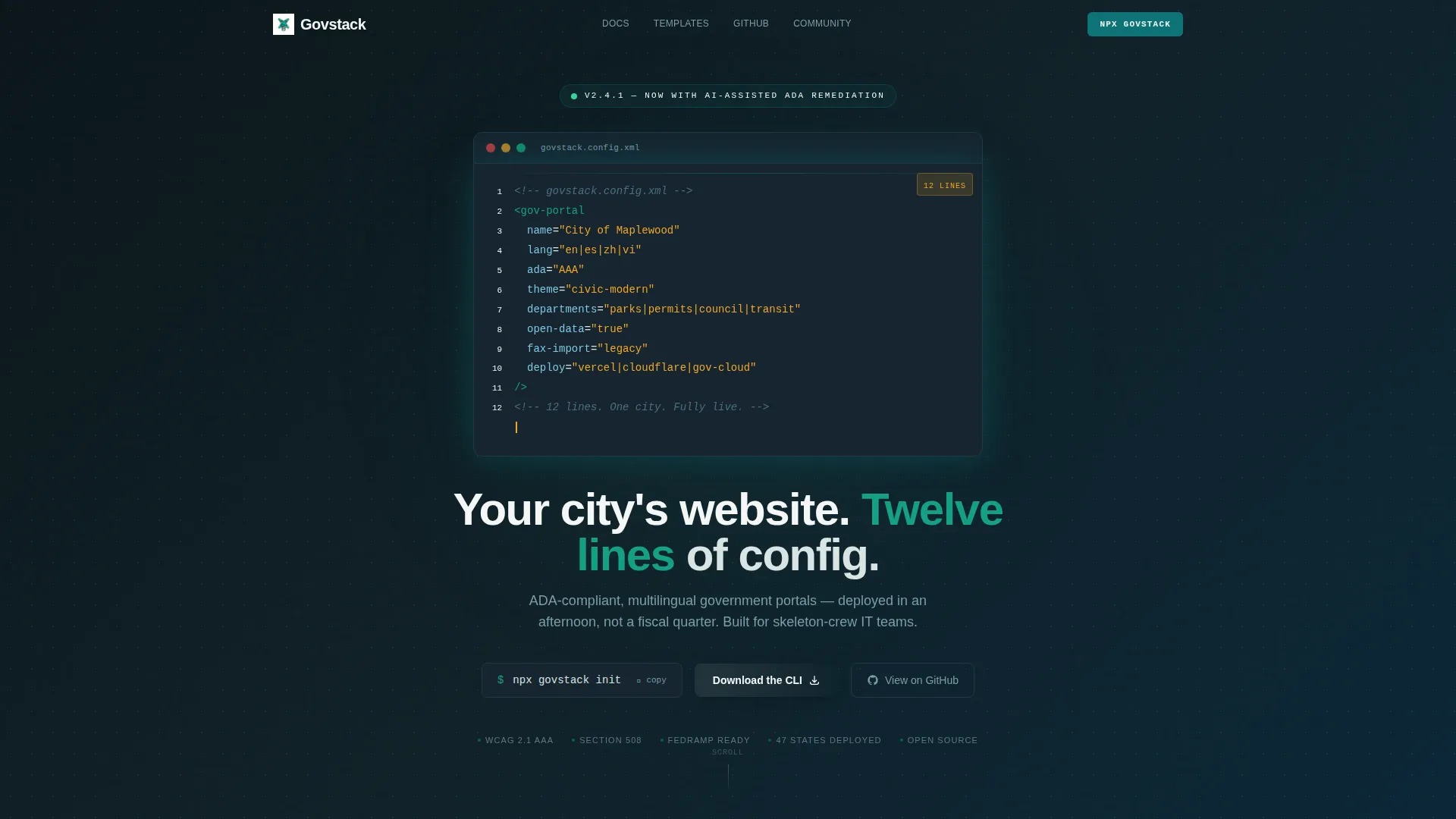
The header centers a syntax-highlighted code block rendering a <gov-portal> component with attributes like lang="es" and ada="AAA". A blinking cursor at the end of the last line creates the impression the visitor just typed it. Below the block, a single headline fades in: "Your city's website. Twelve lines of config." The contrast between raw markup and a finished government portal creates an immediate stop-scroll moment.
Interactive City Directory Grid
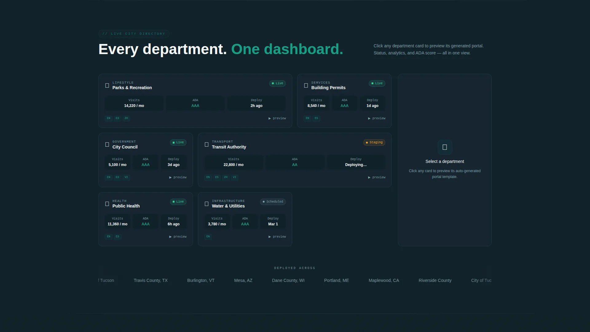
The first content section displays a live data grid with mock department entries for Parks, Permits, Council, and Transit. Each card carries a green status pill and is clickable to reveal a template preview. The grid communicates the template's scope at a glance and gives visitors a tangible sense of the finished product.
Deployment Timeline Animation
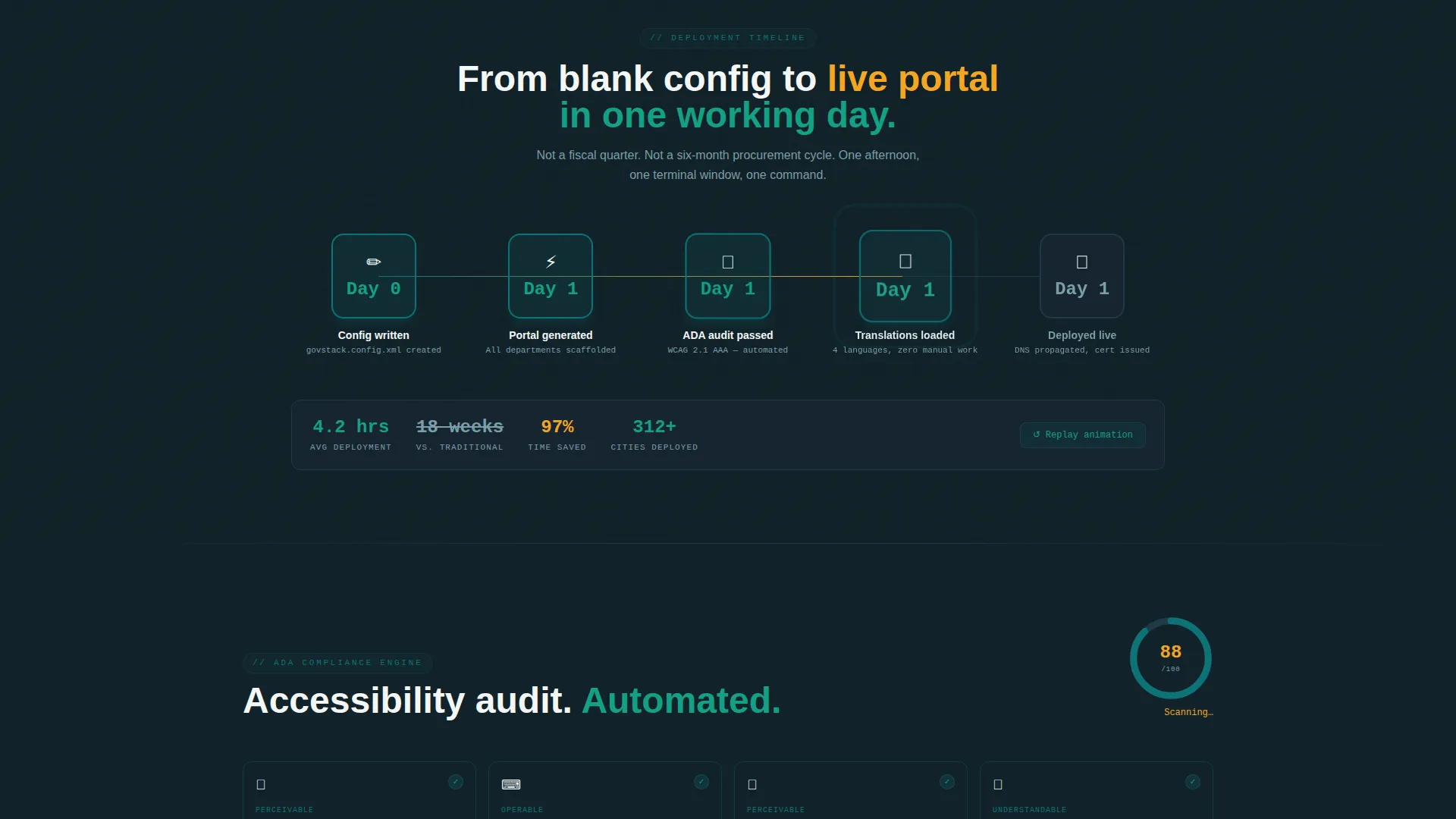
A countdown animation sequences through "0 days... 1 day... live" to show how fast a portal can go from config to published. Confetti particles fire in teal and amber at the end of the sequence. The animation reinforces the core promise of rapid deployment without requiring any written explanation.
Accessibility Scorecard Section
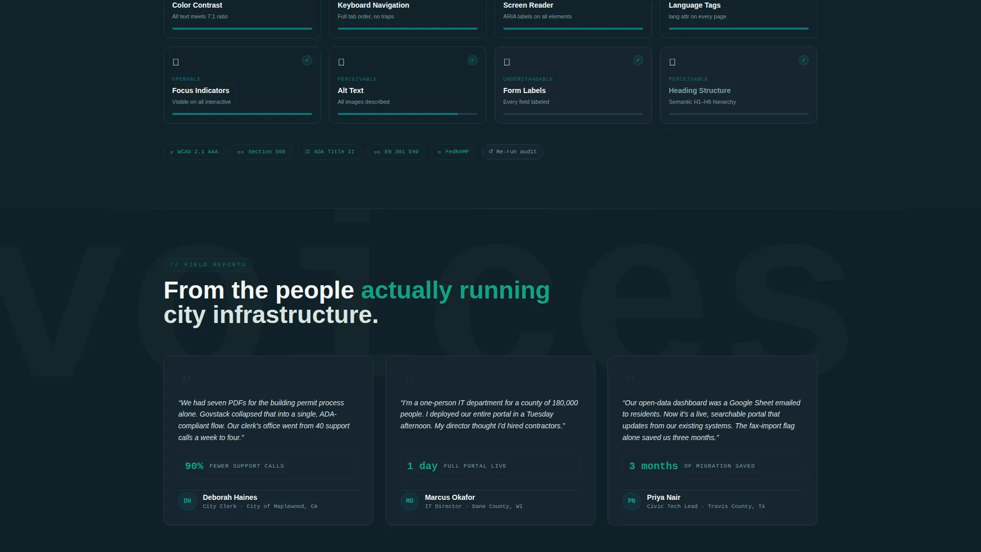
An auto-filling scorecard visually counts up to a score of 100, emphasizing the template's ADA-compliant and multilingual design foundations. This section speaks directly to compliance-conscious decision-makers who need to justify a technology choice internally.
Copyable CLI Conversion Block
Directly above the primary call-to-action button, a formatted code block displays the command npx govstack init. Visitors can copy it with a single click and paste it directly into their terminal. This removes the friction between interest and first use for technical team members.
Dual-Path Conversion Footer
The conversion section offers two distinct paths. Technical users see a primary "Download the CLI" button alongside "View on GitHub" and "Try the Playground" options. Non-technical decision-makers see an email signup labeled "Get the Launch Kit" so they can share the template with their IT team.
Page sections overview
| Section | Purpose |
|---|---|
| Code Snippet Header | Anchor attention with a live-rendered <gov-portal> markup block and a single bold headline |
| City Directory Grid | Show a mock department data grid with status pills and clickable card previews |
| Deployment Timeline | Animate the path from zero to live with a countdown and confetti burst |
| Accessibility Scorecard | Auto-fill a compliance score to 100 to address governance and ADA concerns |
| CLI Conversion Block | Display the npx govstack init command in a copyable block above the primary call to action |
| Dual-Path call to action Footer | Serve technical and non-technical visitors with separate but parallel conversion actions |
Design & branding system
The template uses the Teal Catalyst color system, a palette designed to feel authoritative enough for a public-sector domain while still being visually engaging for everyday residents.
- Deep civic teal (#0D7377) anchors interactive elements and primary actions; midnight charter (#0F2027) fills dashboard card backgrounds for high contrast
- Clean parchment (#F4F7F6) covers open whitespace across the grid layout, while signal amber (#F5A623) highlights notification badges and live-status indicators
- The overall visual tone resembles a freshly redesigned transit map: structured and trustworthy, but alive enough that a resident actually wants to click something
Mobile & speed optimization
The layout is built around a clean open grid that scales naturally across screen sizes. Every section prioritizes legibility and tap-friendly interaction without sacrificing the visual density the data grid requires.
- Card-based grid sections reflow cleanly on smaller screens so department entries remain readable and tappable on mobile devices
- The syntax-highlighted code block and copyable CLI command are sized and spaced for comfortable interaction on both desktop and mobile viewports
How this template helps you convert
Every scroll event on this page is designed to build momentum toward a single decision: ship the portal. The page uses visual proof, low-friction tools, and parallel conversion paths to serve both technical and non-technical visitors.
- The live code header and animated deployment timeline create progressive confidence, showing visitors that setup is fast and the output is real before they reach any button
- The copyable CLI block drops the barrier for technical users to near zero, while the "Get the Launch Kit" email path gives procurement-minded decision-makers a way to act without a terminal
Other information about this template
This template is categorized under Technology with a subcategory focus on Government Digital Presence, making it a practical fit for civic tech projects, municipal redesigns, and open-government initiatives.
- The template style is Dashboard and Data Grid, meaning the layout is organized around scannable card rows and status indicators rather than a traditional narrative scroll
- The Directory and Discovery theme is designed to help residents find what they need quickly, which aligns with the core goal of a government service portal
- The Launch Energy creative direction means every section of the page accelerates toward conversion, using animation and progressive disclosure to keep visitors engaged through the full scroll
Theme
Directory & Discovery
Creative direction
Launch Energy
Color system
Teal Catalyst
Style
Dashboard/Data Grid
Direction
App Download
Page Sections
Live Code Snippet Header Block
Interactive Department Data Grid
Deployment Timeline Animation
Auto-filling Accessibility Scorecard
Copyable CLI Command Block
Dual-path Conversion Footer
Related questions
Who is this template designed for?
Does this template support multiple languages?
What does ADA-compliant mean in the context of this template?
How does the dual conversion path work?
Can a non-developer use this template?



