Advanced Government Digital Presence Professional Website Template
Civic is a scroll-reveal landing page template built for government communications teams. It showcases a social media design platform through a cinematic Problem-to-Solution arc, dark glass panel header, live metrics simulation, and a single-tap app download call to action. Built for city halls, transit authorities, and public health departments who need posts residents actually stop to read.
by Rocket studio
Quick summary
Civic is a single-page, scroll-reveal landing page template designed to market a government social media template platform. It guides visitors through a before-and-after transformation story, from ugly clip-art flyers to polished, on-brand public announcements, and drives them toward a free app download with no forms and no friction.
Who this template is for
This template is built for digital teams inside government and public-sector organizations. It speaks directly to the people who write and publish public communications every single day, often alone, often under pressure.
- Solo communications coordinators at mid-size municipalities managing urgent alerts alongside routine announcements
- State agency digital teams who need accessible, visually consistent social content at scale
- Government comms directors who need to pitch a better design tool upward to leadership before anyone installs it
What problem this template solves
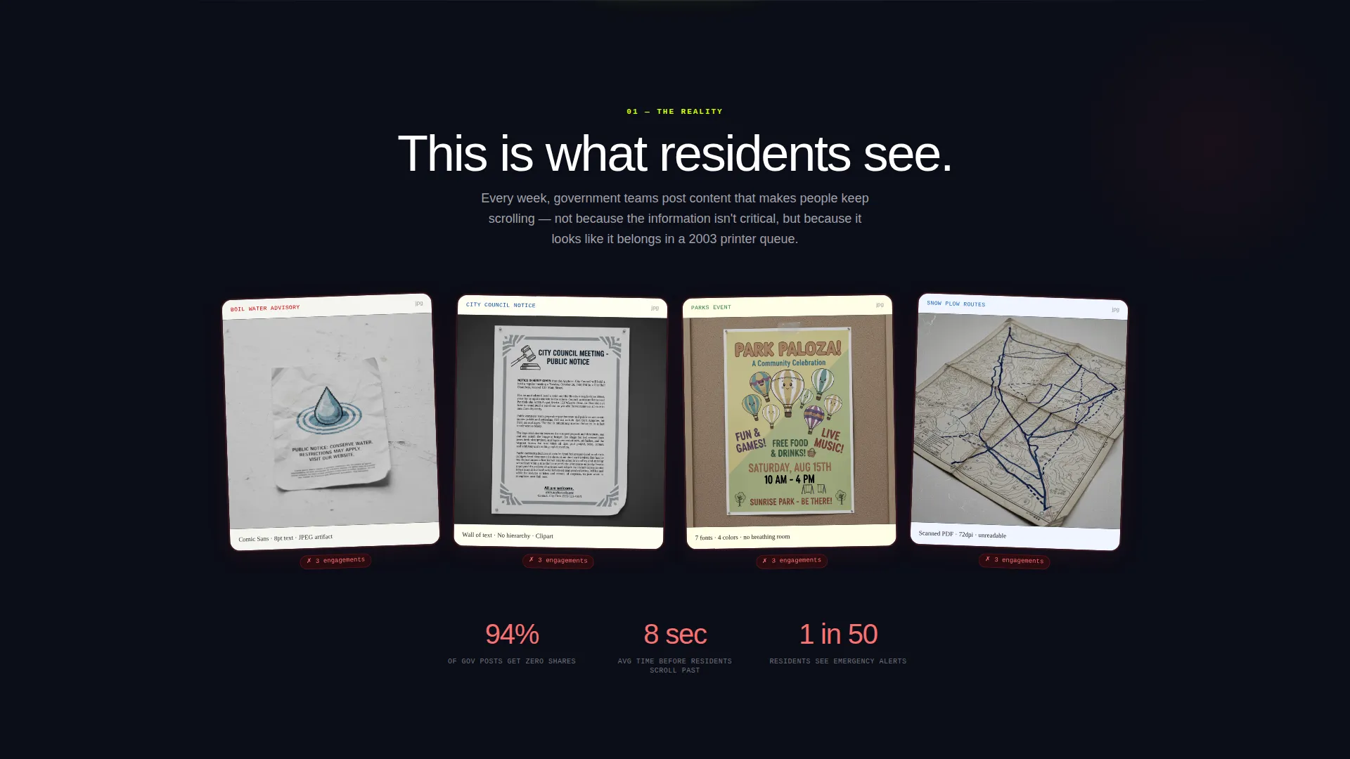
Government social media content often looks like it was made in a hurry, because it was. Clip-art flyers, walls of small text, and Comic Sans event banners erode public trust before a single resident reads the message. This template makes the cost of that problem visible, then shows the fix.
- Residents scroll past poorly designed public posts, so critical information never reaches them
- Comms teams lack a fast, polished way to produce professional-looking social content without a graphic designer
- Decision-makers need to see a clear transformation before approving a new tool for the team
What you get with this template
You get a fully structured, single-page scroll-reveal layout that tells a complete product story from the first glass panel to the final download tap. Every section is choreographed to build trust and then convert.
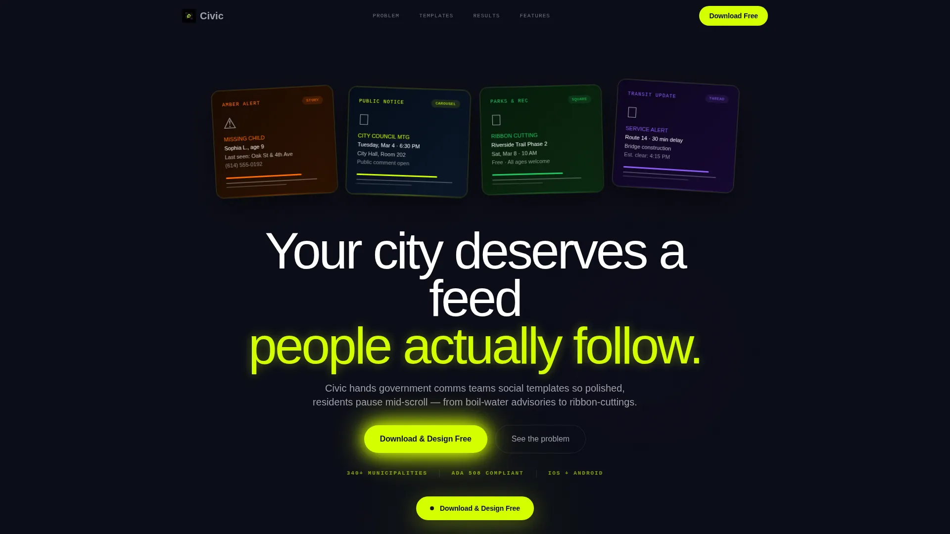
- A cinematic header with four dark glass panel cards, each showing a different live government social template in context
- A three-stage Problem-to-Solution arc with before-and-after gallery reveals and a live metrics simulation section
- A sticky app download call to action, paired platform badges, and a secondary email capture path for team pitches
Feature list
This section details the core built-in components and interaction patterns included in the Civic landing page template.
Dark Glass Panel Header
Four translucent, frosted-glass cards float over a void black background, each tilted at a slight parallax angle. Each card displays a distinct government social post in context: an amber alert story, a public meeting carousel slide, a parks-and-rec event square, and a transit delay thread opener. A chartreuse edge-light pulses once across the glass as the page loads.
Scroll-Triggered Headline Reveal
No headline appears until the visitor scrolls a single pixel. At that moment, the primary headline slides up from below the fold with motion easing that matches the Dynamic Motion theme. This single interaction immediately signals that the page is alive and rewards curiosity.
Before-and-After Reveal Arc
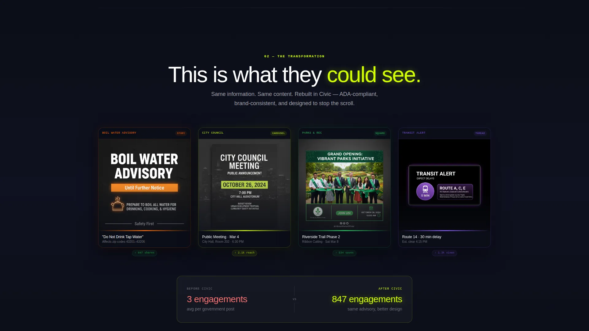
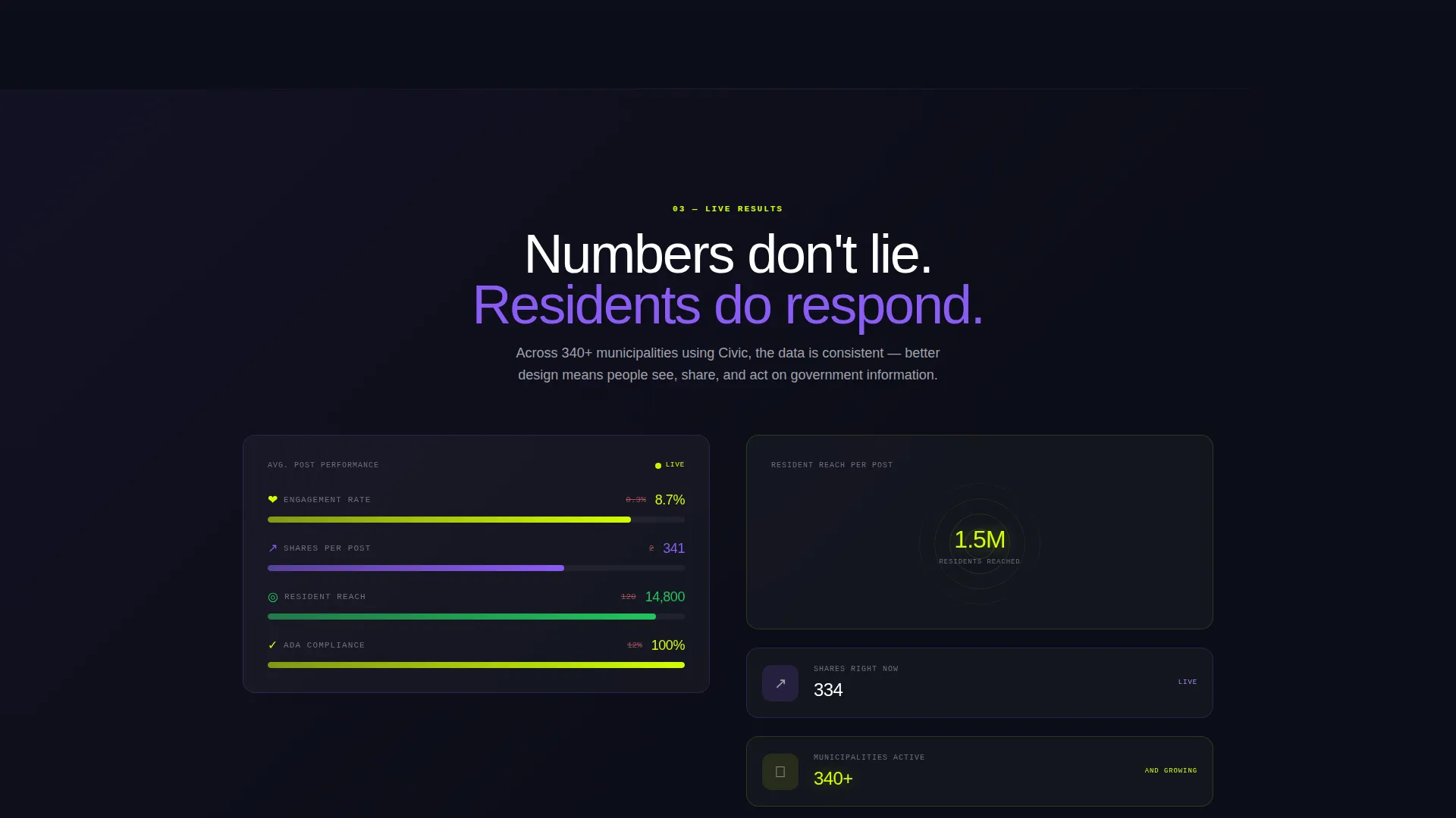
Three sequential scroll triggers drive the core narrative. The first reveals real examples of low-quality government posts fading in one by one. The second snaps polished redesigns into frame using motion easing. The third shows a live metrics simulation with rising engagement bars, climbing share counts, and expanding reach circles.
Sticky App Download Call to Action
After the second scroll reveal, a pill-shaped call to action reading "Download & Design Free" becomes sticky at the top of the viewport. It stays visible as the visitor continues scrolling, reducing the distance between intent and action at the exact moment trust is established.
Dual Conversion Paths
The primary path is a platform-detected, single-tap app download with paired App Store and Google Play badges. The secondary path is a single work-email field for comms directors who need to send the tool recommendation to their team before installing. No additional form fields are required for either path.
Full-Width Download Section
At the bottom of the page, a dedicated full-width section repeats the app download call to action alongside both platform badges. This section acts as a final, unambiguous conversion moment after the visitor has seen the entire transformation story.
Page sections overview
| Section | Purpose |
|---|---|
| Glass Panel Header | Anchors the visual identity and previews four real government post templates in situ |
| Headline Scroll Reveal | Delivers the primary message only after the first scroll, rewarding visitor engagement |
| Before State Gallery | Shows recognizable examples of low-quality government social posts to establish the problem |
| After State Gallery | Reveals the same content redesigned inside the platform to demonstrate the solution |
| Metrics Simulation | Makes abstract engagement benefits tangible through animated counters and expanding reach visuals |
| Sticky call to action Pill | Keeps the app download action visible from the midpoint of the page onward |
| Email Capture Row | Provides a secondary path for team pitches via a single work-email field |
| Full-Width Download | Closes the page with a definitive, distraction-free app download moment |
Design & branding system
The visual identity follows an Acid Digital color system built around a void black base. Every color choice reinforces a city-control-room atmosphere: dark, precise, and quietly urgent. The palette makes chartreuse feel like a status light and purple feel like depth.
- Void black (#0B0D17) covers the dominant background; electric chartreuse (#D4FF00) owns every button, hover state, and highlight stroke
- Scanner purple (#8B5CF6) bleeds into background gradients that shift subtly as the visitor scrolls deeper into the page
- Cool zinc (#A1A1AA) handles all body text and dividers, keeping long-form content readable without breaking the nocturnal atmosphere
Mobile & speed optimization
The layout is designed around a single vertical scroll path, which means every interaction and reveal translates cleanly to a smaller screen. The app download section uses platform detection so mobile visitors see the correct store badge immediately.
- Scroll-triggered animations are tied to a single axis, keeping the experience smooth on touch devices
- The sticky call-to-action pill is sized for thumb reach on mobile viewports
- The dual conversion paths (direct download and email capture) each require only one tap or one field, minimizing friction on any screen size
How this template helps you convert
Civic is structured so that conversion feels earned rather than demanded. By the time any call to action becomes visible, the visitor has already watched their own problem get solved on screen.
- The before-and-after arc builds emotional resonance first. Visitors recognize their situation in the problem gallery, then feel genuine relief when the solution gallery snaps into view.
- The sticky call-to-action pill appears precisely after the solution is revealed, timing the offer to the peak of visitor motivation rather than interrupting the story too early.
- The secondary email capture path removes a common blocker for institutional buyers. A comms director who cannot install an app unilaterally can still forward the recommendation to a decision-maker with one field and one click.
Other information about this template
Civic is built specifically for the government digital communications niche, where visual credibility and public trust are as important as the message itself. The template supports use cases that range from emergency alert promotion to routine parks-and-recreation event announcements.
- The template is categorized under Technology with a subcategory of Government Digital Presence
- The scroll-reveal structure means every section is hidden until the visitor reaches it, creating a paced, focused experience rather than a wall of information
- The work-email-only secondary capture field is designed to filter for professional and institutional contacts, making follow-up more relevant for team-level decisions
- The Dynamic Motion theme and Acid Digital color system are intentionally unusual for government digital presence, making the platform feel modern rather than bureaucratic
Theme
Dynamic Motion
Creative direction
Problem→Solution Arc
Color system
Acid Digital
Style
Scroll Reveal (Progressive)
Direction
App Download
Page Sections
Dark Glass Panel Header
Scroll-triggered Reveal System
Before-and-after Transformation Arc
Sticky App Download Call to Action
Dual Conversion Paths
Related questions
Who is the Civic landing page template designed for?
What does the scroll-reveal structure mean for visitors?
Does the template require form fields to convert?
Can the colors and content sections be customized?
Is this template suitable for promoting tools used by accessibility-focused government teams?



