Intelligent Compliance Platform Landing Page Template
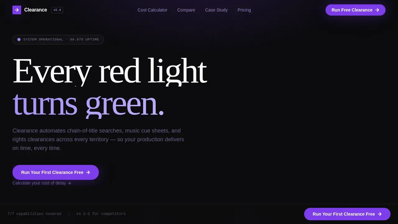
The Clearance automated rights management comparison landing page template is built for entertainment compliance SaaS products targeting production legal teams and post-production supervisors. It opens with an interactive cost-of-delay calculator, flows into a scroll-triggered competitive comparison table, and closes with a two-step conversion form, turning a complex B2B argument into a financially undeniable, visually precise landing page.
by Rocket studio
Quick summary
This is a single-page, conversion focused landing page template engineered for entertainment compliance software. It leads with a live cost calculator, builds its case through a scroll-animated competitive comparison table, and closes with a gated two-step form. The Void and Violet design system, all void black, deep ultraviolet, and phosphor lilac, gives the page the feel of a spacecraft console in a darkened edit suite.
Who this template is for
This template is purpose-built for B2B SaaS companies operating in the entertainment compliance, rights management, and legal technology space. It is especially suited for teams that need a comparison landing page capable of converting highly informed, skeptical buyers, people who have already lived through the pain of manual clearance workflows.
The target audience for this landing page includes:
- Production legal teams and post-production supervisors who need to see a clear, calculable argument before they consider switching tools
- Studio business affairs executives evaluating global release risk and comparing platforms on territory coverage and audit-trail depth
- SaaS founders or product marketing leads building a new landing page to win deals against established competitors in the rights clearance space
What problem this template solves
Rights clearance is one of the most failure-prone stages of any film or television production. A single uncleared asset can delay a global release by weeks. The core pain point is not just time, it is the financial and reputational cost that piles up every day a delivery sits blocked. Potential customers in this space are not browsing casually; they arrive with urgency, skepticism, and a spreadsheet full of bad experiences.
A generic marketing page cannot close this kind of deal. A well-structured comparison landing page built around proof, precision, and competitive transparency can.
This template directly addresses those problems:
- Manual workflows, spreadsheet chaos, and missed territory clearances create measurable financial losses, this landing page opens by making that cost visible and calculable before the visitor scrolls at all
- Potential customers cannot easily evaluate competing tools side by side without a structured comparison table that surfaces the decisive differences at a glance
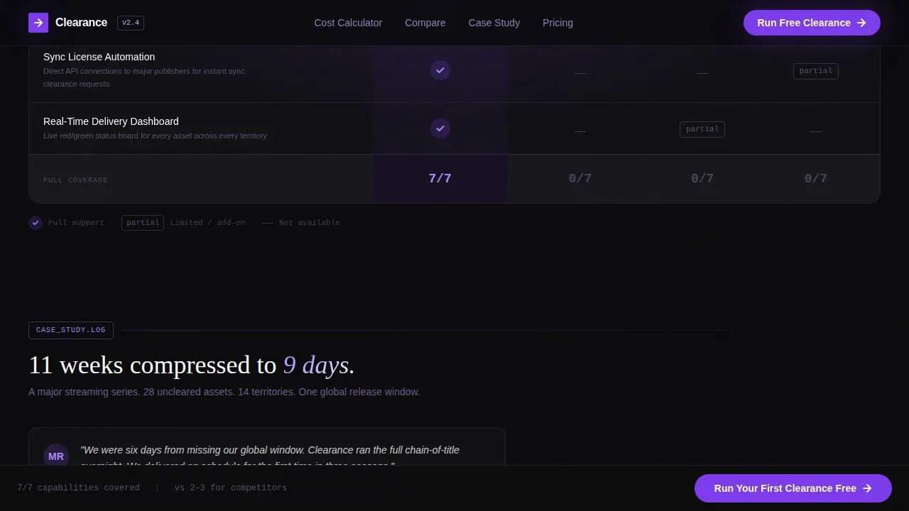
- Trust gaps and lingering competitor loyalty are real objections, social proof, concrete timelines, and a case study showing an eleven-week process collapse to nine days resolve those doubts with visual proof rather than assertion
What you get with this template
This template delivers a fully structured, high converting landing page ready to adapt to your entertainment compliance product. Every section is pre-architected around a Problem to Solution arc, starting with financial pain, moving through competitive comparison, and ending at a clear call to action. You do not need to figure out section order or conversion logic; it is already built in.
Here is what this template includes:
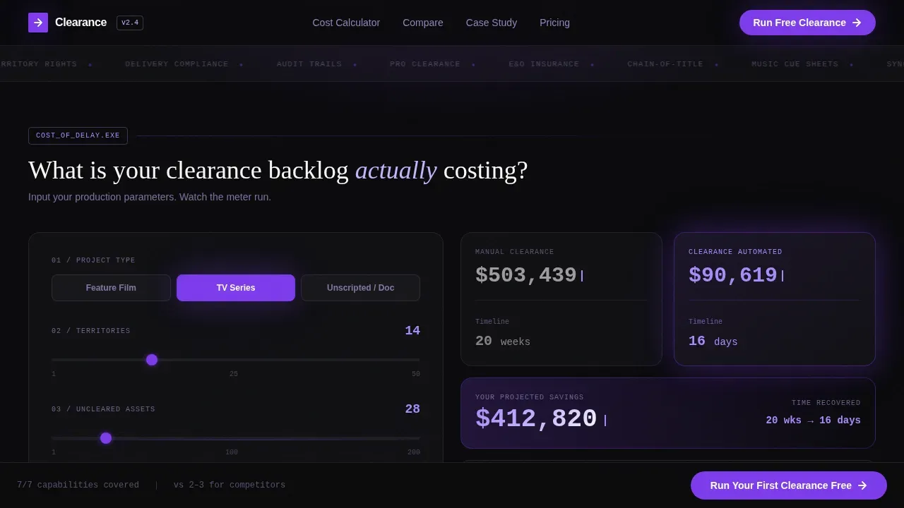
- An interactive cost-of-delay calculator in the hero section that accepts project type, territory count, and uncleared asset count, then renders a live dollar-and-timeline comparison between manual and automated clearance, the numbers tick upward in violet like a running meter
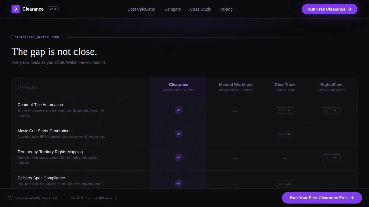
- A scroll-triggered competitive comparison table that loads row by row as the visitor scrolls, placing your product against manual workflows and two named competitors across rows for chain-of-title automation, music cue sheet generation, territory-by-territory rights mapping, delivery spec compliance, and audit-trail depth
- A case study timeline block, a two-step conversion form, a sticky call to action bar that pulses on reaching the final comparison row, a secondary lead magnet text link gated by email, and a linear single-row footer
Feature list
This section details what the template is pre-built to do. Every feature listed here is grounded directly in the template brief.
Interactive Cost-of-Delay Calculator
The hero opens with a live estimator, not an illustration, not stock photography. Visitors input their project type (feature, series, or unscripted), their number of territories, and their count of uncleared assets. The calculator instantly renders a side by side comparison of manual clearance cost and timeline versus automated clearance. Numbers tick upward in deep ultraviolet like a taxi meter. The emotional connection is immediate: the problem becomes financially undeniable before the visitor scrolls even one pixel. This is a benefit driven headline replacement, the math does the persuading. It immediately communicates what is at stake and sets the value proposition before any copy needs to.
Scroll-Triggered Comparison Table
The comparison table is the centerpiece of the page and the primary tool for competitive comparison. It loads row by row as the visitor scrolls, creating a reveal sequence that builds tension and holds attention. Each row covers a critical capability: chain-of-title automation, music cue sheet generation, territory rights mapping, delivery spec compliance, and audit-trail depth. Your product column fills with violet checkmarks. Competitor columns accumulate gray dashes and partial-support asterisks. This side by side comparison format is one of the most effective ways to surface a competitive advantage quickly. Using a comparison table helps most visitors grasp differences at first glance without needing to read dense paragraphs. A compelling landing page always showcases unique value clearly, and this table does exactly that.
Case Study Timeline Block
After the comparison table, a single named case study delivers the proof. It shows a real delivery timeline collapsing from eleven weeks to nine days. This is not a vague claim, it is a concrete, visual timeline that gives the competitive comparison an emotional anchor. Social proof in this format is more persuasive than a list of bullet-point benefits. Comparison landing pages that include testimonials and real user stories guide visitors toward a decision by reinforcing value with evidence. The case study plays a key role in converting visitors who have made it through the table but still need a final nudge.
Two-Step Gated Conversion Form
The primary call to action is a two-step form triggered by the sticky call to action bar. Step one captures production title and project type. Step two captures studio or production company name and work email. This progressive structure reduces friction by asking for low-commitment information first, then gating the higher-value ask. A secondary text link beneath the form acts as a lead magnet: it offers a detailed competitive teardown PDF gated by email only. This approach gives the sales team a warm lead with context, not just an anonymous email address.
Sticky call to action Bar with Scroll Pulse
The primary call to action, "Run Your First Clearance Free", is locked to the bottom of the viewport for the entire table scroll. When the visitor reaches the final comparison row, the bar pulses once in violet. This timed animation draws attention at exactly the right moment, when the comparison table has already made the argument. Including clear calls to action at multiple touchpoints on the page drives conversion rates. The sticky bar ensures the call to action is never more than one click away, no matter where the visitor is on the page.
Void and Violet Design System
The visual identity follows a terminal-and-spacecraft aesthetic. Absolute void black (#09090B) dominates every background. Deep ultraviolet (#7C3AED) marks interactive states, checkmarks, and the pulsing call to action. Phosphor lilac (#C4B5FD) softens secondary text and dividers. Status-screen white (#FAFAFA) snaps table content into clinical legibility. Typography uses DM Sans for body and user interface elements and Fraunces as a serif accent. This is not decoration, the design system is doing conversion work. The visual hierarchy guides the eye from calculator to table to call to action without a single distraction.
Page sections overview
| Section | Purpose |
|---|---|
| Hero Calculator | Interactive cost-of-delay estimator showing manual versus automated clearance in real time |
| Comparison Table | Scroll-triggered row reveals comparing your product against manual workflows and two competitors |
| Case Study Block | Named timeline visualization collapsing eleven weeks to nine days |
| Two-Step Form | Gated conversion form capturing production context then company and email |
| Secondary Lead Magnet | Email-gated PDF teardown linked below the primary call to action |
| Linear Footer | Single-row footer pattern closing the page cleanly |
Design & branding system
The visual layout is built around a terminal-in-a-darkened-suite aesthetic. Void black dominates every surface. Violet is the only light source, every interactive element glows in ultraviolet. The design deliberately avoids stock imagery and hero illustrations, choosing raw data and live computation as the opening visual instead. This restraint is a standout detail: the page earns visual appeal through precision and motion, not decoration.
Key design properties included in this template:
- Color system: absolute void black (#09090B) for backgrounds, deep ultraviolet (#7C3AED) for interactive states and checkmarks, phosphor lilac (#C4B5FD) for secondary text and dividers, status-screen white (#FAFAFA) for table cells and body text
- Typography: DM Sans handles all body and user interface copy; Fraunces serves as the serif accent for headings, no generic system fonts used
- Animation and motion: high-intensity stagger reveals, ticker counters in the calculator, sequential comparison table row loads, and a single viewport-locked call to action pulse on reaching the final table row
Mobile & speed optimization
The template is engineered desktop-first, reflecting the reality that production legal teams and business affairs executives work on large monitors in edit suites. The layouts and table structures are optimized for wide-screen clarity first. Mobile responsiveness is included so the landing page remains usable and readable on smaller devices.
Technical architecture notes for this template:
- Static sections use server components to keep the non-interactive parts of the landing page fast and stable at load
- The live calculator, comparison table scroll triggers, and two-step form use client components to handle interactivity without blocking the rest of the page
- Animation intensity is high throughout: ticker counters, stagger reveals, and scroll-triggered table rows all rely on client-side rendering scoped to those specific components
How this template helps you convert
This landing page is built around a single, disciplined conversion argument. Every section exists to advance the visitor one step closer to clicking the primary call to action. There are no decorative detours. The comparison landing page format is one of the most efficient structures for B2B SaaS products competing in a defined category, it lets the product's competitive advantage speak without relying on abstract copy.
Here is how the template moves visitors from skepticism to action:
- The cost-of-delay calculator opens the page by making the financial pain of inaction calculable. The visitor knows their number before they read a single line of body copy. This addresses the user's intent immediately: they came to understand whether switching is worth it, and the answer is quantified in violet numbers within seconds of arriving.
- The scroll-triggered comparison table builds the case row by row, giving visitors a comprehensive comparison they can evaluate at their own pace. Each row reveal is a small win for the product, checkmarks bloom while competitor columns fill with gray. By the final row, the argument is visual, structured, and hard to dismiss. Incorporating social proof in the case study block then adds the human layer that comparison data alone cannot provide, and the sticky call to action bar closes the loop the moment the evidence is complete.
Other information about this template
This template is designed for a very specific intersection: SaaS comparison pages in the entertainment compliance vertical. That focus matters. Competitor comparison landing pages are particularly effective in industries where multiple companies offer similar services, and film and television rights clearance is exactly that kind of market. A well-built comparison landing page in this space can rank on search engines for high-intent queries and serve as a durable content marketing asset for the sales team over time.
A few additional details worth knowing before you build your own landing pages with this template:
- The comparison categories in the table (chain-of-title automation, music cue sheet generation, territory rights mapping, delivery spec compliance, audit-trail depth) are pre-set based on the brief but can be adapted to reflect the specific features offered by your product and the competitor columns you choose to populate
- The template is a great example of a saas comparison page that works for both direct sales and content marketing use cases, the secondary PDF lead magnet functions as a lead magnet for the sales team and a content marketing asset simultaneously, giving visitors more value and giving the sales team a qualified warm lead
- When building competitor comparison pages, the comparison categories you highlight should focus on where your product genuinely excels, this template structures those rows to showcase your strongest competitive comparison points first and accumulate contrast as the visitor scrolls
- The two-step form structure is a smart way to reduce abandonment: visitors commit to step one (low friction) before reaching step two (higher friction), which increases form completion rates and gives the sales team richer context per lead
- The free plan call to action text ("Run Your First Clearance Free") is editable, if your product does not offer a free plan, adapt this to a free trial or free audit framing that matches your actual offer
- Customer testimonials and third party ratings can be added to the case study block or beneath the comparison table to strengthen social proof and encourage visitors who need additional reassurance before converting
- The template follows a visual hierarchy that places the highest-friction ask last, potential customers see the full argument before they are ever asked for their email, which increases trust and conversion rates
- Rights management context worth knowing: automated rights management solutions have evolved well beyond basic Digital Rights Management (DRM) protection, modern platforms manage the entire asset lifecycle, from chain-of-title searches to territory-by-territory licensing. Information Rights Management (IRM) focuses on document-level access control, while DRM is primarily used to protect media content from unauthorized access, copying, and distribution. Digital Asset Management (DAM) integrated systems embed rights at the point of upload, managing expiration dates and usage rights automatically. Choosing between these systems depends on whether the focus is on securing media content, managing enterprise documents, or licensing creative assets, a distinction your comparison table can make explicit for potential customers evaluating their options
- Platforms such as those offering automated contract management can automatically populate contractual templates and send them through portals for digital signatures, ensuring legal compliance, this is relevant context for any landing page explaining how automated clearance workflows replace manual legal processes
- The template is built on a Startup Velocity theme, which means the animation intensity and interactivity level are high by design, if you are adapting this for a more conservative brand, some motion elements can be scaled back without breaking the overall structure
- Other comparison pages in the SaaS space, including well-known landing page examples from tools like Unbounce, ZenDesk, and Klaviyo, follow similar table-led structures because a comparison table converts better than paragraph-heavy copy for high-consideration purchases. This template applies the same effect to the entertainment compliance category, giving visitors a comprehensive comparison they can trust and act on. Creating competitor comparison pages in this format is a perfect example of how B2B saas companies use structured comparison landing pages to replace long sales cycles with a single, persuasive, self-service argument
Theme
Startup Velocity
Creative direction
Problem→Solution Arc
Color system
Void & Violet
Style
Comparison Table
Direction
Comparison/Versus
Page Sections
Interactive Cost-of-delay Calculator
Scroll-triggered Comparison Table
Case Study Timeline Visualization
Two-step Gated Conversion Form
Sticky Viewport-locked Call to Action Bar
Void and Violet Design System
Related questions
Can I adapt the comparison table columns for different competitors?
Does the template include the live calculator logic or just the visual layout?
How does this landing page handle social proof beyond the case study block?
Is the secondary PDF lead magnet gated separately from the main form?
Is this template only suitable for entertainment compliance products?



