Government - High-Converting ERP Landing Page Template
Procure is a government ERP landing page template built for public-sector software platforms. It uses a dark Tech Glass visual identity, a scroll-reveal comparison table, and a five-tab module switcher to show prospects exactly where legacy systems fall short. The primary call to action drives migration assessment requests from city, county, and state procurement audiences.
by Rocket studio
Quick summary
Procure is a single-page government ERP template designed to convert public-sector buyers. It opens with a five-tab module dashboard, then walks visitors through a progressive comparison table that exposes the cost of legacy systems row by row. By the time they reach the call to action, the case for switching has already been made.
Who this template is for
This template is built for government software vendors and public-sector SaaS companies that sell enterprise resource planning platforms to municipal, county, and state agencies. It speaks directly to the decision-makers who live inside those procurement cycles.
- County IT directors managing decade-old system migrations
- City finance officers reconciling fund accounting under deadline pressure
- State procurement chiefs who need documented audit trails for legislative review
What problem this template solves
Government technology buyers are skeptical. They have seen too many vendor promises that did not survive contact with a real budget cycle. This template earns trust by showing the gap before asking for anything. The scroll-reveal comparison table materializes evidence progressively, so the visitor does their own math.
- Legacy ERP users toggle between multiple disconnected systems daily
- Finance and procurement teams lack a single, auditable workflow view
- Vendors struggle to communicate compliance readiness in a way that resonates with public-sector procurement reviewers
What you get with this template
You get a fully structured, single-page layout that guides government buyers from awareness to conversion without a single piece of stock photography. Every section is purposeful and sequenced to match how public-sector procurement decisions actually unfold.
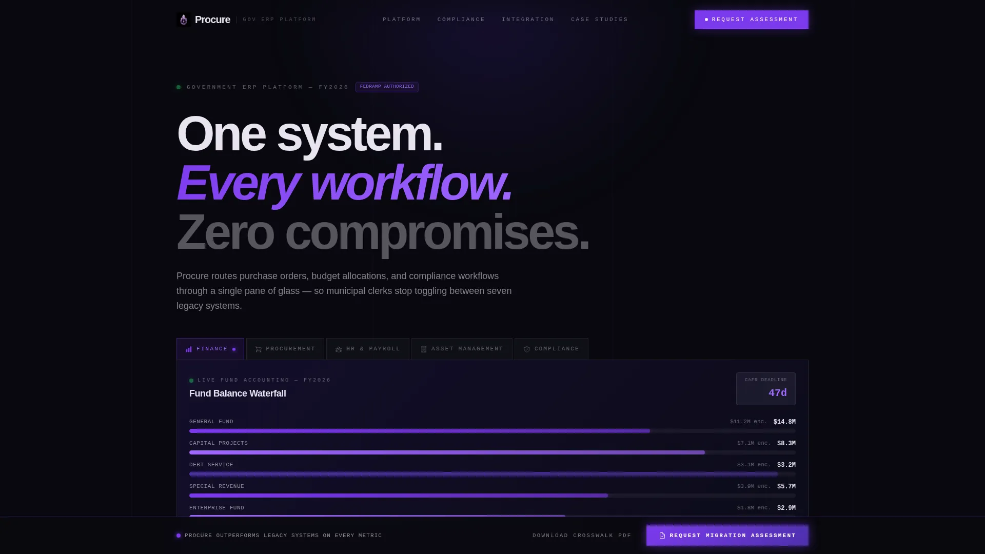
- A five-tab Feature Tab Switcher header showing Finance, Procurement, HR and Payroll, Asset Management, and Compliance dashboards
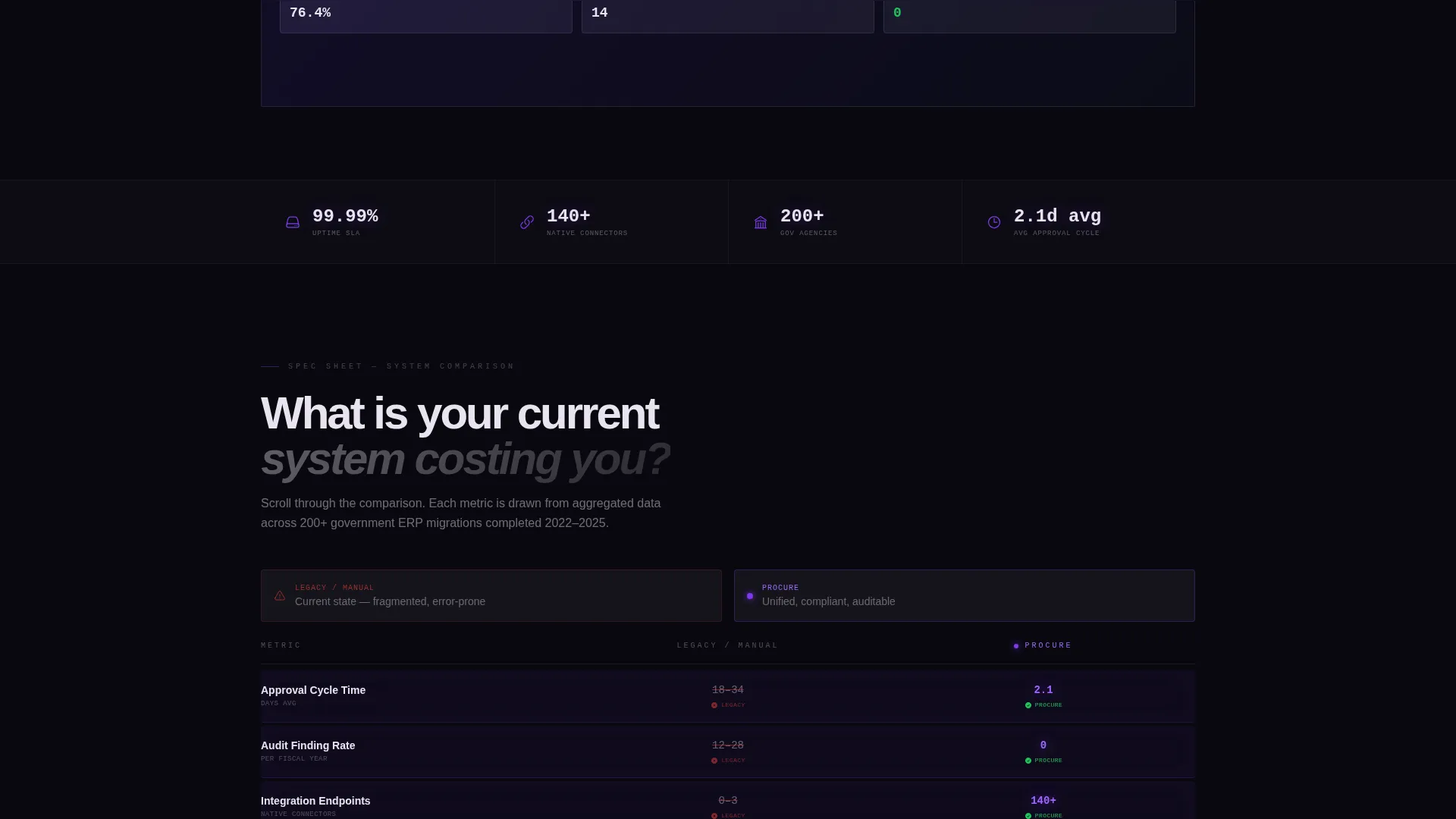
- A scroll-triggered comparison table with legacy versus Procure metrics that appear row by row as the visitor scrolls
- A sticky bottom bar with a primary call-to-action form and a secondary gated PDF download path
Feature list
This section covers the core interactive and structural components built into the template.
Five-Module Tab Switcher Header
The header presents five translucent glass tabs: Finance, Procurement, HR and Payroll, Asset Management, and Compliance. Each tab reveals a unique module dashboard beneath it when selected. The default Finance view shows a real-time fund balance waterfall chart, encumbrance status bars, and a CAFR (Comprehensive Annual Financial Report) deadline countdown. Tabs transition using a glass-refraction animation.
Scroll-Reveal Comparison Table
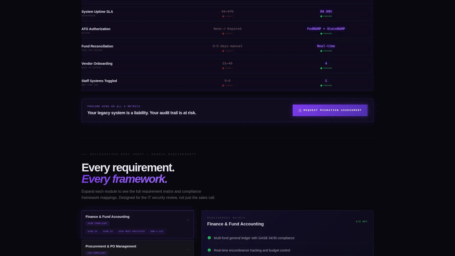
Below the header, a progressive comparison section loads with a faint grid and the question "What is your current system costing you?" As the visitor scrolls, each row of the table materializes. Metrics include approval cycle days, audit finding rates, integration endpoints, uptime service-level agreement status, and ATO (Authorization to Operate) authorization status. Each row that favors Procure pulses briefly in electric violet.
Module Deep-Dive Spec Sheets
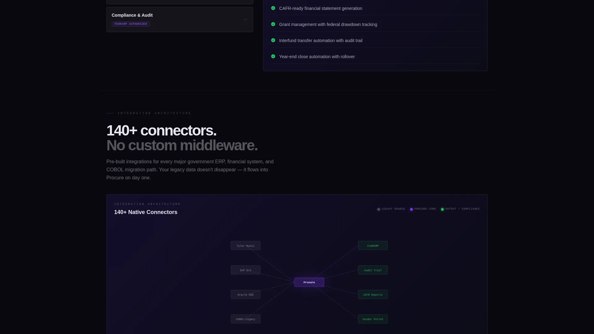
After the comparison table, the page unfolds into module-level detail sections styled like declassified specification sheets. These include expandable requirement matrices, compliance framework mappings for FedRAMP, StateRAMP, and FISMA (Federal Information Security Management Act), and integration architecture diagrams that draw themselves as they enter the viewport.
Sticky Migration Assessment call to action Bar
A sticky bottom bar appears after the comparison table completes. The primary form collects jurisdiction type, current ERP vendor from a pre-populated dropdown, number of active users, and a work email address. This anchored call to action remains visible as the visitor continues scrolling through evidence sections.
Gated Compliance Crosswalk PDF
A secondary conversion path offers a downloadable Compliance Crosswalk PDF gated behind email-only capture. This path is designed for prospects still in the research phase who are not yet ready to request a migration assessment.
Progressive Evidence Escalation
The page is structured so evidence builds in stages: features first, then benchmarks, then case studies with named municipalities and redacted savings figures. This sequencing is intentional and mirrors how public-sector buyers evaluate vendors before engaging a sales team.
Page sections overview
| Section | Purpose |
|---|---|
| Tab Switcher Header | Showcase five ERP module dashboards |
| Comparison Table Intro | Pose the legacy cost question |
| Progressive Comparison Rows | Reveal metric gaps row by row |
| Module Spec Sheets | Detail compliance and integration depth |
| Case Study Evidence | Build credibility with named municipalities |
| Sticky call to action Bar | Capture migration assessment requests |
| PDF Gated Download | Convert research-phase prospects via email |
Design & branding system
The visual identity follows a Tech Glass theme using a Void and Violet color system. The palette is designed to reduce eye strain during long work sessions and to feel authoritative without being sterile. Every surface is intentional: backgrounds recede, cards float, and data points glow.
- Void black (#09090F) backgrounds with frosted glass cards (#E8E4F0) that appear to float above the surface
- Deep interstellar violet (#2D1B69) for structural depth, electric violet (#7C3AED) for active states, toggle switches, and comparison highlights
- No stock photography anywhere on the page; the product interface itself serves as the visual hero
Mobile & speed optimization
The template layout is built to remain readable and navigable on smaller screens. The scroll-reveal interactions and sticky bar are designed to work within a responsive structure.
- Tab switcher and comparison table reflow cleanly for tablet and mobile viewports
- Sticky call to action bar remains anchored and usable across screen sizes without obscuring content
- Dark background and frosted glass card pattern reduces visual noise on high-density mobile displays
How this template helps you convert
The conversion architecture is built around a single insight: government buyers need to see the problem clearly before they consider a solution. This template earns the click by showing the gap first.
- The scroll-reveal comparison table builds the case progressively, so by the time the visitor reaches the sticky call to action bar, they have already seen their current system lose on every tracked metric.
- The dual conversion paths serve two buyer stages simultaneously: the migration assessment form captures decision-ready prospects, while the gated PDF captures researchers who need more time.
Other information about this template
This template is categorized under Government Software and SaaS within the Technology template category. It is specifically designed for the government ERP niche and carries a high intersection match score between its theme, creative direction, color system, template style, and landing page direction. The Spec Sheet creative direction and Comparison/Versus landing page direction work together to address the long evaluation cycles common in public-sector procurement.
- Template style: Scroll Reveal (Progressive) with viewport-triggered animations throughout
- Color system: Void and Violet, engineered for twelve-hour budget cycle readability
- Header concept: Feature Tab Switcher with glass-refraction tab transitions
- The compliance framework sections reference FedRAMP, StateRAMP, and FISMA to speak directly to the authorization language public-sector IT reviewers expect
Theme
Tech Glass
Creative direction
Spec Sheet
Color system
Void & Violet
Style
Scroll Reveal (Progressive)
Direction
Comparison/Versus
Page Sections
Five-module Feature Tab Switcher
Scroll-reveal Comparison Table
Declassified Module Spec Sheets
Sticky Migration Assessment Form
Gated Compliance PDF Download
Progressive Evidence Architecture
Related questions
Who is this landing page template designed for?
Can I customize the module tabs and comparison table metrics?
What are the two conversion paths on this landing page?
Does this template include actual dashboard data or charts?
Is this template suitable if my platform does not cover all five modules?



