Government Digital Presence Provider Directory Website Template
A searchable, filterable government directory landing page built for citizens who need fast, accurate answers from public agencies. This single-page template presents a live-feel dashboard preview, structured comparison tables, and frosted glass card layouts that make navigating government contacts feel like operating a control room, not hunting through outdated websites.
by Rocket studio
Quick summary
This template turns a government directory into a confidence-building landing page. Visitors see the product working before they click anything. A dashboard preview header, spec-sheet comparison tables, and a "Browse by State" grid give every type of user a clear entry point. The design runs on a dark, glassmorphic palette that reads like a professional data command center.
Who this template is for
This template is built for teams publishing a government contact directory or public agency listing site. It speaks directly to the citizens who will use that directory every day.
- Small business owners chasing permits or licensing contacts at the county or state level
- Veterans, journalists, and lawyers who need verified agency details, jurisdiction boundaries, and org chart clarity
- Government digital teams or civic tech publishers who want a credible, conversion-ready landing page for their directory product
What problem this template solves
Finding the right government contact is surprisingly hard. Phone numbers are buried, websites are outdated, and a simple Google search often returns the wrong office entirely. This template frames your directory as the direct solution to that frustration.
- Citizens waste time cycling through agency websites, 311 hold queues, and dead-end search results
- There is no single place that shows agency name, jurisdiction, phone number, office hours, and verification date together
- Without a clear comparison, visitors cannot immediately see why a dedicated directory is better than just searching online
What you get with this template
You get a fully structured, single-page landing page designed to move visitors straight into your directory. Every section is built to prove value before asking for any action.
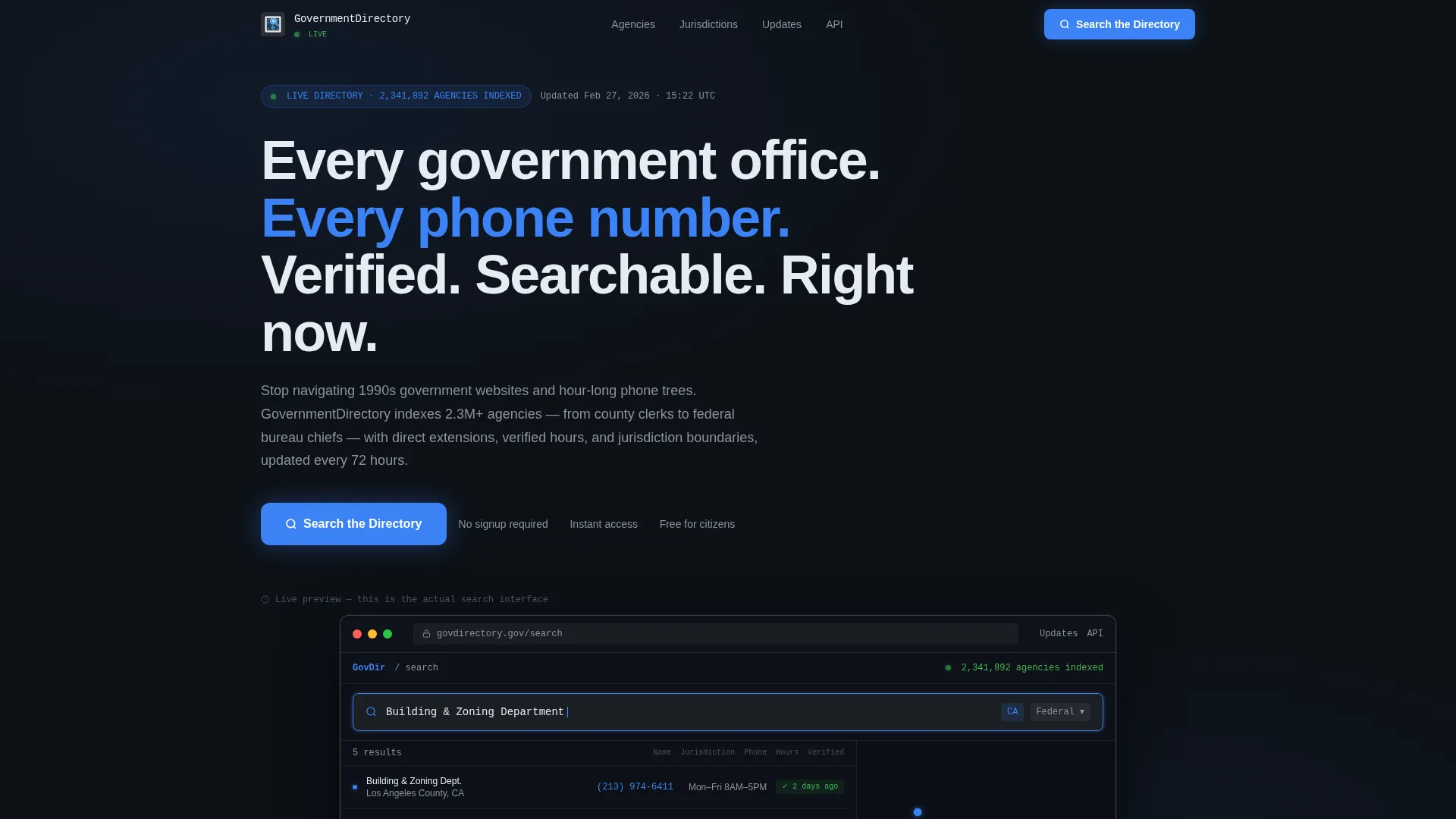
- A browser-frame dashboard preview in the header showing a live-looking directory search in progress, complete with a results table and a map panel
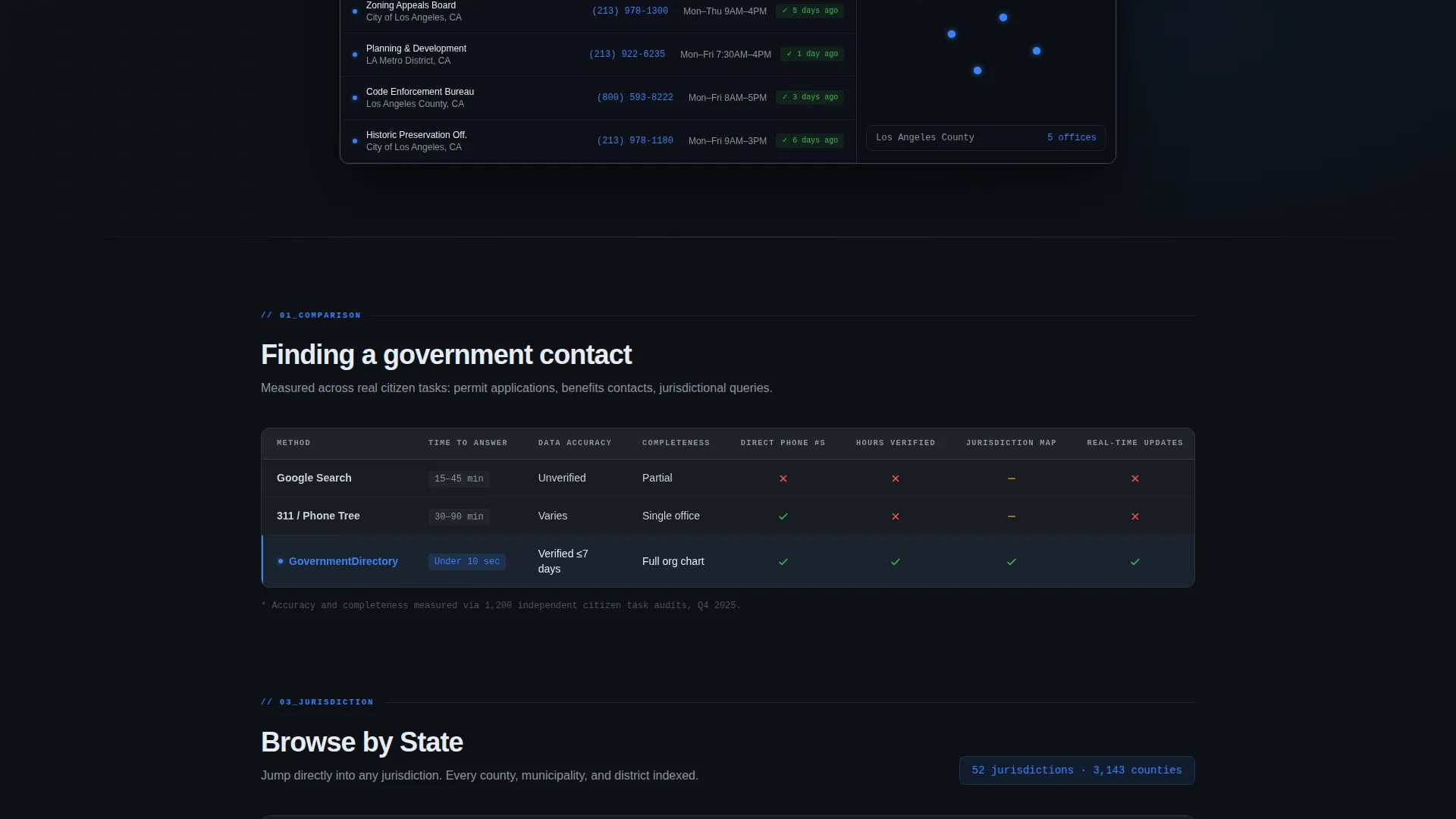
- Two comparison table sections and a frosted glass feature stat block that answer "why not just Google it" with specifics, not slogans
- A persistent "Search the Directory" call-to-action button and a "Browse by State" grid that give visitors two immediate ways to enter the product
Feature list
This template includes the following purpose-built sections and design components.
Live Dashboard Header Preview
The header contains a browser-frame mockup showing the directory interface mid-search. A real-looking query, a five-column results table with agency names, jurisdiction, phone, hours, and a verification timestamp, and a map panel with location pins make the product feel usable before the visitor scrolls.
Method Comparison Table
The first comparison table benchmarks three contact-finding methods: a generic web search, calling a general city hotline, and this directory. Columns cover speed, accuracy, and completeness. Visitors see the advantage stated in data, not marketing language.
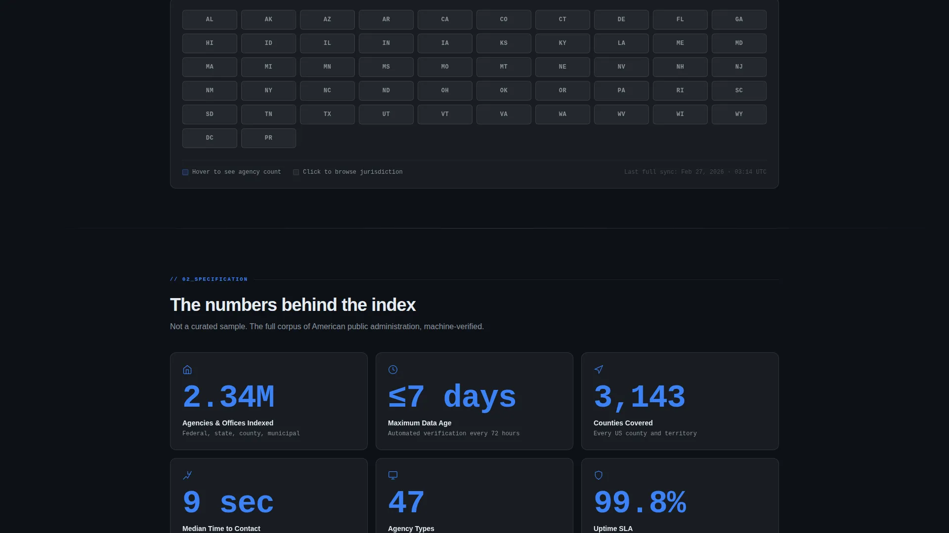
Frosted Glass Stat Cards
Key directory metrics sit inside individual frosted glass cards. Each card displays one oversized number in electric civic blue, such as the number of agencies indexed, update frequency, or jurisdictions covered. The layout communicates scale and reliability at a glance.
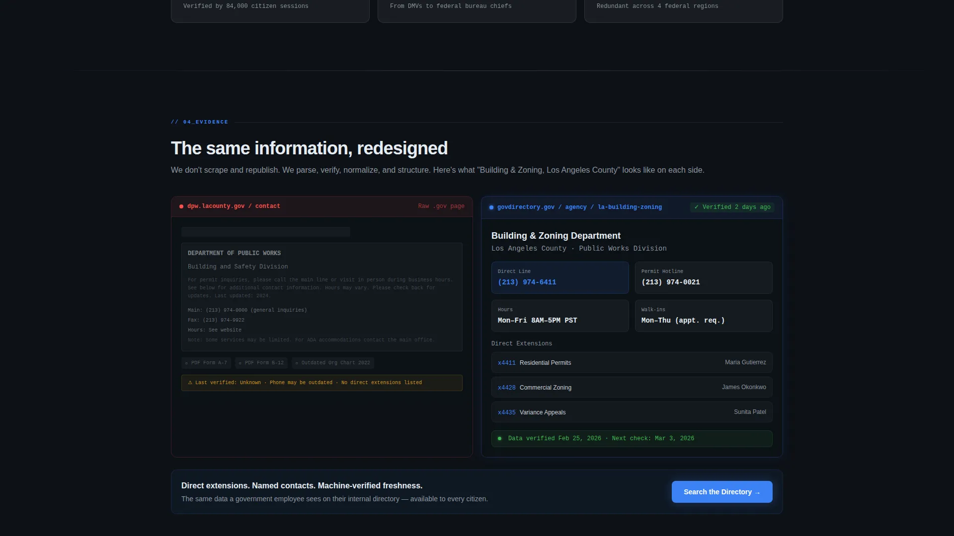
Raw versus. Structured Side-by-Side
A direct visual comparison shows a raw government website screenshot beside the same information restructured inside the directory. This section answers objections without a single persuasion word.
Browse by State Grid
A grid of state abbreviations sits below the first comparison table. Each abbreviation is a clickable entry point. Impatient visitors can jump straight into a geographic slice of the directory without reading the rest of the page.
Persistent Call-to-Action Placement
The primary "Search the Directory" button appears three times: inside the dashboard header as an interactive-looking search bar, as a fixed-bottom button on small screens, and as a persistent top-right button on wider screens. No form, no gate, just a direct path into the search interface.
Page sections overview
| Section | Purpose |
|---|---|
| Dashboard Header Preview | Shows the directory interface mid-search to prove value immediately |
| Method Comparison Table | Compares web search, city hotline, and this directory across speed, accuracy, completeness |
| Feature Stat Cards | Highlights key directory metrics inside frosted glass cards with oversized numbers |
| Raw versus. Structured View | Contrasts a raw agency website with the cleaned directory layout side by side |
| Browse by State Grid | Lets visitors jump into state-level results without scrolling further |
| Persistent call to action Bar | Keeps the primary search action visible at all scroll positions |
Design & branding system
The visual identity follows a Data Command theme executed through a glassmorphic color system. Every surface feels like a lit control panel in a darkened room.
- Background uses deep command-center charcoal (#0D1117), cards and tables use a frosted glass white panel at 12% opacity (#FFFFFF1F) with thin 1-pixel rgba white borders, and electric civic blue (#3B82F6) fires only on interactive states, links, toggles, and hover highlights
- Secondary text and divider lines use muted steel (#8B949E), keeping information hierarchy clear without competing with the blue accent layer
- No stock photography or illustrations appear anywhere; the dashboard mockup and data tables carry all the visual weight
Mobile & speed optimization
The layout adapts to smaller screens without losing the command-center feel. The most important conversion path stays visible at all times.
- The fixed-bottom "Search the Directory" button persists on mobile so the primary action is always one tap away regardless of scroll position
- Frosted glass cards and comparison tables reflow cleanly into single-column stacks on narrow viewports, keeping content readable without horizontal scrolling
How this template helps you convert
Every design and layout decision in this template is aimed at removing hesitation and shortening the path from first impression to first search.
- The dashboard preview header lets visitors read real-looking data before committing to anything, building trust through demonstration rather than description.
- The comparison tables replace vague claims with structured evidence, answering the natural objection of "why not just Google it" before it forms.
- Two distinct entry points, "Search the Directory" and "Browse by State", accommodate both focused searchers and exploratory browsers, so no visitor leaves without a clear next step.
Other information about this template
This template is categorized under Technology with a subcategory of Government Digital Presence. It is designed specifically for the government directory and listing site niche.
- The Spec Sheet creative direction means every scroll section is structured like a procurement document: direct, evidence-led, and respectful of the reader's time
- The Click-Through landing page direction means there are no form fields, no sign-up gates, and no friction between the landing page and the live directory search interface
- The template style is a Comparison Table layout, making it especially effective for civic tech products that need to justify their existence against free alternatives
- The Data Command theme and glassmorphic color system are consistent choices for government and public sector digital products that need to feel authoritative without feeling cold
Theme
Data Command
Creative direction
Spec Sheet
Color system
Glassmorphic
Style
Comparison Table
Direction
Click-Through
Page Sections
Live-look Dashboard Header
Side-by-side Comparison Tables
Raw Versus. Structured Agency View
Browse by State Entry Grid
Persistent Search Call-to-action
Glassmorphic Data Command Layout
Related questions
Who is this landing page template built for?
Does this template include a live search database?
Can I update the comparison table figures and stat card numbers?
Do visitors need to create an account before searching?
How does the Browse by State grid function?



