Government Digital Presence Cost Estimator Website Template
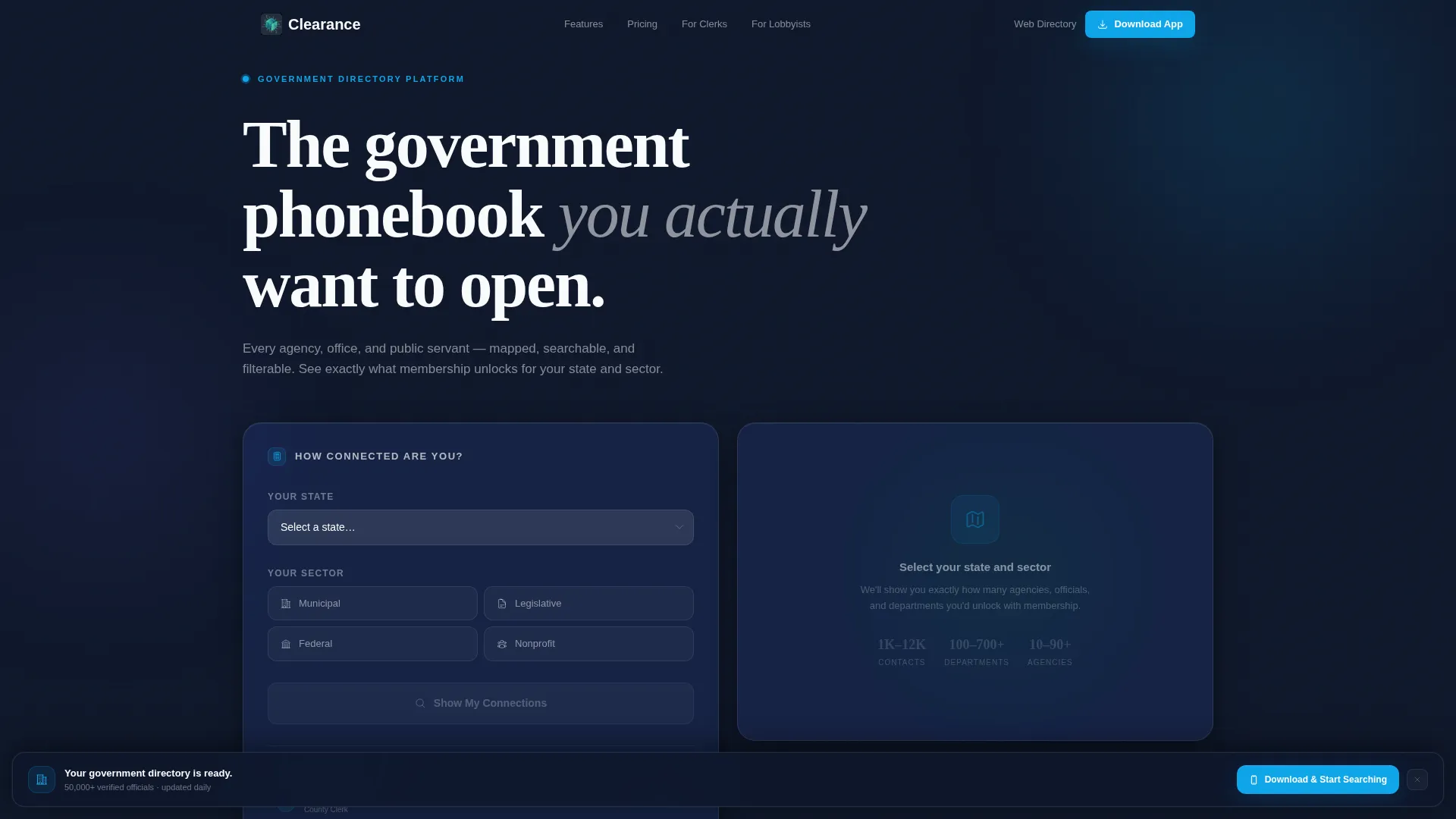
Clearance is a scroll-reveal government membership landing page built on a glassmorphic design system. It opens with an interactive estimator that personalizes the directory scope to each visitor's state and sector. Progressive feature tiles stack as users scroll, and a persistent download bar drives app installs. The result is a civic directory experience that feels organized, modern, and immediately useful.
by Rocket studio
Quick summary
Clearance is a single-page government membership landing page template. It leads with a personalized "How Connected Are You?" estimator, then progressively reveals five capability tiles as visitors scroll. Every element follows a glassmorphic visual system built on frosted panels, civic teal, and soft lavender. The primary goal is driving app downloads, with a secondary path capturing work emails for web access.
Who this template is for
This template is built for organizations running a government membership directory or civic networking portal. It speaks directly to the people who actually need a structured, searchable contact network inside government.
- Municipal clerks who routinely track down counterparts in neighboring counties
- Lobbyists building legislative contact trees ahead of a session
- Newly elected officials learning who leads which department before day one
What problem this template solves
Government contact information is scattered, outdated, and hard to navigate. There is no single organized place where public servants, elected officials, and civic professionals can find verified names, titles, and departments across agencies. This template gives that problem a clear visual solution.
- Visitors arrive with no sense of scale and leave knowing exactly what the directory holds for their state and sector
- The progressive scroll structure builds trust feature by feature, reducing hesitation before the download ask
- Two conversion paths capture both mobile-first visitors and desktop browsers who want to explore first
What you get with this template
You get a fully structured, single-page scroll-reveal landing page ready to adapt to your government membership platform. Every section is purpose-built and visually connected through the glassmorphic design system.
- An interactive estimator header that personalizes directory scope by state and sector
- Five progressive feature tiles that reveal capabilities one at a time as the visitor scrolls
- A persistent frosted download bar and a secondary web-access email capture path
Feature list
This template delivers six distinct, prompt-backed features. Each one is designed to move a civic professional from curious visitor to active member.
Interactive "How Connected Are You?" Estimator
Visitors type their state and choose a sector such as legislative, municipal, federal, or nonprofit. A glassmorphic results panel then animates upward, showing the exact number of agencies, officials, and departments they would unlock with membership. The counter crystallizes inside frosted cards, making the data feel personal before any call to action appears.
Progressive Scroll-Reveal Feature Matrix
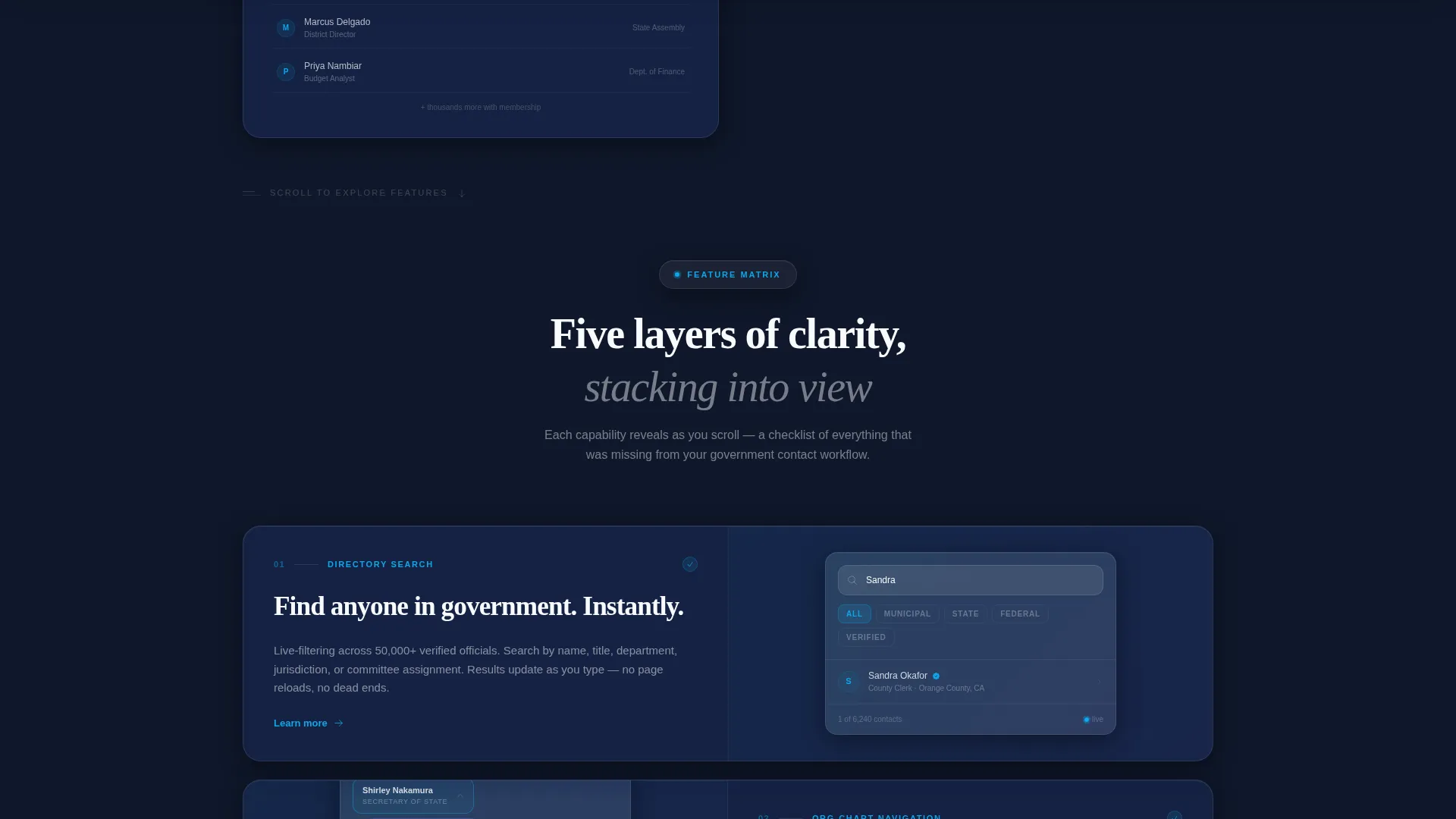
As visitors scroll, five capability tiles slide into view like transparent tiles stacking on a light table. Each frosted glass card sharpens from blurred to crisp as it enters the viewport. A small teal checkmark locks into place on each tile, giving the scroll the rhythm of a checklist being completed.
Five Capability Tiles
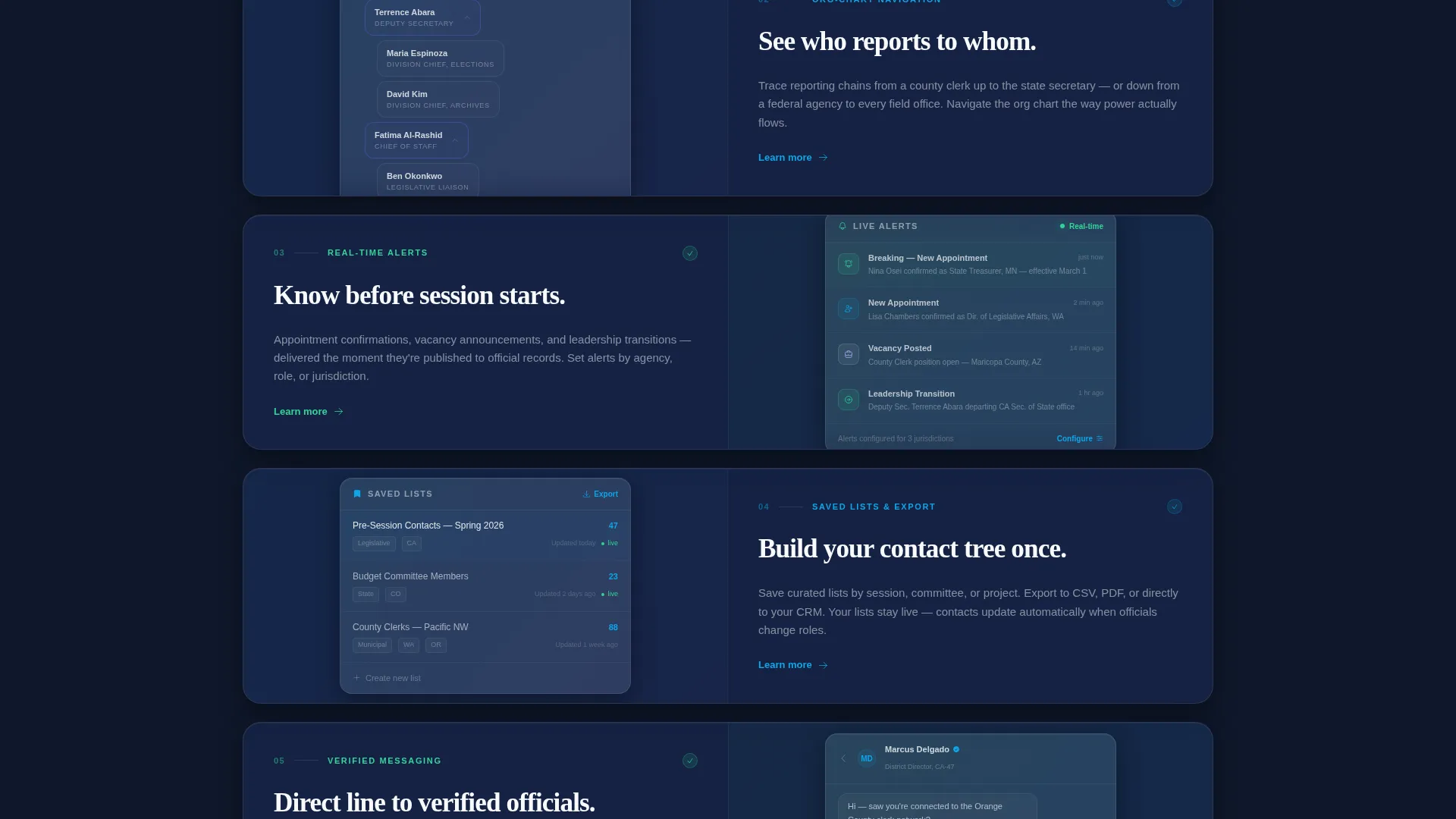
The five tiles cover: directory search with live filtering, org-chart navigation that maps reporting chains, real-time appointment and vacancy alerts, saved lists and export tools, and direct messaging between verified members. Each tile is its own visual story, presented in sequence.
Persistent App Download Bar
After the third feature tile reveals, a frosted bar slides up from the bottom of the screen. The primary call to action reads "Download and Start Searching." Tapping it detects the visitor's operating system and routes them to the correct app store.
Dual Conversion Path
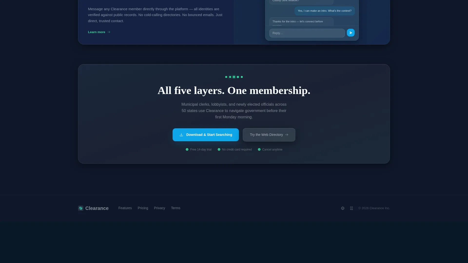
Desktop visitors who want to explore before committing see a secondary option labeled "Try the Web Directory." This path captures a work email address. Both paths are present on the same page, serving different intent levels without conflict.
Glassmorphic Card System
Every data card, feature tile, and results panel uses the same frosted panel treatment: white at reduced opacity over a deep slate base, with blur-shadow layering between cards. Active states pulse in civic teal and confirmation moments flash in sharp mint.
Page sections overview
| Section | Purpose |
|---|---|
| Estimator Header | Personalizes directory scope by state and sector before the call to action appears |
| Estimator Results Panel | Displays animated agency, official, and department counts in frosted cards |
| Primary Download call to action | First placement of "Download and Start Searching" inside the results panel |
| Feature Tile One | Introduces directory search with live filtering |
| Feature Tile Two | Shows org-chart navigation and reporting chain mapping |
| Feature Tile Three | Presents real-time appointment and vacancy alerts |
| Feature Tile Four | Covers saved lists and export tools |
| Feature Tile Five | Highlights direct messaging between verified members |
| Persistent Download Bar | Slides up after tile three; routes to correct app store by detected OS |
| Web Directory call to action | Secondary path for desktop visitors; captures work email |
Design & branding system
The visual identity follows a Directory and Discovery theme executed through a glassmorphic color system. Every layer is intentional: depth, translucency, and light work together to make data feel organized and trustworthy rather than cold or bureaucratic.
- Frosted panel white at 12 percent opacity sits over a deep slate base of #0F172A, creating backlit depth across every card
- Civic teal (#0EA5E9) drives active states and progress indicators; soft lavender mist (#E0E7FF) fills secondary surfaces; sharp mint (#34D399) pulses on confirmation and success moments
- No stock photography or headshots appear anywhere; the data itself is the visual hero, floating in clean translucent panels
Mobile & speed optimization
The template is designed with a mobile-first download goal in mind. The persistent download bar and OS-detection routing are central to the mobile experience, ensuring the primary conversion action is always within reach.
- The scroll-reveal structure loads content progressively as tiles enter the viewport, keeping the initial view lightweight and focused
- The persistent frosted bar slides up from the bottom after the third tile, a natural thumb-reach position on most mobile screens
- The estimator input and results panel are designed to function cleanly on smaller screens without horizontal scrolling
How this template helps you convert
The conversion architecture is layered deliberately. Each interaction builds on the last, so by the time the download button appears, the visitor already feels like the app is built for them.
- The estimator creates personal ownership first. Visitors see their own state and sector reflected in the results before any ask is made. The membership feels relevant before it is offered.
- The progressive feature matrix builds inevitability. Each tile that sharpens into view adds another reason to join, making the download feel like a logical next step rather than a cold pitch.
- The dual call to action structure removes friction for hesitant visitors. Desktop users who are not ready to download can still enter their work email and access the web directory, keeping them inside the funnel.
Other information about this template
This template is categorized under Technology with a subcategory of Government Digital Presence. It is purpose-built for the Government Membership Site niche and carries an intersection match score of 13, indicating a strong alignment between its design direction and its target use case.
- The template style is Scroll Reveal (Progressive), meaning sections animate into view as the visitor scrolls rather than loading all at once
- The header concept is a Calculator and Estimator interaction, which is uncommon in government-sector templates and is a key differentiator for this design
- The creative direction is Feature Matrix, a pattern where capabilities are revealed sequentially rather than listed in a static grid
- The landing page direction is App Download, making this template well-suited for government platforms that have a companion mobile application
Theme
Directory & Discovery
Creative direction
Feature Matrix
Color system
Glassmorphic
Style
Scroll Reveal (Progressive)
Direction
App Download
Page Sections
Interactive Directory Estimator
Progressive Scroll-reveal Feature Tiles
Persistent App Download Bar
Dual Conversion Path Design
Glassmorphic Card and Panel System
Five Capability Overview Tiles
Related questions
Who is the primary audience for this landing page template?
Does the estimator tool require custom data to function?
Can desktop visitors convert without downloading the app?
Is this a multi-page template or a single landing page?
How does the OS-detection routing work in the download bar?



