Expert Government Software Professional Website Template
Dispatch is a government help desk and ticketing landing page template built for municipal agencies, county administrators, and state-level IT teams. It uses a modular card grid layout with a glassmorphic dark-dashboard visual identity. The page leads with live-metric proof, walks visitors through core workflows, and drives toward flexible deployment options built for government procurement realities.
by Rocket studio
Quick summary
Dispatch is a single-page government ticketing platform landing page template. It pairs a dark command-center aesthetic with a modular card grid to move visitors from operational proof to confident action. The layout leads with performance statistics, builds through workflow capability cards, and closes with deployment-flexible call-to-action options designed for government IT procurement needs.
Who this template is for
This template is built for teams inside public-sector technology roles who need to present a serious, credible government help desk solution. It speaks directly to the people who carry the weight of modernizing constituent services under budget and timeline pressure.
- Municipal and county IT directors managing high-volume citizen request backlogs
- State-level Chief Information Officers mandated to modernize constituent services
- Government software teams positioning a ticketing platform for procurement review
What problem this template solves
Government agencies still track constituent requests in spreadsheets, shared inboxes, and disconnected systems. That approach breaks down fast when volume scales, departments multiply, or service-level commitments need to be reported. This template gives a government ticketing platform a landing page that matches the gravity of the problem it solves.
- Visitors arrive skeptical; the stats-first layout replaces promises with operational proof immediately
- Procurement reviewers need deployment flexibility; the template surfaces both cloud and on-premises options side by side
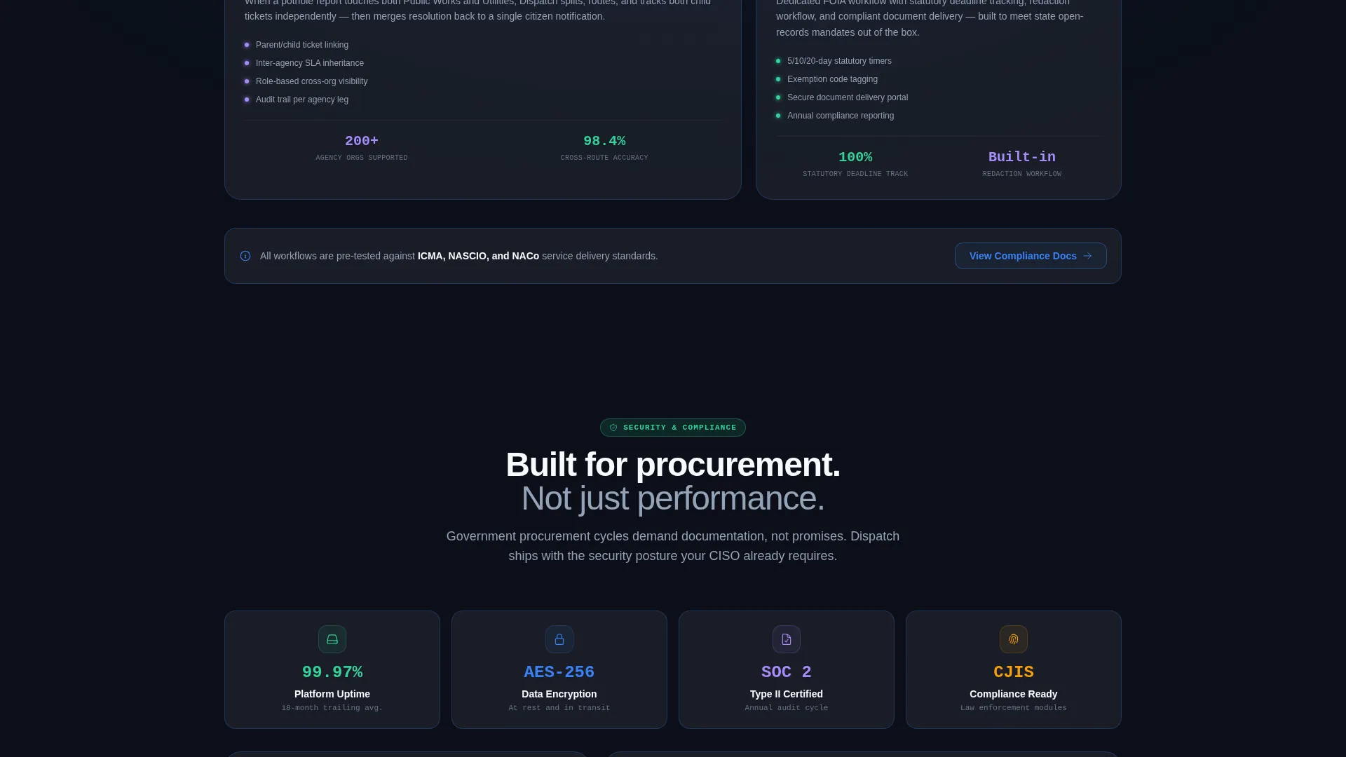
- Security-conscious leads need a documented compliance path; a gated brief download addresses that need directly
What you get with this template
You get a fully structured, single-page layout ready to represent a government help desk and ticketing platform. Every section is purpose-built to move a technically demanding government audience from awareness to action without friction.
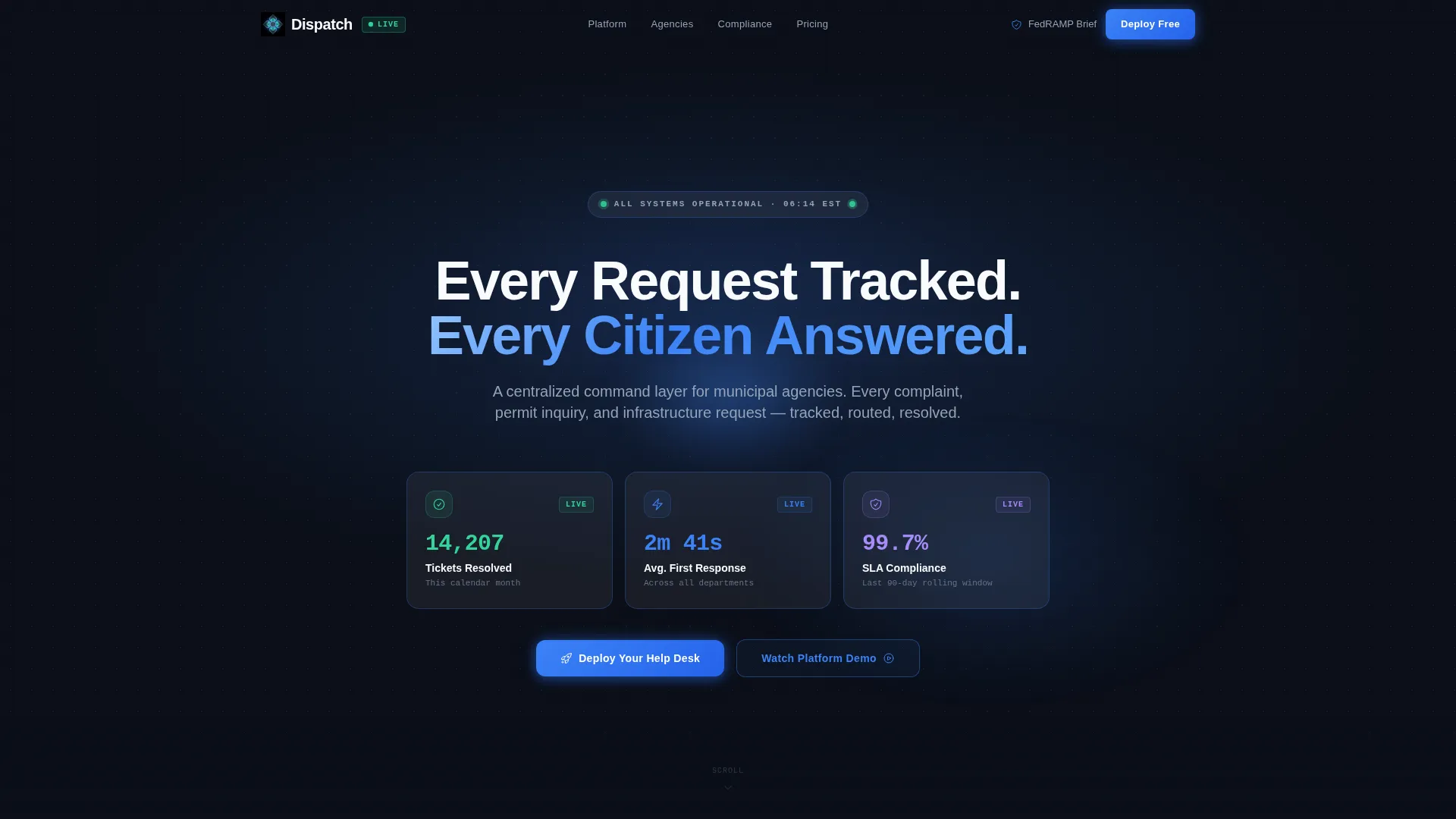
- A dark full-bleed header with glassmorphic stat cards and a live-metrics hero block
- A responsive modular card grid presenting ticketing capabilities through a data-lens narrative
- Dual deployment call-to-action buttons plus a gated compliance brief download path
Feature list
This template's feature set is drawn directly from the brief and built to serve the specific demands of government software marketing.
Stats-First Hero Header
The header opens with three floating glassmorphic stat cards displaying resolved ticket counts, average first-response time, and Service Level Agreement compliance rates. There is no stock photography. The numbers serve as the hero, establishing immediate operational credibility before any feature copy appears.
Modular Capability Card Grid
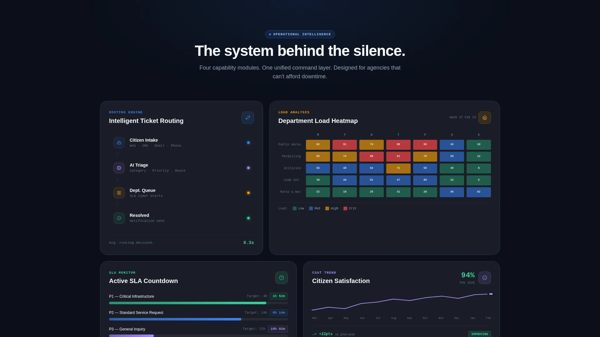
Below the header, frosted-glass cards arrange in a responsive grid. Each card presents a specific capability through a data lens: ticket-routing flowcharts, department-load heatmaps, Service Level Agreement countdown timers, and citizen-satisfaction trend indicators. The grid is designed so rows escalate in workflow depth without increasing cognitive load.
Scroll-Entry Micro-Animations
Cards stagger into view on scroll with micro-animations that mimic live dashboard widgets loading in real time. The effect reinforces the operational metaphor and keeps the page feeling active and monitored as the visitor moves through the content.
Dual Deployment Call to Action
The primary call-to-action block presents two parallel download paths: a cloud-hosted browser launch option and a self-hosted on-premises installer download. This pairing directly addresses the procurement reality that many government IT teams cannot approve a software-as-a-service-only deployment.
Gated Compliance Brief Download
A tertiary conversion path offers a Federal Risk and Authorization Management Program compliance brief as a gated PDF download. This captures security-focused leads who need documented assurance before advancing a procurement conversation.
Escalating Narrative Grid Structure
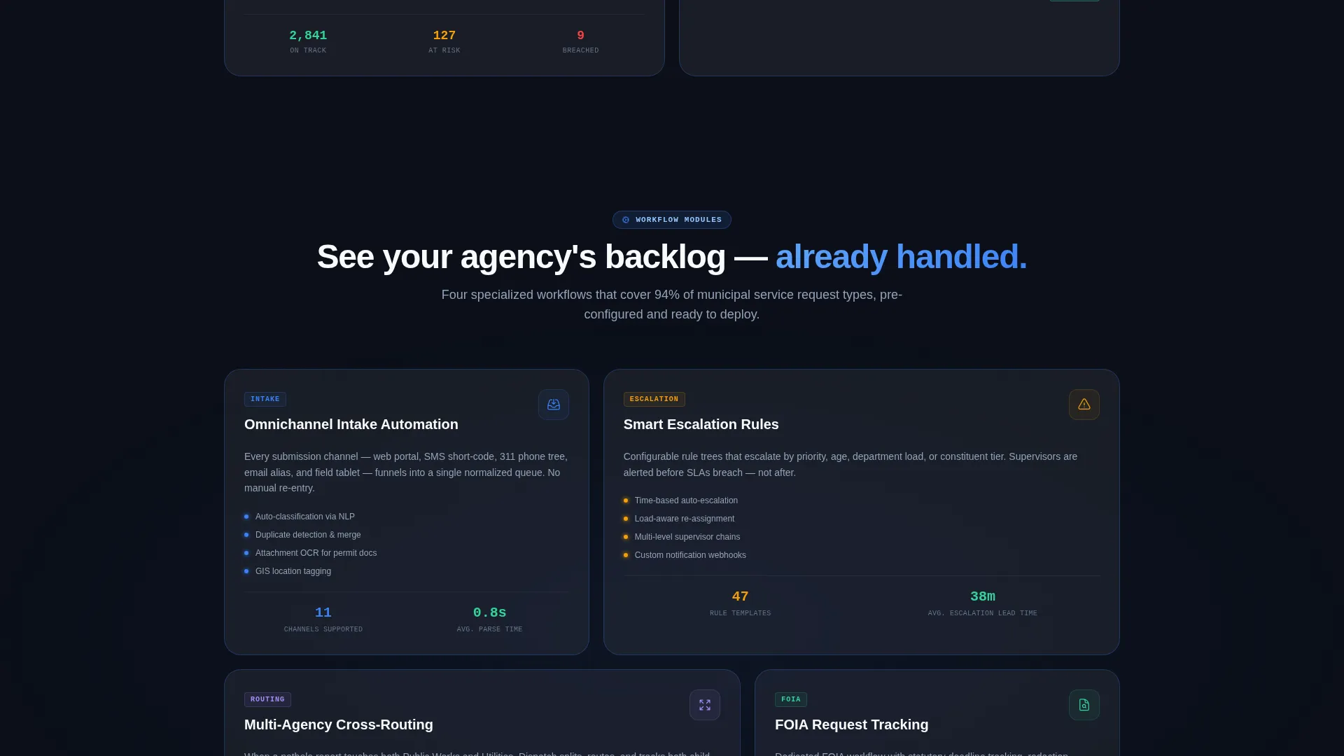
The page is structured so the first rows surface aggregate metrics, middle rows reveal specific workflows such as intake automation, escalation rules, multi-agency routing, and Freedom of Information Act request tracking, and the final rows bring the visitor to the call-to-action feeling they have already seen their own agency's situation reflected in the demo data.
Page sections overview
| Section | Purpose |
|---|---|
| Dark Glow Header | Opens with radial civic-blue glow and three stat cards as the hero |
| Floating Stat Cards | Displays resolved tickets, response time, and compliance rate |
| Metrics Impact Row | Anchors visitor trust with operational proof before feature copy |
| Ticket Routing Card | Shows routing flowchart capability in a frosted-glass card |
| Department Load Card | Presents heatmap of agency department request volume |
| SLA Countdown Card | Illustrates Service Level Agreement timer and deadline tracking |
| Satisfaction Trend Card | Displays citizen-satisfaction trend data in a dashboard card |
| Workflow Depth Grid | Deepens from metrics into intake, escalation, and routing workflows |
| FOIA Tracking Card | Highlights Freedom of Information Act request tracking capability |
| Deployment call to action Block | Presents cloud and on-premises download options side by side |
| Compliance Brief Download | Gated PDF path for security and procurement decision-makers |
Design & branding system
The visual identity follows a Dashboard Pro theme built on a glassmorphic color system. Every design decision reinforces the sense of a system that is already running, already handling volume, and already trustworthy before the visitor reads a single line of copy.
- Deep command-center black (#0B0F19) for backgrounds with subtle radial gradients; frosted panel white at 12% opacity (#FFFFFF1F) for floating card surfaces with 1-pixel blue border highlights
- Electric civic blue (#3B82F6) for active-state indicators, primary accents, and interactive element glow states; soft signal green (#34D399) for resolved-status badges and success confirmations
- Crisp white (#F8FAFC) for headline text; muted slate (#94A3B8) for secondary copy; all interactive elements including buttons, toggles, and hover states carry the civic blue glow treatment
Mobile & speed optimization
The modular card grid is built to reflow naturally across screen sizes. Government decision-makers review solutions on laptops in meetings and on phones between briefings, so the layout needs to hold its authority at every viewport.
- The responsive grid collapses from multi-column desktop rows to single-column stacked cards on smaller screens without breaking the visual hierarchy
- Scroll-entry stagger animations are designed as lightweight transitions that preserve the dashboard-loading metaphor without adding heavy asset overhead
How this template helps you convert
The page is engineered around a single insight: government buyers trust numbers before they trust features. The layout sequences content so each scroll interaction builds the confidence needed to reach for the call-to-action.
- The stats-first header eliminates skepticism immediately by opening with resolved-ticket volume, response time, and compliance data rather than feature headlines or marketing language
- The escalating card grid walks visitors through the system layer by layer, so by the time they reach the deployment call-to-action block, they have already recognized their own agency's workflow challenges reflected in the demo metrics
Other information about this template
This template is designed to operate as a standalone government software landing page within the Dispatch platform ecosystem. It is a strong fit for teams presenting ticketing solutions in competitive procurement environments.
- The template style is Card Grid (Modular), making individual capability sections easy to reorder or expand without redesigning the full layout
- The creative direction is Stats-First Impact, a deliberate choice for government software audiences who respond to evidence over narrative
- The header concept is Dark Full-Bleed with Glow, producing the quiet authority of a command center rather than the brightness of a consumer product page
- The primary landing-page direction drives toward App Download with dual deployment paths and a gated compliance lead capture, covering the full range of government IT buyer types in a single page
Theme
Dashboard Pro
Creative direction
Stats-First Impact
Color system
Glassmorphic
Style
Card Grid (Modular)
Direction
App Download
Page Sections
Stats-first Hero Header
Modular Capability Card Grid
Scroll-entry Micro-animations
Dual Deployment Call to Action
Gated Compliance Brief Download
Escalating Narrative Grid Structure
Related questions
Who is this landing page template designed for?
Can I adjust the card grid layout to add or remove capability sections?
What deployment options does the call-to-action section present?
Does this template include placeholder metric data for the stat cards?
Is this template suitable for state or federal agencies, or only municipal use?



