Government Digital Presence Comparison Website Template
Govmenu is a hub-and-spoke government digital menu landing page built on a Data Command visual theme. It replaces cluttered legacy portal navigation with a single, intelligent menu layer citizens can actually use. Designed for state and municipal digital teams, it pairs a striking Problem-to-Solution narrative with a persistent comparison table and a free portal audit call to action.
by Rocket studio
Quick summary
Govmenu is a single-page government digital menu template built for public-sector web teams ready to modernize. It opens with a live-typed code snippet that morphs into a real navigation component, then walks visitors through a clear Problem-to-Solution arc. A persistent comparison table and a focused audit call to action make the case for switching from legacy portals to a clean, accessible menu layer.
Who this template is for
This template is built for the people closest to the problem. If you work inside a government agency and carry the weight of a portal that has not aged well, this is for you.
- Chief Information Officers and Chief Technology Officers at state or county agencies managing overdue modernization mandates
- Municipal web managers who inherited aging content management systems and need a defensible upgrade path
- Procurement and IT directors fielding accessibility compliance complaints and looking for a clear replacement story
What problem this template solves
Legacy government portals bury essential services under layers of outdated navigation, broken document links, and mobile experiences that fail citizens on their phones. A web team trying to make the case for change needs more than a slide deck. They need a page that shows the problem and the solution side by side, in the same scroll.
- Citizens cannot find services quickly because portal structures were built for internal org charts, not public needs
- Accessibility audit scores stay in the red because no one has a clear path to fix the underlying navigation architecture
- Decision-makers do not approve modernization budgets without a concrete, visual comparison of before and after
What you get with this template
You get a fully structured, single-page layout that moves a skeptical government buyer from problem recognition to action. Every section is purposeful and every design choice supports the narrative.
- A hub-and-spoke anchor navigation system with five spoke sections guiding the reader from pain to resolution
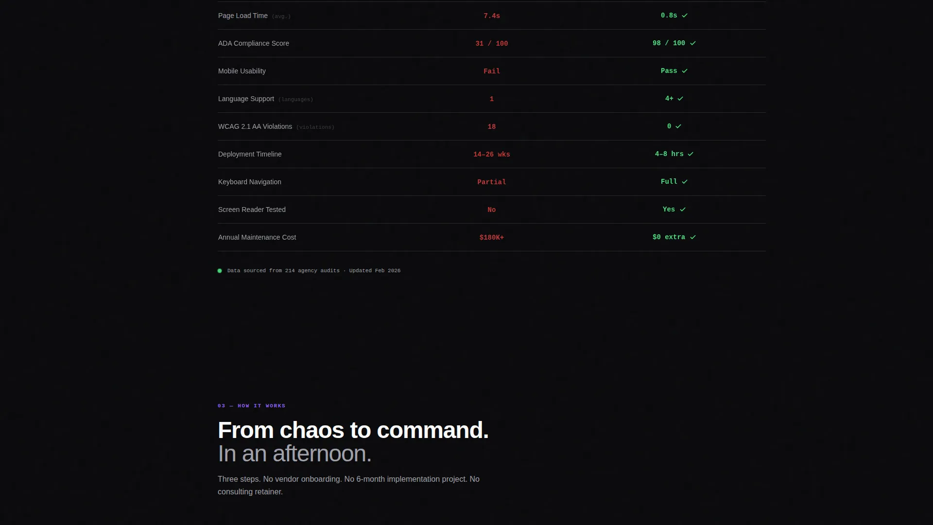
- A persistent sticky comparison table showing load time, accessibility score, mobile usability, language support, and deployment timeline
- A dual conversion path combining a free portal audit form and a gated compliance report download
Feature list
This template is built around a specific conversion job: turning a burned-out government web team into a committed demo request. Every feature below serves that purpose directly.
Live Code Snippet Header
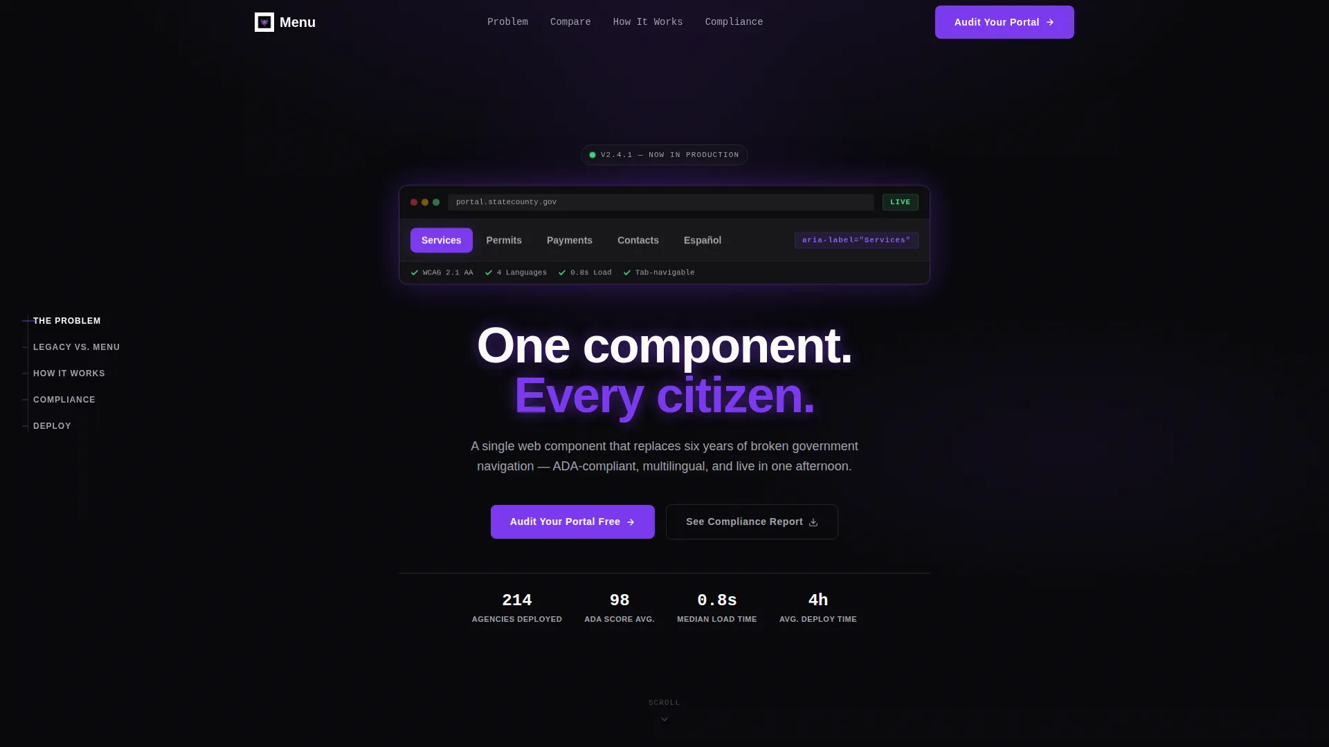
The header opens with a terminal-style, auto-typing code block showing a <gov-menu> web component with real attributes: aria-label="Services", departments="12", languages="4", and load-time="0.8s". Once the final closing tag types out, the snippet collapses and morphs into an actual rendered navigation bar visitors can interact with. It is the most efficient possible proof of concept.
Hub-and-Spoke Anchor Navigation
A persistent left-rail navigation anchors five spoke sections: "The Problem," "Legacy versus. Menu," "How It Works," "Compliance," and "Deploy." Readers can jump to any section without losing context, and the anchor rail keeps the page structure legible even during a long scroll session.
Problem-to-Solution Contrast Sections
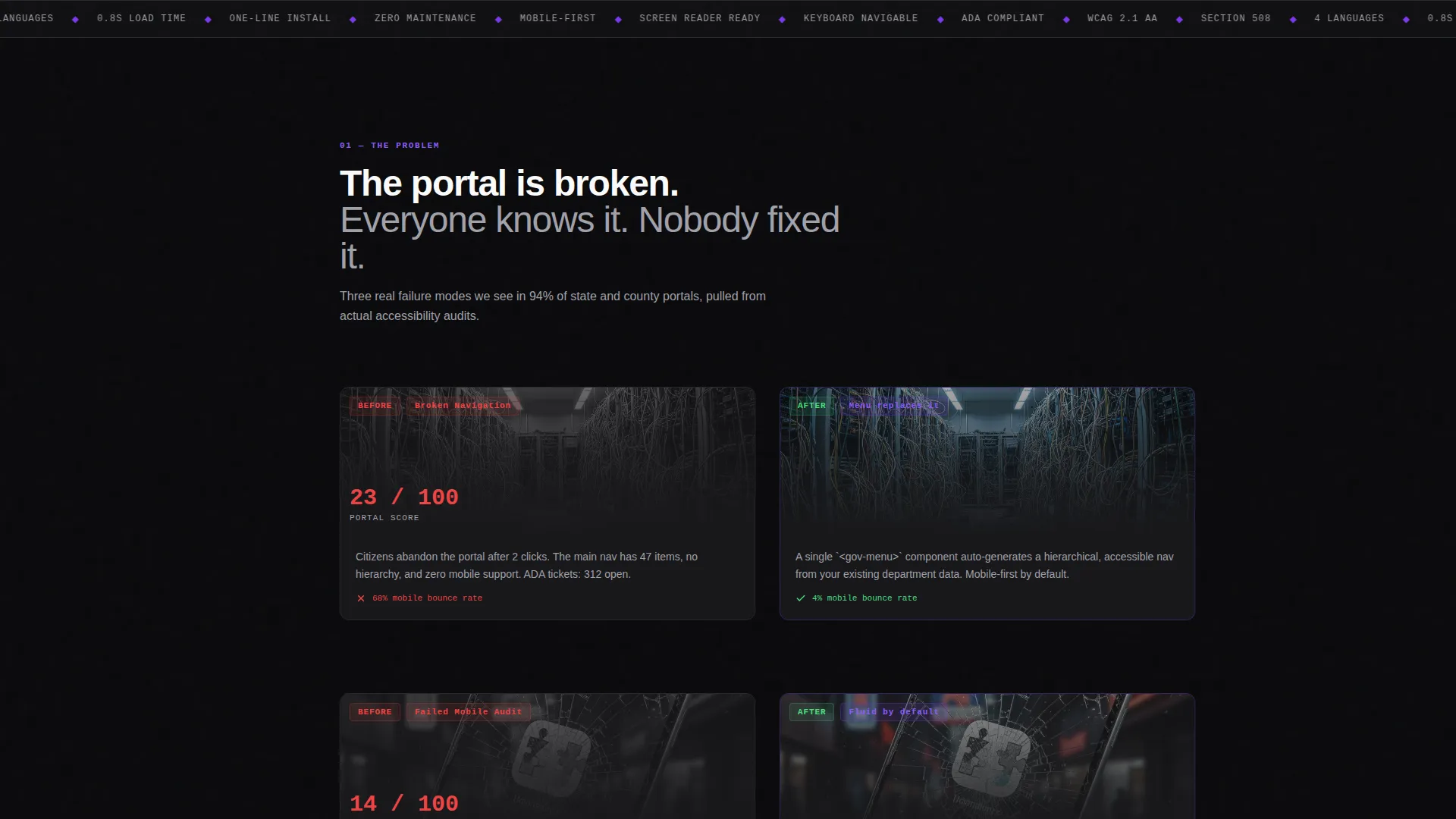
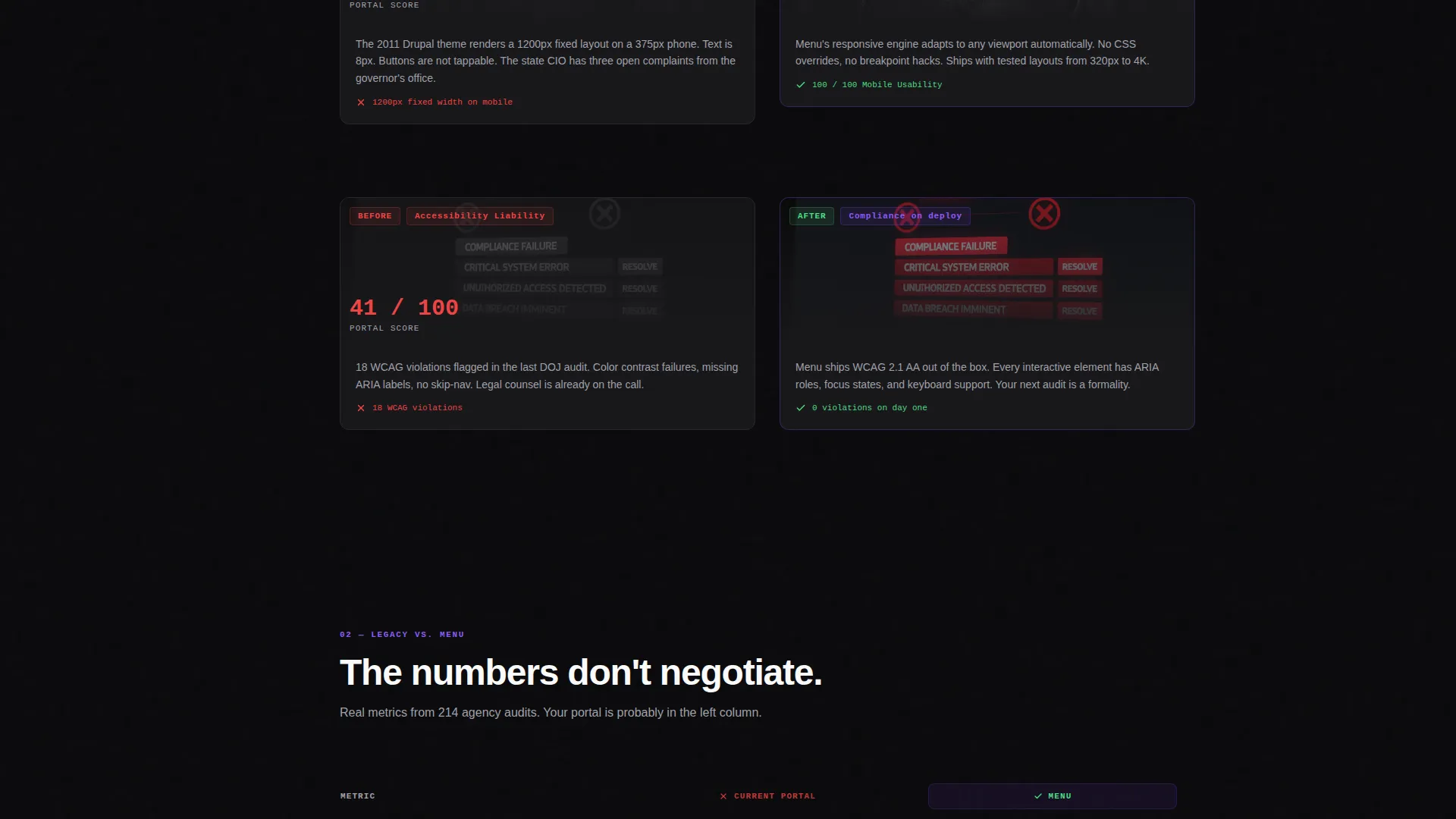
Each spoke section opens with a redacted screenshot of a real broken government portal placed beside the clean Menu replacement. The contrast is immediate and intentional. Violet accent pulses on every metric that improves, so the improvement registers visually before the reader finishes the sentence.
Persistent Sticky Comparison Table
The "Legacy versus. Menu" spoke anchors a sticky table that compares five dimensions: load time, accessibility compliance score, mobile usability, language support, and deployment weeks. The Menu column fills with violet checkmarks as the reader scrolls. The table stays visible long enough to become the reader's mental reference point for every section that follows.
Dual Conversion Path
The primary call to action asks for an agency URL plus a department-size selector and a role dropdown, lowering the commitment threshold for procurement-aware visitors. A secondary path offers a gated compliance report download for visitors not ready to submit their URL. Two entry points means fewer people leave without taking any action.
Data Command Visual Theme
The entire page runs on a Void and Violet color system: absolute void black as the background, deep terminal violet for interactive states, muted satellite gray for secondary text, and phosphor white for headlines. The result reads like a secure operations room display, not a marketing brochure.
Page sections overview
| Section | Purpose |
|---|---|
| Code Snippet Header | Demonstrates the menu component live before a word is read |
| Hero Headline | Anchors the value proposition in one line |
| The Problem spoke | Establishes pain with real broken-portal visuals |
| Legacy versus. Menu spoke | Runs the sticky comparison table across five dimensions |
| How It Works spoke | Explains the menu layer logic step by step |
| Compliance spoke | Addresses accessibility audit scores and language support |
| Deploy spoke | Reduces perceived effort with a deployment timeline visual |
| Portal Audit form | Captures agency URL, department size, and role |
| Compliance Report gate | Offers a PDF download for visitors not ready to submit |
Design & branding system
The visual language is built around a Data Command theme. Every color and typographic choice is functional, not decorative. The palette communicates authority and precision without feeling cold or bureaucratic.
- Void black (#09090B) as the full-page background, deep terminal violet (#7C3AED) for interactive anchors and active states, muted satellite gray (#A1A1AA) for secondary text and dividers, and phosphor white (#FAFAFA) for primary headlines
- Violet accent pulses on improving metrics inside the comparison sections, creating a visual rhythm that rewards scrolling
- Typography stays clean and high-contrast throughout, keeping every headline readable against the dark canvas at any viewport size
Mobile & speed optimization
A government digital menu template must perform on the devices citizens and decision-makers actually use. This template is structured with that constraint in mind from the first section to the last.
- The hub-and-spoke anchor navigation collapses cleanly on smaller screens so the spoke sections remain navigable without a full sidebar
- The comparison table is designed to scroll horizontally on mobile rather than break its column structure, preserving readability across device widths
- The code snippet header and morphing component are lightweight by design, prioritizing fast initial render over decorative animation weight
How this template helps you convert
The persuasion architecture is built into the page structure itself. Visitors do not need to be sold; they need to be shown. The template does that showing in a deliberate sequence.
- The Problem-to-Solution arc builds emotional momentum across five spoke sections, so by the time the reader reaches the call to action they have already accepted the premise
- The persistent comparison table keeps the quantified improvement visible throughout the scroll, giving procurement-minded visitors the data reference they need before they fill in a form
- The dual conversion path removes the all-or-nothing pressure by offering a gated compliance report as a lower-commitment alternative to submitting an agency URL
Other information about this template
This template belongs to a specific intersection of government digital transformation and single-page conversion design. A few additional details round out the full picture.
- The template category is Technology with a subcategory of Government Digital Presence, targeting the Government Digital Menu niche specifically
- The hub-and-spoke layout style is well suited to long-form government procurement conversations where decision-makers return to specific sections across multiple sessions
- The role dropdown in the audit form captures CTO or CIO, Web Manager, and Procurement as distinct segments, allowing teams to tailor follow-up based on who actually submitted the request
Theme
Data Command
Creative direction
Problem→Solution Arc
Color system
Void & Violet
Style
Hub & Spoke (Anchor Nav)
Direction
Comparison/Versus
Page Sections
Live Code Snippet Header
Hub-and-spoke Anchor Navigation
Problem-to-solution Contrast Sections
Persistent Sticky Comparison Table
Dual Conversion Path Design
Data Command Visual Identity
Related questions
Who is the primary audience for this template?
Does the template include the actual gov-menu web component?
Can I change the comparison table metrics to match my agency's situation?
What are the two conversion paths built into this template?
Is this template suitable for a vendor selling to government clients?



