Local Government Software Comparison Website Template
Govpost is a single-page comparison landing page built for government social media management platforms. It positions your tool against generic alternatives using a structured comparison table, kinetic scroll animations, real case study callouts, and a government-validated lead capture form. The design follows a command-center visual style built for public-sector credibility and conversion.
by Rocket studio
Quick summary
Govpost is a high-impact comparison landing page template designed for government social media management platforms. It pairs a live dashboard header with a side-by-side feature comparison table, three rapid-fire case studies, and a two-field lead form that auto-validates government email domains. Every section is built to earn trust from public-sector buyers before asking for the click.
Who this template is for
This template is purpose-built for teams selling software to government communications professionals. It speaks directly to the people responsible for keeping public agencies accountable online.
- Municipal communications directors managing multiple platforms with lean staff
- State agency public information officers who need documented approval trails
- Elected officials' offices seeking structured content review before anything goes live
What problem this template solves
Government buyers are not convinced by generic feature pages. They need proof that a tool was designed for public-sector accountability, audit requirements, and multi-level approval chains. Standard marketing templates have no framework for that argument.
- Generic landing pages cannot demonstrate FOIA-compliant archival or role-based approval workflows side by side
- Email-and-spreadsheet workflows look credible until a comparison table exposes every gap
- Research-phase buyers leave without converting when there is no lower-commitment path like a downloadable checklist
What you get with this template
You get a fully structured, single-page layout that walks a government buyer from first impression to form submission. Every section is pre-built and positioned to reduce friction and build confidence.
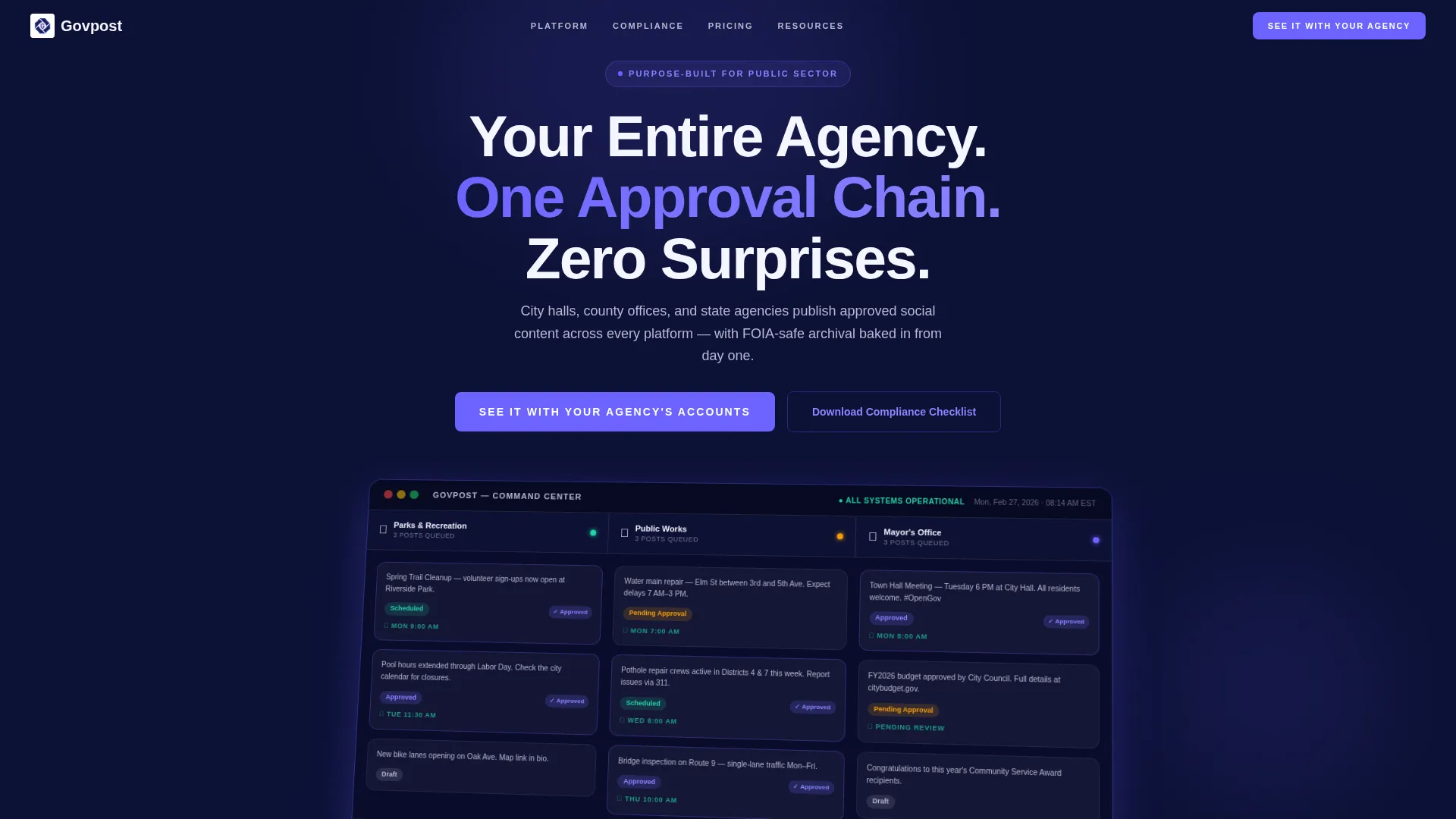
- A floating, angled dashboard header showing three live agency account queues in draft, pending-approval, and scheduled states
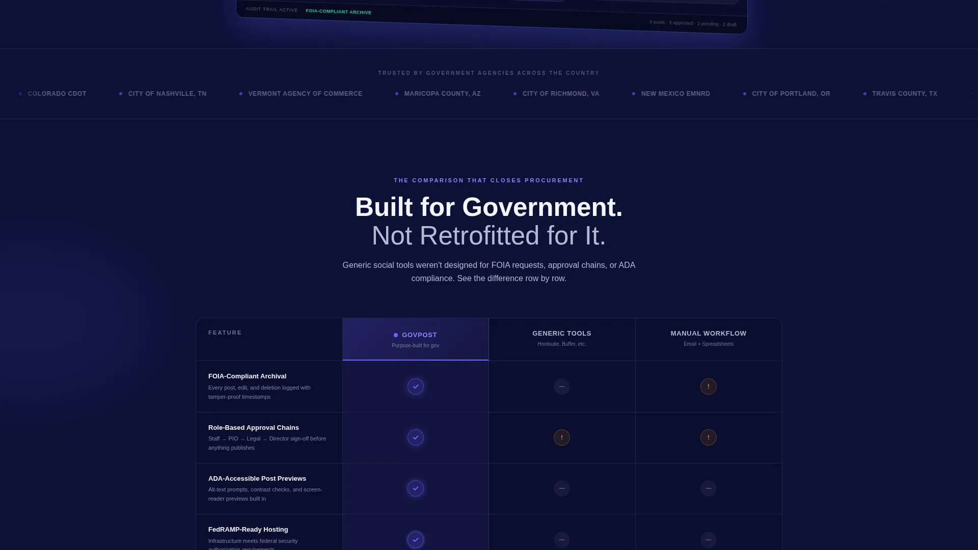
- A structured comparison table pitting your platform against generic social tools and manual workflows across six government-specific criteria
- Three animated case study blocks, a sticky call-to-action in the top navigation, and a two-field gated lead form with domain validation
Feature list
This template includes a focused set of purpose-built components. Each one is designed to move a public-sector buyer from skepticism to confidence.
Animated Dashboard Header
A pixel-perfect scheduling grid mockup floats at a slight angle on a deep navy background. It shows three agency accounts with posts in draft, pending-approval, and scheduled columns. Approval badges glow indigo, and a compliance timestamp watermarks every card.
Comparison Table with Scroll Animations
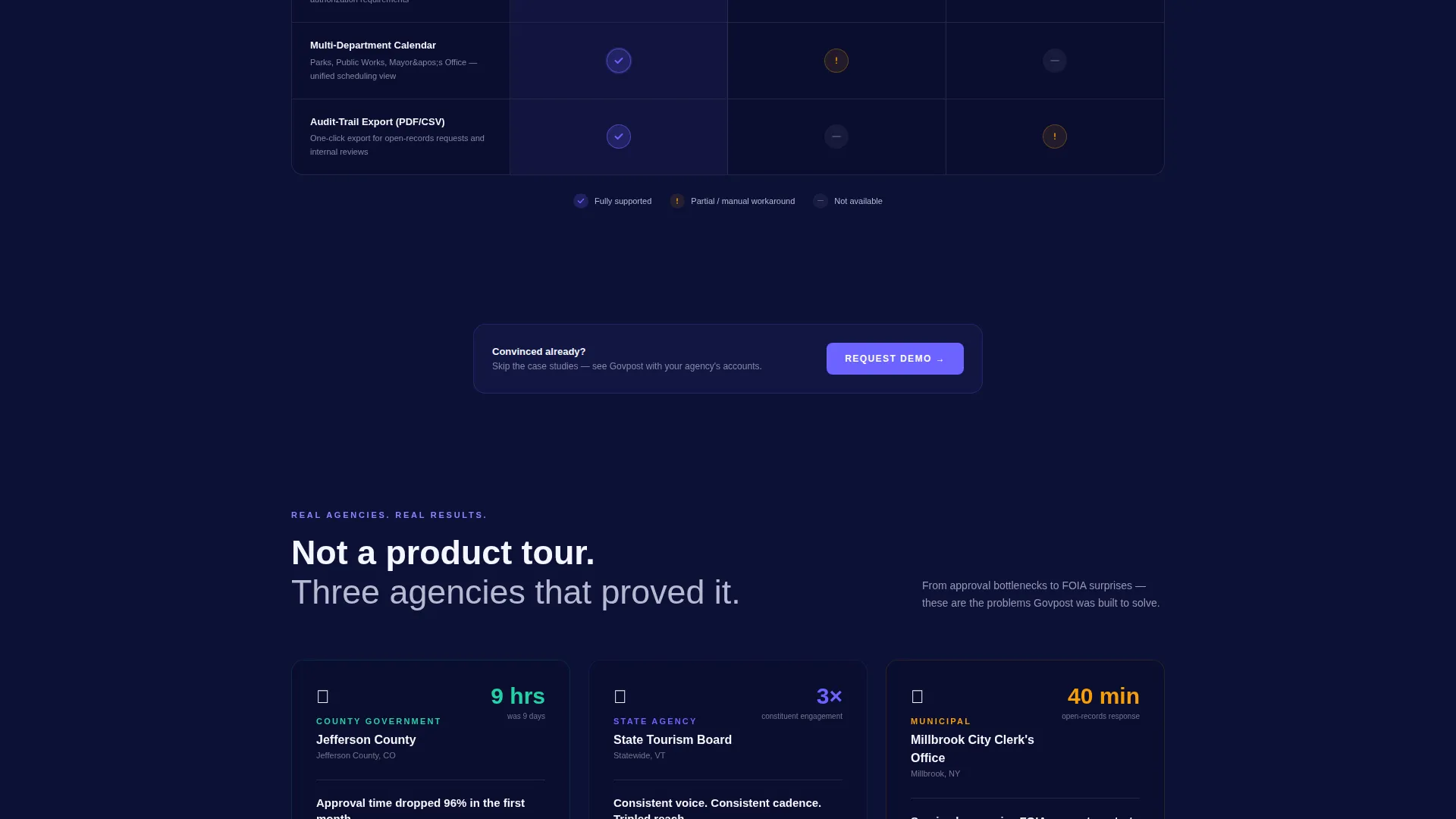
The core of the page is a structured comparison table. It evaluates your platform against two alternatives across six government-relevant rows. Each Govpost cell pulses with an indigo checkmark animation as it scrolls into view, while competitor columns show static gray indicators.
Case Study Trio with Kinetic Entry
Three mini case studies slide into view with motion energy that keeps the page feeling active. Each block highlights a measurable government outcome: faster approval cycles, higher constituent engagement, and a successful open-records response.
Sticky and Repeated Call-to-Action
The primary call-to-action, "See It With Your Agency's Accounts," appears in the sticky top navigation and again after the comparison table and case studies. Repetition at key decision points reduces the chance a buyer scrolls past without acting.
Government-Validated Lead Form
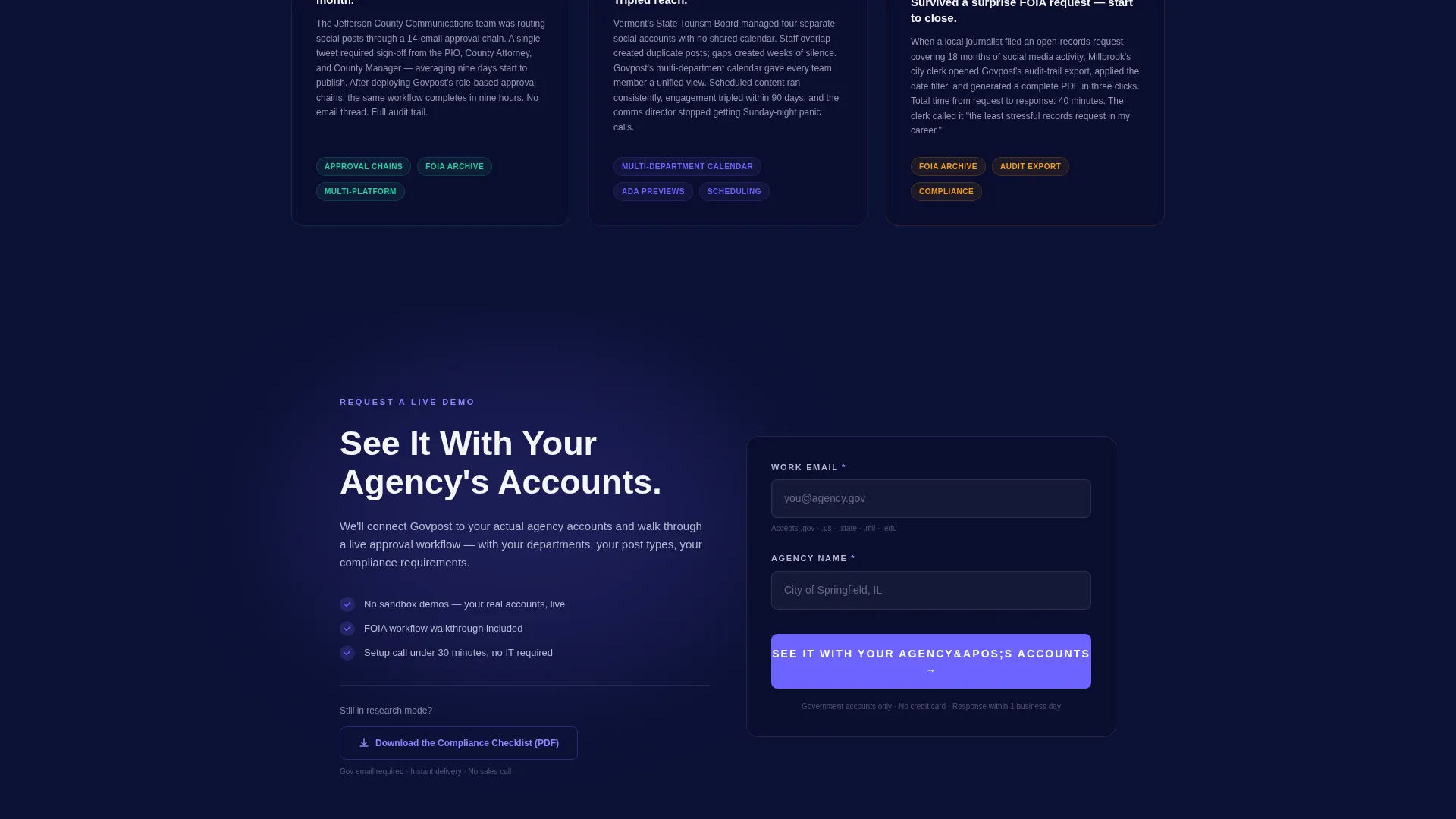
The two-field form captures work email and agency name. The email field auto-validates against.gov,.us, and.state domains, filtering for genuine public-sector leads from the first interaction.
Secondary Gated Content Path
A "Download the Compliance Checklist" option gives research-phase visitors a lower-commitment conversion route. This keeps early-stage buyers in your funnel while the primary call to action captures decision-ready contacts.
Page sections overview
| Section | Purpose |
|---|---|
| Sticky Top Nav | Anchors primary call to action across full scroll |
| Dashboard Header | Establishes platform credibility visually |
| Comparison Table | Proves superiority across six criteria |
| Case Study Trio | Delivers outcome proof with real scenarios |
| Primary Lead Form | Captures government-validated contact details |
| Compliance Checklist call to action | Converts research-phase visitors to leads |
Design & branding system
The visual identity follows a Dashboard Pro theme centered on an Electric Indigo color system. Every color choice reinforces the feeling of a professional government operations environment.
- Deep command-center navy (#0D1137) for page backgrounds, charged indigo (#6C63FF) for interactive highlights and approval badge glow states, and cool operations gray (#B8B8D1) for secondary text and table borders
- Urgent civic white (#F5F5FF) surfaces card backgrounds and form fields, ensuring content is always easy to read against the dark base
- The overall palette evokes the focused glow of a live operations center: authoritative, always-on, and built to be readable at a glance
Mobile & speed optimization
The template is designed to translate the command-center aesthetic cleanly across screen sizes. Government buyers often review vendor materials on tablets and mobile devices during procurement cycles.
- The angled floating dashboard header and comparison table are structured to reflow without losing visual hierarchy on smaller screens
- Scroll-triggered animations are scoped to the comparison table and case study blocks, keeping motion purposeful and layout stable on mobile viewports
How this template helps you convert
The page is structured as a persuasion sequence, not a brochure. Every section builds on the last to move a skeptical government buyer toward action.
- The dashboard header creates immediate visual proof that the platform was designed for multi-department, multi-account government workflows, setting a credible first impression before a single word is read.
- The comparison table delivers the core argument row by row, making it impossible to ignore the gap between a purpose-built government tool and generic or manual alternatives.
- The repeated call-to-action placements and dual conversion paths ensure that both decision-ready buyers and research-phase visitors have a clear, low-friction next step matched to where they are in the process.
Other information about this template
This template is categorized under Technology, specifically within the Government Software subcategory and Government Social Media Management niche. It is a single conversion-focused landing page, not a multi-page site.
- The template style is a Comparison Table layout with Launch Energy creative direction, meaning scroll momentum and animation timing are central to how the persuasion sequence feels
- The header concept is a Dashboard Preview, a proven format for SaaS tools targeting buyers who want to visualize the product before a demo
- The template is built on the Dashboard Pro theme and uses the Electric Indigo color system throughout, giving teams a cohesive starting point that requires minimal visual customization for government-facing deployments
Theme
Dashboard Pro
Creative direction
Launch Energy
Color system
Electric Indigo
Style
Comparison Table
Direction
Comparison/Versus
Page Sections
Floating Dashboard Header Preview
Six-row Government Comparison Table
Kinetic Case Study Blocks
Dual Conversion Path Design
Sticky Navigation Call-to-action
Related questions
Can I customize the comparison table rows for my platform's specific features?
How does the email domain validation work in the lead form?
Does the template include the actual case study content?
Can this template be used by agencies selling to government buyers, not just software platforms?
Can the compliance checklist lead path be removed if I only want one call-to-action?



