Govwrite - Powerful Government Landing Page Template
Govwrite is a government AI content writer landing page template built around a high-impact comparison table. It showcases animated stats, a structured versus layout, and a sticky call-to-action bar, all designed to help government communications teams see exactly why the platform beats manual drafting, generic AI tools, and contracted writing firms.
by Rocket studio
Quick summary
Govwrite is a single-page comparison landing page built for an AI content platform serving government communicators. It leads with animated metric counters, flows into a twelve-row comparison table, and closes with rotating agency case studies. Every design choice supports one goal: showing overworked public-sector teams why this tool drafts compliant copy faster than any alternative.
Who this template is for
This template speaks directly to the people who carry the heaviest writing loads inside government. If your inbox is a graveyard of half-finished policy briefs and overdue FOIA (Freedom of Information Act) responses, this layout was designed around your reality.
- Municipal communications directors who manage high document volume with small teams
- Federal program managers stuck in reporting cycles that never seem to end
- State-level public affairs professionals who need plain-language copy that survives legal review
What problem this template solves
Government writing has a speed and compliance problem. Drafting a single RFP (Request for Proposal) narrative or constituent newsletter can consume days of skilled staff time. Generic AI tools do not understand regulatory tone. Contracted writing firms are slow and expensive. This template frames all three problems visually and lets the comparison table do the persuading.
- Teams waste hours on documents that could be drafted in minutes with the right tool
- Standard AI platforms produce copy that fails plain-language and compliance checks
- Decision-makers need internal buy-in materials before they can act on new tools
What you get with this template
You get a fully structured, single-page comparison landing page ready for a government AI content platform. The layout moves quickly and keeps visitors engaged from the first animated counter to the final case study card.
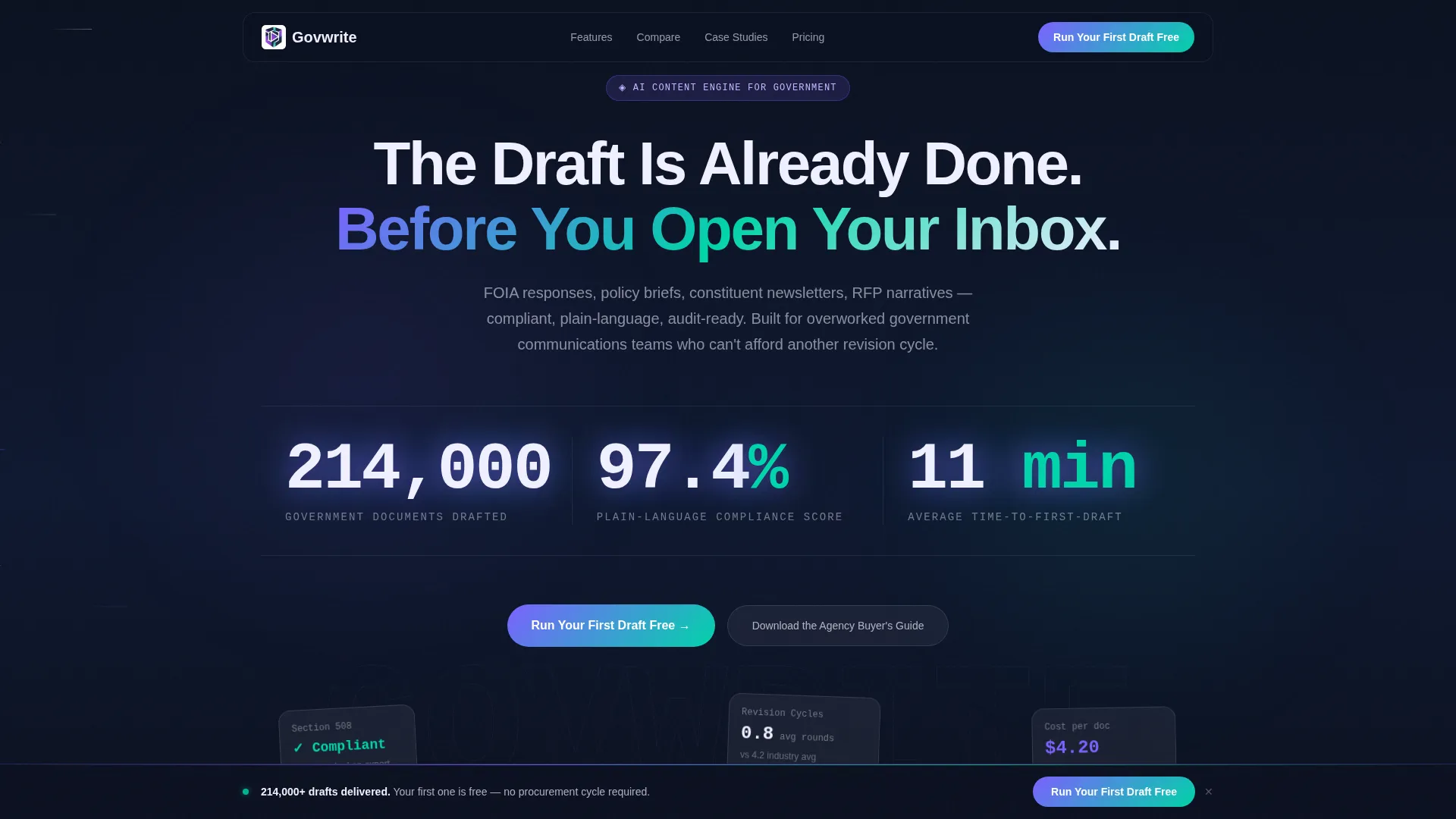
- An animated stats wall with three live-counting metrics and a particle-line background
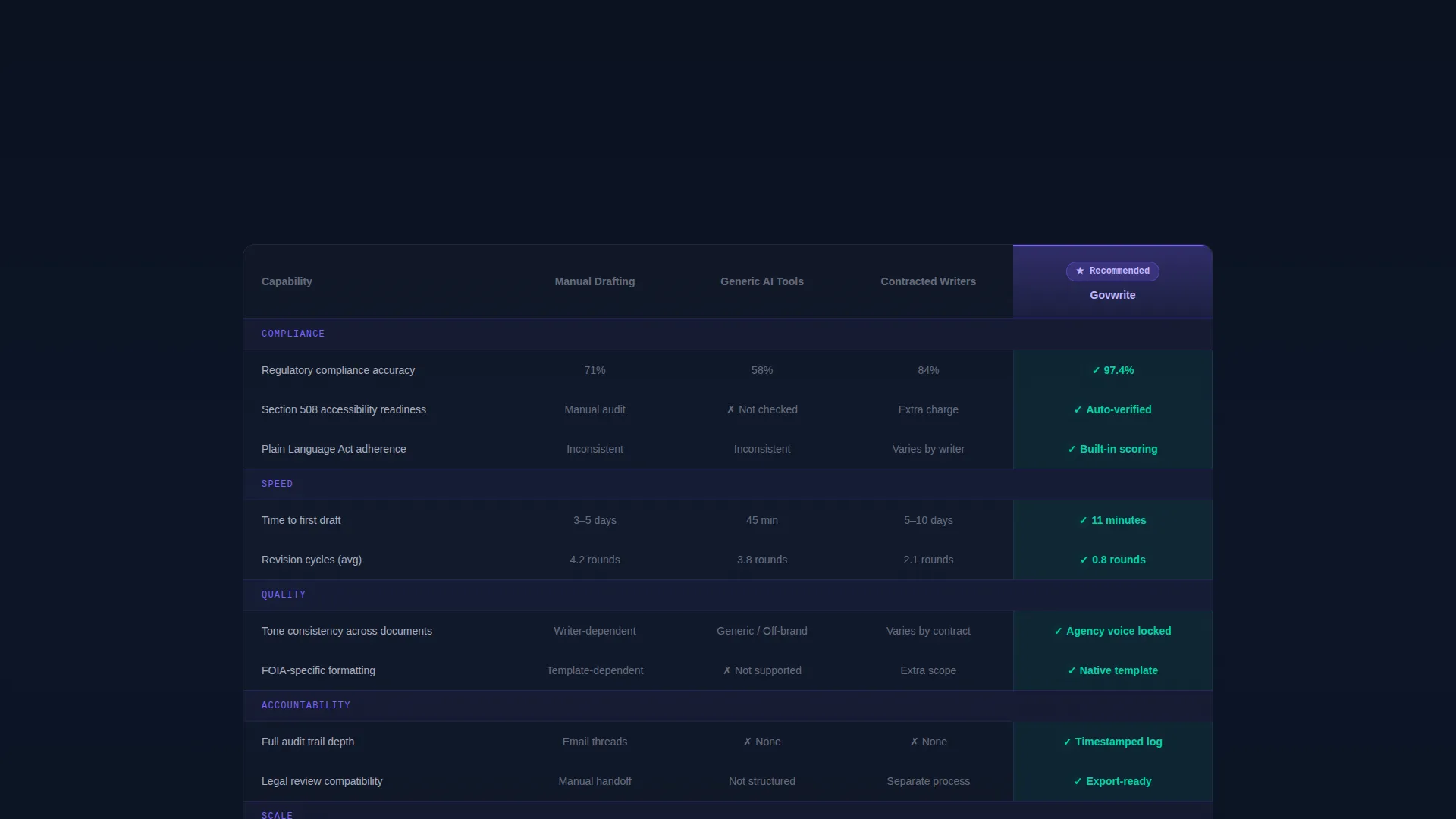
- A twelve-row comparison table that benchmarks the platform against manual drafting, generic AI tools, and contracted writing firms
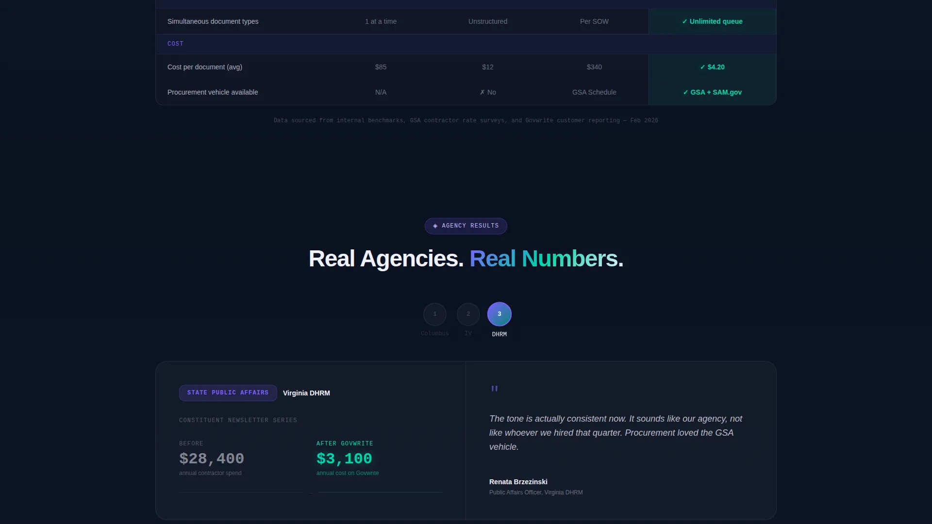
- Three rotating agency case study blocks, each pairing a before metric with an after metric
- A sticky call-to-action bar that appears after the visitor scrolls past the third table row
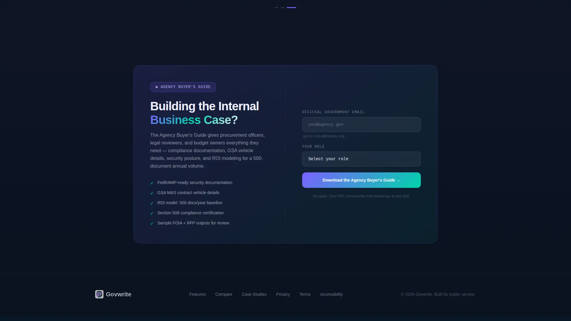
- A gated secondary download path requiring a.gov or.mil email and a role selector
Feature list
This template is built from specific components described in the source brief. Each feature below reflects what the layout actually delivers.
Animated Metrics Header
Three large counters animate upward in real time using a monospaced typeface that reads like a terminal display. The stats shown are 214,000 government documents drafted, a 97.4 percent plain-language compliance score, and an eleven-minute average time-to-first-draft. A subtle particle-line animation drifts laterally behind the numbers without competing for attention.
Twelve-Row Comparison Table
The core of the page is a structured table that places the platform side by side against manual drafting, generic AI tools, and contracted writing firms. Rows cover compliance accuracy, revision cycles, Section 508 readiness, tone consistency, audit trail depth, and cost per document, among others. Each row animates in with a horizontal wipe, and every cell where the platform wins pulses briefly in teal.
Rotating Agency Case Studies
Below the comparison table, three agency case study blocks auto-rotate like mission patches. Each card shows a clear before metric and an after metric, keeping the page's forward momentum going without requiring the visitor to scroll through static testimonials.
Sticky Call-to-Action Bar
A persistent bar appears once the visitor scrolls past the third table row. The primary action reads "Run Your First Draft Free." This placement is intentional: the visitor has already seen enough evidence to act, and the bar is simply there to open the door.
Gated Buyer's Guide Download
A secondary conversion path lets stakeholders who need internal buy-in download an agency buyer's guide. Access requires a.gov or.mil email address and a role selector offering Comms Director, Program Manager, Procurement, and Other as options. This filters for serious institutional buyers.
Page sections overview
| Section | Purpose |
|---|---|
| Stats Metrics Header | Opens with three animated counters and a moving particle background to signal platform scale and credibility |
| Comparison Table | Benchmarks the platform across twelve rows against three alternatives with animated row reveals and teal win-state pulses |
| Agency Case Studies | Auto-rotating cards show before and after metrics from real agency use, sustaining scroll momentum |
| Sticky call to action Bar | Persistent bar with primary action appears after the third table row to convert visitors at peak engagement |
| Buyer's Guide Gate | Secondary download form gated by.gov or.mil email and role selector for stakeholders building internal approval |
Design & branding system
The visual identity follows a Dynamic Motion theme using an AI Iridescent color palette. The palette is designed to feel institutional enough to earn trust while signaling that something genuinely new is at work.
- Deep civic navy (#0B1120) anchors all text and table headers for authority and readability
- Shimmer violet (#7B61FF) highlights the platform's own comparison column to draw the eye
- Prismatic teal (#00D4AA) activates on hover states and winning checkmarks throughout the table
- Soft holographic white (#F0F0FF) keeps comparison rows breathable and easy to scan
- A monospaced typeface in the header evokes terminal readouts, reinforcing the platform's technical credibility
Mobile & speed optimization
The template is built with the Launch Energy creative direction in mind, meaning the visual momentum established in the header carries through every scroll interaction without slowing the experience down.
- Horizontal wipe animations on table rows are designed to feel fast and purposeful, not decorative
- The sticky call to action bar is a lightweight persistent element that does not interrupt the reading flow
- Particle-line and counter animations in the header are subtle enough to remain smooth on standard devices
How this template helps you convert
The page is architected as a Comparison/Versus landing page, meaning it converts by building conviction before it asks for action. Every structural choice leads toward the two conversion goals.
- The comparison table does the heavy persuasion work by exposing the gap between the platform and every alternative across twelve measurable rows, so the visitor arrives at the call to action already convinced.
- The gated buyer's guide captures high-intent institutional stakeholders who are not yet authorized to act alone, giving the sales process a warm, role-qualified lead with a verified government email.
Other information about this template
This template is purpose-built for the government AI content writer category and fits within the broader AI for Government technology niche. It is a strong fit for procurement-stage evaluations where a comparison table is the most trusted format for internal justification documents.
- The template style is Comparison Table, matching the format government buyers most often use in vendor evaluation workflows
- The header concept is Stats/Metrics, which establishes platform credibility before the visitor reaches any persuasive copy
- The Dynamic Motion theme and AI Iridescent color system are calibrated to look current and trustworthy inside a government communications context
- The template supports two distinct buyer journeys: a fast-action path for visitors ready to try the platform and a slower approval path for stakeholders who need a shareable document first
Theme
Dynamic Motion
Creative direction
Launch Energy
Color system
AI Iridescent
Style
Comparison Table
Direction
Comparison/Versus
Page Sections
Animated Stats Metrics Wall
Twelve-row Comparison Table
Rotating Agency Case Studies
Sticky Primary Call to Action Bar
Gated Buyer's Guide Download
Related questions
What type of page is this template?
Who is the intended end user for this template?
What are the two conversion paths included in this template?
What does the twelve-row comparison table cover?
Is this template suitable for a non-government product?



