Luxury Hospitality Landing Page Template
Concierge is a Tech Glass landing page template built for hospitality course and training platforms. It features a dark full-bleed header, a modular card grid organized by hotel department, and a click-through funnel that guides visitors from curiosity to curriculum preview before asking for a single detail. The result is a confident, friction-low entry point for serious learners.
by Rocket studio
Quick summary
Concierge is a single-page landing page template designed for hospitality training platforms. It pairs a cinematic void-black header with a glowing isometric hotel atrium, then drives scroll through a modular department card grid. Each card surfaces course count, skill tags, and a difficulty arc. The funnel opens curriculum previews before asking for an email, keeping friction low from the first click.
Who this template is for
This template suits any hospitality education brand that needs to communicate depth, credibility, and momentum at a glance. It speaks directly to the learner who is evaluating whether a platform is worth their time before committing.
- Career-changers pursuing their first hotel management certificate
- Line-level staff working toward a supervisor qualification
- Boutique property owners who need every team member cross-trained across departments
What problem this template solves
Hospitality training platforms often lose visitors before a single course is previewed. The page either asks for a registration too early, or it buries the curriculum under generic marketing copy. Concierge solves both problems.
- Visitors bounce before discovering course depth because there is no trust signal early enough
- Registration walls block exploration and shrink top-of-funnel conversion
- Generic layouts fail to communicate the breadth of a multi-department curriculum at a glance
What you get with this template
You get a fully structured, single-page layout ready to represent a hospitality training platform with real visual authority. Every component is intentional and tied to a specific conversion role.
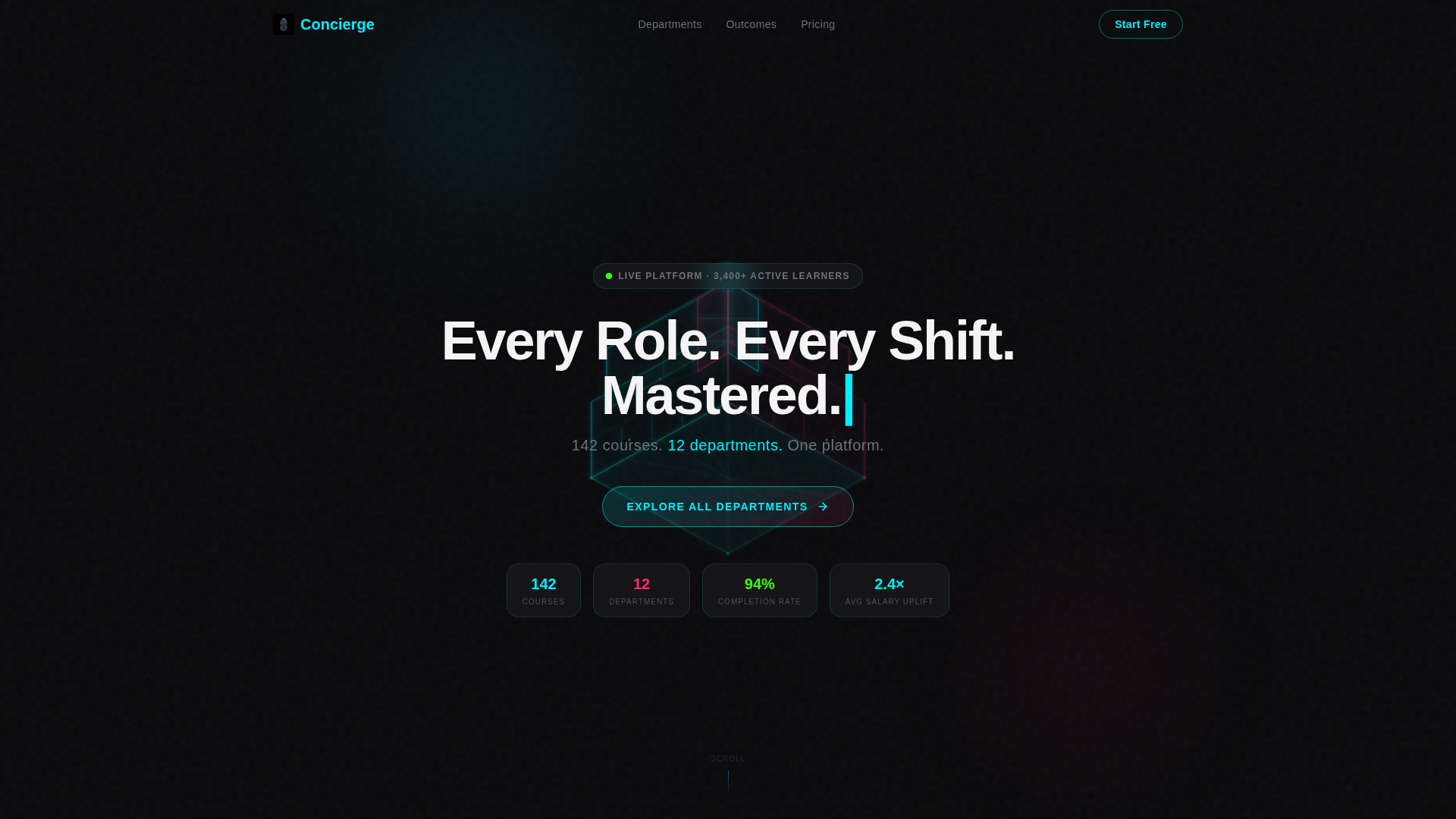
- A dark full-bleed header with a holographic isometric hotel atrium illustration and a bold geometric headline
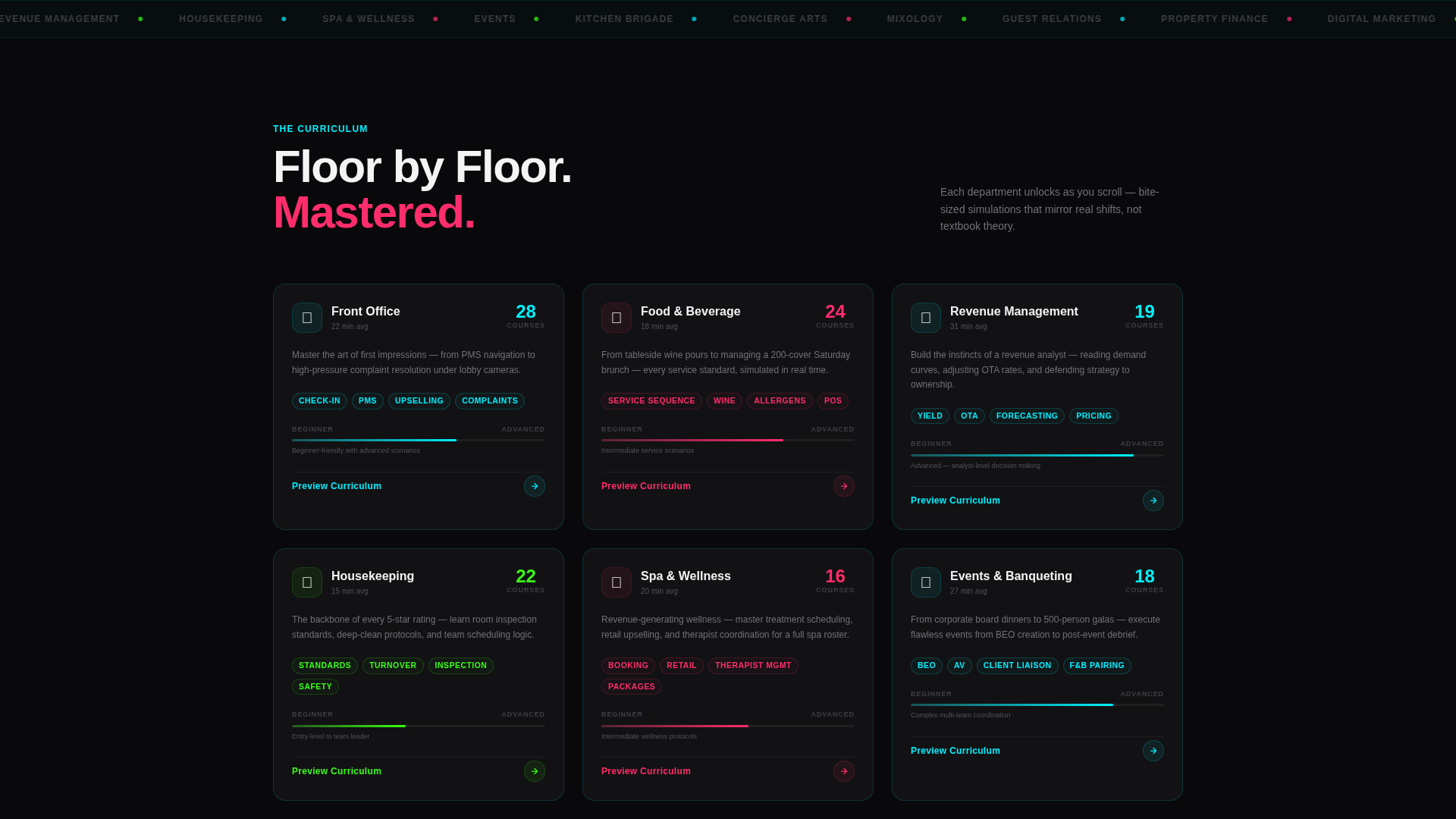
- A scrollable department card grid covering Front Office, Food and Beverage, Revenue, Housekeeping, Spa and Wellness, and Events
- A click-through curriculum preview panel with sample module titles, a looping simulation preview, and a low-friction sign-up step
Feature list
This template includes purpose-built components that reflect how a modern hospitality training platform actually earns trust and drives sign-ups.
Holographic Hero Header
The header fills the full viewport with a void-black field. A single holographic glow refracts cyan and magenta light across a translucent wireframe of a grand hotel atrium rendered in isometric glass. The headline materializes letter by letter inside the atrium, with a supporting subline glowing beneath it.
Modular Department Card Grid
Each row of cards maps to one hotel department. Inside every card, a micro-grid displays course count, average completion time, skill tags, and a difficulty arc visualized as a thin glowing line running from beginner to advanced. Scrolling through the grid feels like moving floor by floor through a transparent building.
Click-Through Curriculum Preview Panel
Every card carries a "Preview Curriculum" call to action. Clicking it opens an expanded glass panel showing three sample module titles, a 15-second looping simulation preview, and a single forwarding button labeled "Start Learning Free." No registration is required until after the preview, reducing friction to one email field and a single-sign-on option.
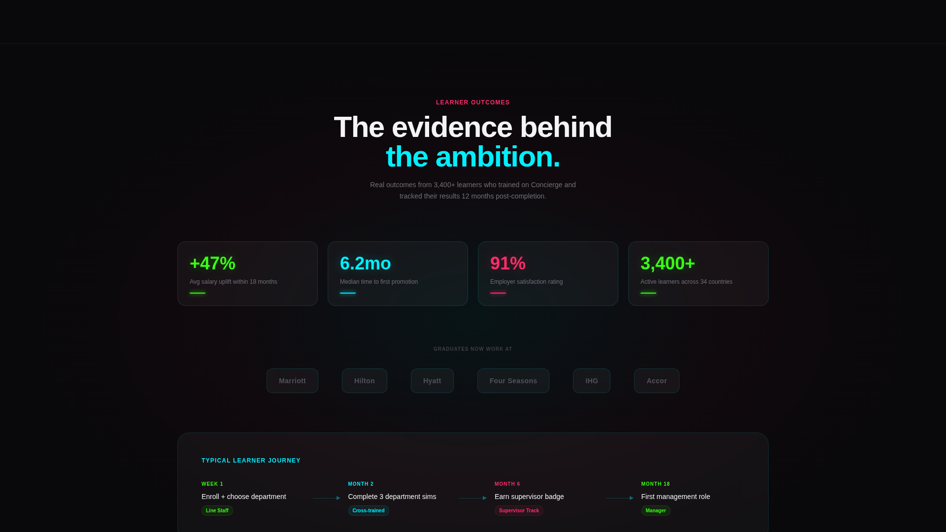
Learner Outcomes Break Card
Midway through the page, a full-width break card flips the feature matrix into learner outcome data. It surfaces salary uplift percentages, promotion timelines, and employer logos so the evidence directly answers the ambition the top half of the page has built.
Acid Digital Color and Glow System
Frosted-glass card surfaces tinted at near-transparent white float on the void-black field. Cards carry one-pixel luminous borders that shift between electric cyan and hot magenta on hover. Phosphor green is reserved for progress indicators, completion badges, and live-pulse dots on active courses.
Geometric Typography Hierarchy
Headlines use a sharp geometric sans-serif in crisp white. Acid green appears only on functional indicators, keeping the type hierarchy clean and the neon palette deliberate. Every typographic decision reinforces the platform's tone of engineered precision.
Page sections overview
| Section | Purpose |
|---|---|
| Hero Header | Establish visual identity and primary headline |
| Hero call to action Block | Anchor visitors to the department card grid |
| Department Card Grid | Display all six hotel department course sets |
| Difficulty Arc Cards | Visualize skill progression from beginner to advanced |
| Learner Outcomes Break | Present salary, promotion, and employer evidence |
| Curriculum Preview Panel | Expand course detail without a registration wall |
| Sign-Up Step | Capture email or Google sign-on after preview |
Design & branding system
The visual language is Tech Glass with an Acid Digital color system. Every design choice serves the platform's core promise: precision training delivered with hospitality polish.
- Color palette: void black (#09090B) as the field, electric cyan (#00F0FF) and hot magenta (#FF2D6B) for interactive glows, phosphor green (#39FF14) for progress and badge indicators, and frosted card surfaces at (#FFFFFF0A)
- Typography: sharp geometric sans-serif in crisp white (#F4F4F5) for all body and headline text, with acid green reserved strictly for functional status elements
- Card surfaces float with one-pixel luminous borders that animate between cyan and magenta on hover, creating depth without background photography
Mobile & speed optimization
The modular card grid is built to reflow cleanly across screen sizes. Each department card is a self-contained unit, so the layout adapts without breaking the visual hierarchy or losing the glow interactions.
- Cards stack vertically on smaller screens while preserving the difficulty arc and skill tag layout inside each card
- The curriculum preview panel opens as a full-screen glass overlay on mobile, keeping the three sample modules and the forwarding button accessible without horizontal scrolling
- The hero atrium wireframe scales down gracefully, maintaining the holographic glow effect without requiring a photographic fallback
How this template helps you convert
The entire page is structured as a click-through funnel. Trust is built before commitment is requested, and each section earns the next click.
- The hero call to action, "Explore All Departments," routes visitors directly into the card grid rather than a sign-up form, keeping momentum high from the first interaction.
- The curriculum preview panel lets visitors inspect three real module titles and watch a looping simulation before they see any registration prompt, earning trust through transparency.
- The final step after the preview reduces sign-up friction to a single email field and a Google single-sign-on button, removing every barrier between interest and enrollment.
Other information about this template
Concierge is suited to platforms with a multi-department curriculum and enough course volume to populate the card grid meaningfully. The layout works best when real learner outcome data is available to fill the break card.
- The template supports 142 courses across 12 departments as illustrated in the hero subline, giving visitors an immediate sense of platform scale
- The page style is designed for a niche that sits at the intersection of hospitality digital presence and technology, making it a strong fit for modern edtech brands in the hotel training space
- The card grid is modular, so departments can be added, reordered, or removed to match the actual curriculum without redesigning the layout
- The lightly frosted glass card aesthetic and neon glow system align with a cocktail-bar-meets-server-rack visual tone that distinguishes the platform from generic course marketplaces
Theme
Tech Glass
Creative direction
Feature Matrix
Color system
Acid Digital
Style
Card Grid (Modular)
Direction
Click-Through
Page Sections
Holographic Hero Header
Modular Department Card Grid
Click-through Curriculum Preview
Learner Outcomes Break Card
Acid Digital Glow and Glass System
Low-friction Sign-up Step
Related questions
Who is this landing page template designed for?
Does the template include the curriculum preview panel interaction?
Can I adjust the number of department cards in the grid?
Is registration required before visitors see course content?
What makes this template different from a standard course landing page?