Database Managed Service Landing Page Template
Graph is a landing page template built for managed graph database services. It leads with animated performance counters, a feature tab switcher, and a comparison table that makes the case for graph over relational databases. The dark Tech Glass visual system, teal interactive elements, and a CLI install call-to-action give it the tone of a tool engineers immediately trust.
by Rocket studio
Quick summary
Graph is a single-page comparison table landing page template designed for a managed graph database service. It opens with animated stat counters, moves through a tabbed feature header, and builds its argument with a structured comparison table. The design uses deep terminal black, catalyst teal, and frosted glass white to feel like a live monitoring dashboard.
Who this template is for
This template is built for technical product teams launching or promoting a managed graph database service. It speaks directly to the engineers and decision-makers who evaluate infrastructure tools under real pressure.
- Backend engineers who spend hours writing multi-table JOIN queries and want a faster, graph-native alternative
- Data scientists building fraud detection or recommendation systems who need efficient relationship traversal
- Engineering leaders and CTOs who have watched teams sink months into self-hosting graph databases on container orchestration platforms
What problem this template solves
Setting up a graph database from scratch is painful. Engineers face cluster configuration, capacity planning, and ongoing maintenance before they ever write a single query. This template solves the problem of communicating why a managed service removes that friction, using data and structure rather than marketing prose.
- Visitors cannot quickly see the performance gap between graph and relational databases without a structured comparison
- Technical buyers need more than a headline; they need numbers, a deployment demo, and a clear install path
- Generic landing page templates lack the dark, dashboard-style credibility that infrastructure tools require
What you get with this template
You get a fully structured comparison table landing page that argues the case for a managed graph database through performance data, interactive tabs, and a strong call-to-action. Every section is built to move a technical visitor from curiosity to action.
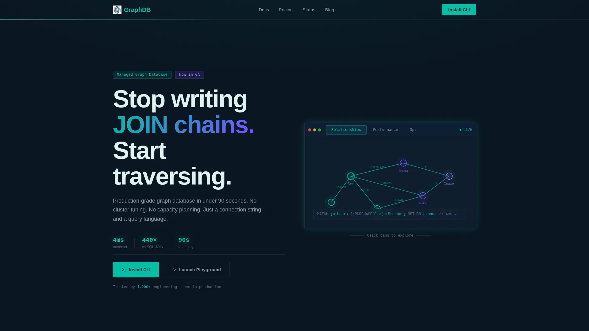
- A Feature Tab Switcher header with three tabs: Relationships, Performance, and Ops, each showing animated, product-demonstrating content
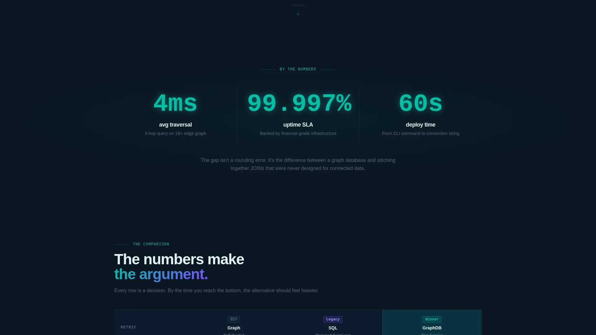
- Three animated entry counters showing average traversal speed, uptime, and deploy time before any paragraph text appears
- A primary call-to-action for CLI installation with a platform-detection toggle and a secondary in-browser playground path
Feature list
This template includes purpose-built components for communicating graph database value to a technical audience.
Animated Feature Tab Switcher
The header panel holds three tabs labeled Relationships, Performance, and Ops. The default tab shows a node-and-edge graph assembling itself in real time, with connections lighting up in catalyst teal as traversals complete. Each tab is designed to demonstrate the product rather than describe it.
Stats-First Entry Counters
Three oversized counters animate on page entry before any body text appears. They display average traversal time at 4ms, uptime at 99.997%, and deploy time at 60 seconds. The counters create an immediate impression of performance credibility.
Structured Comparison Table
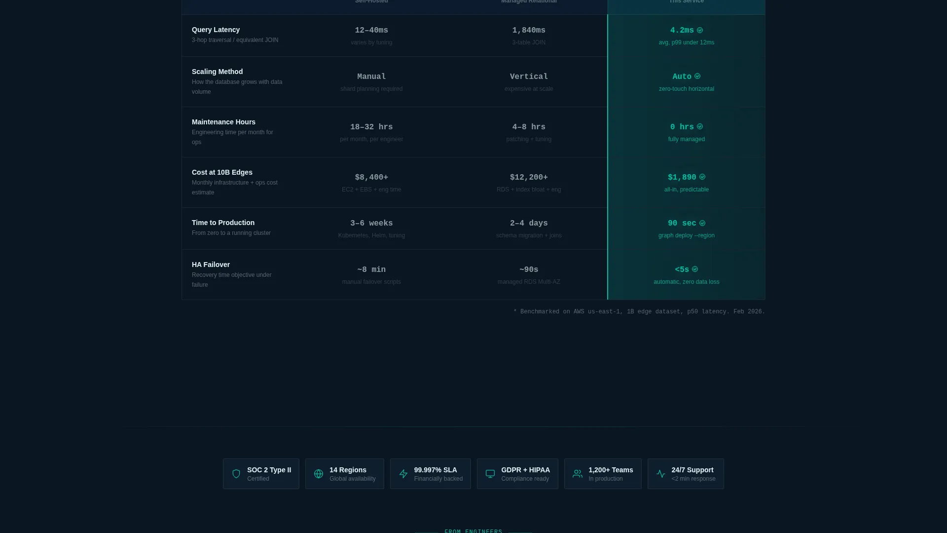
The comparison table is the narrative backbone of the page. It compares graph self-hosted, relational managed, and this managed graph service across query latency, scaling method, monthly maintenance hours, and cost at ten billion edges. The winning cell in each row glows teal, making the gap undeniable at a glance.
Live Latency Performance Demo
Inside the Performance tab, a live-updating counter displays a three-hop traversal completing at 4.2ms. A relational comparison fades in beside it, showing a three-table JOIN at 1,840ms. The contrast is visual and immediate, requiring no explanation from the reader.
CLI Install Call-to-Action
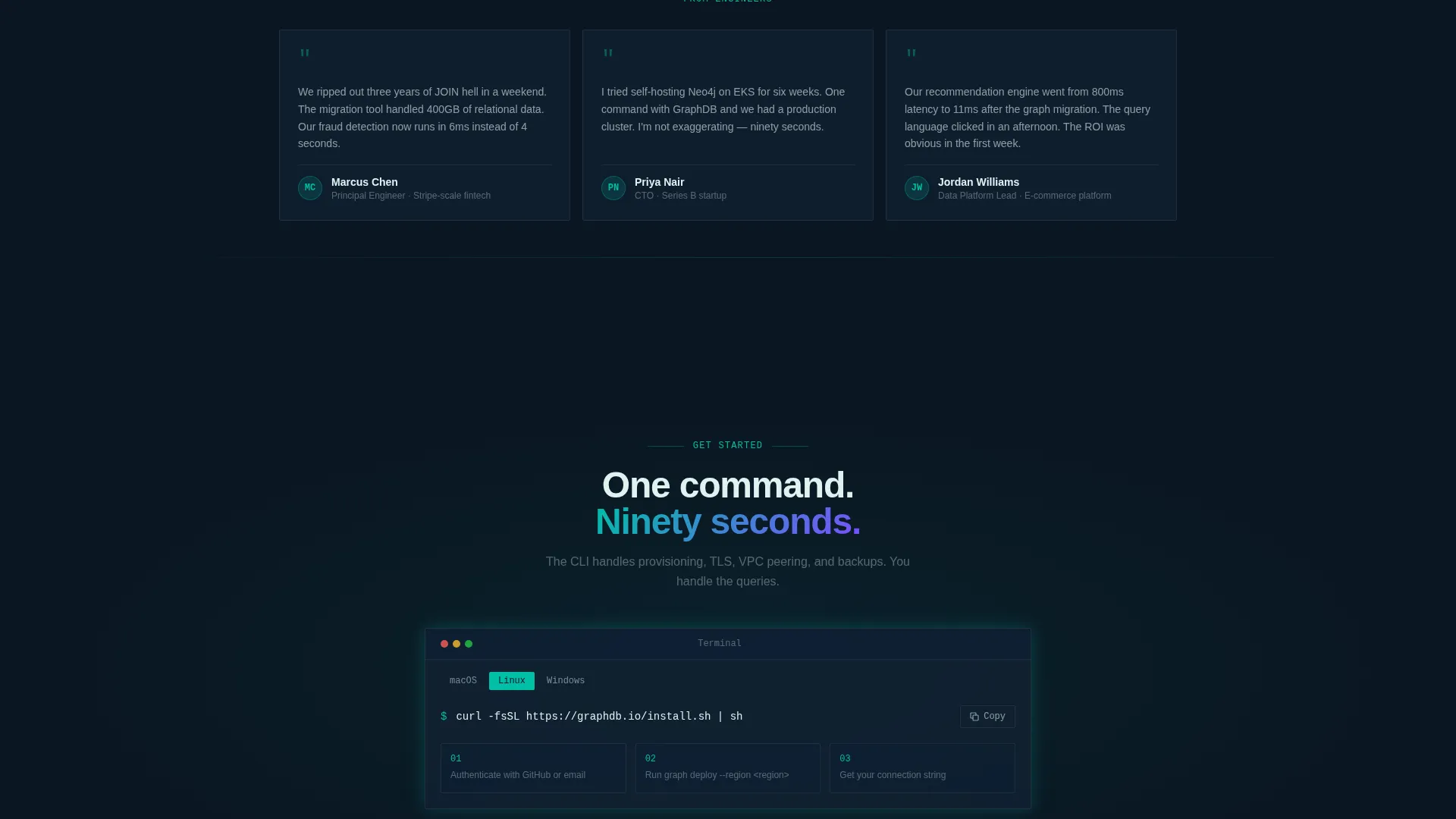
The primary call-to-action reads "Install the CLI" and includes a platform-detection toggle for macOS, Linux, and Windows. A one-line install command is displayed and copyable directly from the page. A secondary option labeled "Launch Playground" lets engineers query a sample dataset in-browser before committing.
Terminal Deploy Animation
The Ops tab shows a single terminal command, graph deploy --region us-east-1, followed by a two-second animation that ends with a green checkmark and the text "Cluster ready." This demonstrates the ninety-second deploy promise without requiring a signup.
Page sections overview
| Section | Purpose |
|---|---|
| Feature Tab Header | Demonstrate product capabilities across three interactive tabs |
| Stats Entry Block | Lead with animated performance counters before any body copy |
| Comparison Table | Show side-by-side performance, cost, and maintenance data |
| Latency Demo Panel | Visualize the traversal speed gap versus. relational databases |
| CLI Install call to action | Drive engineers to install or try the product immediately |
| Playground Launch Path | Offer a low-friction in-browser query entry point |
Design & branding system
The visual system is built around a Tech Glass theme using the Teal Catalyst color palette. The overall feel is a focused monitoring dashboard viewed at late hours: dark backgrounds, precise teal highlights, and frosted card surfaces that keep data readable without distraction.
- Background colors stay in the deep terminal black range from #0B1622 to #112233, with frosted glass white (#E0F2F1) used for card backgrounds and table cells
- Catalyst teal (#00BFA6) is applied to every interactive surface, data highlight, table winner cell, stat counter, and call-to-action button
- Signal violet (#7C4DFF) is reserved for badges and performance delta indicators, creating a secondary visual accent without competing with teal
Mobile & speed optimization
The template is structured to load fast and remain readable on smaller screens. The dark background system and minimal image use keep the page lightweight, while the section-led layout stacks cleanly on mobile viewports.
- No hero images or stock photography are used anywhere; all visuals are animated, text-based, or component-driven, which reduces load overhead
- The comparison table and tab switcher are designed for viewport-aware layout, ensuring data columns and tab labels remain legible on mobile screens
How this template helps you convert
Every section in this template is sequenced to reduce doubt and raise the stakes of staying on legacy infrastructure. The page builds a logical, data-driven case that ends at a low-friction install moment.
- The animated counters at entry establish immediate performance credibility, hooking technical visitors before they read a single paragraph
- The comparison table deepens the case section by section, moving from speed to reliability to cost and making the alternative feel progressively heavier
- The CLI install block with platform detection and a copyable command removes the last practical barrier between interest and action
Other information about this template
This template is designed specifically for graph database managed service positioning. It is well-suited for teams competing in a space where buyers often compare hosted options against self-managed setups on platforms like Kubernetes. The template's layout and language naturally support positioning against alternatives like Neo4j self-hosted deployments, where operational overhead is a known buyer concern.
- The comparison table structure can be adapted to highlight differences in pricing tiers, regional availability, or query language compatibility
- The playground call-to-action path is useful for developer-led growth motions where hands-on evaluation drives conversion
- The Tech Glass visual style translates well across developer tool categories beyond graph databases, including time-series, vector, and other infrastructure-adjacent managed services
Theme
Tech Glass
Creative direction
Stats-First Impact
Color system
Teal Catalyst
Style
Comparison Table
Direction
App Download
Page Sections
Animated Feature Tab Switcher
Stats-first Entry Counters
Structured Comparison Table
CLI Install Call-to-action
Terminal Deploy Animation
Live Latency Comparison Demo
Related questions
Who is this landing page template built for?
Can I adapt the comparison table for different competitors or pricing tiers?
Does this template include the in-browser playground functionality?
What makes this template feel credible to a technical audience?
Can I use this template for a graph database product other than the one in the brief?



