Greenlight - Powerful Entertainment Landing Page Template
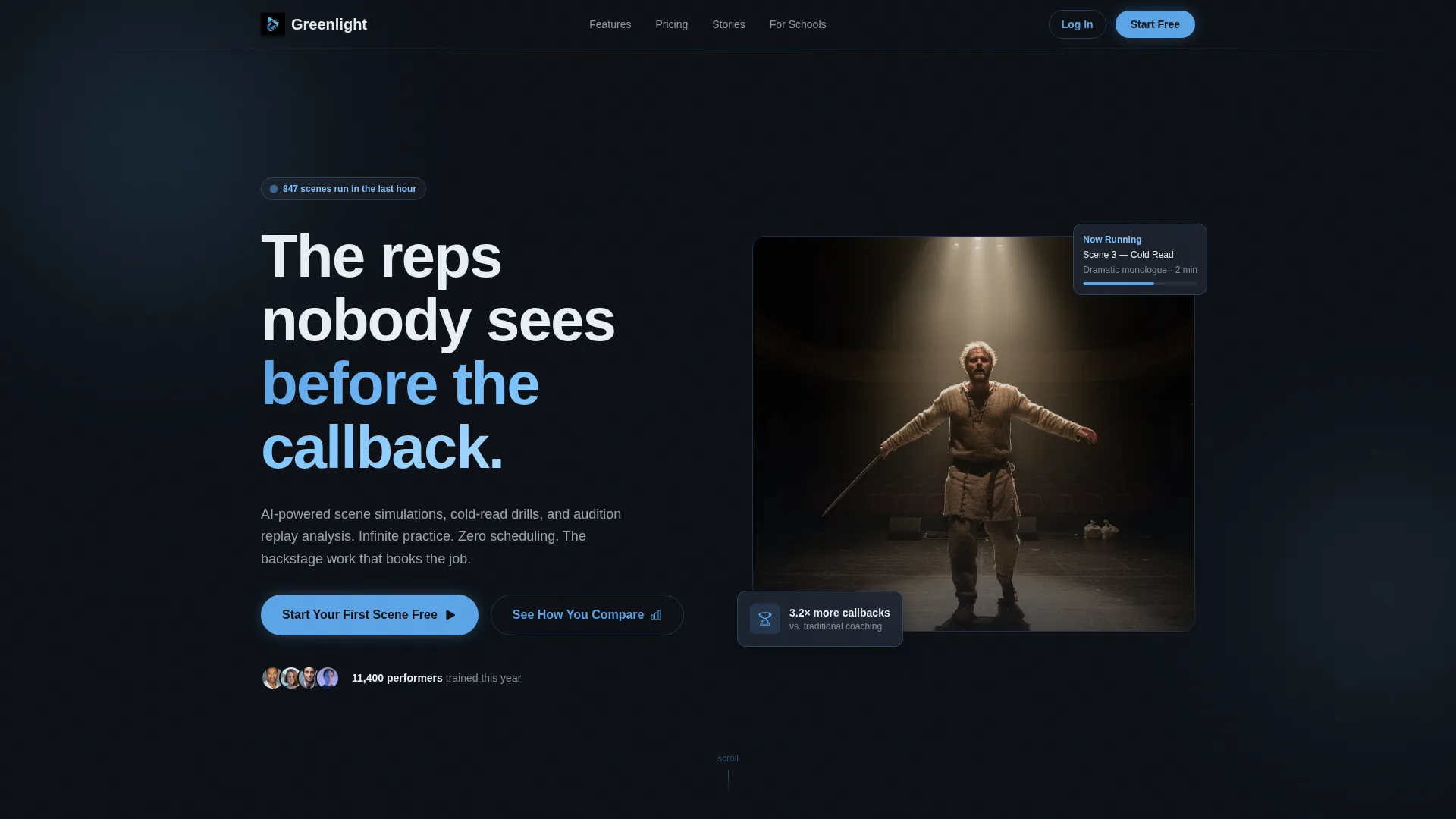
Greenlight is a bento grid landing page template built for an AI-powered entertainment training platform. It targets working actors, comedians, and content creators with a data-driven Industry Report layout, a real-time Comparison toggle, and a frosted Tech Glass visual identity. The design captures the charged atmosphere of backstage preparation and converts curiosity into signups.
by Rocket studio
Quick summary
Greenlight is a single-page bento grid template designed for an AI-powered performance training platform. It blends a Tech Glass visual identity with an Industry Report narrative, using comparative data cards and a live toggle to show visitors exactly why traditional training falls short. The page guides performers from discovery to signup through evidence, not hype.
Who this template is for
This template is built for performance training platforms and entertainment software products that need to establish credibility fast. It speaks directly to the performers those platforms serve, making the value case feel personal and urgent.
- Working actors and comedians grinding through audition prep between bookings
- MFA students and showcase performers with tight preparation deadlines
- Comedy writers and content creators testing material before live performances
What problem this template solves
Most entertainment training platforms struggle to justify their cost against free alternatives like YouTube tutorials, one-off workshops, or personal coaches. Visitors arrive skeptical and leave without converting because the page never proves its case.
- Generic landing pages fail to show concrete performance data that separates a platform from cheaper options
- Performers need to see their own situation reflected before they trust a new tool
- Traditional training methods feel familiar, so switching requires clear and specific evidence
What you get with this template
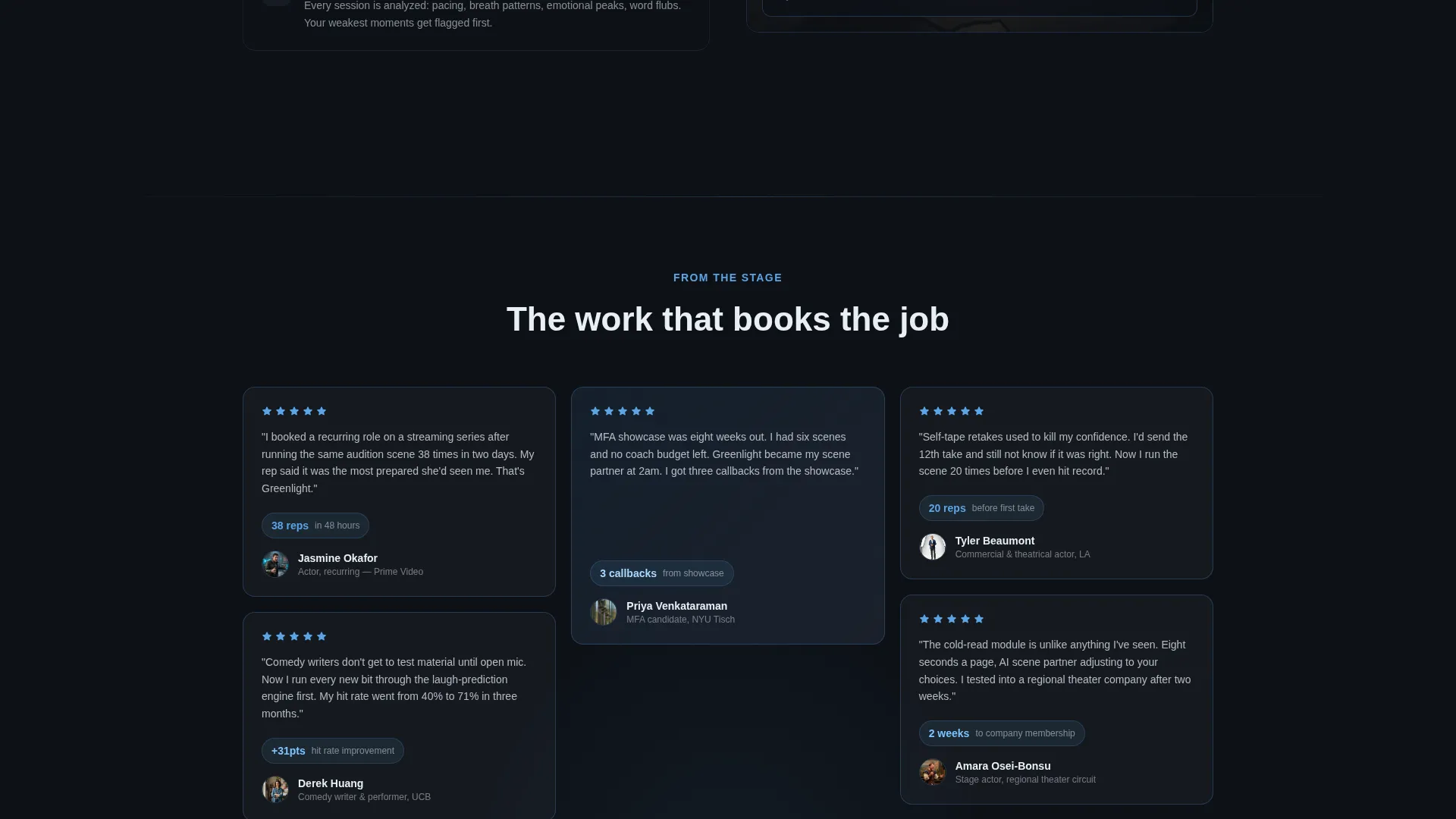
You get a fully structured bento grid landing page that argues its case like an industry report. Every section is a discrete finding, and the layout assembles proof piece by piece as the visitor scrolls.
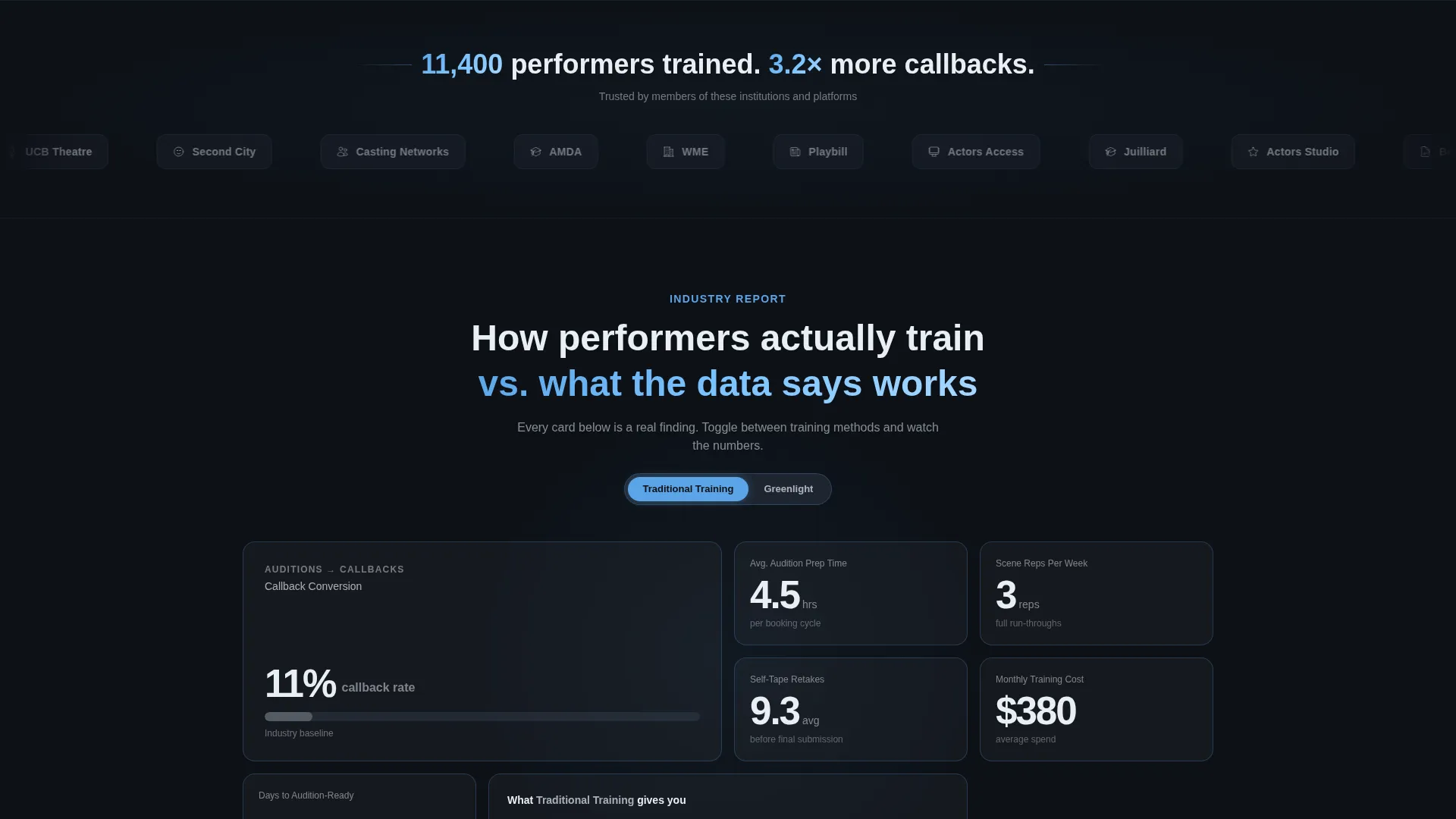
- A sticky Comparison toggle that flips metric cards between Traditional Training and Greenlight in real time
- A Logo Bar header displaying training institutions, casting platforms, and talent agencies in frosted monochrome
- A pinned primary call-to-action and a diagnostic quiz secondary path that routes curious visitors to the signup form
Feature list
This template includes purpose-built components that work together to move a skeptical performer toward signup.
Real-Time Comparison Toggle
A sticky toggle near the top of the page lets visitors switch between Traditional Training and Greenlight across every metric card. Numbers and feature checks flip in real time, making the platform's advantage impossible to ignore without requiring the visitor to scroll back and forth.
Bento Grid Data Cards
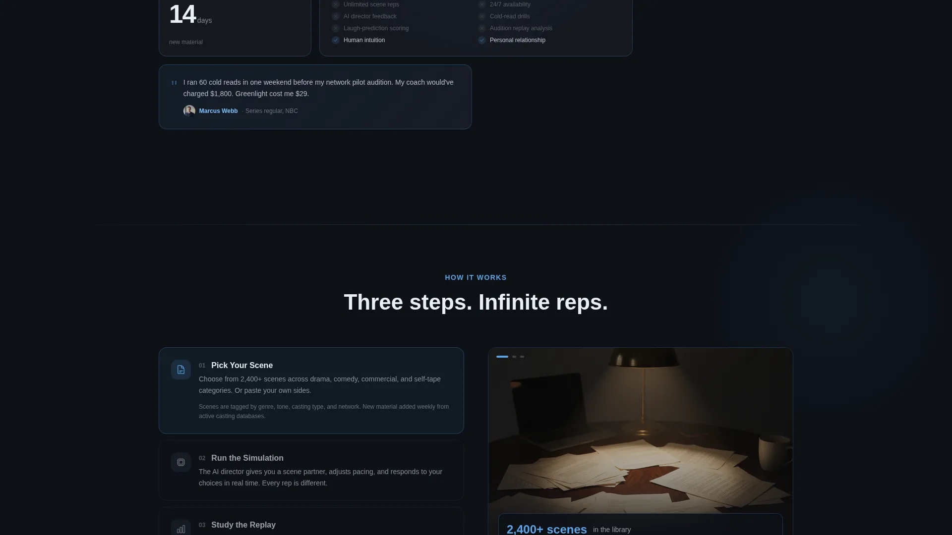
Each card in the grid represents a discrete industry finding: average audition prep time, self-tape retake rates, callback conversion percentages. The cards build a cumulative evidence stack that positions the platform as the data-backed choice rather than just another option.
Logo Bar Social Proof Header
A horizontal scroll of recognizable training institutions, casting platforms, and talent agencies is rendered in frosted monochrome against the charcoal backdrop. Above the bar, a hard-hitting stat headline lands the platform's core claim before the visitor reads a single feature.
Diagnostic Quiz Secondary Path
The "See How You Compare" flow triggers a short quiz that benchmarks the visitor's current training habits against platform averages. It dissolves friction by satisfying curiosity first, then deposits the visitor directly at the signup form with personalized context already established.
Pinned Primary Call-to-Action
The "Start Your First Scene Free" button stays fixed at the bottom of the viewport throughout the entire scroll. The signup form requires only an email address and a performer type selector, keeping the entry barrier as low as possible.
Tech Glass Visual System
Frosted-glass card surfaces with 1px sky-blue borders, deep charcoal backgrounds, and clean white text create a visual identity that feels like a glowing phone screen in a dark theater. Every hover state brightens the border, reinforcing interactivity without cluttering the layout.
Page sections overview
| Section | Purpose |
|---|---|
| Stat Headline Bar | Opens with "11,400 performers trained. 3.2× more callbacks." to anchor credibility immediately |
| Logo Bar Header | Horizontal scroll of partner institutions and agencies rendered in frosted monochrome |
| Comparison Toggle | Sticky switcher that flips all metric cards between Traditional Training and Greenlight |
| Metric Data Cards | Bento grid cards presenting industry findings: prep time, retake rates, callback rates |
| Diagnostic Quiz Entry | "See How You Compare" trigger that benchmarks visitor habits before routing to signup |
| Pinned call to action Bar | Fixed bottom bar with email input, performer type selector, and primary signup button |
Design & branding system
The visual identity uses a Slate and Sky color system that evokes a phone screen glowing in a dark theater. Every color choice is intentional: charcoal grounds, sky blue activates, white clarifies.
- Deep backstage charcoal (#1E2530) and cool rehearsal slate (#3A4556) form the grid background and card base layers
- Open-sky blue (#5BA4E6) marks every interactive element, border highlight, and hover state throughout the page
- Frosted glass white (#E8EEF4) surfaces card content with clean contrast, and 1px sky-blue borders sharpen on hover to signal interactivity
Mobile & speed optimization
The bento grid layout is designed to restack cleanly across screen sizes so the data-card narrative reads logically on smaller viewports. The sticky call to action bar and comparison toggle remain accessible throughout the scroll on mobile devices.
- Bento cards reflow into a single-column stack on narrow screens without breaking the evidence-building sequence
- The pinned call-to-action bar stays visible at the bottom of the viewport regardless of scroll position or device size
How this template helps you convert
This template converts by treating the visitor as an intelligent professional who needs evidence, not enthusiasm. The page earns trust before it asks for anything.
- The Industry Report narrative builds cumulative proof across the bento grid so visitors feel informed rather than sold to, lowering resistance before any call to action appears.
- The real-time Comparison toggle lets visitors personally verify the platform's advantage, making the decision feel self-directed rather than pushed.
- The diagnostic quiz secondary path catches undecided visitors, satisfies their curiosity with a personalized benchmark, and delivers them to the signup form already invested in the outcome.
Other information about this template
This template is a strong fit for entertainment software and SaaS products in the performance training space. It is particularly well-suited for platforms operating at the intersection of artificial intelligence and creative industry tools.
- The template style is Bento Grid, the theme is Tech Glass, and the creative direction follows an Industry Report narrative framework
- The header concept is a Logo Bar, and the landing page direction is a Comparison and Versus engine
- The color system is Slate and Sky, built around four defined hex values that remain consistent across all card surfaces and interactive states
- The performer type selector in the signup form supports segmentation for actors, comedians, creators, and writers without requiring additional pages
Theme
Tech Glass
Creative direction
Industry Report
Color system
Slate & Sky
Style
Bento Grid
Direction
Comparison/Versus
Page Sections
Real-time Comparison Toggle
Bento Grid Data Cards
Logo Bar Social Proof Header
Diagnostic Quiz Secondary Path
Pinned Primary Call-to-action
Tech Glass Visual System
Related questions
Who is this landing page template designed for?
Can I customize the metric data shown in the bento cards?
How does the Comparison toggle work in this template?
What does the diagnostic quiz section do?
Is the primary call-to-action always visible while scrolling?



