Design System & Component Library Portfolio Website Template
The Grid Precision Layout System landing page template gives front-end engineers, design-system leads, and solo founders a structured, visually sharp single-page hub to showcase a CSS grid framework. Built on a Tech Glass aesthetic with frosted panels and luminous accents, it demonstrates responsive grid capabilities live, converting visitors through interactive feature cards and a clear documentation call to action.
by Rocket studio
Quick summary
Grid is a grid precision layout system landing page template built for developer-tool audiences. It pairs a hub-and-spoke anchor navigation structure with five animated capability cards, a frosted metrics strip, and a zero-form conversion flow. Every section proves the grid system in real time, letting visitors watch columns snap into place before they ever open the docs.
Who this template is for
This template speaks directly to people who live inside layout problems every day. It is purpose-built for the developer-tool and design-system niche, where clarity of structure is itself the product pitch.
- Front-end engineers debugging collapsed or chaotic layouts who need a reliable grid layout reference to replace ad-hoc CSS hacks
- Design-system leads who must enforce spatial consistency across large multi-screen applications and need landing pages that communicate that discipline visually
- Solo founders who want a visually appealing grid website without spending weeks writing code or wrestling with page structure from scratch
What problem this template solves
Chaotic layouts cost teams real time. Without a shared grid structure, components drift, spacing becomes inconsistent, and every new screen introduces new guesswork. This template solves the communication problem that sits in front of that technical one: how do you convince a skeptical developer that one grid system is worth adopting?
- It replaces five separate CSS hacks with a single coherent grid layout, demonstrated live inside each capability card, so the user's eye sees the proof before the mind processes the pitch
- It removes the cognitive load of evaluating abstract documentation by showing real-time visual output next to live code snippets, reducing the cost of adoption to a single click
- It prevents overwhelming users with walls of text by organizing every argument into discrete, scannable frosted-glass sections anchored by a sticky navigation ribbon
What you get with this template
You get a complete, single-page hub-and-spoke landing page ready to customize. The page structure is designed around demonstration, not description, so every section earns its space by showing the grid system at work.
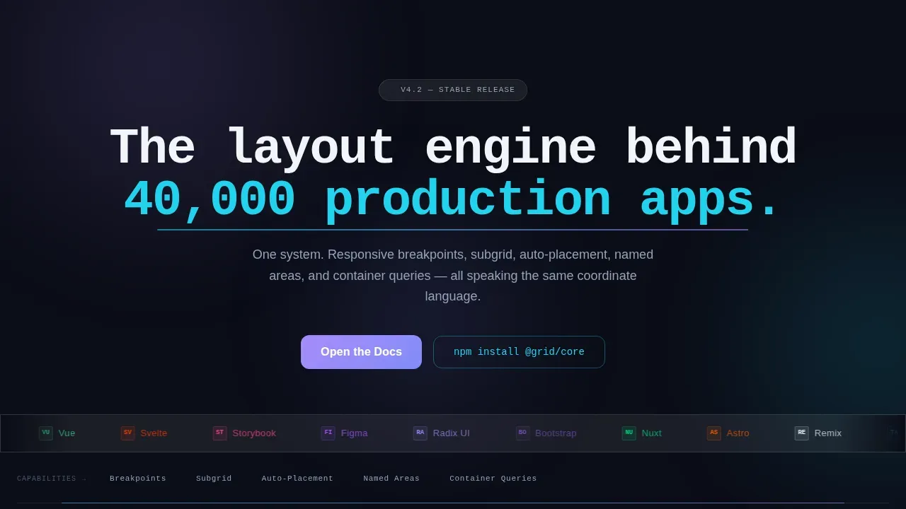
- A hero section with an infinite-scroll logo bar, a monospaced headline, and a pulsing cyan anchor navigation that doubles as a progress indicator for the spoke destinations below
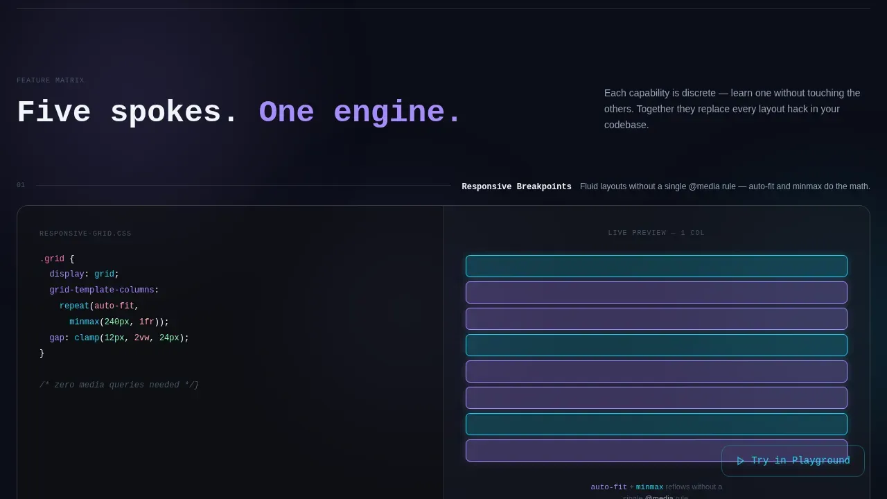
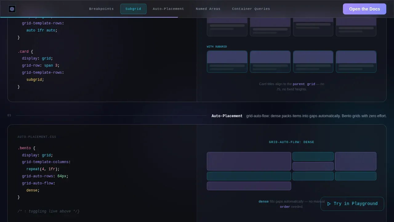
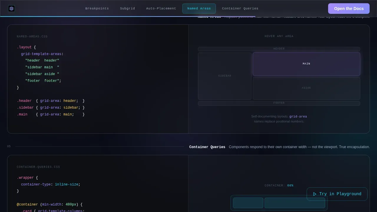
- Five frosted-glass capability cards covering responsive breakpoints, subgrid, auto-placement, named areas, and container queries, each with a live code snippet on the left and an animated visual output on the right
- A frosted proof bar displaying key metrics, a full-width final call-to-action section, and a persistent floating secondary call-to-action button that stays visible throughout the user journey
Feature list
This section covers the key features built into the Grid template. Each capability is present in the source brief and visible in the delivered page.
Hub-and-Spoke Anchor Navigation
The sticky anchor navigation pins to the top of the viewport after the visitor scrolls past the hero image. Each navigation item links directly to its corresponding capability card below, keeping the user journey linear and frictionless. The pulsing cyan underline doubles as a visual progress indicator.
Live Capability Cards with Code and Output
Five frosted-glass cards form the core of the feature matrix. Each card displays a live code snippet on the left side and an animated visual output on the right. Intersection-triggered animations fire as each card enters the viewport: columns animate into alignment, gutters breathe open, and responsive breakpoints snap as a simulated viewport preview narrows. This approach lets designers and engineers see the grid layout respond to real conditions rather than reading about it.
Glassmorphic Visual System
The entire page uses a Tech Glass color system built on deep void black, frosted panel layers at low opacity, luminous edge lilac, and signal cyan for interactive highlights. GPU-accelerated transforms handle all motion, and backdrop filters are applied sparingly to maintain crisp readability across the frosted surfaces.
Intersection-Triggered Grid Animations
As visitors scroll, each section fires its own animation sequence. Columns animate into position along their grid lines. Gutters expand to their final width. The simulated viewport preview demonstrates responsive behavior as the visible space narrows. These animations create cumulative proof that a single engine handles every layout scenario.
Dual Call-to-Action Architecture
The primary call to action, "Open the Docs," appears both inside the sticky navigation and as a full-width frosted bar after the final spoke. The secondary call to action, "Try in Playground," floats as a persistent ghost button in the lower-right corner. No form, no fields. The page earns the click by letting the grid system demonstrate itself.
Frosted Proof Metrics Strip
A dedicated metrics section displays numeric social proof: 40,000 production apps, 97% browser support, and a zero-JavaScript footprint note. The strip uses the same frosted-glass panel style as the capability cards, keeping the visual language consistent across all page elements.
Page sections overview
| Section | Purpose |
|---|---|
| Hero with Logo Bar | Establishes credibility with an infinite-scroll ribbon of framework brand marks and a bold monospaced headline |
| Anchor Nav Bar | Sticky ribbon that pins after scroll, linking to each capability spoke and showing progress |
| Responsive Breakpoints Card | Demonstrates how the grid layout adapts column count across different screen sizes |
| Subgrid Capability Card | Shows nested containers aligning to the parent grid without extra wrappers |
| Auto-Placement Card | Illustrates how the grid system places dynamic content automatically without manual positioning |
| Named Areas Card | Displays a named grid template columns layout where regions are defined by readable string identifiers |
| Container Queries Card | Shows how individual grid block components respond to their own container width, not the viewport |
| Proof Metrics Strip | Frosted bar of numeric metrics reinforcing scale and browser coverage |
| Final call to action Section | Full-width frosted call-to-action bar anchoring the conversion moment after all five spokes |
| Footer | Linear single-row footer with minimal links |
Design & branding system
The visual identity is built on a Tech Glass theme with a Glassmorphic color system. The palette feels deliberate and technical, matching the audience that will evaluate this template.
- Colors: deep void black (#0B0D17) as the base, frosted panel white at approximately 12% opacity for surface layers, luminous edge lilac (#A78BFA) as the primary accent, and signal cyan (#22D3EE) for interactive highlights and the pulsing progress indicator
- Typography: JetBrains Mono for headlines and all code display elements, DM Sans for body copy, and Fraunces as a display accent font, creating a clear visual hierarchy between explanatory text and technical content
- Motion: an animated gradient mesh background, infinite logo scroll in the hero, intersection-triggered column and gutter animations, and a pulsing underline progress indicator, all powered by GPU-accelerated transforms for smooth display
Mobile & speed optimization
The template is desktop-first by design, reflecting the primary audience of developers working on large screens. It also ships with a solid mobile fallback so the page remains useful when accessed from mobile devices or smaller screens.
- The sticky anchor navigation collapses gracefully on smaller screens, and the five capability cards reflow to a single column layout so content remains readable without horizontal scrolling
- GPU-accelerated transforms handle all animations, and backdrop-filter effects are applied sparingly, reducing the rendering cost on devices where frosted-glass effects would otherwise create jank
- The page is designed for at least three standard viewport widths, ensuring responsive behavior holds across different screen sizes from widescreen desktop to mid-range tablet to compact mobile
How this template helps you convert
This template is built specifically for click-through conversion. It does not rely on forms or lead capture. Instead, it reduces the cognitive cost of adoption by making the grid system's value self-evident.
- The sticky "Open the Docs" call to action stays visible throughout the entire user journey, so the conversion option is always one click away regardless of how far the visitor has scrolled through the feature matrix
- The live code-and-output card format shows the grid system solving real layout problems in real time, which lowers the trust barrier and improves conversion rates by giving technical visitors proof they can verify immediately
- The floating "Try in Playground" ghost button provides a persistent secondary path for visitors who want to experiment before committing, capturing intent without adding form friction or overwhelming users with choices
Other information about this template
This template is designed for teams and individuals who already understand the value of a structured design grid but need a landing page that communicates that value to others quickly.
- The page structure follows established grid system principles: a 12-column grid for desktop, condensing to a 4- to 8-column layout for mobile devices, with consistent gutter widths that create breathing room and prevent visual clutter
- Content elements align to grid lines and start and end at column edges, following the best practice of keeping gutters empty for clear visual separation of page elements
- The 8-pixel grid principle applies to all spacing decisions: margins, padding, and gutters use multiples of 8px to create a harmonious vertical rhythm across the full page layout
- A baseline grid aligns all text elements horizontally, improving readability and providing a cohesive vertical flow across the hero image, capability cards, and proof strip
- Placing critical page elements at the intersections of a 3x3 grid guides the user's eye to the most important conversion moments without relying on aggressive visual interruptions
- The design process is intentionally modular: each capability card is a self-contained grid block, which means you can reorder the spokes, add a new card, or remove a section without disrupting the overall page structure
- The template supports custom designs by exposing clear grid template columns definitions that designers can fine tune to match their own spatial system or brand proportions
- Vertical lines and intersecting lines are made visible during development through the animated column overlays, helping teams validate alignment before shipping
- Pre built layouts for the hero, card matrix, proof bar, and footer mean you can reach a working draft quickly without writing code from scratch
- The page can serve as a companion to design-system documentation workflows in tools like Adobe XD, where grid templates and column width definitions are already part of the design file
Theme
Tech Glass
Creative direction
Feature Matrix
Color system
Glassmorphic
Style
Hub & Spoke (Anchor Nav)
Direction
Click-Through
Page Sections
Hub-and-spoke Sticky Anchor Navigation
Live Code-and-output Capability Cards
Glassmorphic Tech Glass Visual System
Intersection-triggered Grid Animations
Dual Call-to-action Architecture
Frosted Proof Metrics Strip
Related questions
Does this template require JavaScript to run the animations?
Can I change the column count or adjust grid template columns for my own system?
Is this template suitable for a design system rather than a CSS framework?
Does the page include any form or lead-capture fields?
Can I customize this template without writing CSS from scratch?



