E-Commerce Conversion Optimization Tools Website Template
Gridlock is a bold brutalist landing page template built for e-commerce conversion tools. It combines a dark glass panel header, a scrolling feature matrix, and a dashboard-style data grid layout to position your app as mission-critical software. Designed for growth-focused sellers and performance marketers, this template makes every scroll feel like unlocking more power.
by Rocket studio
Quick summary
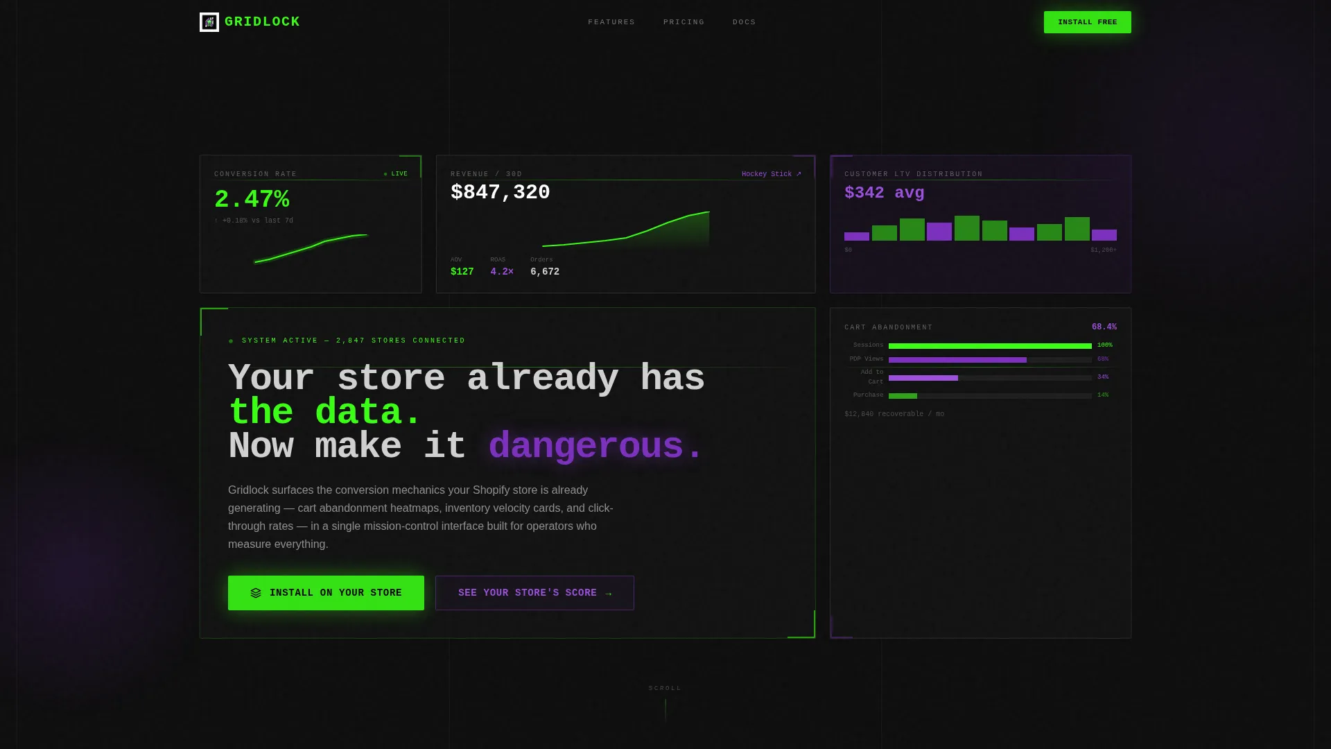
Gridlock is a single-page brutalist template designed for e-commerce lead capture tools. It opens with a full-viewport dark glass panel header packed with live-looking store metrics, then builds urgency through a scrolling feature matrix. The page drives two clear conversion paths: a direct app install and a URL-based store audit teaser that captures leads earlier in the funnel.
Who this template is for
This template is built for operators who think in performance terms. If you are launching or promoting an e-commerce analytics or optimization app, Gridlock speaks directly to your audience in the language they already use.
- High-revenue Shopify sellers who judge tools by measurable output
- Direct-to-consumer brand founders running data-driven acquisition and retention
- Growth marketers and product teams promoting conversion or analytics apps to store owners
What problem this template solves
Most app landing pages look like brochures. They describe features without making the visitor feel the cost of not having them. Gridlock solves this by building psychological pressure through layout and copy rhythm.
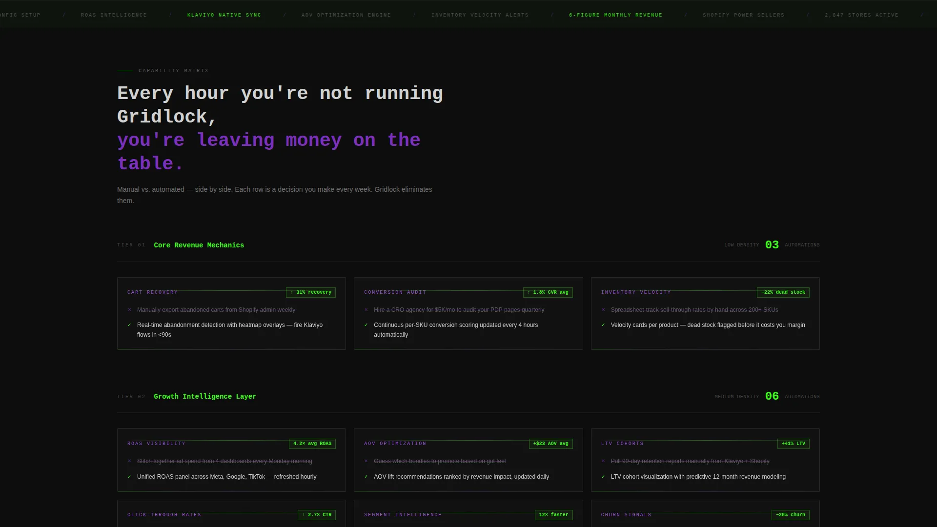
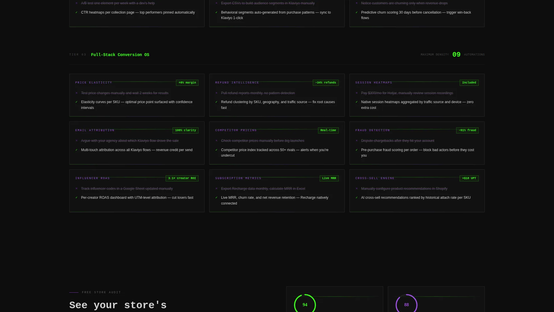
- Visitors scroll through a feature matrix that gets denser with each section, making manual processes feel increasingly inefficient
- The page captures leads at two points, not one, reducing drop-off from visitors who are curious but not yet ready to install
What you get with this template
You get a fully structured single-page layout with distinct sections, a clear visual system, and two built-in conversion paths. Every design decision is deliberate and tied to the template's core mission: make the app feel essential.
- A dark glass panel header with asymmetric grid layout and live-metric display panels
- A three-stage scrolling feature matrix with side-by-side comparison cards
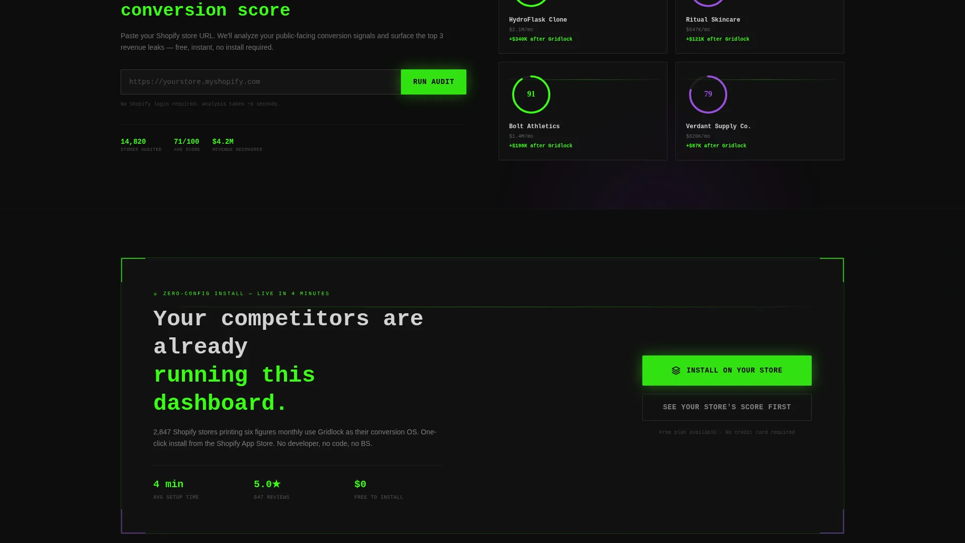
- A primary install call to action and a secondary store URL lead capture field
Feature list
This template ships with a set of purpose-built components that work together to build trust and drive action across a single focused scroll.
Dark Glass Panel Header
The header fills the entire viewport with semi-transparent frosted panels arranged in an asymmetric grid. Each panel displays a different store metric, from conversion rate to cart abandonment. A monospaced headline punches through the center panel, anchoring the opening statement without lifestyle photography or illustration.
Scrolling Feature Matrix
The feature matrix is the engine of the page. It presents capability cards in escalating density: three cards in the first section, six in the next, nine in the final block. Each card compares a manual process against an automated one, using terminal green checkmarks and ultraviolet strikethroughs to make the contrast immediate and visual.
Dual Conversion Path Layout
The template is structured around two actions. The primary path leads to an app install button styled with a pulse animation. The secondary path offers a single-field store URL input that delivers an instant audit teaser, capturing the lead without requiring a full commitment.
Scroll-Triggered Micro-Interactions
Numbers count up as they enter the viewport. Graphs animate on scroll. Panels slide into position with mechanical timing. These interactions are baked into the template's scroll rhythm to reinforce the sense that the tool is live, active, and already working.
Persistent Mobile Bottom Bar
On mobile, the primary call to action stays fixed at the bottom of the screen as a persistent action bar. This ensures the install prompt is always reachable regardless of where the visitor is in their scroll.
Metric Display Panels
The header grid includes four distinct metric panels: a ticking conversion rate, a hockey-stick revenue graph, a cart abandonment funnel, and a customer lifetime value distribution chart. These panels establish credibility before a single feature is read.
Page sections overview
| Section | Purpose |
|---|---|
| Glass Panel Header | Opens with full-viewport metric display and primary headline |
| Metric Display Grid | Shows four live-looking store performance panels |
| Feature Matrix Block One | Introduces three core capability comparisons |
| Feature Matrix Block Two | Expands to six comparisons, building scroll momentum |
| Feature Matrix Block Three | Peaks at nine comparisons, maximizing urgency |
| Primary Install call to action | Drives the main app download action |
| Store URL Input | Captures leads via instant audit teaser field |
| Mobile Bottom Bar | Keeps install call to action persistent on smaller screens |
Design & branding system
The visual identity is built around an Acid Digital color system that makes every element feel functional rather than decorative. The palette references server rooms and developer tools, not lifestyle brands.
- Void black (#0D0D0D) as the dominant background, terminal green (#39FF14) for live data pulses and the primary call-to-action button, and ultraviolet (#7B2FBE) for gradient bleeds and secondary highlights
- Raw aluminum (#D1D1D1) for body text and grid borders, with all typography set in monospaced or terminal-style fonts to reinforce the dashboard aesthetic
Mobile & speed optimization
The template is structured to maintain its brutalist visual impact on smaller screens without sacrificing the conversion flow. The layout adapts so the density of the feature matrix remains readable on mobile.
- The asymmetric header grid collapses into a focused single-column stack on smaller viewports
- The persistent bottom bar replaces the in-panel call-to-action button on mobile, keeping the install action within thumb reach at all times
How this template helps you convert
The page is engineered to reduce friction and build conviction simultaneously. Each structural decision pushes the visitor closer to one of the two conversion actions.
- The escalating feature matrix creates progressive urgency: the visitor begins by recognizing a few inefficiencies and ends feeling that every manual process is a liability, making the install feel like the logical next step rather than a purchase decision.
- The secondary store URL input lowers the commitment barrier. Visitors who are not ready to install can still engage, submit a lead signal, and receive an audit teaser, keeping them inside the funnel.
Other information about this template
Gridlock sits at the intersection of dashboard design and direct-response copywriting. It is categorized under e-commerce store website templates with a specific focus on lead capture for store optimization tools.
- The template style is Dashboard and Data Grid, making it well suited for any e-commerce store lead capture landing page that needs to signal analytical depth
- The Bold Brutalist theme and Acid Digital color system distinguish this template from conventional SaaS landing pages that rely on illustration or photography
- The Feature Matrix creative direction is a proven structural pattern for conversion-focused app promotion pages, where the comparison format builds perceived value with every row
Theme
Bold Brutalist
Creative direction
Feature Matrix
Color system
Acid Digital
Style
Dashboard/Data Grid
Direction
App Download
Page Sections
Dark Glass Panel Header
Escalating Feature Matrix
Dual Conversion Path Layout
Scroll-triggered Micro-interactions
Persistent Mobile Bottom Bar
Live Metric Display Panels
Related questions
Is this template designed for a single page or multiple pages?
Can I use this template to promote any type of e-commerce tool?
Do I need design experience to customize Gridlock?
What makes the feature matrix different from a standard features table?
Does the template include both a desktop and mobile layout?



