Construction Software Booking Website Template
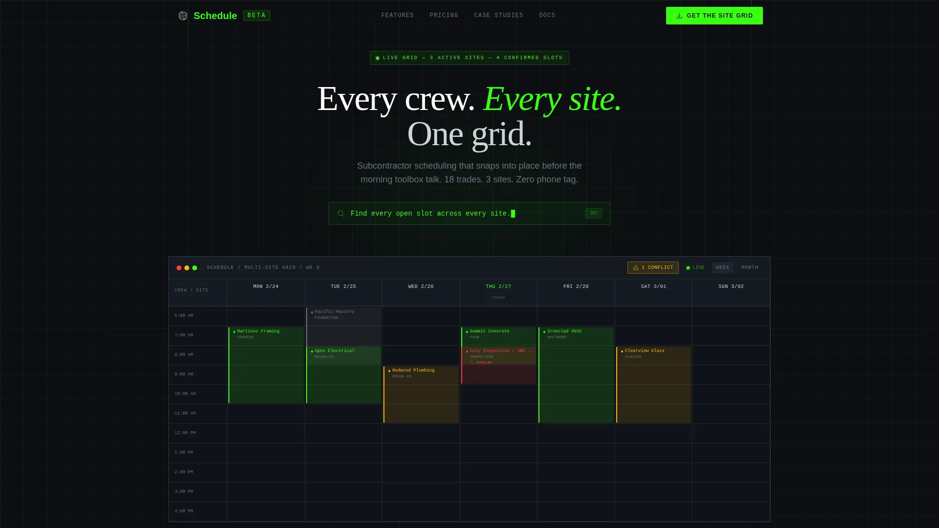
Gridlock is a construction appointment scheduling landing page built around a live dashboard interface. It targets general contractors, project managers, and superintendents who need every crew, inspection window, and pour date visible at once. The design uses a Data Command visual system with bold status colors, a draggable schedule grid, and a direct app download flow.
by Rocket studio
Quick summary
Gridlock is a single-page template designed for a construction appointment scheduling platform. It opens with a fully interactive scheduling dashboard, walks visitors through key capabilities via animated feature cards, and closes with a clear app download call to action. Every section reinforces one idea: coordinating subcontractors should feel fast, visual, and certain.
Who this template is for
This template is built for construction professionals who manage overlapping schedules across multiple active job sites. If your mornings start with phone calls instead of confirmed plans, this layout speaks directly to your workflow.
- General contractors coordinating up to eighteen trades across several sites simultaneously
- Project managers who lose time every week chasing confirmations from electricians, framers, and other subcontractors
- Superintendents who need real-time visibility into crew rotations, pour dates, and inspection windows
What problem this template solves
Subcontractor coordination is one of the most time-consuming parts of any active construction project. Crews get double-booked, inspection slots overlap, and weather delays ripple through the rest of the week with no single place to catch the conflict before it costs money.
- No central view means a missed concrete delivery or an inspection clash can derail a full day of work
- Phone tag and scattered spreadsheets slow down decisions that should take seconds, not half a Monday morning
- Site teams lack a shared, live reference point they can all trust when plans change overnight
What you get with this template
You get a fully structured, single-page landing page designed to present a construction scheduling platform with authority and clarity. Every section is purpose-built and ready to populate with your own project data, crew names, and site details.
- An interactive header dashboard pre-populated with realistic construction data, drag-and-drop time blocks, and a conflict badge pulsing in hazard amber
- A scrolling feature matrix that reveals platform capabilities one by one through animated, cropped dashboard frames
- A conversion-ready footer section with app download badges, an SMS download link field, and a sandboxed demo entry point
Feature list
This template delivers a coordinated set of interactive and visual components that reflect how a real scheduling command center should feel and function.
Interactive Scheduling Dashboard Header
The header fills the entire viewport with a live-rendered scheduling grid. It shows crew names, site addresses, and color-coded time blocks. Visitors can drag a time block from one day to another and watch the grid recalculate dependencies in real time. A parallax effect separates the toolbar layer from the calendar grid, giving the interface a sense of physical depth.
Conflict Detection Badge
A pulsing hazard amber badge overlays an overlapping inspection slot in the header preview. This single visual element communicates the platform's core value immediately. Visitors understand what the tool solves before reading a single line of body copy.
Animated Feature Matrix
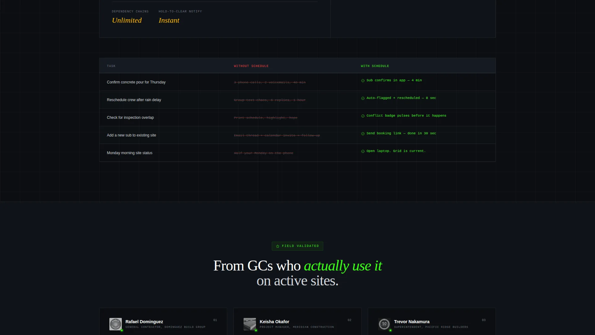
Each capability is revealed as a full-width grid card with a micro-animation showing the feature inside a cropped dashboard frame. Cards start large and detailed, then compress into a dense comparison grid that contrasts the platform against spreadsheets and phone calls. The rhythm of the scroll accelerates as the comparison becomes more direct.
Multi-Site Calendar Sync Section
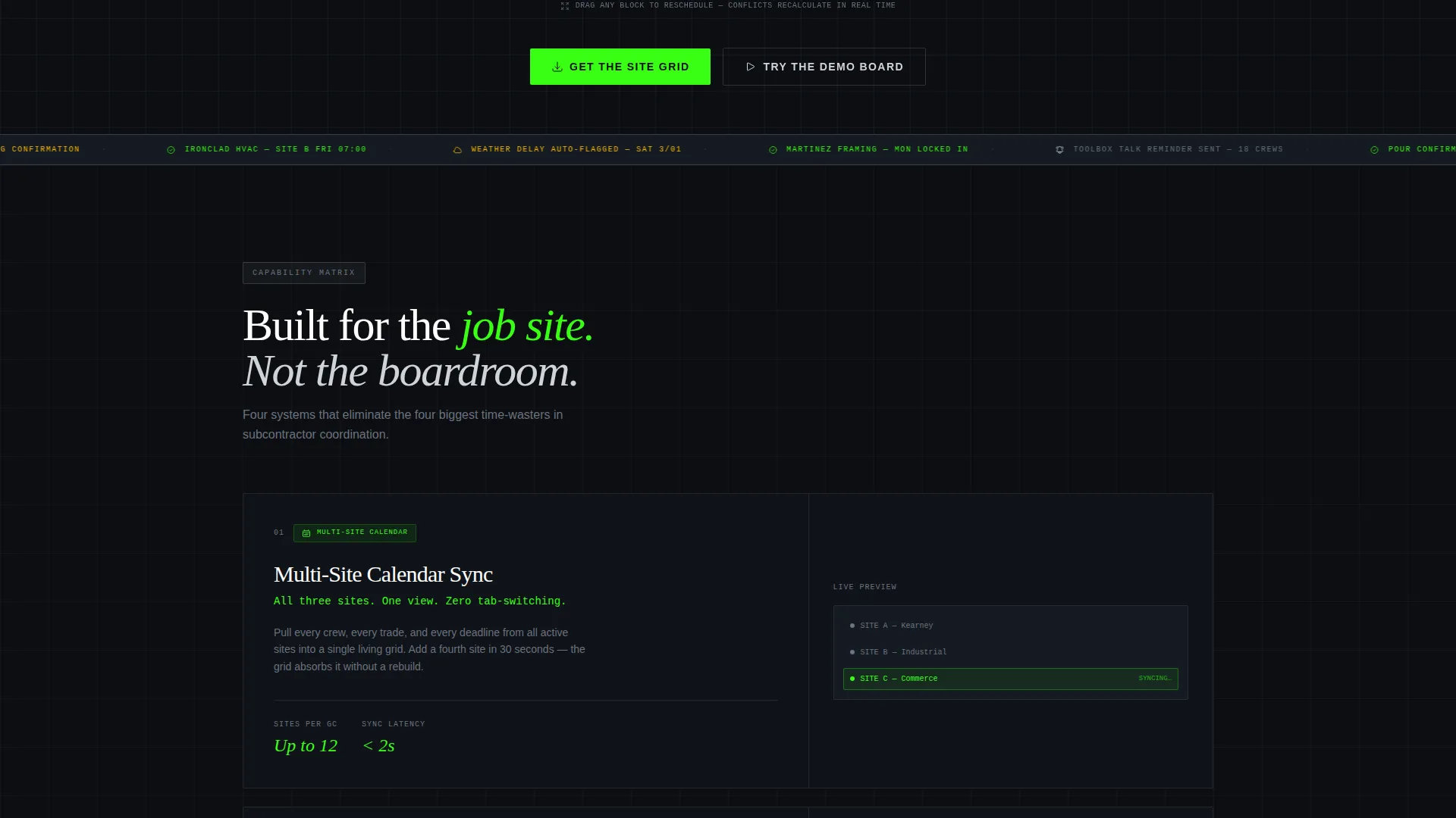
A dedicated feature card isolates the multi-site calendar synchronization capability. It shows how crew schedules across different addresses align inside one grid view. The visual framing makes it easy for visitors to picture their own sites slotting into the layout.
Subcontractor Self-Booking and Auto-Rescheduling Cards
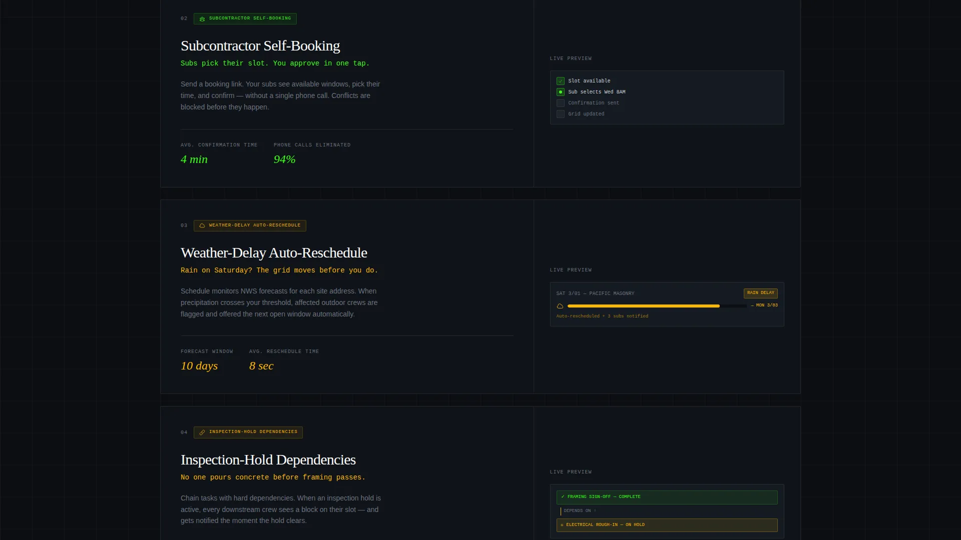
Separate feature cards cover subcontractor self-booking and weather-delay auto-rescheduling. Each card uses a micro-animation to show the action happening inside a dashboard frame. These sections answer the specific questions a superintendent or project manager would ask before committing to a download.
App Download Conversion Section
The primary call to action reads "Get the Site Grid" and is supported by paired App Store and Google Play badges. A phone number input field delivers a direct download link via SMS. A secondary path labeled "Try the Demo Board" opens a sandboxed, in-browser interactive version for visitors who want to explore before downloading.
Page sections overview
| Section | Purpose |
|---|---|
| Interactive Dashboard Header | Fills viewport with live scheduling grid and drag-and-drop demo |
| Conflict Badge Overlay | Visualizes scheduling conflict detection with amber pulse |
| Feature Matrix Cards | Reveals platform capabilities through animated dashboard frames |
| Comparison Grid | Contrasts platform against spreadsheets and phone-based workflows |
| App Download Section | Drives installs with badges, SMS link field, and demo board path |
Design & branding system
The visual identity follows a Data Command theme built on the Acid Digital color system. Every color carries a functional meaning, which reduces visual noise and speeds up decision-making for users who are already working under pressure.
- Void black (#0B0E11) forms the primary background, creating the feel of a lit dispatch console in a steel-framed job trailer
- Terminal green (#39FF14) marks active states and confirmed appointments; hazard amber (#FFB800) signals pending items and conflicts
- Cold aluminum (#D0D3D8) handles grid lines, labels, and secondary text, keeping the interface legible without competing with status colors
Mobile & speed optimization
The template is structured for the job-site reality that many users will open it on a phone between tasks. The dashboard layout and feature cards are designed to adapt across screen sizes without losing the command-center clarity of the full desktop view.
- The interactive header and drag-and-drop grid are built to remain functional and readable on smaller screens
- Feature matrix cards reflow from full-width detail views into a compact vertical stack on mobile viewports
How this template helps you convert
The conversion strategy is built into the experience itself. By the time a visitor reaches the download section, they have already interacted with the product inside the page.
- The interactive header lets visitors drag a time block and watch the grid respond, creating a genuine product moment before any copy asks them to act
- The feature matrix accelerates trust by showing each capability in context, then making the old workflow look visually cumbersome by comparison
- The app download section offers three paths to commitment: a direct badge tap, an SMS link for later, and a no-install demo board for the undecided
Other information about this template
This template is part of a construction software niche and is designed specifically for teams operating in high-coordination environments. It reflects the scheduling demands of active multi-site construction projects.
- The template style is Dashboard and Data Grid, matched to the Data Command theme and Acid Digital color system
- It is built as a single landing page with a section-led scroll flow, not a multi-page site
- The creative direction follows a Feature Matrix reveal pattern, meaning each capability is introduced in sequence with increasing visual density
- The header concept is an Interactive Preview, which means the first thing a visitor experiences is a working product simulation, not a static hero image
- This template is suitable for construction appointment scheduling platforms targeting professionals who value speed, clarity, and visual status signaling over decorative design
Theme
Data Command
Creative direction
Feature Matrix
Color system
Acid Digital
Style
Dashboard/Data Grid
Direction
App Download
Page Sections
Interactive Viewport Dashboard
Pulsing Conflict Detection Badge
Animated Feature Matrix Scroll
Multi-site and Self-booking Cards
App Download Conversion Section
Related questions
Who is this template designed for?
What makes the header different from a standard hero section?
Can I customize the crew names and site data in the dashboard?
Does the template include both app store and web demo conversion paths?
What color system does this template use?



