Fitness Digital Presence Professional Website Template
Grind is a modular card-grid landing page template built for independent strength coaches and gym owners who sell digital training programs. It combines a high-fidelity dashboard screenshot hero, an interactive feature grid, a monetization row, and a two-step lead generation form into one focused, dark-themed page that turns visitors into qualified leads.
by Rocket studio
Quick summary
Grind is a single-page template designed for coaches who turn periodized programming into sellable digital courses. The layout uses a modular card grid with flip and hover interactions, a Dashboard Pro theme, and a Monochrome Steel color system. Every section builds on the last, stacking capability until the value is undeniable and the next step is obvious.
Who this template is for
This template is built for serious people in the strength and coaching space who want a professional digital presence without starting from zero.
- Independent strength coaches with anywhere from zero to fifty-plus online clients who are building or scaling a course-based business
- Gym owners who want to package their training methodology and sell it beyond their physical location
- Competitive athletes looking to offer elite remote programming to their own growing client base
What problem this template solves
Most coaches have the knowledge. What they lack is a page that communicates it with the same authority their programming carries. A generic template undercuts years of expertise the moment a prospective client lands on it.
- There is no structured way to showcase course features like periodization blocks, athlete tracking, and video libraries in one coherent visual flow
- Monetization intent gets buried when a page treats pricing as an afterthought rather than a featured capability
- Lead qualification is weak when a form captures only an email address and nothing about the prospect's coaching context
What you get with this template
You get a complete, ready-to-adapt landing page that moves a visitor from curiosity to qualified lead inside a single scroll. Every section has a job, and every interaction rewards attention.
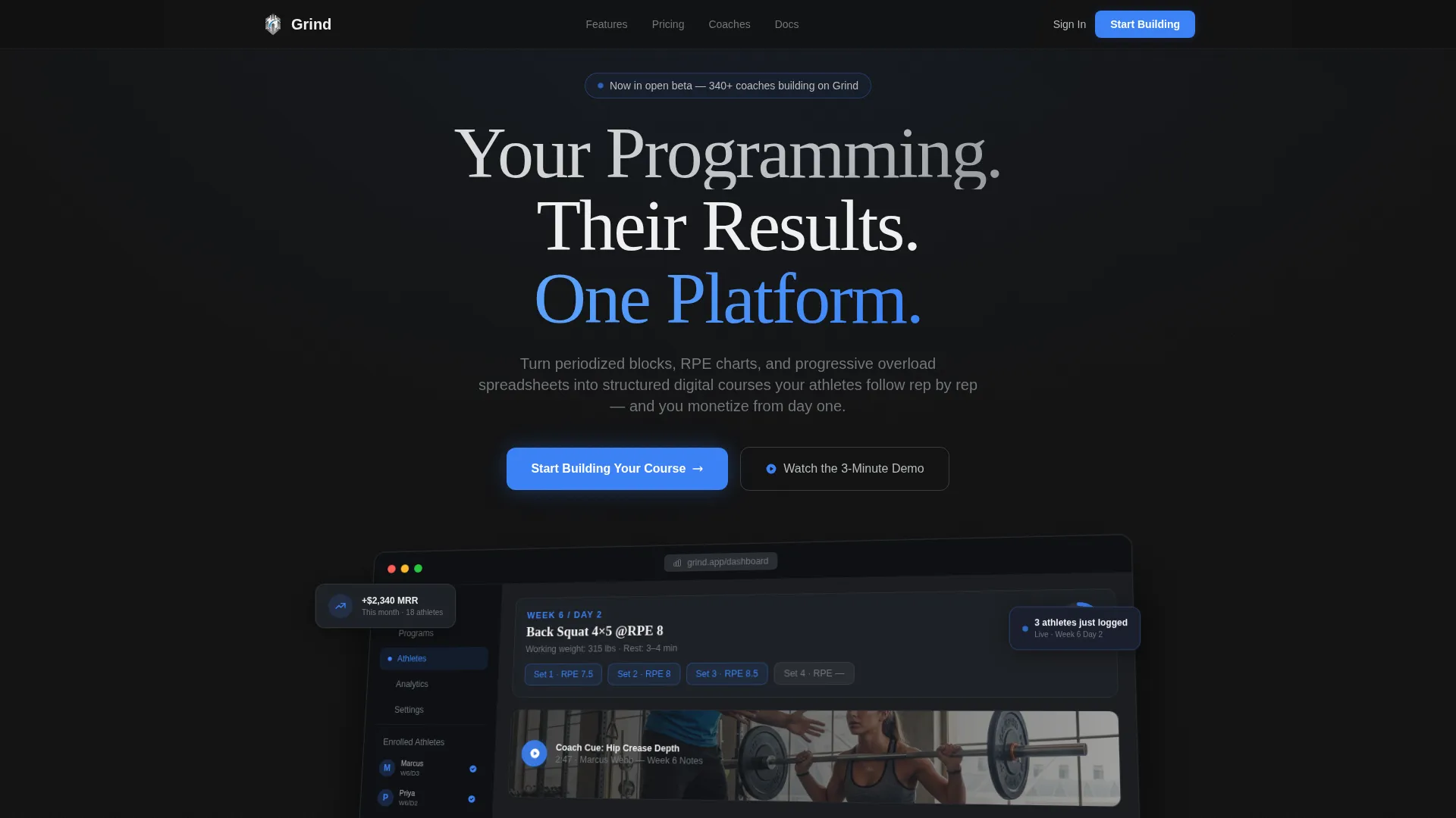
- A full hero section with an isometric dashboard screenshot, floating user interface cards, and a dual call-to-action layout
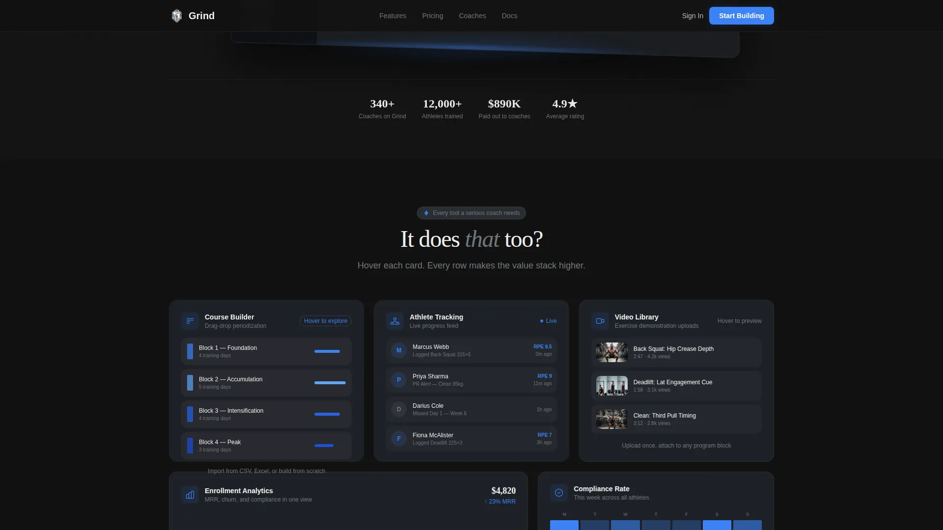
- An interactive modular card grid covering Course Builder, Athlete Tracking, and Video Library features with flip and hover states
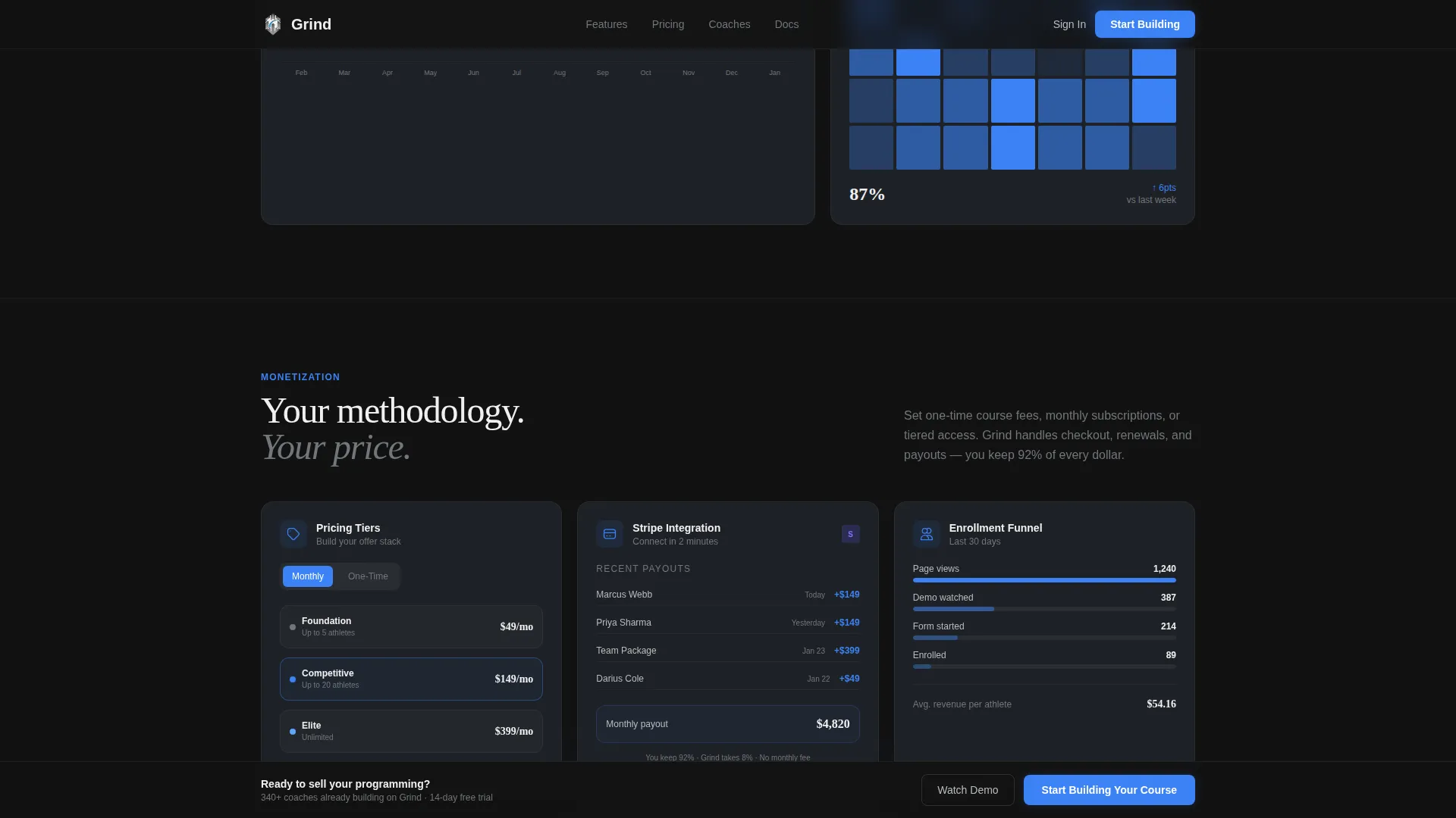
- A monetization row with pricing tier builder, payment integration preview, and monthly recurring revenue analytics cards
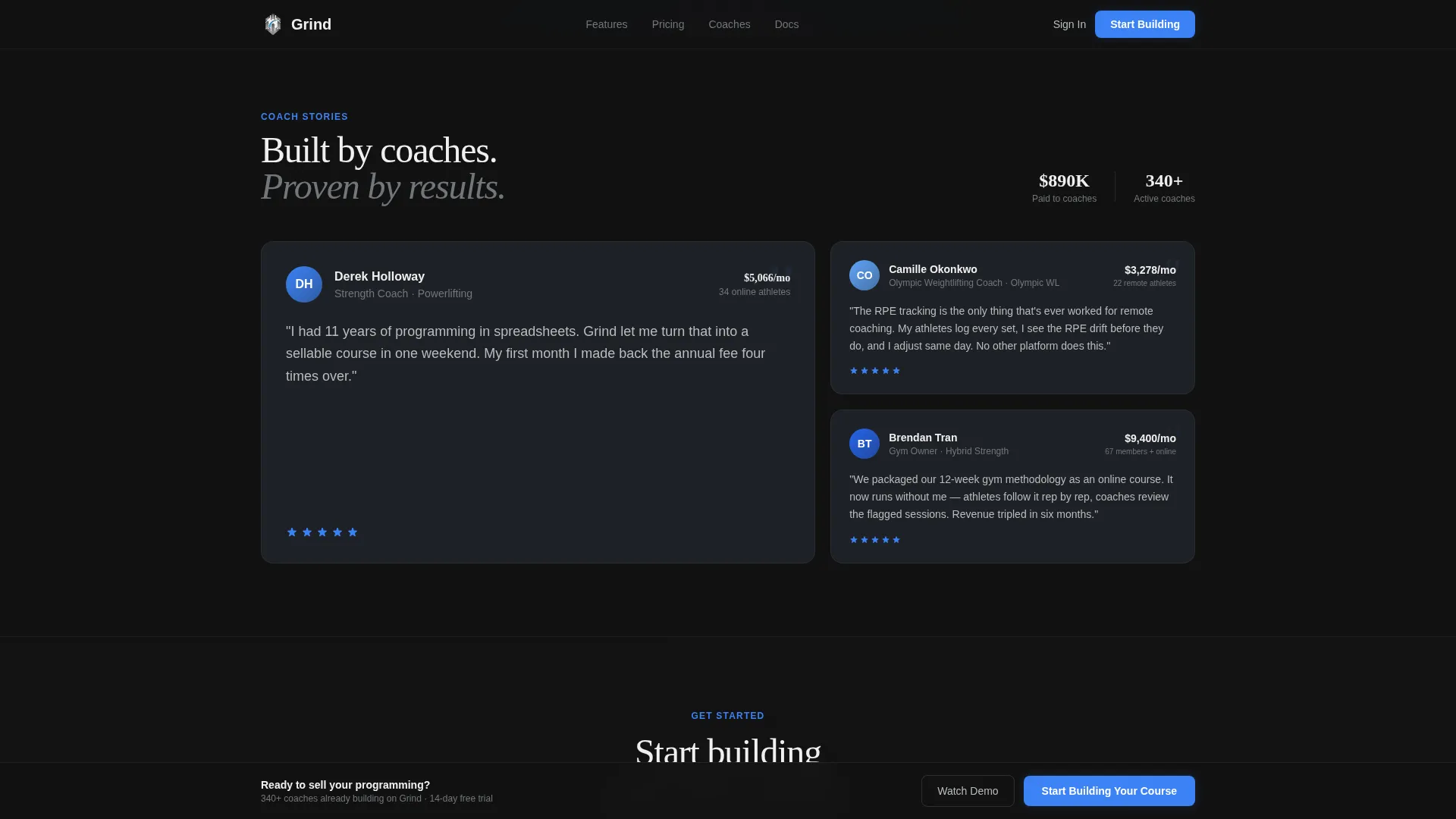
- A social proof section built for coach testimonials with specific metrics, plus a two-step progressive disclosure lead generation form
Feature list
This template covers six distinct capability zones, each built around what a strength coach actually needs to present and sell digital programming.
Isometric Hero with Dashboard Screenshot
The hero renders a high-fidelity platform dashboard mid-session, tilted on a subtle isometric angle with a soft shadow lifting it off the dark background. The featured workout card reads "Week 6 / Day 2, Back Squat 4x5 @RPE 8" with a progress ring at 73%, grounding the visual in real coaching language immediately.
Interactive Modular Card Grid
Cards in the feature grid flip, expand, or hover to reveal deeper functionality. The first row covers Course Builder with drag-and-drop block periodization, Athlete Tracking with a live progress feed mockup, and Video Library with a looping exercise demonstration preview. Interactivity drives discovery without requiring any scrolling explanation.
Monetization Feature Row
The second card row shifts focus to revenue. Visitors see a pricing tier builder, a payment processing integration preview, and an enrollment analytics panel showing monthly recurring revenue graphs. The layout positions monetization as a core product feature, not a footnote.
Two-Step Lead Generation Form
The form uses progressive disclosure across two steps. Step one asks for coaching specialty and current client count. Step two captures name, email, and a one-sentence description of the coach's programming style. This structure qualifies leads before they submit rather than after.
Sticky Call-to-Action Bar
A sticky bottom bar appears after the visitor has scrolled past forty percent of the page. It keeps the primary call to action visible without interrupting the reading flow earlier in the session.
Social Proof Section
The testimonials section is built for specificity. Coach names, training specialties, client count milestones, and monthly recurring revenue figures give each testimonial concrete weight that a generic quote cannot match.
Page sections overview
| Section | Purpose |
|---|---|
| Hero Header | Dashboard screenshot, headline, dual call to action |
| Interactive Feature Grid | Card-flip tour of Course Builder, Athlete Tracking, Video Library |
| Monetization Row | Pricing builder, payment preview, revenue analytics |
| Social Proof | Metric-backed coach testimonials |
| Lead Generation Form | Two-step qualifying form for serious prospects |
| Footer | Single-row linear layout with navigation and legal links |
Design & branding system
The visual identity is built around the Dashboard Pro theme using a Monochrome Steel color system. Every color decision reflects the interior of a serious training facility at 5 AM.
- The palette runs from forged black (#121212) as the primary background through brushed gunmetal (#2A2D32) on card surfaces, plate-iron gray (#71767B) for secondary text and dividers, and chalk-dust white (#F0F0F0) for headlines and primary copy
- Electric blue (#3B82F6) appears only on interactive states and calls to action, so every blue element signals that the visitor can do something there
- Typography pairs Fraunces for display headlines with DM Sans for body copy and user interface elements, keeping editorial weight in the headlines and clean readability in the details
Mobile & speed optimization
The template is designed desktop-first to match how coaches build and review courses, and it scales down responsively to handle mobile visitors without breaking the grid layout.
- Card grid rearranges into a single-column stack on smaller screens, preserving interaction logic while fitting narrower viewports
- Animations use CSS transforms only, and scroll-linked reveals rely on Intersection Observer so the page does not load heavy scripting on elements not yet in view
- The sticky call-to-action bar adapts to mobile bottom chrome so the primary action remains accessible without obscuring content
How this template helps you convert
Every structural decision in this template is aimed at moving a qualified visitor toward the lead form while filtering out low-intent traffic before it reaches the submission step.
- The dual call-to-action layout in the hero gives visitors two paths: a primary "Start Building Your Course" button for those ready to act, and a ghost-outlined "Watch the 3-Minute Demo" button that captures email before the video plays, so even hesitant visitors enter the funnel
- The interactive card grid builds capability awareness row by row, so each new feature card answers the question "what else does it do?" before a visitor can talk themselves out of continuing
- The two-step form filters lead quality at the point of capture by asking about coaching specialty and client count before requesting contact details, so the leads that arrive carry real context about the prospect's business stage
Other information about this template
This template belongs to the Technology category under the Fitness Digital Presence subcategory, targeting the Fitness Course and Training Platform niche. It is built specifically for B2B Software as a Service (SaaS) contexts in the fitness and creator economy space.
- The page is localized for English-language audiences using United States dollar pricing and United States date formatting
- Animation intensity is set to high, covering card flips, isometric tilt hover states, scroll-linked sticky bar activation, and staggered grid reveals on scroll entry
- The template style is Card Grid (Modular) under the Dashboard Pro theme with the Interactive Explorer creative direction, making it well-suited for platforms that need to demonstrate product depth without a live demo environment
Theme
Dashboard Pro
Creative direction
Interactive Explorer
Color system
Monochrome Steel
Style
Card Grid (Modular)
Direction
Lead Generation
Page Sections
Isometric Hero Dashboard Screenshot
Interactive Modular Card Grid
Monetization Row with Revenue Analytics
Two-step Progressive Disclosure Form
Sticky Call-to-action Bottom Bar
Metric-backed Social Proof Section
Related questions
Who is this landing page template built for?
Does this template include the actual course platform or just the landing page?
How does the two-step lead form qualify visitors?
Can the modular card grid be adapted to different features?
What is the secondary conversion path for visitors not ready to sign up?



