Early Learning Landing Page Template
Sprout is a hub-and-spoke landing page template built for daycares and preschools that want a polished, trust-first online presence. It leads with an animated parent dashboard preview, rolls into stat counters and anchor-linked spoke sections, and closes with a dual app-download call to action. The result feels like a confident facility tour, not a brochure.
by Rocket studio
Quick summary
Sprout is a single-page, anchor-navigated landing page template designed for neighborhood daycares and preschool programs. It opens with a glowing dashboard mockup, builds trust through stat counters and spoke sections on safety, learning, meals, and reviews, then drives parents toward an app download. Every section earns confidence before asking for a single tap.
Who this template is for
This template speaks directly to three distinct audiences at once. Center directors get a design that finally matches the warmth their program already delivers. Parents get the reassurance they are actively searching for. And relocating families get a clear, scannable snapshot of what a center offers before ever stepping inside.
- Preschool and daycare center directors who want a credible, modern online presence
- Young parents evaluating child care options late at night on a mobile device
- Relocating families searching for licensed nearby programs quickly
What problem this template solves
Most preschool and daycare websites look outdated, feel generic, or bury the details parents actually need. Families land on a page, find nothing immediately reassuring, and move on to the next result. Sprout fixes that by leading with real-seeming data, hard numbers, and specific proof points before a parent even has to scroll far.
- No trust signals above the fold, leaving parents with unanswered safety questions
- Scattered content that forces parents to hunt for curriculum, meals, and review information
- No clear next action, so interested families leave without converting
What you get with this template
Sprout delivers a complete, ready-to-customize landing page structured as a hub-and-spoke layout with smooth anchor navigation. Every section is purpose-built around a parent concern, and the visual system is consistent from top to bottom.
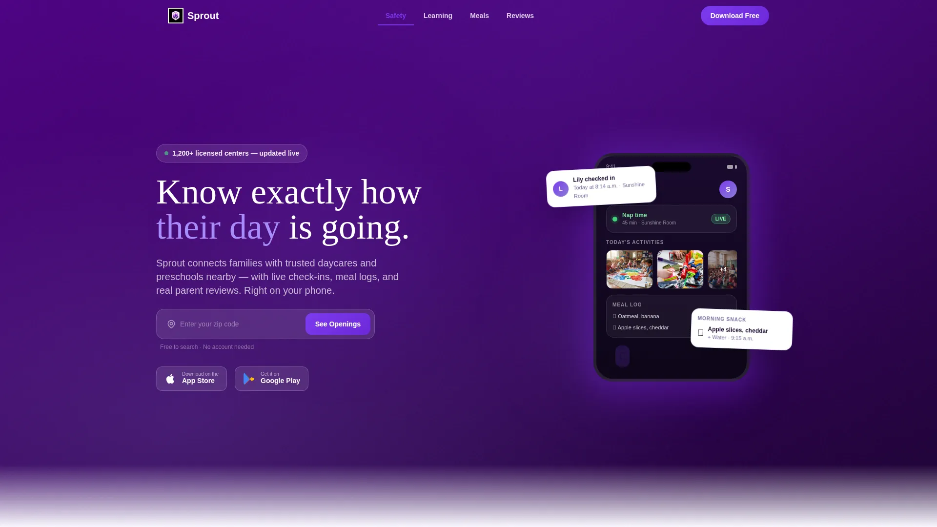
- A floating dashboard preview header with animated check-in details, a photo carousel, a meal log, and a nap-time badge
- Four trust-building spoke sections covering safety, learning, meals, and parent reviews
- Animated stat counters, a zip-code input field, app-download badge pairings, and a desktop-friendly "Text Me the Link" option
Feature list
This section highlights the core built-in components that make Sprout work as a conversion-focused preschool and daycare landing page.
Animated Dashboard Header
The header opens with a floating, slightly angled mockup of a parent-facing app dashboard. It shows a child check-in timestamp, a photo carousel from the day's art project, a meal log entry, and a pulsing green nap-time badge. The whole screen glows against a deep indigo background, immediately communicating that this product is alive and active.
Stat Counter Section
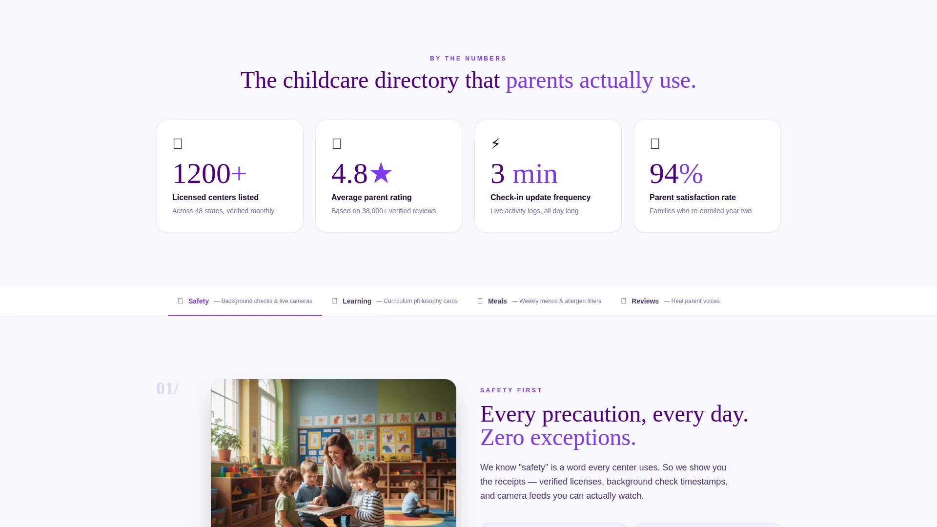
Right below the header, large animated counters tick upward as they enter the viewport. Numbers like licensed centers listed, average parent rating, and check-in update frequency are rendered at display size. This section stops the scroll and builds instant credibility before a parent reads a single paragraph.
Hub-and-Spoke Anchor Navigation
The page uses a sticky anchor navigation system that links directly to each spoke section: Safety, Learning, Meals, and Reviews. Parents can jump to the concern that matters most right now, then return to the hub. This mirrors the experience of walking through a facility room by room.
Trust-Building Spoke Sections
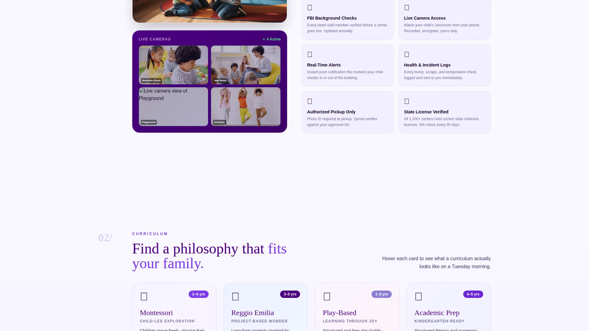
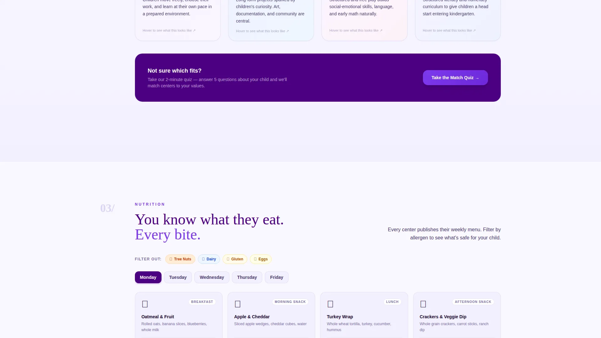
Each spoke section targets a specific parent worry. Safety covers background checks and live cameras. Learning features curriculum philosophy cards that flip to reveal details. Meals shows a sample weekly menu with allergen filter labels. Reviews presents real parent quotes alongside star-rating breakdowns.
Dual App Download Call to Action
The primary call to action reads "Download and Find Your Center" with paired App Store and Google Play badges displayed side by side. Below that sits a zip-code input field for finding nearby openings. A secondary option lets desktop users enter a phone number to receive a download link by text.
Electric Indigo Visual System
The entire page uses a four-color palette built around Electric Indigo. Deep digital indigo anchors the header and navigation. Soft periwinkle frames section backgrounds and card borders. Warm cloud white fills content panels. Electric violet highlights buttons, badges, and interactive elements throughout.
Page sections overview
| Section | Purpose |
|---|---|
| Dashboard Preview Header | Opens with animated app mockup to show real-time check-in data and build immediate trust |
| Anchor Navigation Hub | Lets parents jump directly to the spoke section most relevant to their concern |
| Stats Impact Row | Displays animated counters for licensed centers, star rating, and check-in update frequency |
| Safety Spoke Section | Covers background checks and live camera details to answer top parent safety questions |
| Learning Spoke Section | Features flippable curriculum philosophy cards to communicate the program's teaching approach |
| Meals Spoke Section | Shows a sample weekly menu with allergen filter labels to reassure parents about nutrition |
| Reviews Spoke Section | Presents real parent quotes and star-rating breakdowns to provide social proof |
| App Download call to action | Drives toward app install with paired store badges, zip-code field, and text-link option |
Design & branding system
The Electric Indigo color system gives Sprout the visual energy of a brand-new box of washable markers. It is saturated enough to catch a tired parent's eye on a dim screen, yet soft enough to communicate safety and care. Every color choice has a clear role in the layout.
- Deep digital indigo (#4B0082) anchors the primary navigation and the header background
- Soft periwinkle (#8A7FD4) frames section backgrounds and card borders; warm cloud white (#FAF8FF) fills content panels
- Electric violet (#7C3AED) powers all buttons, badges, and interactive highlights across the page
Mobile & speed optimization
This template is built with a mobile-first audience in mind. The primary user is a parent browsing at night on a phone, so every design decision prioritizes small-screen clarity. The dashboard preview, stat counters, and call to action all render cleanly at mobile viewport sizes.
- The hub-and-spoke anchor navigation collapses gracefully for touch-based scrolling on phones and tablets
- The zip-code input field and app-download badges are sized and spaced for comfortable thumb interaction
- The "Text Me the Link" secondary call to action specifically serves parents who discover the page on desktop and want to switch to mobile
How this template helps you convert
Sprout is structured so that trust accumulates before any ask is made. By the time a parent reaches the download button, the page has already answered their biggest concerns through data, social proof, and visible program detail.
- The animated dashboard mockup in the header shows the product in real use, so parents picture their own child's check-in notification before reading a single feature description.
- The stat counters deliver hard numbers immediately, replacing vague promises with specific, scannable proof that builds confidence in seconds.
- The spoke sections guide parents through safety, learning, meals, and reviews in a logical sequence that mirrors a real facility tour, so the download call to action feels like a natural next step rather than an interruption.
Other information about this template
Sprout fits naturally into the broader daycare and preschool website templates category. It is particularly relevant for technology-focused directory and discovery platforms that connect parents with licensed child care centers. The template style is Hub and Spoke with anchor navigation, and the landing-page direction is oriented toward app downloads. The creative direction is Stats-First Impact, meaning conversion relies on visible numbers and proof before any soft persuasion.
- Template style: Hub and Spoke with anchor navigation, suited to single-page directory and discovery experiences
- Category fit: Technology, with a subcategory focus on daycare and preschool homepage templates
- The Dashboard Preview header concept and Stats-First Impact creative direction are both matched intersection context fields baked into this template's layout logic
Theme
Directory & Discovery
Creative direction
Stats-First Impact
Color system
Electric Indigo
Style
Hub & Spoke (Anchor Nav)
Direction
App Download
Page Sections
Animated Parent Dashboard Header
Viewport-triggered Stat Counters
Hub-and-spoke Anchor Navigation
Four Trust-building Spoke Sections
Dual App Download Call to Action
Related questions
Can I customize the color palette in this template?
Is this template suited for a single preschool or a multi-center directory?
What is the hub-and-spoke layout and why does it matter here?
Does the template include the app download call to action and zip-code input?
Who is this template best suited for?



