Guard — SIEM Monitoring Landing Page Template
Sentinel is a single-page SIEM (Security Information and Event Management) platform landing page template built for cybersecurity teams. It uses a split-screen layout, Dynamic Motion animations, and a Carbon Fiber color system to showcase log ingestion, threat correlation, and automated response. The page is designed to convert SOC analysts, CISOs, and DevSecOps engineers with a freemium trial flow.
by Rocket studio
Quick summary
Sentinel is a high-impact, single-page landing page template designed for a SIEM platform. It combines a 50/50 split-screen layout with scroll-triggered motion animations and a Carbon Fiber visual identity. The template guides security professionals from raw log chaos to a clean, correlated alert, and drives trial signups with a friction-free freemium conversion flow.
Who this template is for
This template is built for cybersecurity product teams that need to communicate technical depth without losing non-technical stakeholders. It speaks directly to three distinct buyer types within the security space.
- SOC analysts who need to see fast, noise-free alert triage reflected in the product demo.
- CISOs who present security risk posture to boards and need a polished, credible first impression.
- DevSecOps engineers looking to understand how detection-as-code fits into continuous integration and delivery pipelines.
What problem this template solves
Security platforms often struggle to explain their value quickly. The typical landing page either overwhelms visitors with jargon or undersells the intelligence behind the product. This template solves the gap between raw technical complexity and clear, convincing communication.
- Visitors drown in feature lists before they understand the core value of faster threat detection.
- The split-screen format immediately contrasts broken, manual workflows with clean, automated outcomes.
- A passive viewer becomes an active prospect by seeing their exact pain point reflected on screen before the call to action appears.
What you get with this template
You get a fully structured, single-page layout ready to represent a SIEM platform at a professional level. Every section is purposefully sequenced to earn trust before asking for a signup.
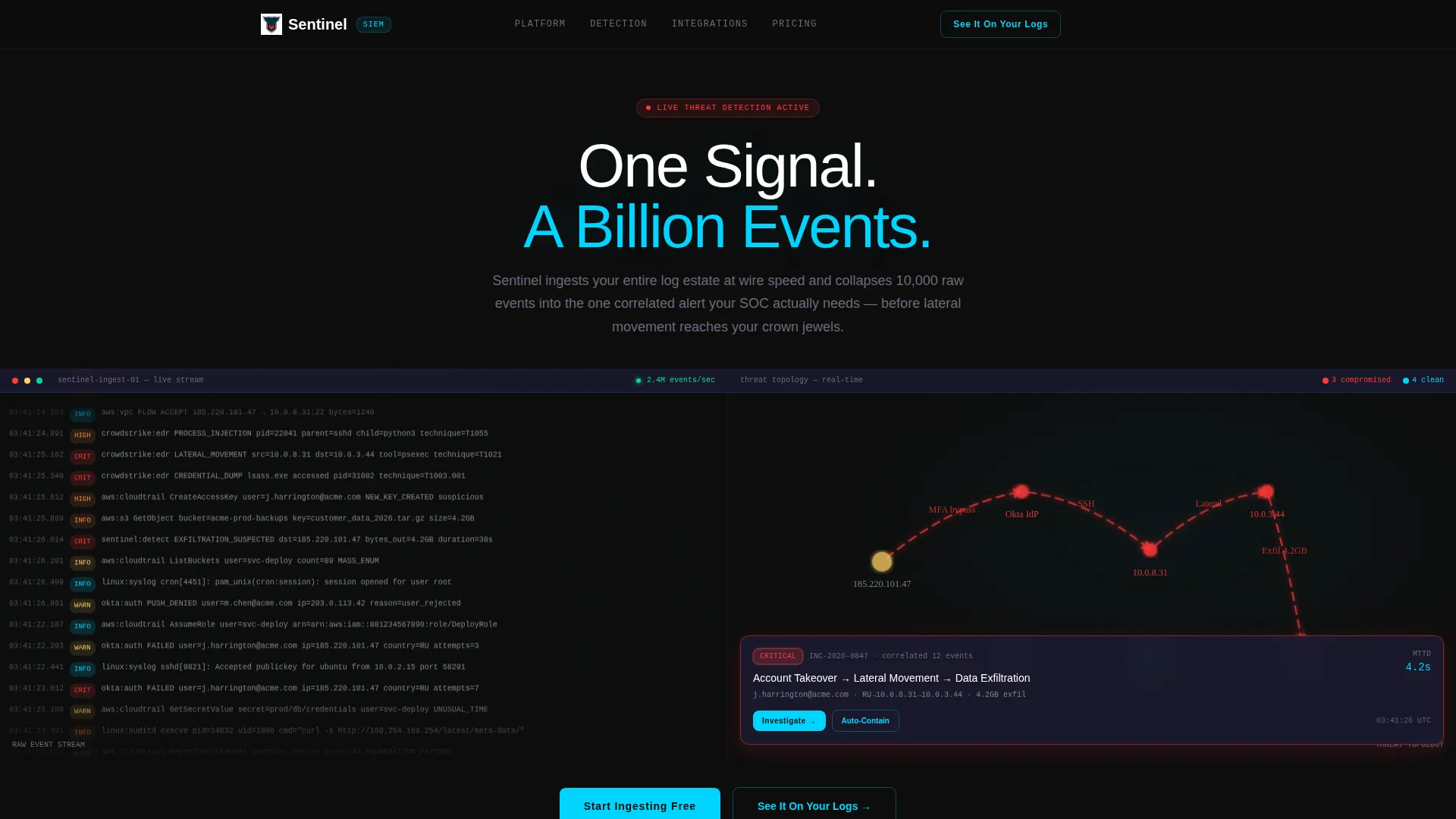
- A live-style dashboard header with an animated event stream, threat topology map, and a correlated alert card that demonstrates the product in motion.
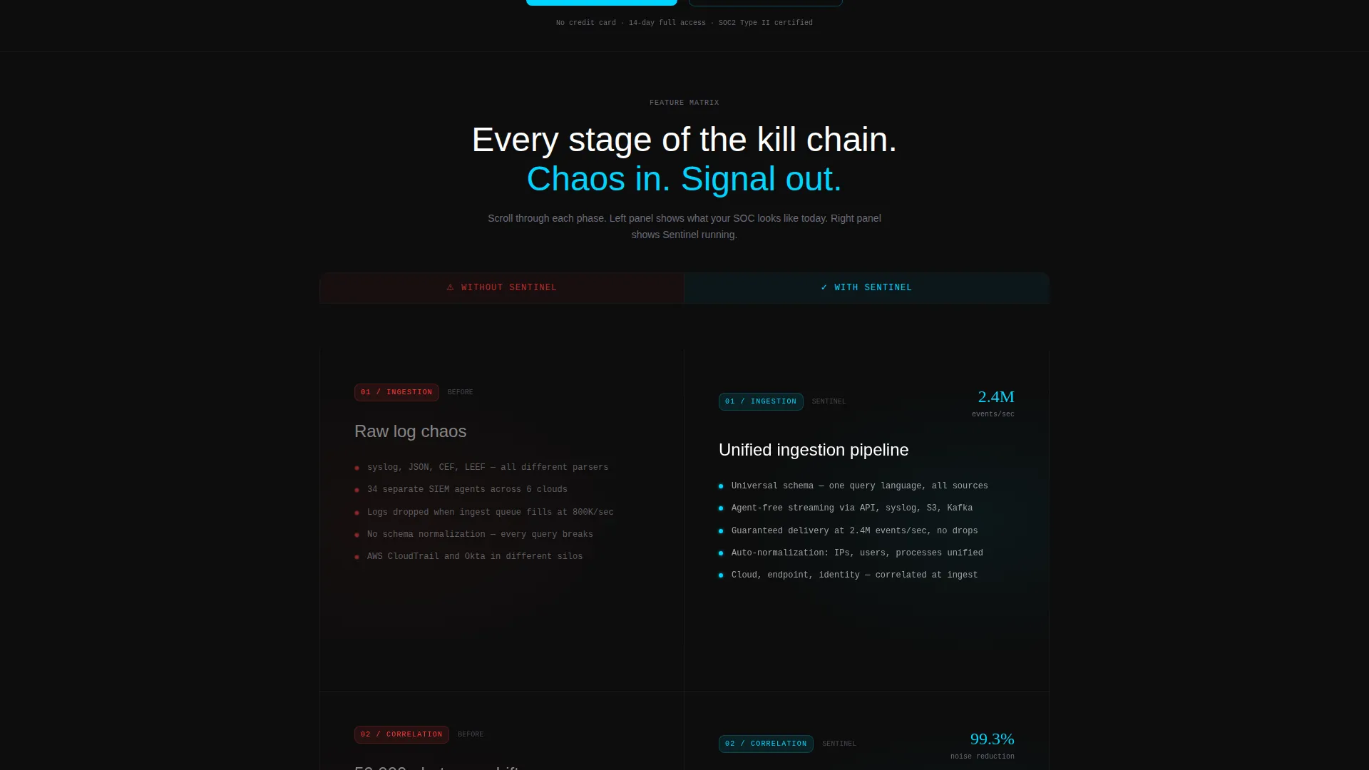
- A scrolling Feature Matrix with four capability stages: ingestion, correlation, investigation, and response, each using left-versus-right animation to contrast chaos with clarity.
- A pinned navigation bar with a primary "Start Ingesting Free" call to action and a secondary "See It On Your Logs" form with no credit card field required.
Feature list
This template delivers a focused set of built-in components and design behaviors that reflect the product's core promise.
Live Dashboard Header
The header splits 50/50 between an animated log stream on the left and a pulsing threat topology map on the right. Log lines cascade in monospaced type with source IPs, timestamps, and color-coded severity tags. After two seconds, a correlated alert card slides into frame, collapsing twelve raw events into one actionable incident.
Scroll-Triggered Feature Matrix
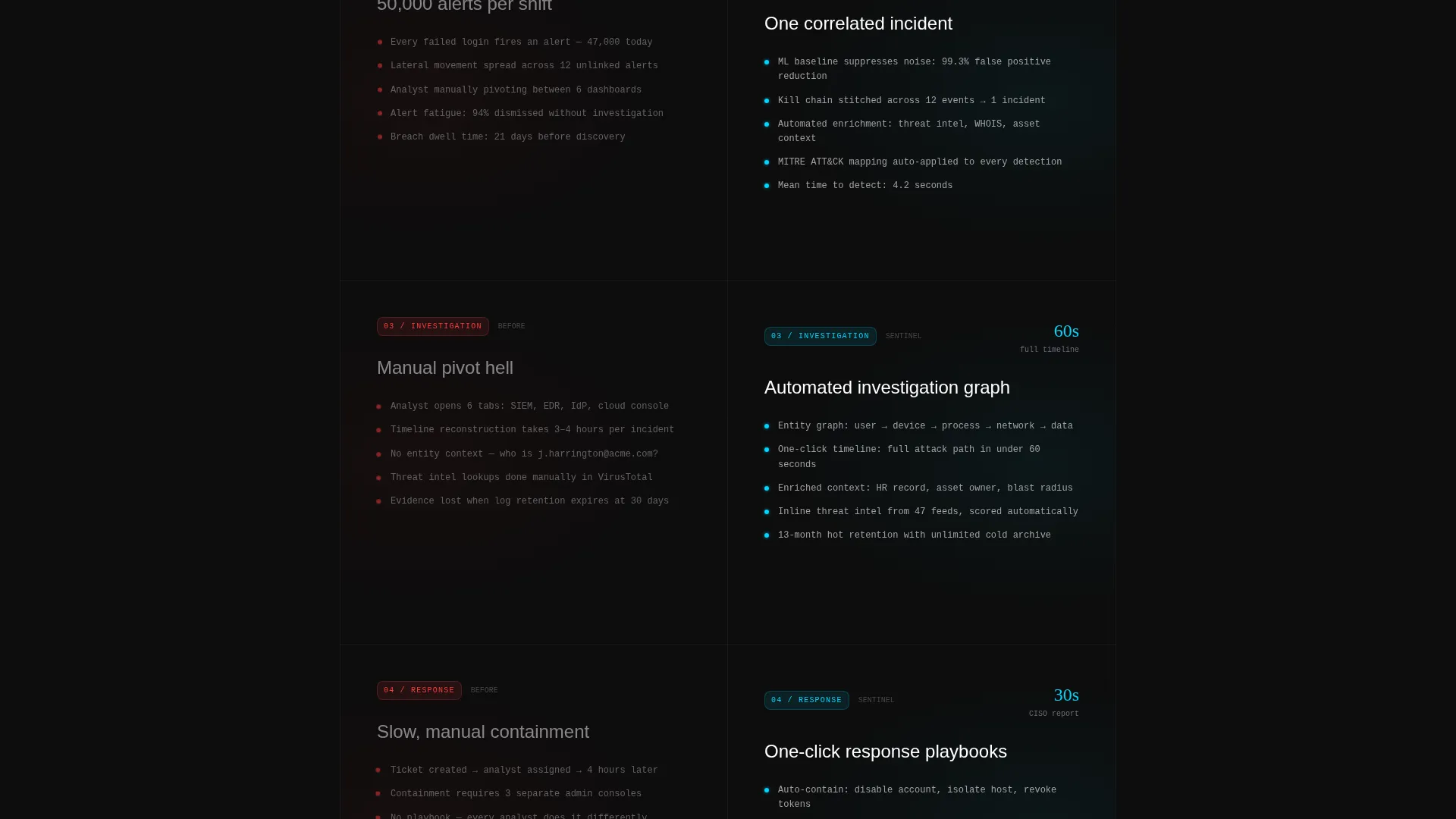
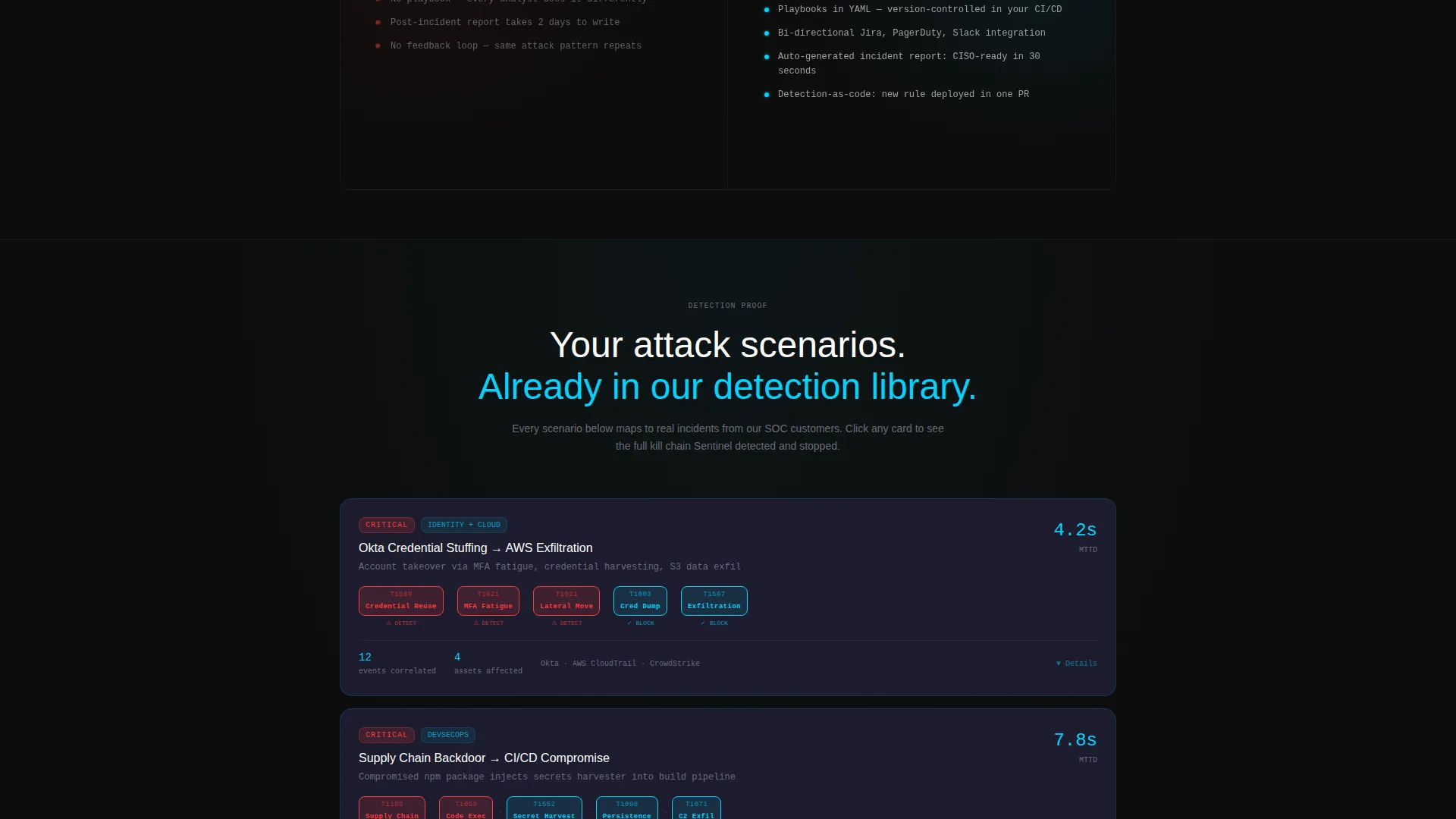
Four capability sections animate as the visitor scrolls. The left panel shows unprocessed log chaos, fragmented alerts, and manual triage queues. The right panel assembles those same elements into correlated timelines, enriched context, and one-click response playbooks. Motion escalates naturally from ingestion through to response.
Pinned Navigation with Dual call to action
After the first scroll, the navigation bar pins to the top with the primary call to action always in view. "Start Ingesting Free" drives direct trial entry. "See It On Your Logs" opens a lightweight lead form asking for work email, estimated daily log volume, and primary log sources, with no credit card required.
Freemium Lead Capture Form
The secondary call to action opens a minimal form. Visitors select their daily log volume from a dropdown (under 1 GB, 1 to 10 GB, 10 to 100 GB, or 100 GB and above) and check their primary log sources: cloud, endpoint, network, or identity. The form is designed to qualify leads without creating friction.
Carbon Fiber Color System
The visual identity uses deep carbon black and woven graphite for all backgrounds. Cold telemetry blue handles data streams and interactive hover states. Threat-red appears exclusively on alert indicators. Silver-gray renders all body text. Every color has a defined role, keeping the interface readable under high information density.
Dynamic Motion Theme
Interactive elements pulse with telemetry blue on hover, as if the interface is actively processing. Scroll animations on the Feature Matrix use entropy on the left and mechanical assembly on the right. The motion design is purposeful: it demonstrates the platform's logic through the page's own behavior.
Page sections overview
| Section | Purpose |
|---|---|
| Split Screen Header | Show live log stream and threat topology map side by side |
| Correlated Alert Card | Demonstrate event correlation collapsing raw logs into one incident |
| Ingestion Stage Panel | Contrast raw unstructured log chaos with organized ingestion output |
| Correlation Stage Panel | Show fragmented alerts resolving into a unified correlated timeline |
| Investigation Stage Panel | Display manual triage queues transforming into enriched incident context |
| Response Stage Panel | Present one-click response playbooks replacing slow manual remediation |
| Pinned Nav Bar | Keep primary call to action visible after the first scroll |
| Trial Signup Form | Capture work email, log volume, and log source with no credit card |
Design & branding system
The Carbon Fiber color system gives this template a distinctive, high-credibility visual identity suited to enterprise cybersecurity audiences. Every design decision reinforces focus: light draws attention to data, and everything else recedes.
- Background colors stay within deep carbon black (#0D0D0D) and woven graphite (#1A1A2E), keeping the interface visually immersive.
- Cold telemetry blue (#00D4FF) marks all active states, data streams, and hover interactions, while threat-red (#FF3B3B) is reserved strictly for alert indicators.
- Body text renders in silver-gray (#C4C4CC) for high contrast without harshness, and monospaced typography is used in the live log stream for technical authenticity.
Mobile & speed optimization
The template is structured with a responsive layout in mind, ensuring that the split-screen design adapts cleanly across screen sizes. Motion-heavy sections are designed to remain readable and functional on smaller viewports.
- The 50/50 split panels stack vertically on mobile so both sides of each comparison remain clear and legible.
- Scroll-triggered animations are scoped to each section, so the page feels responsive without loading all motion assets at once.
How this template helps you convert
The page is built around the principle that visitors must see their own problem before they trust a solution. Every section earns the next click rather than demanding it.
- The dashboard header delivers a working product demo in the first viewport, letting visitors experience the core value of threat correlation before reading a single feature bullet.
- The Feature Matrix scrolls visitors through their own workflow, showing chaos on the left and resolution on the right, so the call to action arrives after the emotional case is already made.
- The pinned "Start Ingesting Free" button and the low-friction lead form with no credit card field remove the two biggest conversion blockers: commitment anxiety and time cost.
Other information about this template
This template is built on the intersection of Dynamic Motion theming, Feature Matrix creative direction, a Dashboard Preview header concept, and a Freemium/Trial landing page direction. It sits within the Technology category under the Cybersecurity subcategory, targeting the SIEM platform niche.
- The template style is Split Screen (50/50), designed to create visual contrast as a primary storytelling mechanism.
- The page is a single-page landing page structure, not a multi-page website, so all content and conversion flow lives within one continuous scroll.
- The design system, motion behavior, and copy structure were purpose-built for this specific intersection match, making the template immediately usable without heavy customization for SIEM-focused go-to-market teams.
Theme
Dynamic Motion
Creative direction
Feature Matrix
Color system
Carbon Fiber
Style
Split Screen (50/50)
Direction
Freemium/Trial
Page Sections
Live Dashboard Header with Alert Card
Scroll-triggered Feature Matrix
Pinned Navigation with Dual Call to Action
Freemium Lead Capture Form
Carbon Fiber Color System
Dynamic Motion Theme
Related questions
Who is this landing page template built for?
What does the split-screen layout show?
Does the lead form require a credit card?
Can I customize the color system for my brand?
Is this a single-page template or a multi-page website?



