Agriculture Software Privacy Policy Website Template
Comply is an agriculture compliance management landing page template built around a visceral comparison table and a three-tab feature switcher. It targets farm operators, organic producers, and co-op compliance officers who need to trade binder-and-spreadsheet chaos for a clean, inspection-ready dashboard. The design channels high-contrast Carbon Fiber colors and launch-sequence energy to make switching feel urgent and obvious.
by Rocket studio
Quick summary
Comply is a single-page, comparison-table landing page template for an agriculture compliance management platform. It uses a Feature Tab Switcher header, a stark "Without versus. With" contrast table, and case-study cards to move farm operators and compliance officers toward one clear action: starting their free audit prep.
Who this template is for
This template is built for teams selling compliance software into the agricultural sector. It speaks directly to the people who feel the weight of audit season most.
- Mid-size row-crop operators managing requirements across multiple state agencies
- Organic dairy farms preparing for annual National Organic Program audits
- Compliance officers at agricultural co-ops who spend significant time chasing grower signatures
What problem this template solves
Farm compliance teams drown in paperwork. Pesticide logs live in one spreadsheet, water-use reports in another, and certification documents in a filing cabinet no one can find on inspection day. This template makes the cost of that chaos impossible to ignore.
- Manual tracking and missed deadlines shown side-by-side against automated alerts
- Audit panic replaced by a visual, checklist-driven preparation flow
- Scattered documents replaced by a searchable vault with tagged, inspection-ready files
What you get with this template
You get a complete, section-led landing page that guides visitors from problem awareness to a signup click. Every section is purposeful and conversion-focused.
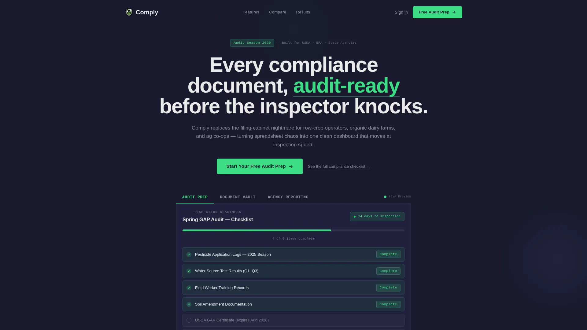
- A three-tab Feature Tab Switcher header with live screenshot swaps for Audit Prep, Document Vault, and Agency Reporting views
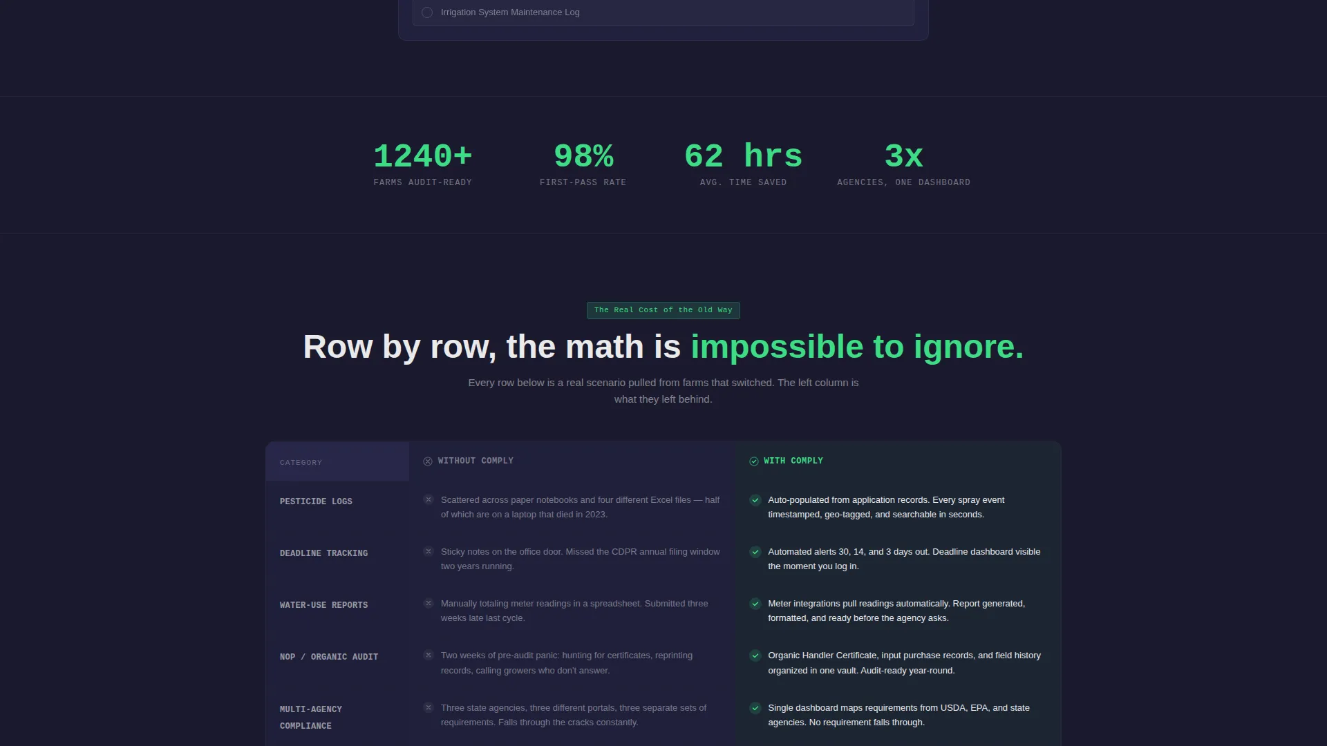
- A high-contrast comparison table with muted graphite "Without Comply" rows and green-checkmark "With Comply" rows
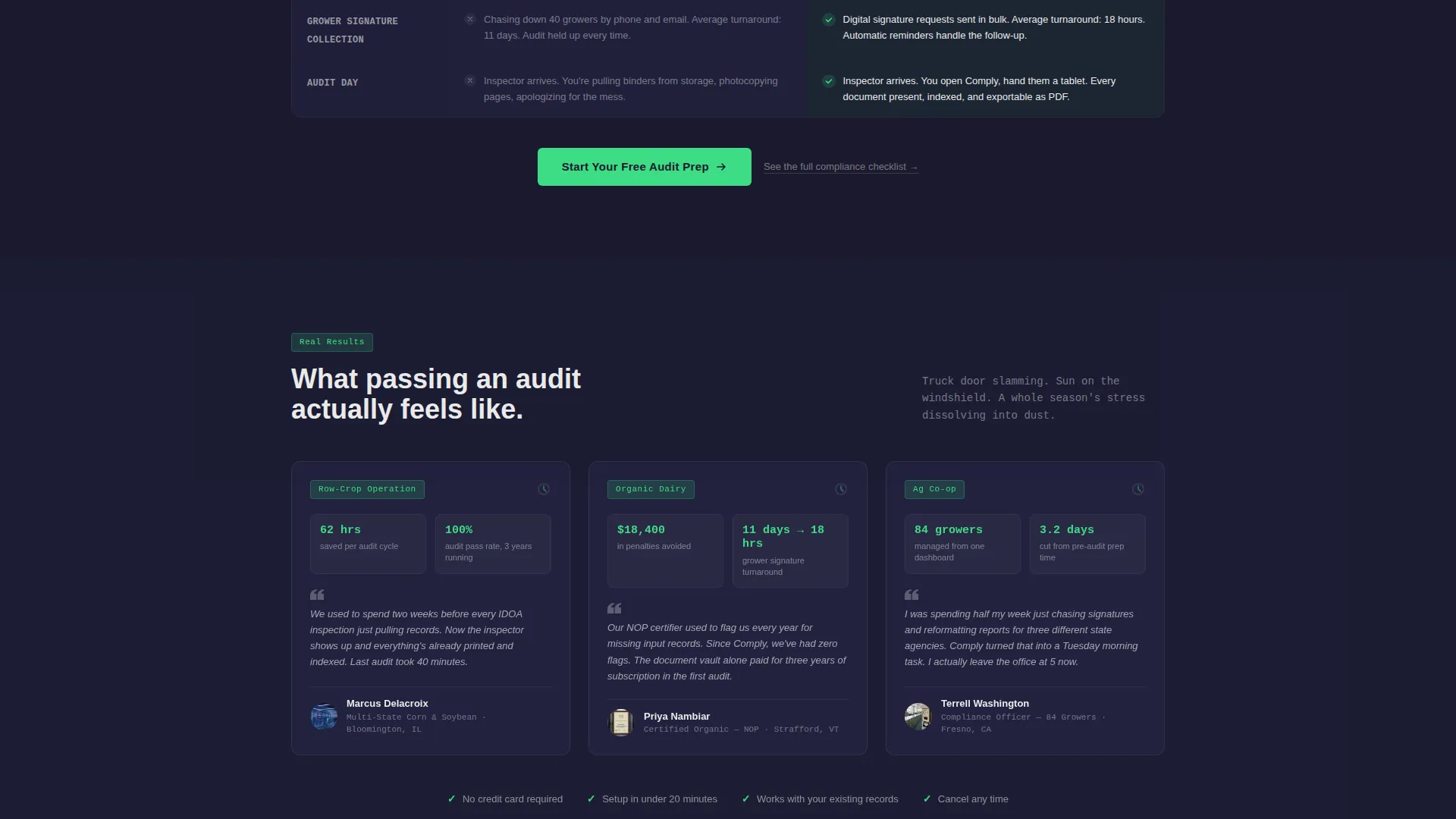
- Three animated case-study cards showing real compliance outcomes, plus dual placement of the primary call-to-action button
Feature list
This template delivers a focused set of interactive and visual components drawn directly from the brief.
Three-Tab Feature Switcher
Three clickable tabs sit above a product screenshot area. Each tab, labeled "Audit Prep," "Document Vault," and "Agency Reporting," swaps the screenshot instantly with zero loading delay. The Audit Prep view shows a checklist with green completion badges and an inspection countdown. Document Vault reveals a tagged file grid. Agency Reporting displays a generated PDF preview addressed to a state agency.
High-Contrast Comparison Table
The core conversion section places "Without Comply" and "With Comply" in adjacent columns. Graphite-toned rows on the left list manual tracking, missed deadlines, and audit panic. Carbon-black rows on the right light up with field-green checkmarks for auto-populated forms, deadline alerts, and one-click submission. The contrast is designed to be visceral, not decorative.
Animated Case-Study Cards
Three short cards stack below the comparison table. Each card surfaces a concrete outcome, such as hours saved, audit pass rates, or penalty dollars avoided. The cards animate in sequence, reinforcing a launch-countdown feeling that builds trust before the call to action fires.
Pinned and Repeated Call-to-Action
The primary call-to-action button, labeled "Start Your Free Audit Prep," appears pinned at the base of the comparison table and repeats after the case-study cards. This dual placement catches visitors at both peak-interest moments without adding form friction to the landing page itself.
Flyout Engagement Drawer
A secondary text link, "See the full compliance checklist," triggers a flyout panel. The flyout deepens visitor engagement and extends time on page without routing users away from the primary conversion flow.
Click-Through Funnel Structure
The entire page is architected as a click-through funnel. No sign-up form lives on the landing page. Both call-to-action placements route visitors to a dedicated signup page, keeping the landing page clean and the path to conversion frictionless.
Page sections overview
| Section | Purpose |
|---|---|
| Feature Tab Switcher | Demonstrate platform views interactively |
| Comparison Table | Show the cost of not switching |
| Case Study Cards | Build trust with outcome-based evidence |
| Primary call to action Block | Drive clicks to the signup page |
| Flyout Checklist Drawer | Deepen engagement without page exit |
Design & branding system
The visual identity follows a Carbon Fiber color system paired with a Startup Velocity theme. The palette feels engineered and purposeful, not decorative.
- Deep carbon black (#1A1A2E) anchors all backgrounds; machined graphite (#30305A) structures comparison table rows
- High-vis field green (#3DDC84) activates on call-to-action buttons, toggle states, and checkmarks throughout
- Titanium white (#EAEAEA) keeps body text and table cell data scannable and easy to read at a glance
Mobile & speed optimization
The template is designed so every component reads clearly on smaller screens and responds to touch interaction without friction.
- Tab switcher and comparison table reflow cleanly for narrow viewports
- Instant tab transitions and lightweight card animations keep the experience feeling fast and responsive
- Flyout drawer opens and closes smoothly on mobile without disrupting the page scroll position
How this template helps you convert
Every design decision in this template is aimed at reducing hesitation and accelerating the decision to sign up.
- The comparison table makes the status quo painful. Row by row, it quantifies what manual compliance management costs, making inaction feel more expensive than switching.
- Case-study cards validate the switch with numbers. Concrete figures for hours saved, audit pass rates, and penalties avoided give skeptical buyers the social proof they need before clicking.
- Dual call-to-action placement catches visitors at two peak-intent moments. The button appears right after the comparison argument lands and again after the evidence closes, so no motivated visitor has to scroll back up to act.
Other information about this template
This template is categorized under Technology, specifically within the Agriculture Software subcategory and the Agriculture Compliance Management niche. A few additional details worth knowing before you customize it.
- The template style is a Comparison Table landing page with a Click-Through funnel direction
- Creative direction is Launch Energy, giving every scroll transition a countdown-to-go-live momentum
- The header concept is a Feature Tab Switcher, which can be updated with your own product screenshots and compliance workflow labels
- Color variables for carbon black, graphite, field green, and titanium white are built into the design system for straightforward rebranding
- The flyout checklist drawer is included as an engagement layer and can be populated with your platform's actual compliance checklist content

Theme
Startup Velocity
Creative direction
Launch Energy
Color system
Carbon Fiber
Style
Comparison Table
Direction
Click-Through
Page Sections
Three-tab Feature Switcher Header
Visceral Comparison Table
Animated Case-study Cards
Dual Click-through Call to Action Placement
Flyout Engagement Drawer
Related questions
Who is this landing page template designed for?
Does the landing page include a sign-up form?
What does the Feature Tab Switcher show?
Can I update the comparison table rows with my own content?
What are the case-study cards used for?



