Trusted Nonprofit Operations Landing Page Template
Steward is a modular, card-grid landing page template built for nonprofit property management platforms. It pairs a Dashboard Pro visual system with an Industry Report scroll cadence, turning real operational pain points into product proof. The layout guides operations directors, executive directors, and CFOs from a portfolio overview hero to a progressive lead-capture form, cleanly and confidently.
by Rocket studio
Quick summary
Steward is a single-page, card-grid template designed for mission-driven property management platforms. It opens with a full-width product screenshot and scrolls through modular card clusters that pair industry statistics with platform features. The Electric Indigo color system gives every section a focused, mission-control feel. Two conversion paths capture both demo-ready leads and earlier-stage researchers.
Who this template is for
This template was built for organizations that manage multiple properties under real compliance pressure. It speaks directly to the people carrying that weight every day.
- Operations directors at housing nonprofits juggling HUD (U.S. Department of Housing and Urban Development) reporting cycles and scattered work orders
- Executive directors of land trusts who inherited a portfolio without inheriting the staff to run it
- CFOs at community development corporations who need one clear dashboard instead of fourteen filing cabinets
What problem this template solves
Nonprofit property teams often track leases, maintenance, and compliance deadlines across a patchwork of spreadsheets, binders, and email threads. That fragmentation costs hours and creates real risk around missed deadlines.
- No single place to see every property, work order, and lease expiration at once
- HUD compliance documents that take hours to pull instead of seconds
- Deferred maintenance that compounds quietly because no alert system exists
What you get with this template
You get a complete, ready-to-customize landing page that presents a property management platform with authority and clarity. Every section is designed to build trust and push toward a conversion.
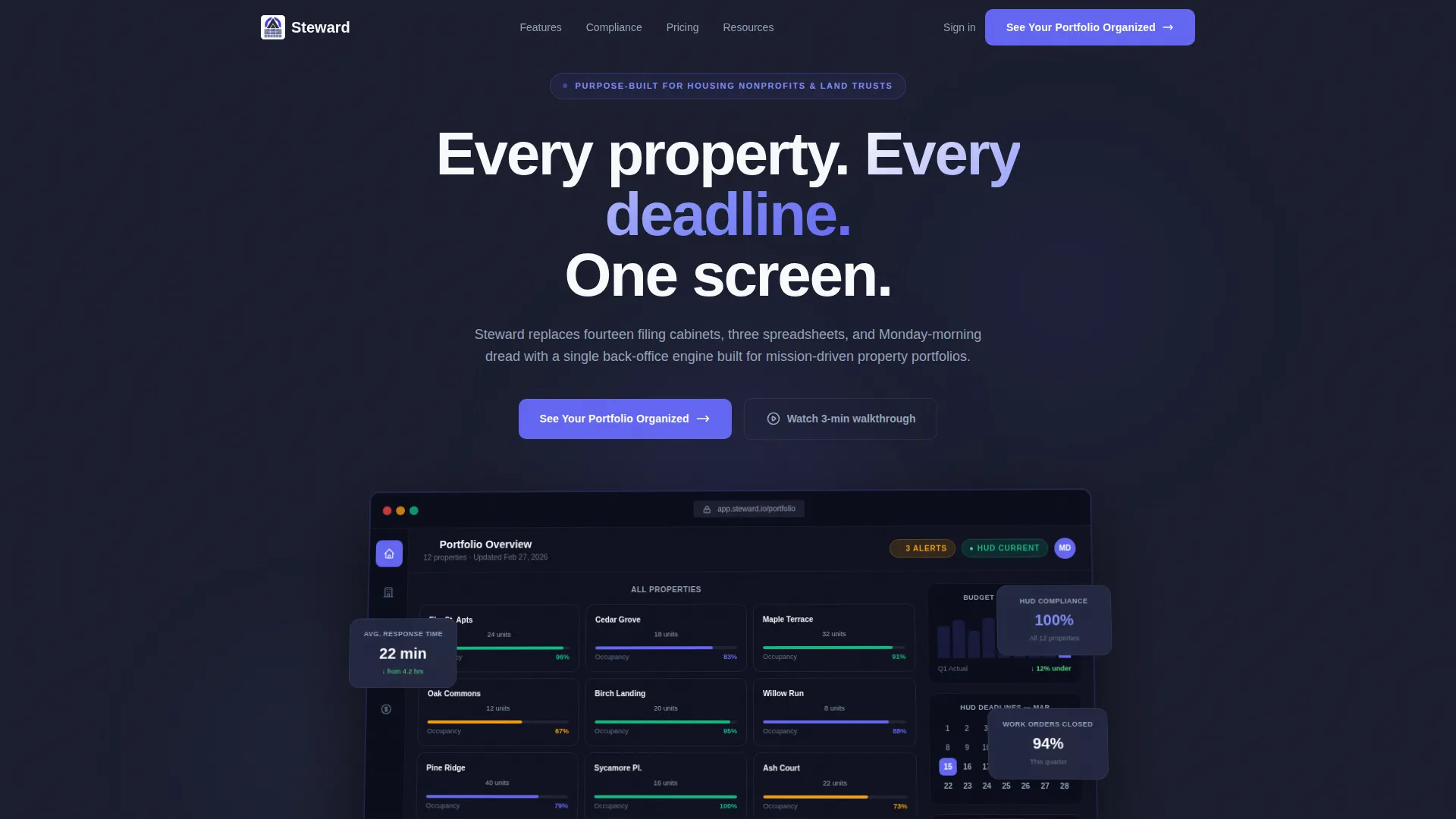
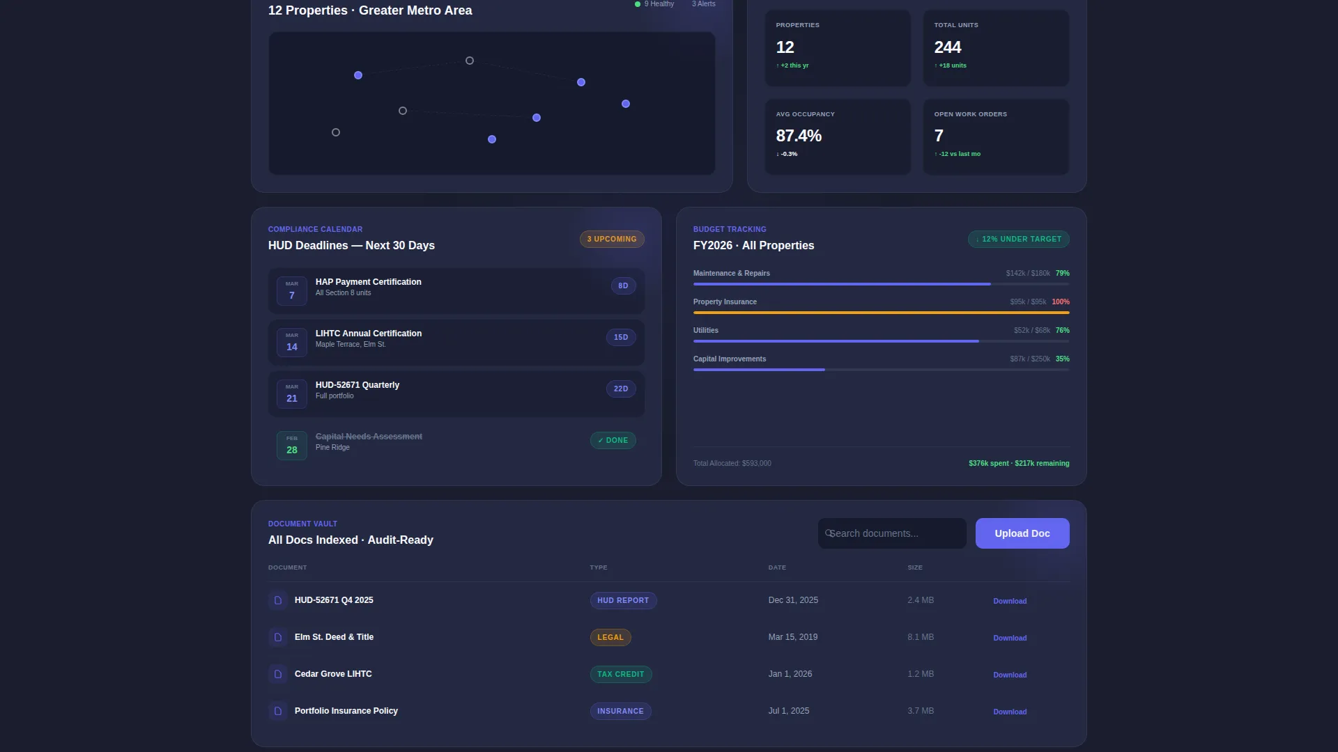
- A full-width product screenshot header showing a live portfolio overview with occupancy data, maintenance alerts, and a compliance calendar
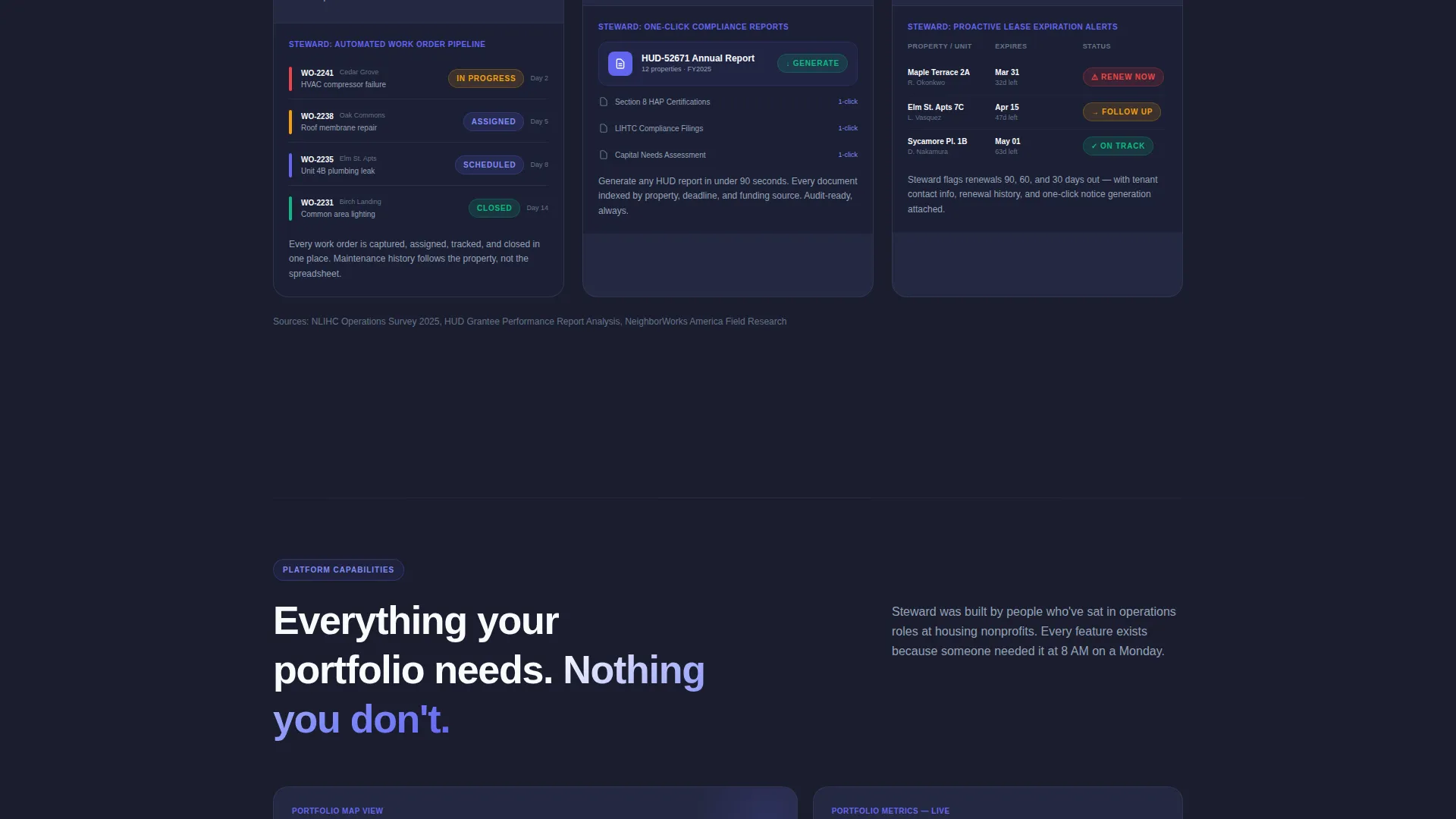
- Modular card clusters that pair real industry statistics with corresponding product feature screenshots
- Two conversion paths: a three-field progressive lead form and a gated benchmark report download for earlier-stage visitors
Feature list
This section covers the core template capabilities drawn directly from the design brief.
Full-Width Product Screenshot Header
The header opens with a pixel-perfect, slightly angled platform screenshot floating over the deep charcoal background. It shows twelve property cards with occupancy percentages, three amber maintenance alerts, a compliance calendar with color-coded HUD deadlines, and a budget burn-down chart. A single headline sits above it: "Every property. Every deadline. One screen."
Industry Report Card Grid
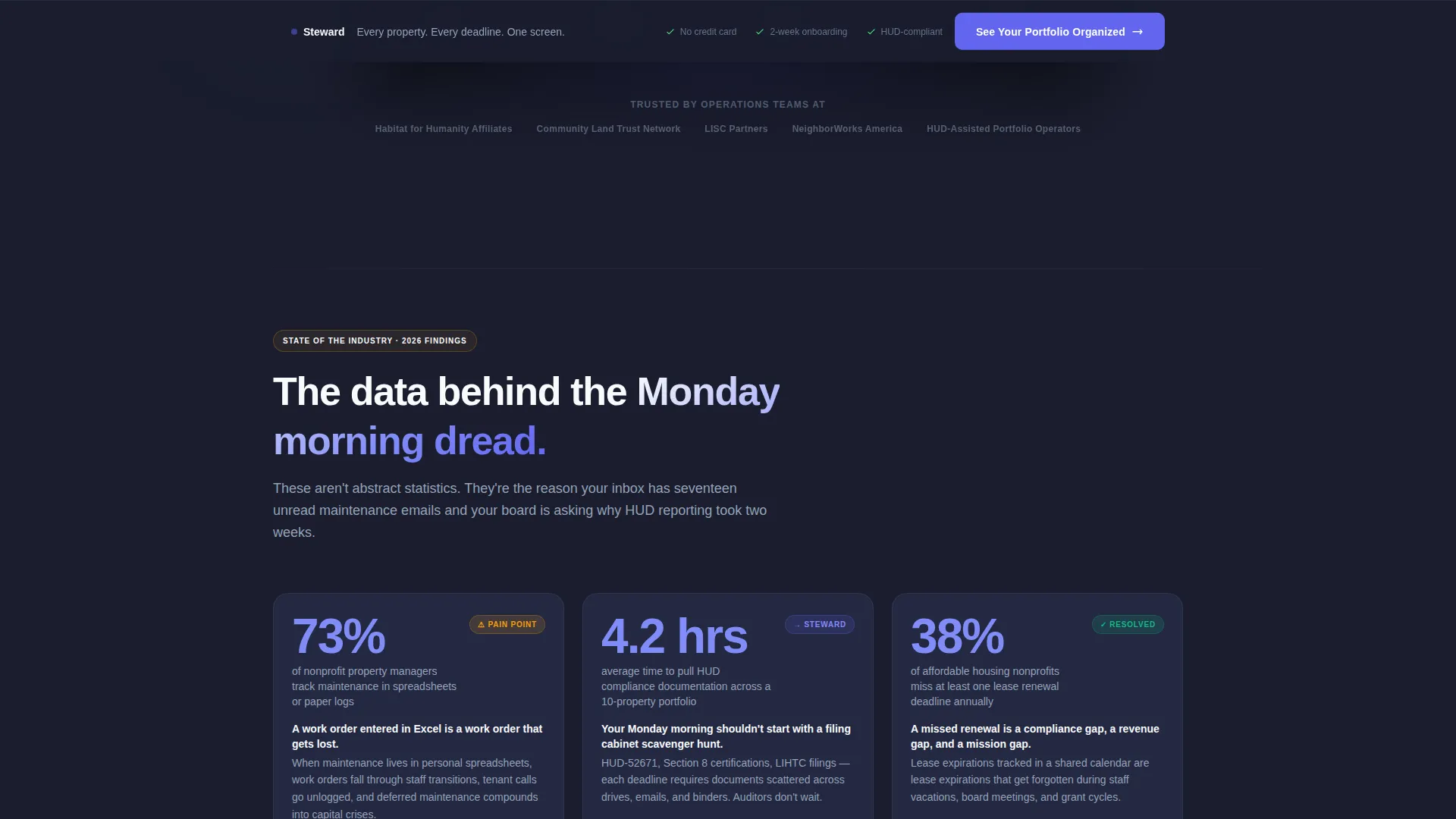
Each scroll section is a modular card cluster that presents a real operational pain point as a data finding, then resolves it with a product feature. The cadence mirrors a state-of-the-industry white paper, building credibility and urgency together as visitors scroll down the page.
Dual Conversion Path Layout
The primary call to action, "See Your Portfolio Organized," appears first beneath the header screenshot. It reappears as a sticky bottom bar after the third card cluster. A secondary path offers a downloadable Nonprofit Property Operations Benchmark Report gated behind email only, capturing visitors who are not yet ready for a demo.
Progressive Lead Capture Form
The lead form uses a three-field progressive sequence: organization name, number of properties managed, and work email. The short field count reduces friction while collecting the data a sales or outreach team needs to follow up with the right context.
Sticky Conversion Bar
A persistent bottom bar carries the primary call to action after visitors scroll past the third card cluster. This keeps the conversion prompt visible without interrupting the content reading experience.
Electric Indigo Visual System
The color palette uses deep workspace charcoal for the primary background, electric indigo on active states and data highlights, soft slate for secondary text and card borders, and crisp white for card surfaces. The result is a focused, high-contrast layout that looks functional rather than decorative.
Page sections overview
| Section | Purpose |
|---|---|
| Product Screenshot Header | Opens with platform dashboard visual and primary headline |
| Primary call to action Block | First "See Your Portfolio Organized" call-to-action placement |
| Card Cluster One | Pairs maintenance tracking stat with work order pipeline feature |
| Card Cluster Two | Pairs HUD compliance time stat with one-click report generation feature |
| Card Cluster Three | Continues industry report cadence with additional pain-point and feature pairing |
| Sticky Bottom Bar | Repeats primary call to action after the third card cluster for persistent visibility |
| Lead Capture Form | Three-field progressive sequence for demo-ready visitors |
| Benchmark Report Gate | Email-only download path for earlier-stage lead capture |
Design & branding system
The template uses a Dashboard Pro theme built around the Electric Indigo color system. Every visual decision prioritizes function over decoration, giving the page a mission-control authority that matches its audience.
- Deep workspace charcoal (#1A1D2E) as the primary background, electric indigo (#6366F1) for active states and data highlights, soft slate (#94A3B8) for secondary text and card borders, and crisp white (#F8FAFC) for card surfaces and type contrast
- No stock photography of people; the product screenshot is the visual hero throughout the entire page
- Card borders, color-coded calendar elements, and amber alert indicators are all drawn from the platform's own interface, keeping the design honest and credible
Mobile & speed optimization
The modular card grid structure is well suited to responsive stacking on smaller screens. Each card cluster is a self-contained unit, so the reading flow holds together whether a visitor is on a desktop or a phone.
- Card clusters reflow naturally into single-column stacks on narrow viewports without losing the stat-then-feature narrative
- The sticky bottom bar remains accessible on mobile, keeping the primary call to action reachable at any scroll depth
- The progressive lead form uses only three fields, reducing friction on touchscreen input
How this template helps you convert
The entire scroll experience is engineered around two types of visitors: those ready to book a demo and those still building their case internally. Both leave with a reason to come back.
- The primary "See Your Portfolio Organized" call to action appears immediately below the hero screenshot, then persists as a sticky bar, so a demo-ready visitor never has to scroll back up to convert.
- The gated Benchmark Report download captures earlier-stage visitors with email only, giving your team a warm lead even before that person is ready to talk to anyone.
Other information about this template
This template is built for the nonprofit property management niche and reflects the real operational language that operations directors, land trust managers, and community development finance professionals use every day.
- The template style is a card grid (modular) layout, which makes future section additions or content swaps straightforward during customization
- The creative direction follows an Industry Report cadence, meaning the copy framework is already structured around data findings paired with product answers
- The header concept is a Product Screenshot, not a lifestyle or stock image, which is a deliberate trust signal for a technical platform audience
- The lead generation direction is baked into the layout at two distinct points, so the page serves both high-intent and research-stage visitors without one path competing with the other
Theme
Dashboard Pro
Creative direction
Industry Report
Color system
Electric Indigo
Style
Card Grid (Modular)
Direction
Lead Generation
Page Sections
Full-width Product Screenshot Header
Industry Report Card Grid Cadence
Dual Conversion Path Layout
Sticky Primary Call to Action Bar
Progressive Three-field Lead Form
Electric Indigo Dashboard Visual System
Related questions
Who is this landing page template designed for?
Can I customize the statistics and card content in the card clusters?
How does the dual conversion path work?
Does the template include the actual platform dashboard screenshots?
Is this template suited to a dark-themed brand identity?



