Space & Advanced Aerospace Professional Website Template
Habitat is a hub-and-spoke landing page template built for a lunar base and habitat engineering firm. It uses an isometric clickable navigation map, four engineering-spoke sections, and head-to-head comparison tables to convert mission architects and agency partners into qualified leads. The design follows a Service Utility field-manual aesthetic in a Warm Stone palette.
by Rocket studio
Quick summary
Habitat is a single-page, anchor-navigated landing page template for a pressurized lunar module engineering firm. It opens with an isometric cutaway of a four-module habitat cluster that doubles as the navigation map. Visitors click into four technical spokes, Structure, Shielding, Life Support, and Operations, each ending in a head-to-head comparison table. The page converts by showing work, not by making promises.
Who this template is for
This template is built for deep-tech engineering firms that serve institutional clients. It suits organizations whose work must earn trust through documented methodology before a prospect will engage.
- Mission architects at national space agencies drafting Artemis-era base camp proposals from Pre-Phase A through Phase C
- Private launch providers that need habitable payload manifests and credible engineering partners
- University research consortia designing lunar analog testbeds in field locations
What problem this template solves
Most engineering firm pages lead with credentials and ask visitors to trust the team. In government and aerospace contracting, that sequence is backwards. Decision-makers need to see the analysis before they will consider a conversation.
- The template removes the credibility gap by leading with trade studies, load-path diagrams, thermal outputs, and fabrication partner callouts
- It replaces vague capability statements with benchmarked data: mass per crew volume, Micrometeoroid and Orbital Debris (MMOD) protection rating, and estimated assembly EVA (Extravehicular Activity) hours
- It structures the lead capture around mission phase specificity, so every inquiry arrives pre-qualified
What you get with this template
The template delivers a complete, structured landing page ready for a lunar habitat engineering firm. Every section is purposeful and content-driven, with no decorative filler.
- An isometric SVG hero that acts as both header imagery and a clickable anchor navigation map
- Four fully structured engineering spokes, each containing a trade study sequence and a three-way comparison table
- A persistent amber call-to-action overlay form and a secondary PDF email-gate link for lighter leads
Feature list
This section covers the core built-in capabilities of the Habitat template, drawn directly from the design brief.
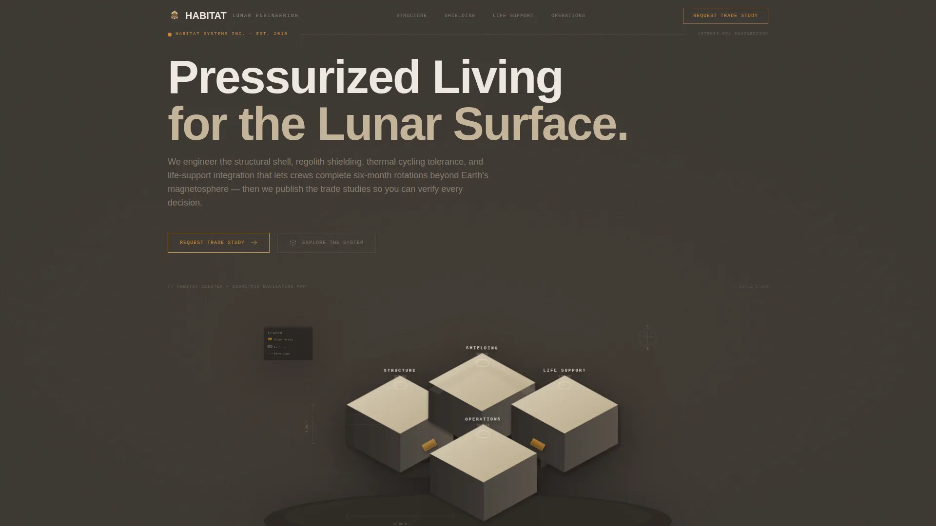
Isometric Clickable Navigation Map
The hero image is a precise vector cutaway of a four-module habitat cluster. Airlocks, regolith berms, solar thermal arrays, and internal deck plans are all visible at once. Each labeled module links directly to its corresponding engineering spoke section below.
Hub-and-Spoke Anchor Navigation
The page is structured as a central hub with four spoke sections: Structure, Shielding, Life Support, and Operations. A sticky navigation bar tracks the active section state, highlighted in caution-amber so visitors always know where they are in the document.
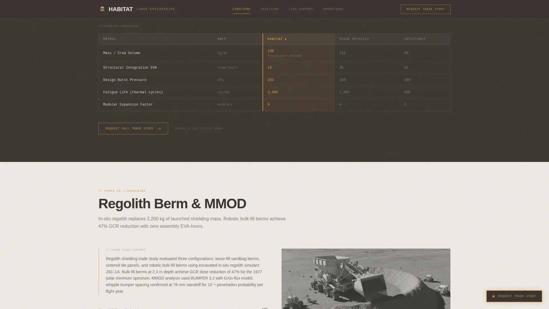
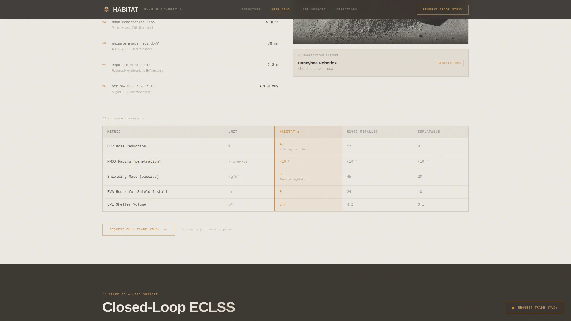
Three-Way Comparison Tables
Every spoke ends with a side-by-side benchmark table. The table compares the firm's approach against two dominant alternatives: rigid metallic shell and inflatable softgoods. Metrics include mass per crew volume, MMOD protection rating, and estimated assembly EVA hours.
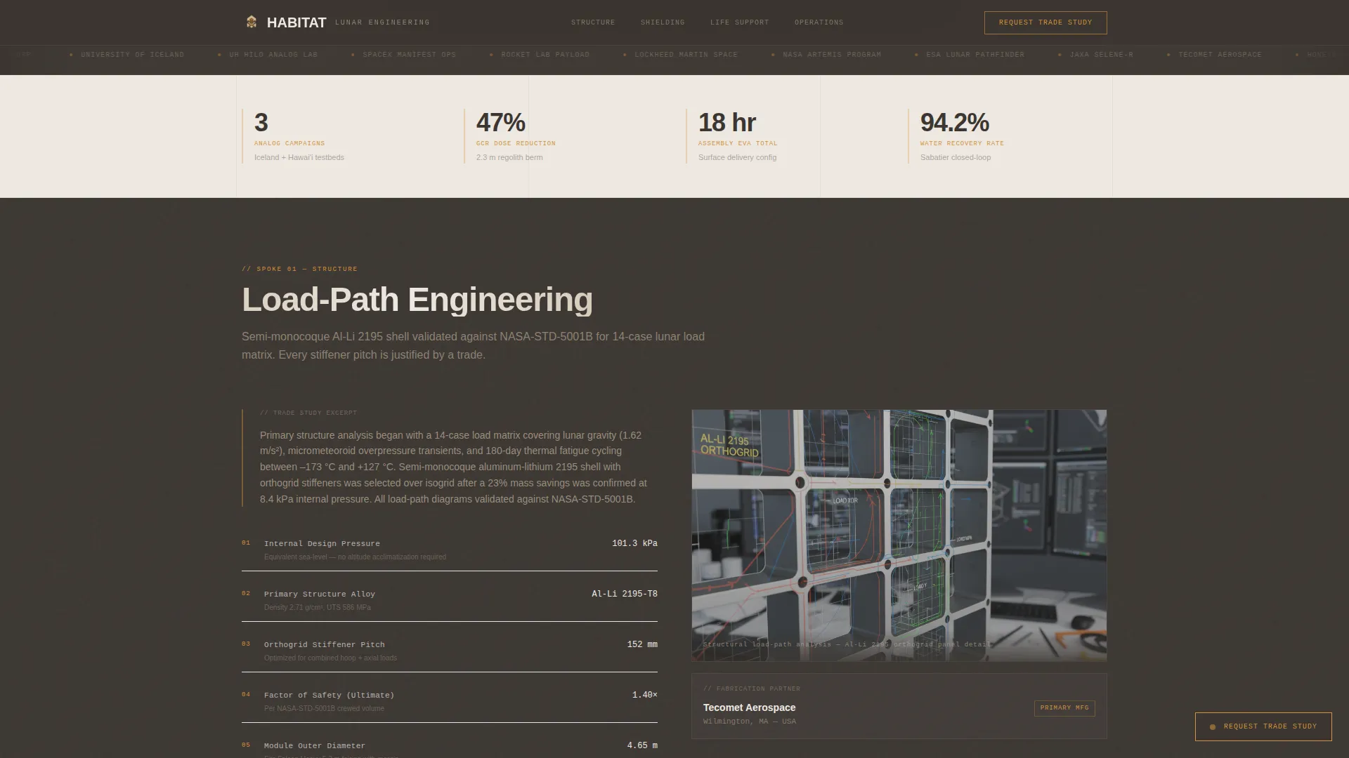
Trade Study Scroll Sequence
Each spoke unfolds in a deliberate engineering order: trade studies first, then load-path diagrams or thermal analysis outputs, then named fabrication partner callouts. Scroll-triggered section reveals pace the information the way a field review would.
Lead Capture Form Overlay
A persistent amber call-to-action button anchored in the bottom-right corner after the first scroll opens a focused form. Fields cover agency or organization name, mission architecture phase, habitat type of interest, and an optional crew size and mission duration field.
Secondary PDF Email Gate
Beneath the primary form, a text link reads "Download Comparison Matrix (PDF)." This captures lighter leads who are not ready to request a trade study but still want the benchmark data, accessed through an email gate.
Page sections overview
| Section | Purpose |
|---|---|
| Hero Navigation Map | Isometric SVG cluster doubles as anchor nav |
| Structure Spoke | Load-path diagrams, trade study, comparison table |
| Shielding Spoke | Regolith berm engineering, MMOD ratings table |
| Life Support Spoke | Thermal cycling analysis, integration comparison |
| Operations Spoke | EVA hours, fabrication partners, comparison table |
| Footer | Linear single-row pattern with contact anchors |
Design & branding system
The visual identity follows a Service Utility theme. It is intentionally functional, dense, and free of decorative elements. The aesthetic reads like a field manual left open on a worktable.
- Four-color Warm Stone palette: lunar regolith tan (#C4B49A) as primary background, basalt shadow (#3B3632) for alternating section backgrounds, pressurized-module white (#EDE8E1) for body text and spec tables, and caution-amber (#D4923A) reserved for interactive anchors, active nav states, and call-to-action borders
- Typography uses DM Sans for headings and user interface elements, with JetBrains Mono for spec tables and technical data fields
Mobile & speed optimization
The template is designed desktop-first, reflecting the reality that mission architects review technical documents on large monitors. Responsive mobile support is included for secondary access scenarios.
- SVG assets are inlined for a fast static render without reliance on heavy external libraries
- Scroll-triggered section reveals and SVG path animations are set to medium intensity, keeping motion purposeful rather than decorative
How this template helps you convert
The conversion strategy is built on analytical proof first, then a natural offer of deeper analysis. No claim is made without a supporting data point somewhere on the page.
- The isometric navigation map gives visitors an immediate system-level overview, reducing bounce by letting them self-select into the subsystem most relevant to their mission phase before reading a single paragraph.
- Each spoke's trade study scroll sequence earns progressive trust, so by the time the comparison table appears, the visitor has already seen the methodology behind the numbers.
- The dual lead capture path (trade study request form and PDF email gate) accommodates both decision-ready mission architects and early-stage researchers, widening the qualified lead funnel without diluting the primary call to action.
Other information about this template
This template is built for the Aerospace and Defense category, specifically the Space and Advanced Aerospace subcategory, with a niche focus on Lunar Base and Habitat Design. A few additional details are worth noting.
- The template uses metric units as the primary measurement system, consistent with international space agency documentation standards
- The form fields are scoped to government contract context: mission architecture phase (Pre-Phase A through Phase C), habitat type (surface, orbital, or analog), and optional crew size and mission duration
- The Intersection Match Score for this template's niche, category, and design direction alignment is 13, indicating a strong fit between the visual system and the target audience's professional context
- Animation intensity is set to medium: scroll-triggered reveals and sticky nav state changes keep the page dynamic without interfering with data-heavy sections
- The footer follows a linear single-row pattern, keeping the page exit clean and focused
Theme
Service Utility
Creative direction
Transparent Process
Color system
Warm Stone
Style
Hub & Spoke (Anchor Nav)
Direction
Comparison/Versus
Page Sections
Isometric Clickable Navigation Map
Hub-and-spoke Anchor Navigation
Three-way Engineering Comparison Tables
Trade Study Scroll Sequence
Dual Lead Capture Path
Related questions
Who is this landing page template designed for?
What does the isometric header actually do?
What metrics do the comparison tables display?
How does the lead capture work?
What color palette and typography does this template use?


