Intelligent Maritime Operations Landing Page Template
Berth is a split-screen CRM landing page template built for port terminal software platforms. It combines an industrial Carbon Fiber design system, a three-tab Feature Tab Switcher, and a brutal head-to-head Spec Sheet layout to convert terminal operations managers, commercial directors, and port authority liaisons into demo requests and qualified sales leads.
by Rocket studio
Quick summary
Berth is a single-page CRM landing page template designed for port and terminal vertical SaaS businesses. It uses a 50/50 split-screen layout, a kinetic Feature Tab Switcher, and a Comparison Spec Sheet to show visitors exactly why a voyage-centric CRM outperforms generic tools. Every design choice targets high-intent B2B buyers in maritime operations.
Who this template is for
This CRM landing page template is built for SaaS founders, product marketers, and go-to-market teams launching or repositioning a port terminal CRM platform. It works equally well for agencies building a website for an established terminal operator software brand.
- Terminal operations managers who manage 40 or more concurrent vessel rotations and need to show customers a clear, real-time berth allocation view
- Commercial directors who handle carrier volume negotiations and need a landing page that communicates revenue impact at a glance
- Designers and developers who want a production-ready page they can customize without starting from scratch
What problem this template solves
Port terminal sales teams struggle to communicate complex CRM capabilities to busy operations buyers. Generic CRM landing page examples fail because they do not speak the language of vessel calls, demurrage, or berth windows. Visitors leave before they find the value.
- Fragmented information and manual processes make it hard to capture leads from website visitors who need instant clarity
- A flat company-card CRM looks identical to every competitor page, so customers cannot determine which platform fits their workflow
- Ops-focused buyers lose attention quickly when a landing page loads slow content or buries the call-to-action
What you get with this template
This CRM landing page template delivers a complete, fully structured page ready to customize. Every section is prompt-backed and built around real port terminal use cases, so your team can launch fast and start collecting leads on day one.
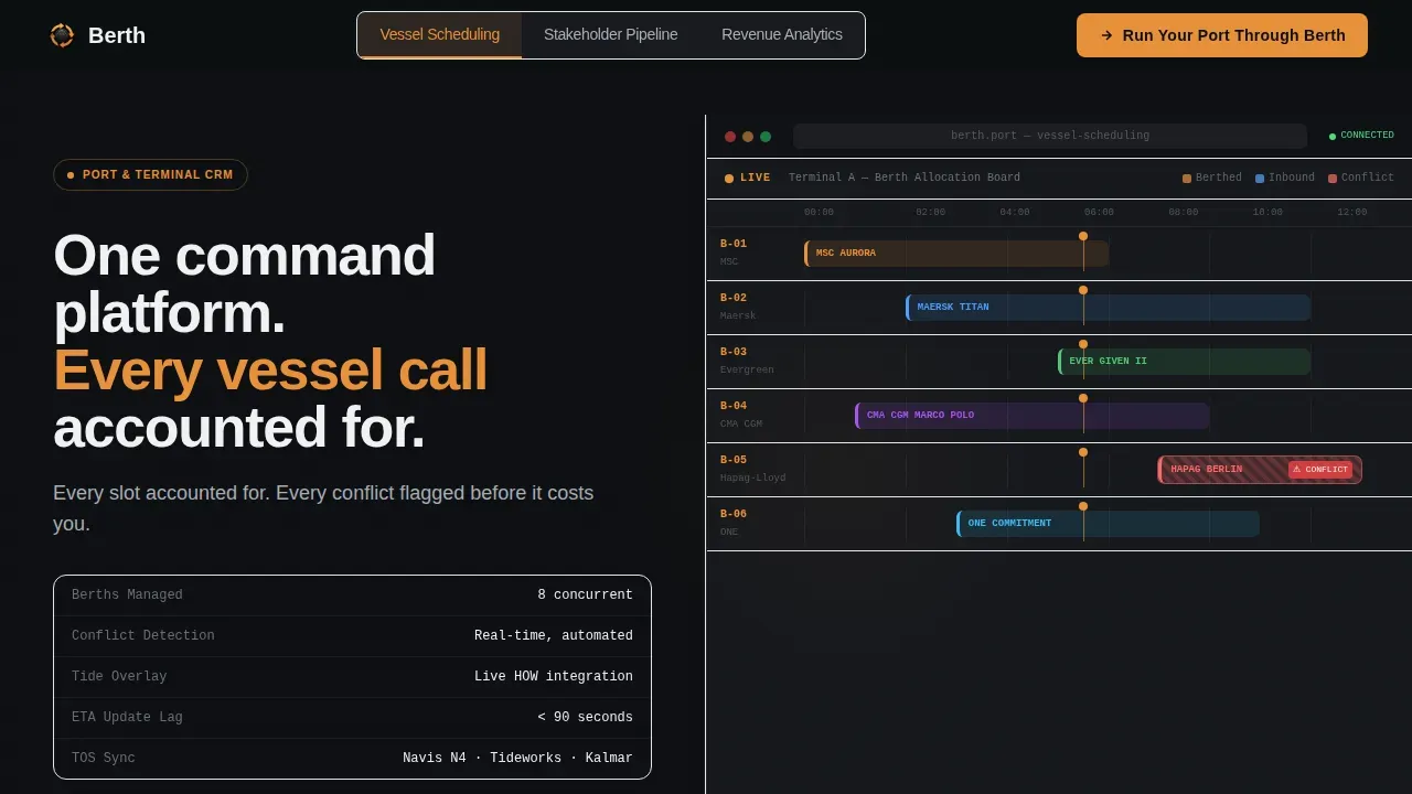
- A three-tab Feature Tab Switcher hero with a Gantt-style berth allocation board, kinetic crossfade animation, and split-screen spec text
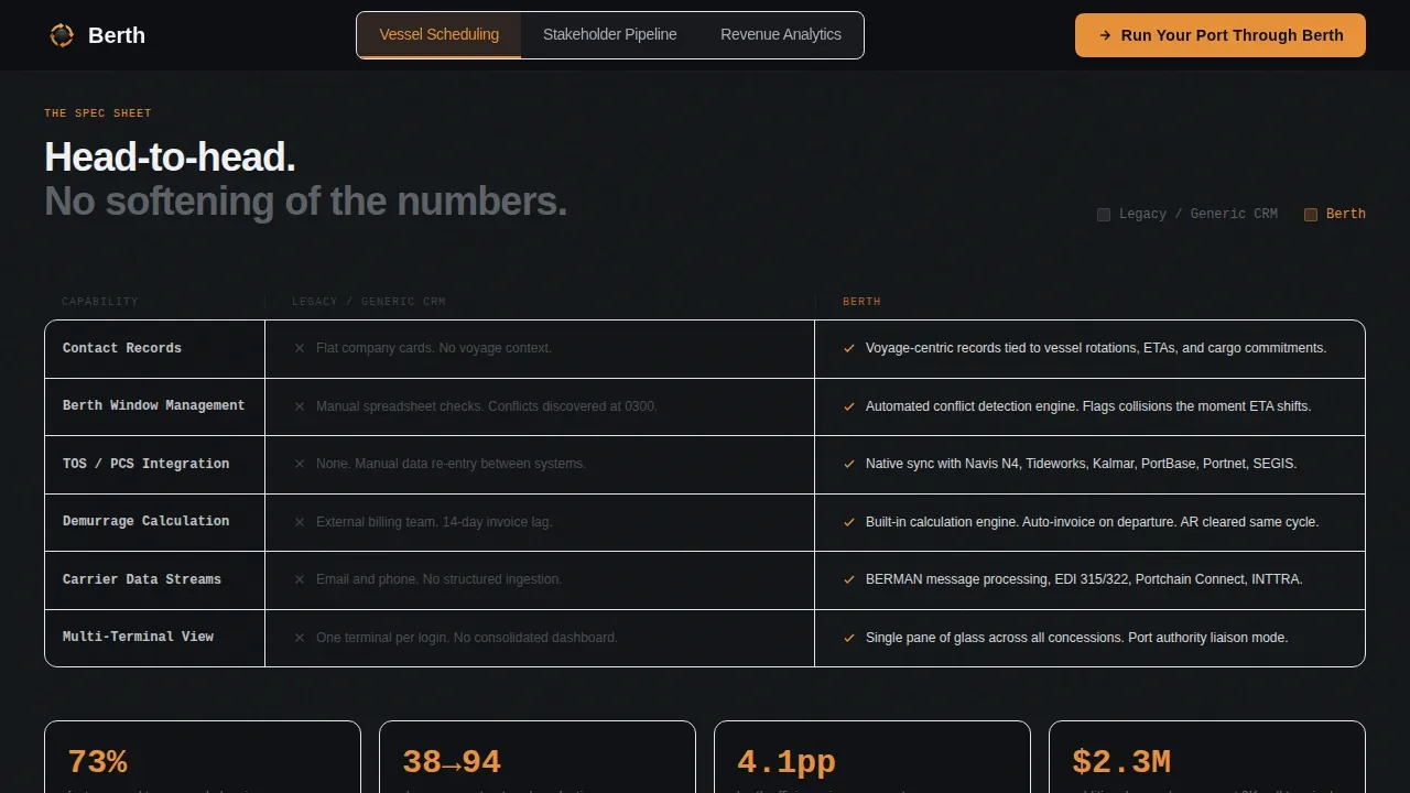
- A head-to-head Comparison Spec Sheet with brutal side-by-side rows that contrast legacy CRM behavior against Berth capabilities, including large stat callouts
- A two-step demo request form, a gated PDF download path, and a sticky mobile call-to-action bar set for conversion
Feature list
This CRM landing page template includes purpose-built components. Each one serves a specific role in moving visitors toward a demo request or a sales conversation.
Three-Tab Feature Switcher Hero
The hero section splits the viewport 50/50. Three labeled tabs ("Vessel Scheduling," "Stakeholder Pipeline," "Revenue Analytics") sit across the top. Each click swaps the right panel to a product screenshot via a kinetic crossfade, while the left panel updates a spec-sheet text block with relevant metrics and integration names.
Head-to-Head Comparison Spec Sheet
The scroll-driving comparison section places a muted graphite "Legacy / Generic CRM" column against an amber-accented "Berth" column. Rows cover voyage-centric contact records, automated berth-window conflict detection, Terminal Operating System and Port Community System integrations, and demurrage calculation. Each section closes with a large stamped stat to anchor the claim.
Two-Step Demo Form Modal
The primary call-to-action opens a two-step form. Step one captures terminal name, annual vessel call volume, and current CRM or Terminal Operating System in use. Step two collects the operations director's email address and preferred demo time slot. This process keeps the form easy to complete while gathering high-quality lead data.
Gated PDF Download Path
Visitors still building an internal business case can choose a secondary path: "Download the Comparison Brief." This gated PDF captures email addresses from lower-commitment visitors, giving the sales team a warm lead pool to nurture over time.
Sticky Mobile Call-to-Action Bar
On smaller screen sizes, the primary "Run Your Port Through Berth" call-to-action persists as a sticky bottom bar. This ensures that visitors on any device can click through to the form without scrolling back to the top of the page.
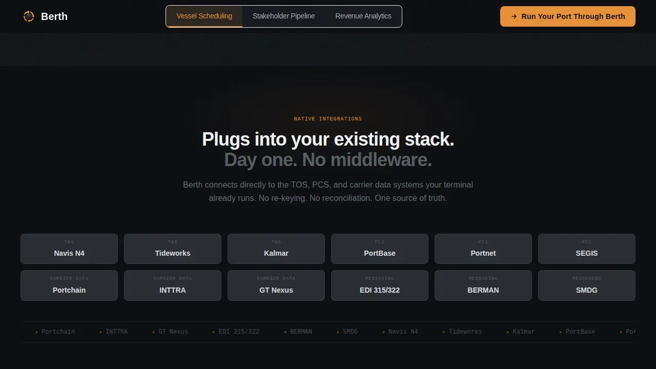
Integration and Stats Row
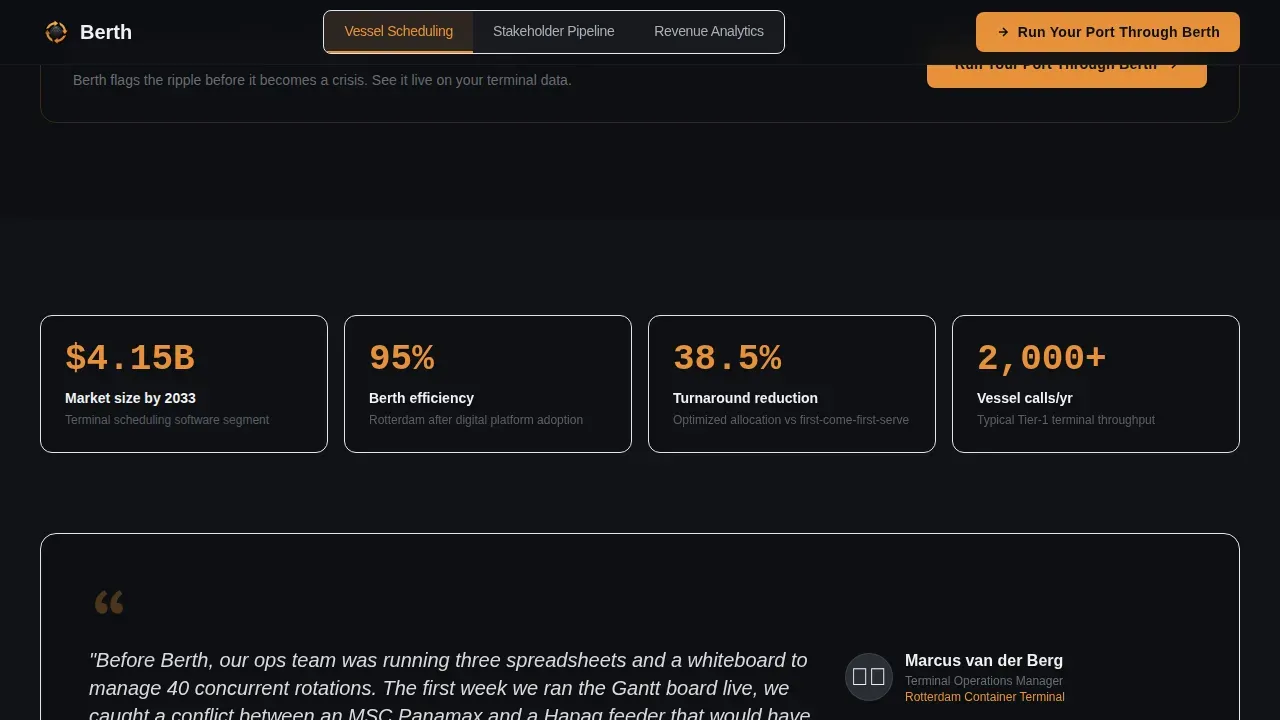
A dedicated section displays Terminal Operating System, Port Community System, and Electronic Data Interchange logo tiles alongside a mid-scroll call-to-action. Key metrics and a terminal testimonial block give visitors the social proof they need to move forward with confidence.
Page sections overview
| Section | Purpose |
|---|---|
| Tab Switcher Hero | Introduce CRM tabs with split-screen product view |
| Comparison Spec Sheet | Show legacy versus. Berth capability side by side |
| Integration Logo Row | Display TOS, PCS, EDI connections with mid-scroll call to action |
| Stats and Proof | Deliver key metrics, testimonial, and efficiency numbers |
| Demo Form call to action | Two-step modal and PDF download conversion path |
| Linear Footer | Single-row footer with navigation links |
Design & branding system
The design language follows a Dynamic Motion theme built on a Carbon Fiber color system. The visual feel is deliberately industrial, like a gantry crane at night, alive only where signal amber catches moving steel. Backgrounds alternate between hull black (#0D0F12) and container-stack graphite (#2A2D34), with text in crane-boom silver (#A8ADB5) and white (#F0F1F3).
- Signal-flare amber (#E8913A) is reserved for active tab states, toggle highlights, and all primary call-to-action elements, so visitors always know where to click
- Typography pairs DM Sans for interface copy with JetBrains Mono for data labels and metrics, reinforcing the control-tower feel across every section
- Panel slide-in animations and tab crossfades are set to restrained motion, fast enough to feel live, controlled enough not to distract from the content
Mobile & speed optimization
This landing page template is built desktop-first to serve ops managers on large monitors, with a mobile-responsive layout for field operators who need to access data on the go. The sticky call-to-action bar on mobile ensures no visitor loses the conversion path regardless of device or screen size.
- Fast-loading static sections use server-rendered components, while interactive elements like the tab switcher and form modal are handled client-side to keep initial page loading lean
- The responsive design ensures visitors can fill out forms on any device, which is critical for port authority liaisons and commercial directors who are rarely desk-bound
- Designers and developers can customize layout proportions, swap content, and change color tokens without restructuring the underlying component set
How this template helps you convert
This CRM landing page is engineered around one clear action: booking a demo or downloading the comparison brief. Every design and content decision serves that single goal.
- The Feature Tab Switcher captures attention immediately, letting visitors self-select their role and see the CRM metrics and examples most relevant to their workflow before they scroll past the hero
- The Comparison Spec Sheet builds trust by making the case on a row-by-row basis, so customers can understand the difference between a voyage-centric CRM and a flat generic tool with no maritime context
- The two-step form and sticky mobile bar work together to close the conversion loop, giving visitors an easy path to sign up for a demo at every scroll depth
Other information about this template
This template is designed to work within the broader ecosystem of tools that port terminal sales and marketing teams already use. Teams can connect CRM and email tools to sync contact data collected through the form, and the page structure supports straightforward integration with analytics platforms. A CRM report consolidates data from multiple sources to track and display key performance indicators (KPIs), and teams can build reporting layers using tools like Google Analytics or Google Looker Studio to monitor page effectiveness and lead volume on an ongoing basis.
- The page is suited for A/B testing headlines and call-to-action buttons to determine which landing page examples capture more leads; the single-call to action structure makes it easy to set up a clean test with no distractions
- CRM landing page templates like this one can be customized to suit specific sales campaigns, e-commerce adjacent SaaS offers, or multi-terminal business units that need a dedicated site or microsite for each concession
- Developers can store and manage component preferences, update the description copy for each tab, and link the form to any CRM or email platform without rebuilding the page from scratch
Theme
Dynamic Motion
Creative direction
Spec Sheet
Color system
Carbon Fiber
Style
Split Screen (50/50)
Direction
Comparison/Versus
Page Sections
Three-tab Feature Switcher Hero
Head-to-head Comparison Spec Sheet
Two-step Demo Form Modal
Gated PDF Download Path
Sticky Mobile Call-to-action Bar
Integration and Social Proof Row
Related questions
Can I customize the tab content and comparison rows for my specific CRM platform?
Does this template include the form logic, or do I need to build that separately?
What screen sizes does this landing page support?
How does the gated PDF download path work?
Can this template be used for a focused sales campaign targeting specific carrier segments?



