Construction Company Careers Website Template
Hardhat is a bold, data-driven construction careers landing page built for companies that need to recruit skilled tradespeople fast. A brutalist dashboard layout leads with raw workforce stats, scrolls through metric-card benefits and project location grids, and closes with a friction-free app download call to action designed for workers already on their phones at a jobsite.
by Rocket studio
Quick summary
Hardhat is a single-page construction careers landing page template built around a Stats-First Impact creative direction. It leads with a full-width stats wall, flows through metric-card benefits and employee proof blocks, and closes with a mobile-first app download call to action. The design runs on a Bold Brutalist theme in an Electric Indigo color system built for credibility and speed.
Who this template is for
This template is built for construction companies that recruit across trades and need to reach workers where they already are: on their phones, mid-shift, in between tasks. It speaks directly to candidates who are ready to move but need a reason to act today.
- Multi-state construction contractors recruiting journeymen, apprentices, and licensed operators
- Workforce managers or HR teams who need a high-impact careers page without a long build process
- Hiring leads targeting CDL operators, electricians, and carpenters who respond to hard numbers over soft promises
What problem this template solves
Most construction careers pages look like an afterthought. They bury wage information, use generic stock photography, and expect a job-site worker to fill out a five-step form from a desktop computer. Candidates bounce before they even read the first benefit.
- Qualified tradespeople scroll past pages that feel corporate, slow, or vague about pay
- Applying from a phone on a lunch break is painful if the page is not built for that exact flow
- Competing contractors poach candidates simply by making the process feel faster and more credible
What you get with this template
You get a fully structured, single-page careers landing page that puts workforce data front and center and guides every visitor toward one clear action: downloading the app and applying in four minutes. Every section is purpose-built to reduce hesitation and increase trust.
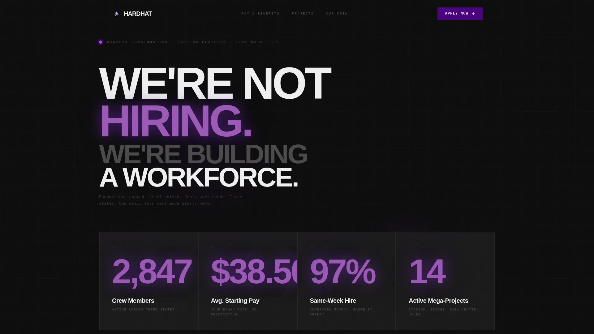
- A full-width header stats wall with four headline workforce metrics rendered in large Brutalist numerals
- Metric-card benefits grid, project location map grid, and employee proof blocks laid out in a relentless data rhythm
- A two-field quick-start app download call to action with app store badges, phone mockup, and a "Text Me the Link" fallback for jobsite users
Feature list
This template delivers a tightly controlled set of purpose-built sections and components. Each one earns its place.
Full-Width Stats Wall Header
The header opens with four oversized workforce metrics: crew count, average starting hourly rate, same-week hire rate, and active mega-project count. Numbers render in high-voltage indigo against deep asphalt black. No hero images, no stock photography. The headline reads "We're not hiring. We're building a workforce."
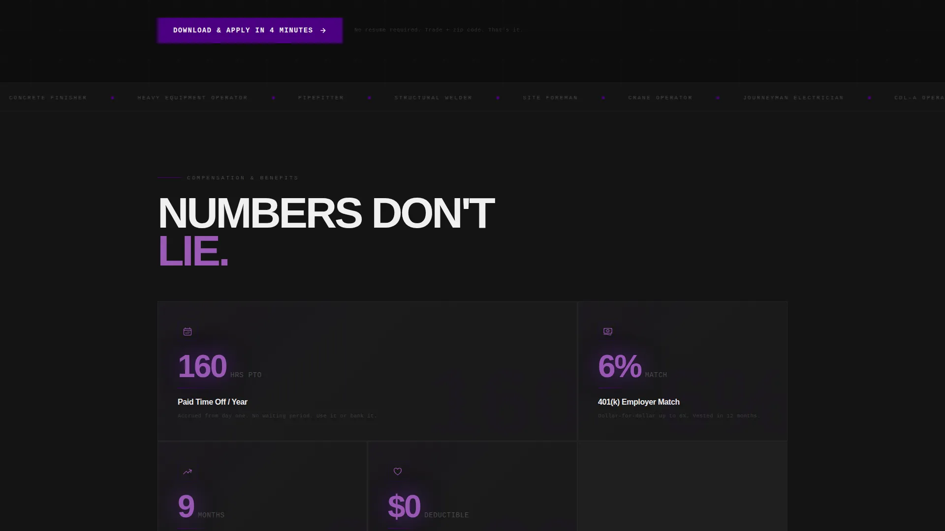
Metric-Card Benefits Grid
Benefits are presented as data cards rather than bullet lists. Each card displays a specific, measurable figure: paid time off hours per year, 401(k) match percentage, and average promotion timeline in months. The card format makes every benefit feel like a verified fact rather than a vague perk.
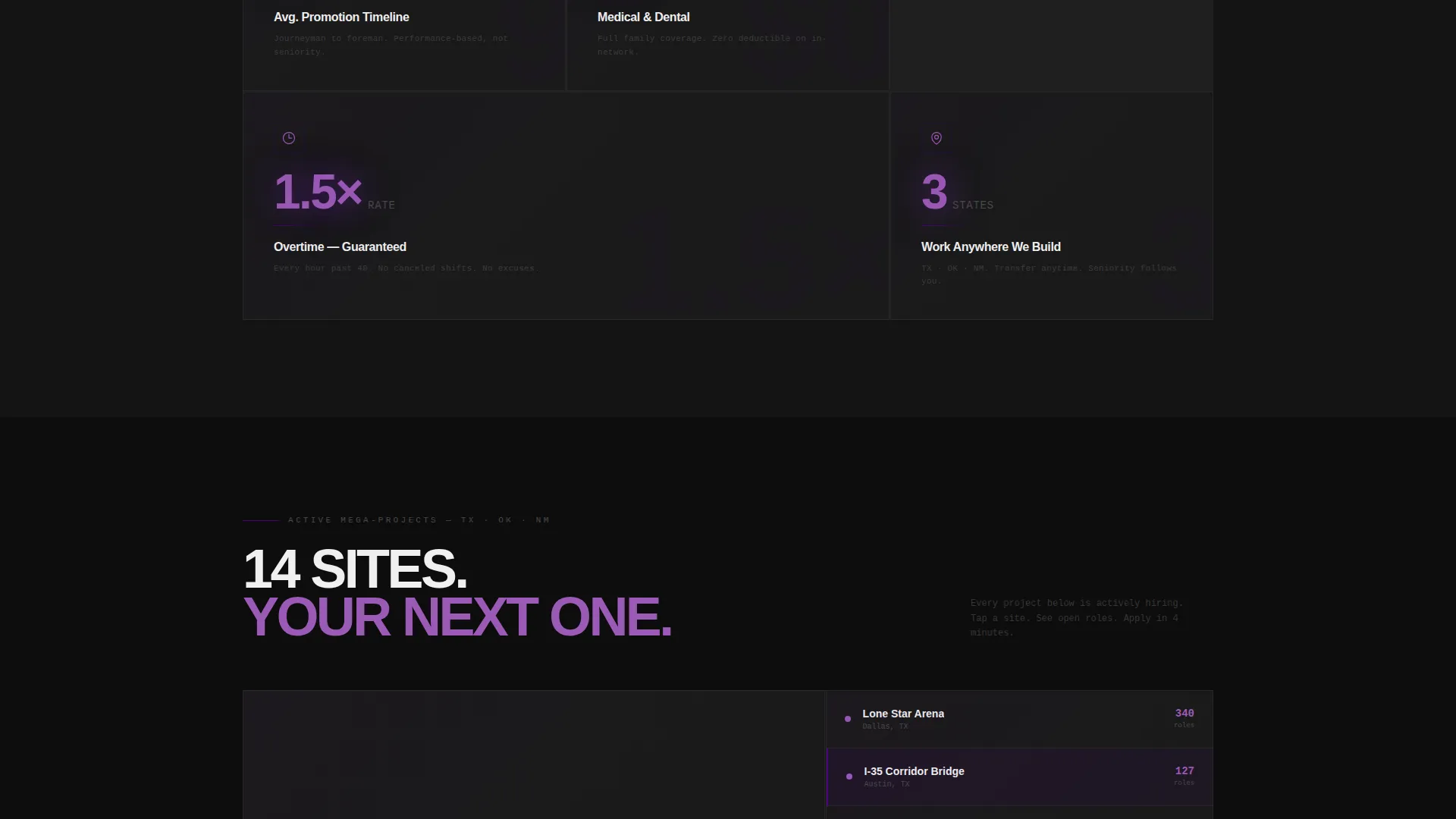
Dark-Map Project Location Grid
Active project locations render on a dark-map grid with indigo pulsing indicator dots. This section communicates geographic reach across three states without requiring a live map integration. It reinforces scale and shows candidates where they could be working.
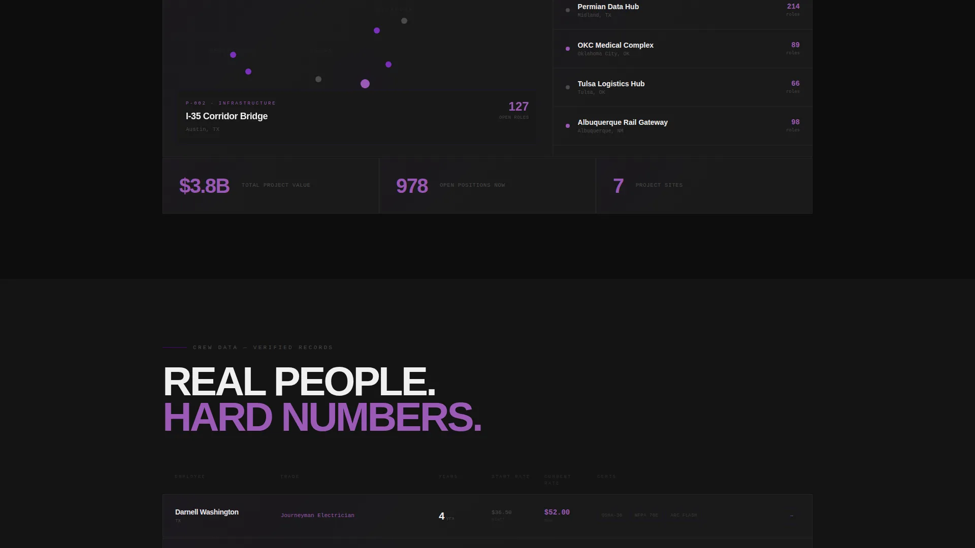
Employee Stat-Line Testimonials
Testimonials are formatted as structured employee records rather than pull quotes. Each entry displays the worker's name, trade, years on crew, and certifications earned. This format turns social proof into concrete data, which aligns with the stats-first tone throughout the page.
App Download Call to Action with Quick-Start Form
The primary call to action prompts visitors to download the app and apply in four minutes. A two-field quick-start form asks for trade or skill and zip code only. App store badges sit beside a phone mockup showing the application progress screen at sixty percent complete.
Mobile Fixed-Bar with "Text Me the Link"
A persistent bottom bar on mobile repeats the download call to action so it is always visible as the user scrolls. A secondary option lets jobsite workers enter a phone number to receive a direct app link by text. This removes the friction of typing a long URL while standing on a construction site.
Page sections overview
| Section | Purpose |
|---|---|
| Stats Wall Header | Lead with four bold workforce metrics |
| Benefits Metric Cards | Show measurable compensation and growth data |
| Project Location Grid | Display active sites across three states |
| Employee Stat Lines | Prove culture through structured worker records |
| App Download Block | Drive app installs with quick-start form |
| Mobile Fixed Bar | Repeat call to action for thumb-reach conversion |
Design & branding system
The visual identity follows a Bold Brutalist theme. Every design choice prioritizes weight, clarity, and raw data readability over decoration. The Electric Indigo color system feels like a job trailer at night: monitors glowing against cinder-block walls, every number load-bearing.
- Color palette: deep asphalt black (#0D0D0D) as the base, poured-concrete mid-gray (#4A4A4A) for secondary surfaces, high-voltage indigo (#4B0082) for data highlights and interactive elements, and safety-vest white (#F0F0F0) for all typography and data labels
- Typography uses enormous Brutalist numerals for headline metrics and clean sans-serif body text that stays legible at small sizes on mobile screens
- No decorative images, no stock photography; every visual element is structural and data-driven
Mobile & speed optimization
This template is designed specifically around the jobsite worker browsing on a phone during a short break. The layout decisions prioritize thumb-friendly interaction and fast comprehension above all else.
- The fixed bottom bar keeps the primary call to action in thumb reach at all times on mobile without interrupting the scroll experience
- The two-field quick-start form reduces input effort to a trade dropdown and a zip code, minimizing the time between intent and action
- The dark-background, high-contrast color system keeps content readable in bright outdoor light conditions common on active construction sites
How this template helps you convert
Every section of this landing page is sequenced to move a skeptical, time-pressed tradesperson from curiosity to action. The rhythm is intentional: number, context, number, context, each section building trust before asking for anything.
- The stats wall header earns immediate credibility with hard workforce numbers before the visitor reads a single line of body copy, removing the most common first objection: "Is this company real and stable?"
- The metric-card benefits grid and employee stat-line testimonials replace vague promises with specific, verifiable figures, giving candidates something concrete to compare against their current employer.
- The app download call to action, repeated as a mobile fixed bar and supported by the "Text Me the Link" fallback, meets workers on the device in their hand and reduces the application to two fields and four minutes.
Other information about this template
This template is categorized under construction company website templates and is specifically designed for the construction company careers page niche. It is a strong fit for any contractor who competes on wages and project scale and needs a recruiting page that feels as serious as the work itself.
- The template style is a Dashboard or Data Grid layout, which makes it well-suited for companies that want their hiring page to feel like an operations center rather than a brochure
- The intersection of Bold Brutalist design, Electric Indigo color, and Stats-First Impact creative direction makes this template visually distinctive in a category where most competitors use blue gradients and stock imagery
- This template is built as a single-page landing experience, so it works well as a standalone recruiting microsite or as a dedicated page within a larger company web presence
Theme
Bold Brutalist
Creative direction
Stats-First Impact
Color system
Electric Indigo
Style
Dashboard/Data Grid
Direction
App Download
Page Sections
Full-width Stats Wall Header
Metric-card Benefits Grid
Dark-map Project Location Grid
Employee Stat-line Testimonials
App Download Block with Quick-start Form
Mobile Fixed Bar and Text Link Option
Related questions
Who is the target candidate for this landing page?
Can I customize the workforce metrics and benefit figures?
Does the app download call to action require a live app?
Is this template suitable for a multi-state construction company?
What makes this different from a standard job posting page?



