Construction Company 404 Recovery Website Template
Hardhat is a single-page 404 error landing page built for construction companies. It turns a dead URL into a working lead tool. Visitors land on a terminal-style error header, scroll through an animated card grid that surfaces key links, and exit through a sticky estimate form or a direct call button, all wrapped in a high-contrast industrial visual identity.
by Rocket studio
Quick summary
Hardhat transforms a construction company's 404 error page into a purposeful, lead-generating landing page. The template uses a terminal-style header, an animated modular card grid, and a sticky estimate form to guide lost visitors toward useful actions. The design is bold, dark, and industrial, built to feel alive rather than abandoned.
Who this template is for
This template is built for construction businesses that want their 404 error page to work as hard as the rest of their site. It suits teams that care about first impressions, even on broken links.
- Construction company owners and marketing managers who want to recover lost visitors instead of losing them
- Web designers and developers building or rebuilding construction company websites
- Digital agencies creating niche construction company website templates for contractor clients
What problem this template solves
A standard 404 page apologizes and stops there. For a construction company, that means a project manager mid-bid, a homeowner hunting for a renovation gallery, or a subcontractor chasing spec sheets at 6 AM all hit a wall and leave. That exit costs real business.
- Stale bookmarks and broken links send qualified visitors to a dead end with no recovery path
- Generic error pages offer no context, no navigation, and no reason to stay
- Lost visitors rarely return, meaning a missed quote request or a missed project inquiry
What you get with this template
This template delivers a complete, single-page 404 error layout with every section pre-built and ready to customize. The structure guides visitors from confusion to clarity in one scroll.
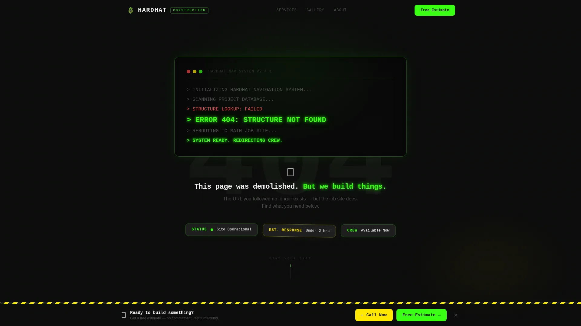
- A terminal-style animated header displaying the error code and a construction-themed message with typewriter timing
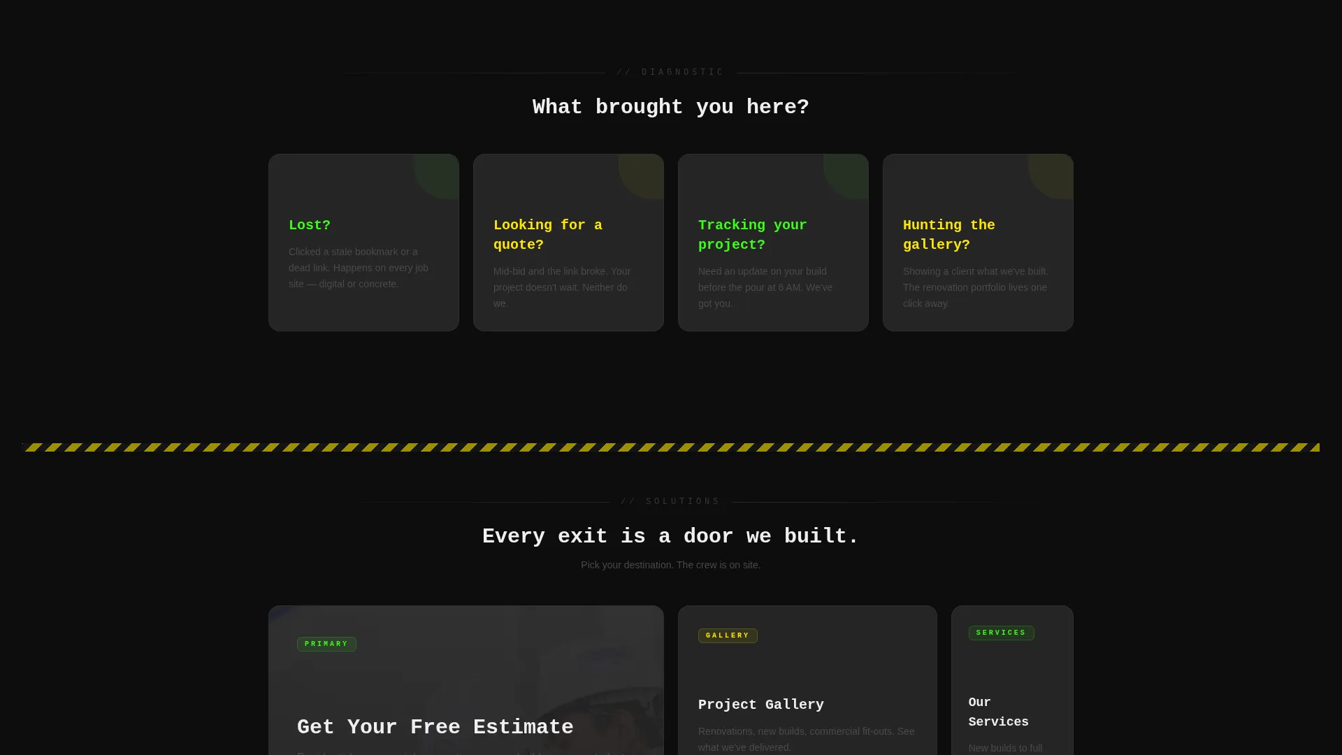
- A modular card grid that presents problem-framing questions in the first row and direct navigation links in the second row
- A sticky bottom bar with a three-field estimate form and a click-to-call button in caution-tape yellow
Feature list
This template is built around purposeful motion, clear information hierarchy, and a visual identity that makes a 404 page feel intentional.
Terminal-Style Animated Header
The header opens with a monospaced code block center-screen that types out "ERROR 404: STRUCTURE NOT FOUND" character by character. A blinking neon green cursor signals active output. The final line lands in bold with a subtle screen shake, making the entry moment memorable without being gimmicky.
Problem-to-Solution Card Grid
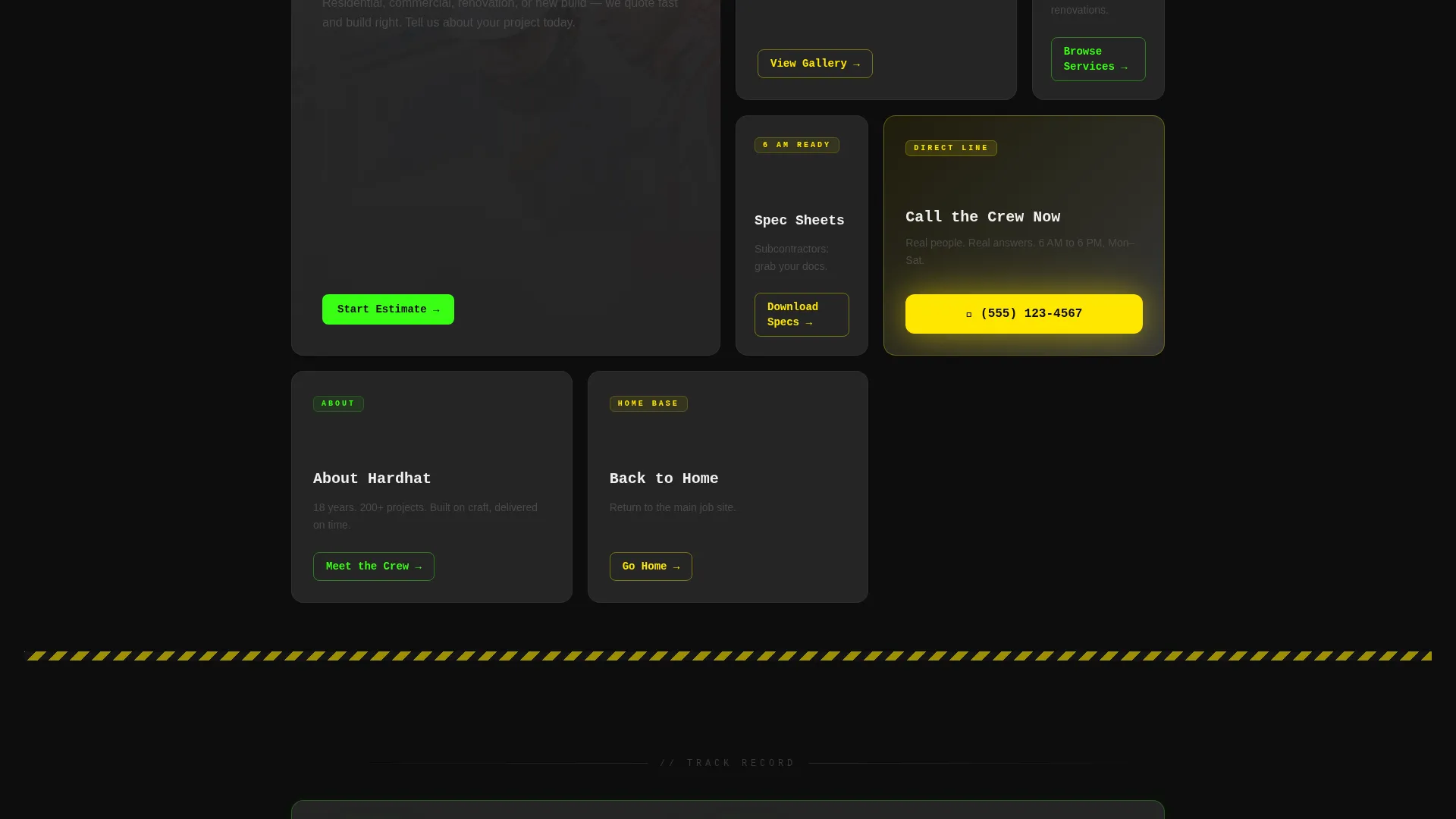
The modular card grid is split into two rows. The first row poses direct questions: "Lost?", "Looking for a quote?", and "Tracking your project?". Each card carries a neon green line-draw icon. The second row flips to answers, linking visitors to the estimate form, project gallery, service pages, and contact line.
Hover Lift and Pulse Animations
Every card responds to hover with a lift effect and a shadow pulse that mimics the precision of a laser level finding plumb. The motion escalates as visitors scroll, turning a static grid into a living site map that feels deliberate and useful.
Sticky Estimate Form Bar
A bottom bar slides into view two seconds after page load. It holds a compact three-field form: name, project type as a dropdown with options for residential, commercial, renovation, and new build, and phone number. The bar stays anchored while the visitor scrolls, keeping the primary call to action always reachable.
Click-to-Call Secondary Button
A "Call the Crew Now" button sits inside the sticky bar in caution-tape yellow. It functions as a direct click-to-call link, giving mobile visitors and subcontractors a fast path to reach the team without filling in a form.
Full-Sitemap Card Reconstruction
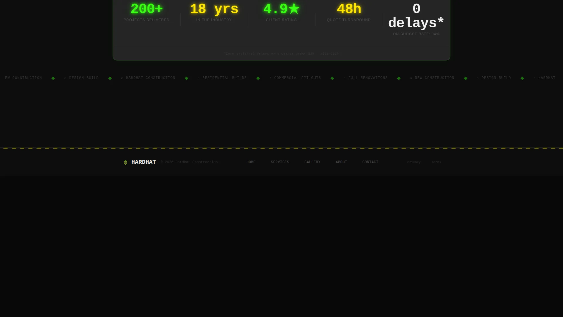
By the time a visitor reaches the bottom of the page, the card grid has assembled into a complete visual sitemap. This layout makes the 404 page feel architecturally intentional rather than apologetic, reinforcing the company's competence through clear organization.
Page sections overview
| Section | Purpose |
|---|---|
| Terminal Error Header | Displays animated 404 message with typewriter effect and screen shake |
| Problem Card Row | Surfaces visitor intent with three question-framing cards and animated icons |
| Solution Card Row | Provides direct navigation links to estimate form, gallery, services, and contact |
| Reconstructed Sitemap Grid | Assembles full card grid into a visual sitemap at the bottom of the scroll |
| Sticky Estimate Bar | Anchors lead capture form with name, project type dropdown, and phone field |
| Click-to-Call Button | Offers one-tap phone access via a caution-tape yellow secondary button |
Design & branding system
The visual identity is built on an Acid Digital color system that reads like a construction site at night. Industrial darkness meets electric precision across every element.
- Core palette: void black (#0D0D0D) as the background field, rebar neon green (#39FF14) for interactive states and hover animations, caution-tape yellow (#FFE600) for warnings and navigation cues, poured-concrete gray (#3A3A3A) for card surfaces, and off-white (#F0F0F0) for readable body type
- Typography uses monospaced fonts in the header to reinforce the terminal code concept, with clean sans-serif type in the card grid for fast scanning
- The Dynamic Motion theme drives the animation system: typewriter delays, hover lift shadows, icon line-draw reveals, and scroll-triggered card assembly all follow a consistent escalation rhythm
Mobile & speed optimization
The card grid uses a modular layout that adapts naturally to smaller screens. Every interactive element is sized and spaced for touch input.
- Cards restack into a single column on mobile, preserving the problem-to-solution scroll flow without requiring horizontal navigation
- The sticky estimate bar remains functional on mobile, with the form fields and click-to-call button stacked vertically for easy thumb reach
- Animations are designed to feel immediate and lightweight, so the motion-heavy design does not create a sluggish experience on mid-range devices
How this template helps you convert
The template is structured so that visitors feel helped before they feel sold to. Every design and copy decision is built around earning the click, not demanding it.
- The card grid solves the visitor's immediate problem first by surfacing useful exits early, so the company demonstrates competence before the estimate form appears
- The sticky bar with the three-field form and the click-to-call button stays visible throughout the scroll, reducing friction for both form-submitters and phone-preference visitors
- The reconstructed sitemap at the bottom gives visitors who are still exploring a complete picture of the site, turning a lost session into an informed starting point
Other information about this template
This template sits inside the construction company website templates category and is specifically designed for the 404 error page use case. It is a strong fit for agencies building or refreshing contractor websites.
- The template style is Card Grid (Modular), making individual cards easy to update, reorder, or extend with additional navigation destinations
- The creative direction follows a Problem-to-Solution Arc, which is particularly effective for recovery pages where visitor frustration is the starting emotional state
- The header concept is a Code Snippet block, which works well for construction brands that want to signal technical precision alongside trade credibility
- The lead generation direction is embedded in the design structure itself, not bolted on as an afterthought, making this template a practical tool for construction firms focused on quote volume
Theme
Dynamic Motion
Creative direction
Problem→Solution Arc
Color system
Acid Digital
Style
Card Grid (Modular)
Direction
Lead Generation
Page Sections
Terminal-style Animated Header
Problem-to-solution Card Grid
Hover Lift and Pulse Animations
Sticky Lead Capture Bar
Click-to-call Secondary Button
Reconstructed Sitemap Grid
Related questions
Can I change the navigation links inside the cards?
Does the sticky estimate form require a backend or form service to work?
Is this template only for 404 error pages?
Can the color palette be adjusted to match our brand?
Who is the typical visitor this page is built to serve?



