Construction Job Board Landing Page Template
Hardhat is a single-page construction job board landing page built for speed and credibility. It pairs a live-dashboard product screenshot header with a hard-hitting comparison table, real contractor testimonials, and a two-path lead generation flow. The dark, high-contrast design feels like a pre-dawn jobsite, built to turn general contractors and staffing agencies into active users fast.
by Rocket studio
Quick summary
Hardhat is a construction job board landing page template designed to convert general contractors, staffing agencies, and specialty subcontractors into active platform users. It leads with a dashboard product screenshot, drives urgency with live-counter stats, earns trust through a competitive comparison table, and closes with a frictionless two-path sign-up flow.
Who this template is for
This template is built for construction industry operators who need to fill skilled roles quickly and can't afford a slow hiring process. It speaks directly to the people managing crews, not abstract HR teams.
- Mid-size general contractors who need to staff crews before Monday morning
- Staffing agencies managing prevailing-wage projects across multiple counties
- Specialty subcontractors who have just landed a large contract and need certified tradespeople fast
What problem this template solves
Hiring in construction moves at a different pace than most industries. A delayed fill means delayed pours, missed inspections, and real money lost. Generic job boards don't speak that language, and word-of-mouth referrals don't scale.
- Contractors waste time posting on platforms not built for construction-specific roles or credentials
- Agencies struggle to show clients why a specialized board is worth switching to
- Workers have no single destination built around the trades they actually work in
What you get with this template
This template gives you a complete, ready-to-customize landing page focused on one goal: getting contractors and workers to act now. Every section is designed to reduce doubt and increase urgency.
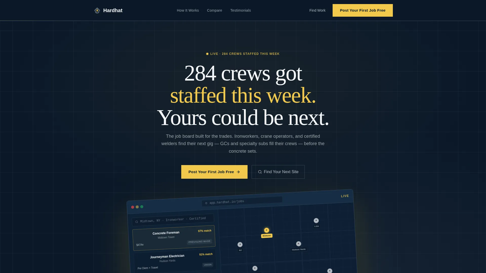
- A product screenshot header with a tilted browser frame showing a live job-search dashboard
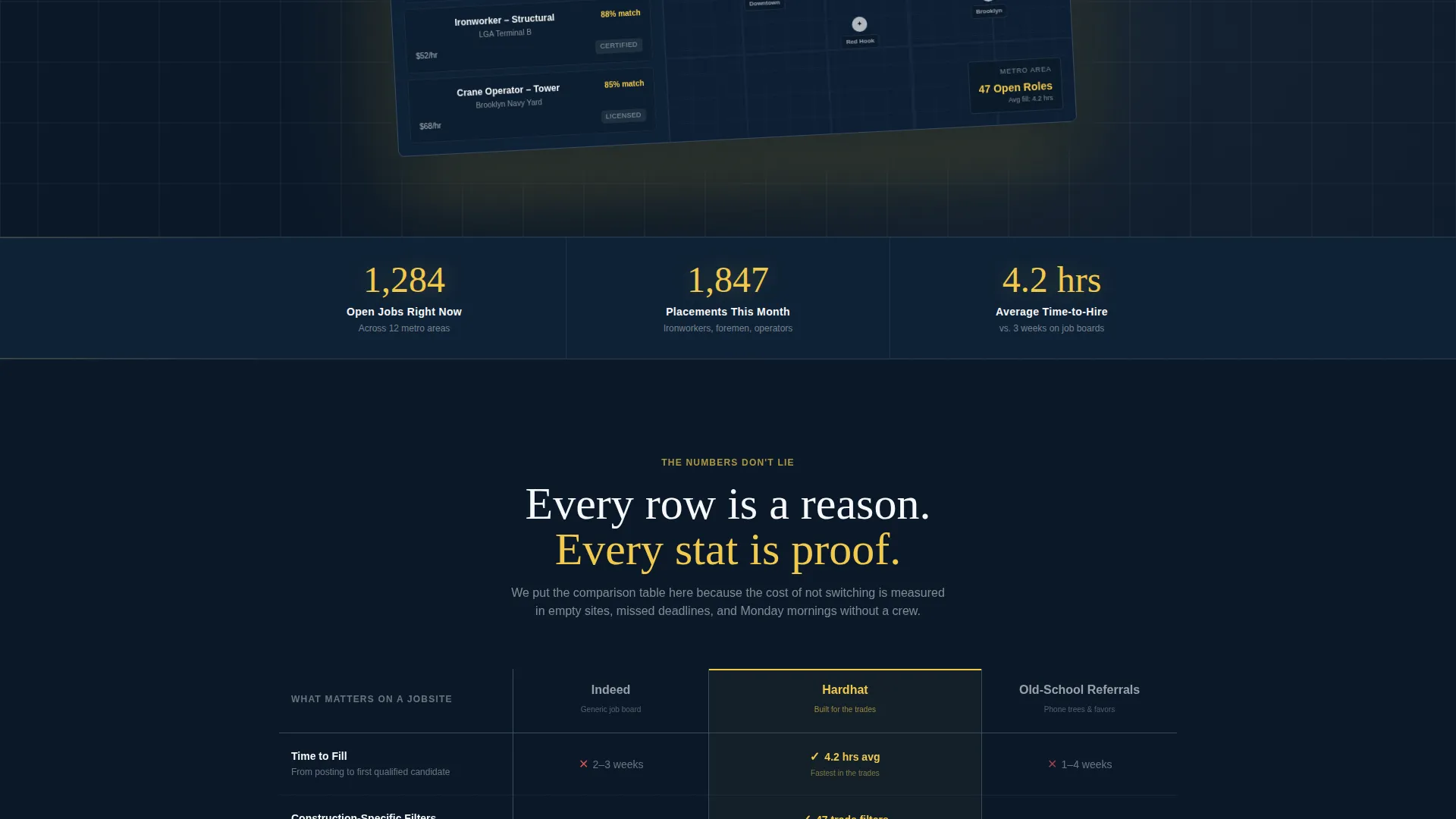
- A stats bar with live-counter metrics covering open jobs, monthly placements, and average time-to-hire
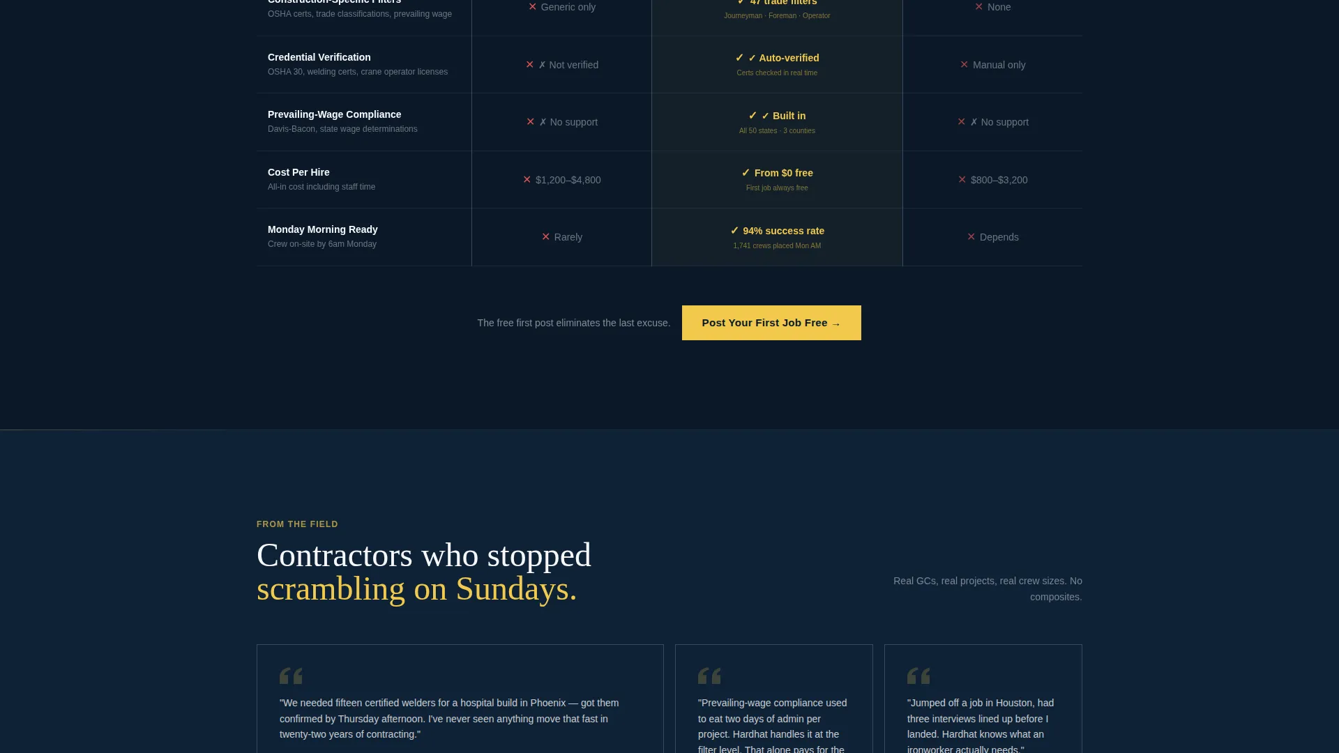
- A three-column comparison table contrasting your platform against generic boards and old-school referrals
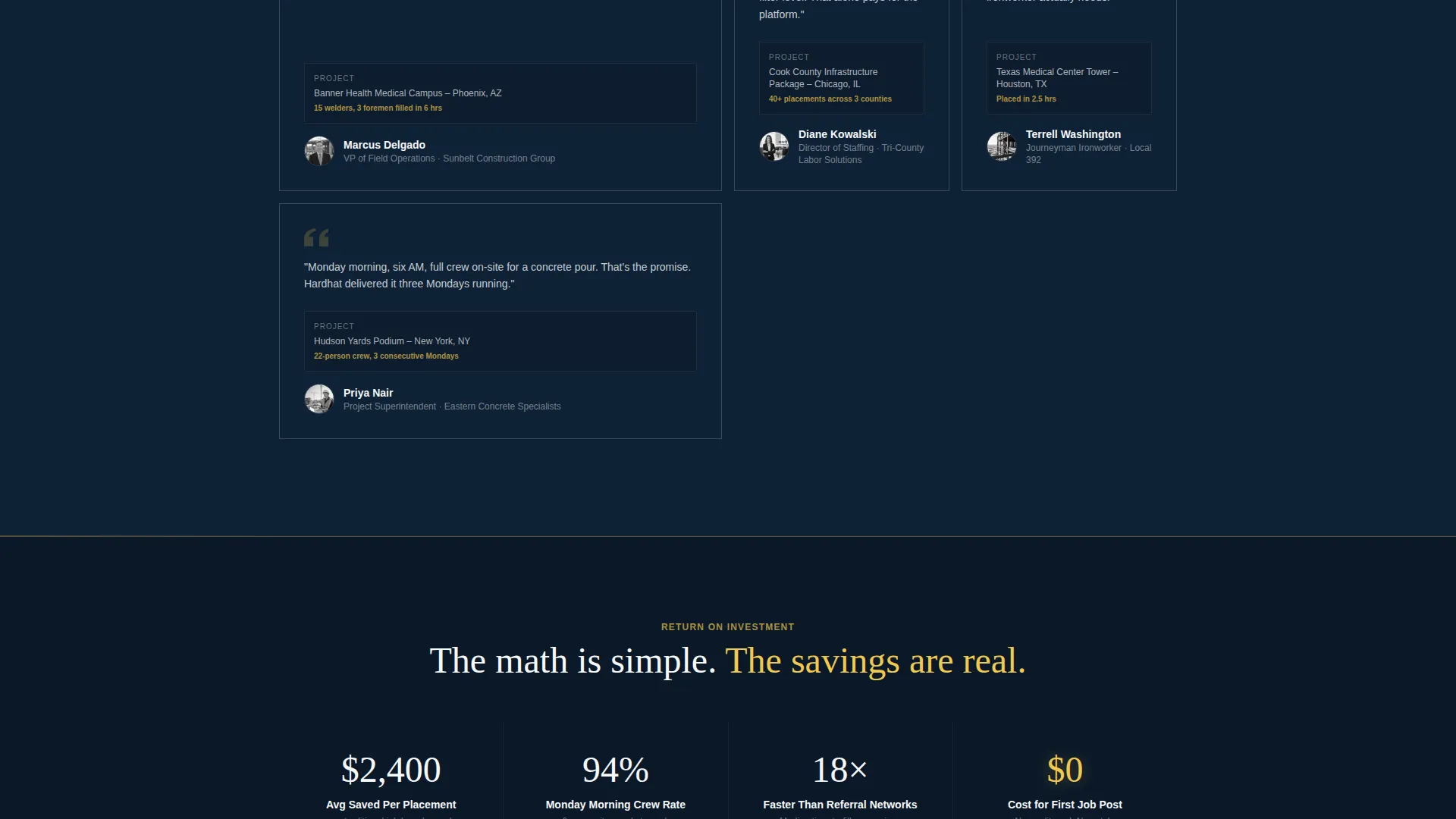
- Social proof testimonials with contractor names, project types, and crew sizes filled in
- A two-path call-to-action flow targeting both employers posting jobs and workers searching by zip code
Feature list
This section covers the core template components and what each one delivers for your audience.
Tilted Product Screenshot Header
The header centers a pixel-perfect browser frame showing the platform dashboard mid-search. The screenshot is tilted at a subtle 3-degree angle and floats over the midnight background with a soft luminous shadow. The headline above it reads "284 crews got staffed this week. Yours could be next." This combination creates immediate proof of a real, working product.
Live-Counter Stats Bar
Immediately below the header, a ticking metrics bar shows three numbers: open jobs, placements this month, and average time-to-hire in hours. These counters animate upward on scroll, creating urgency before the visitor reads a single line of explanation.
Three-Column Comparison Table
The comparison table is the page's persuasion engine. It places the platform in the center column and stacks two alternatives on either side. Each row covers a decision-relevant criterion: time-to-fill, construction-specific filters, credential verification, prevailing-wage compliance, and cost-per-hire. Platform cells carry a safety-yellow checkmark or bold stat; competitor cells show clear red gaps.
Two-Path Lead Generation Flow
The primary call-to-action button reads "Post Your First Job Free" and appears in the header, in a sticky navigation bar, and again after the comparison table. It opens a three-field form: company name, number of open roles via dropdown, and work email. A secondary path targets workers with a "Find Your Next Site" button linking to a zip-code search input.
Contractor Testimonial Block
Below the comparison table, a social proof section displays contractor testimonials. Each testimonial includes a company name, project type, and crew size. This specificity makes the proof feel real and construction-relevant, not generic.
Final ROI Stats Bar
The page closes with a second stats bar that restates platform value in dollar terms, showing cost saved per placement. This reinforces the comparison table's argument with a concrete financial frame before the final call-to-action repeat.
Page sections overview
| Section | Purpose |
|---|---|
| Sticky Navigation Bar | Keeps primary call to action visible on scroll |
| Product Screenshot Header | Establishes platform credibility instantly |
| Live Stats Counter | Drives urgency with real platform metrics |
| Comparison Table | Proves platform superiority over alternatives |
| Testimonial Block | Builds trust with specific contractor proof |
| ROI Stats Bar | Reinforces value in dollars saved |
| Final call to action Repeat | Removes last hesitation before sign-up |
Design & branding system
The visual identity follows a Startup Velocity theme built around a Midnight Blue color system. Every color choice echoes the pre-dawn jobsite atmosphere described in the brief: dark sky, sharp artificial light, and nothing soft or ambiguous.
- Deep terminal navy (#0B1929) covers primary backgrounds; reinforced steel gray (#3A4A5C) defines table borders and secondary surfaces
- High-vis safety yellow (#F2C94C) highlights every call-to-action button, interactive accent, and key stat
- Clean drywall white (#F7F8FA) is used for body text and card faces, keeping readability sharp against the dark palette
Mobile & speed optimization
The template is structured for fast scanning on any screen size. Construction professionals often check sites from a jobsite tablet or a phone between tasks, so the layout prioritizes high-contrast text and large tap targets.
- The sticky navigation bar keeps the primary call-to-action accessible on mobile without scrolling back to the top
- The comparison table is formatted to remain readable on smaller screens, with clear column separation and prominent yellow accents on key cells
How this template helps you convert
Every section of the page is sequenced to move a skeptical contractor or agency contact from curiosity to action. The flow is deliberate: proof first, explanation second, friction removed last.
- The live-counter stats bar creates immediate urgency before any pitch copy appears, anchoring the visitor with real numbers
- The comparison table makes the cost of not switching concrete and visible, turning every row into a reason to act
- The free first job post eliminates the final excuse, and the three-field form keeps the commitment light enough to complete in under a minute
Other information about this template
This template is categorized under Technology and specifically targets the Construction Digital Presence subcategory. It is a single-page layout built around a Comparison Table template style and a Lead Generation landing-page direction under a Startup Velocity theme.
- The header concept is a Product Screenshot, making it suitable for any construction job board platform that has a real dashboard to showcase
- The Stats-First Impact creative direction means numbers do the persuading before narrative copy takes over
- The Midnight Blue color system is intentional for the construction niche: it reads as authoritative, high-contrast, and field-tested rather than corporate or generic
- This template can support adaptation for regional job boards, trade-specific hiring platforms, or contractor staffing agencies looking to launch a dedicated online presence
Theme
Startup Velocity
Creative direction
Stats-First Impact
Color system
Midnight Blue
Style
Comparison Table
Direction
Lead Generation
Page Sections
Tilted Product Screenshot Header
Live-counter Stats Bar
Three-column Comparison Table
Two-path Lead Generation Flow
Contractor Testimonial Block
Final ROI Stats Bar
Related questions
Who is this landing page template designed for?
Can I use this template without a live dashboard to screenshot?
What does the comparison table actually compare?
How does the two-path call-to-action work?
Is this a single landing page or a multi-page template?



