Construction Digital Presence Specialist Professional Website Template
Hardhat is a modular card grid landing page built for a weekly construction email newsletter. It targets general contractors, estimators, and safety officers who need material costs, labor rates, and code updates before the morning site briefing. The page uses a Data Command visual identity with iridescent color accents on a deep graphite base, driving visitors toward an email signup or app download.
by Rocket studio
Quick summary
Hardhat is a single-page, card grid landing page template designed to promote a weekly construction email newsletter. It delivers a dense, scannable spec-sheet experience for busy construction professionals. The design combines a Data Command theme with an iridescent color system, a live-code header, and modular newsletter component cards that build toward a clear email signup and app download call to action.
Who this template is for
This template is built for construction professionals who live by schedules, bid sheets, and compliance deadlines. It speaks directly to the people who check their phones in the job trailer before the crew arrives.
- General contractors and estimators tracking lumber futures and bid spread volatility
- Superintendents and safety officers who need permit updates and Occupational Safety and Health Administration (OSHA) revision summaries before morning pour schedules
- Newsletter creators or construction tech teams launching a weekly digest for the trades
What problem this template solves
Most email newsletter landing pages feel generic. They do not speak the language of the job site, and they waste the time of professionals who have zero tolerance for vague value propositions.
- Construction subscribers need to see what data they get, how often, and why it matters before they hand over a work email
- Standard templates bury the content proof beneath lifestyle copy, creating friction for skeptical, data-driven audiences
- There is no clear path from "I'm interested" to "I've downloaded the app," leaving conversion incomplete
What you get with this template
You get a fully structured, single-page landing page built around a modular card grid. Every section has a defined role, and the layout is designed to let the content itself do the selling.
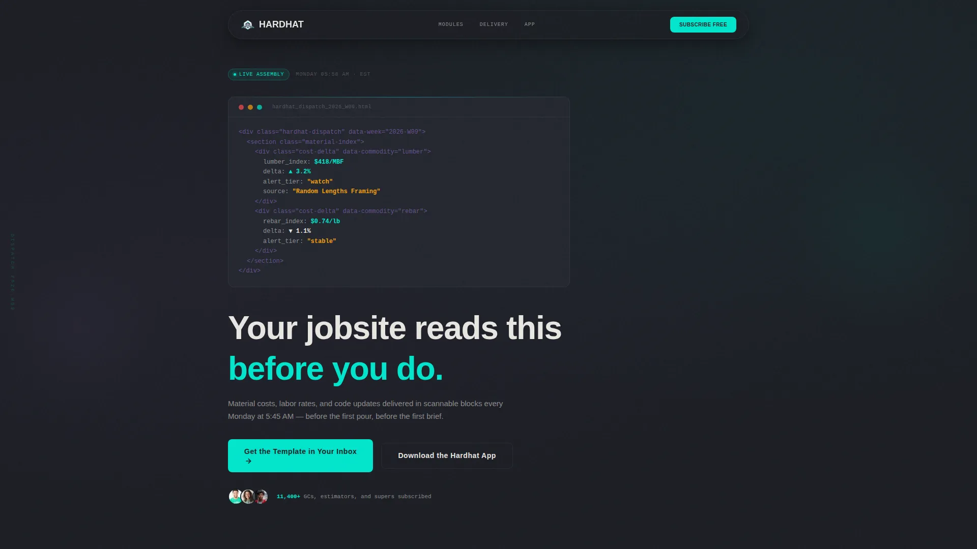
- A styled code snippet header block with live-looking markup and a blinking cursor, setting a technical, credible tone from the first scroll
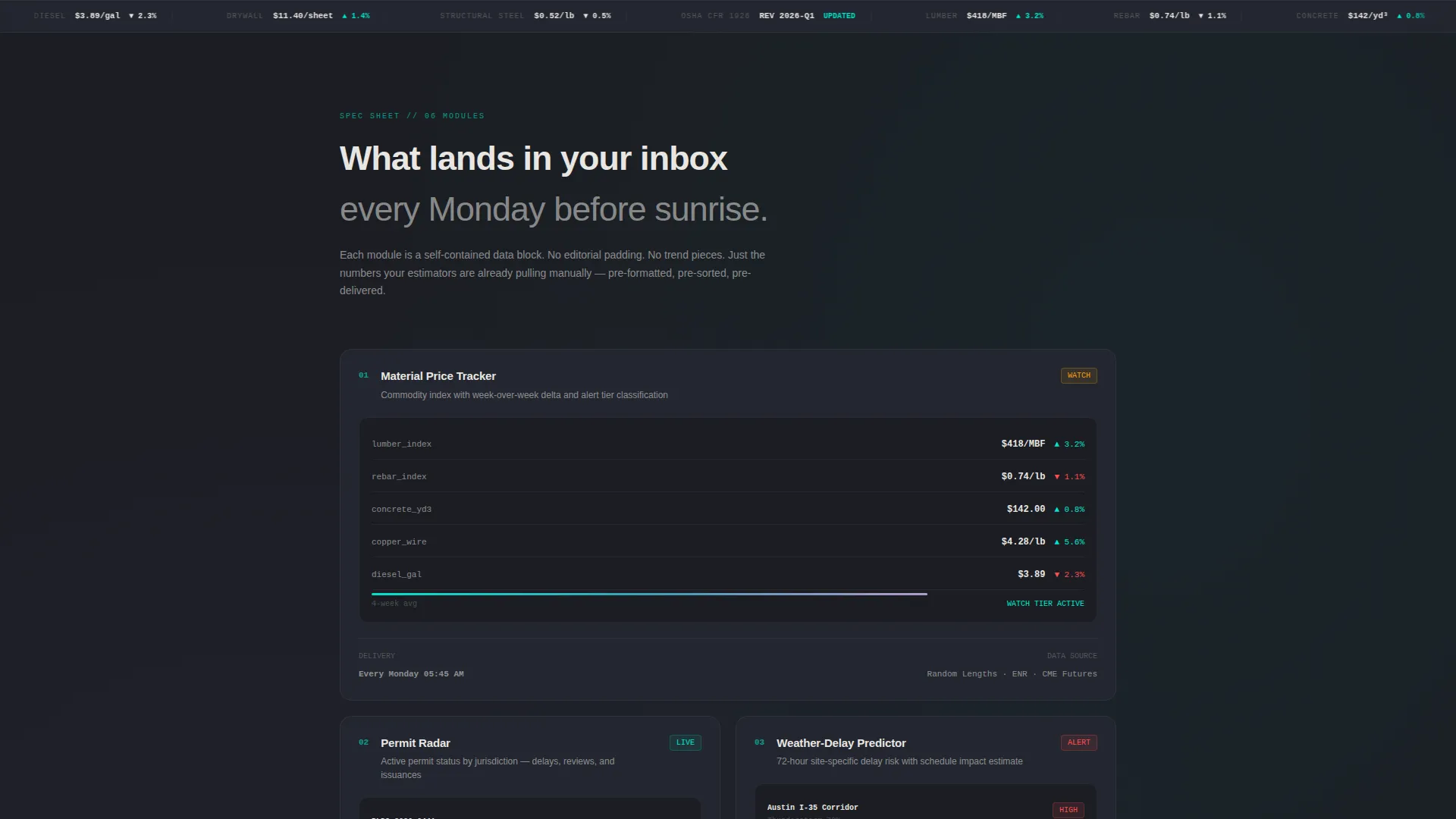
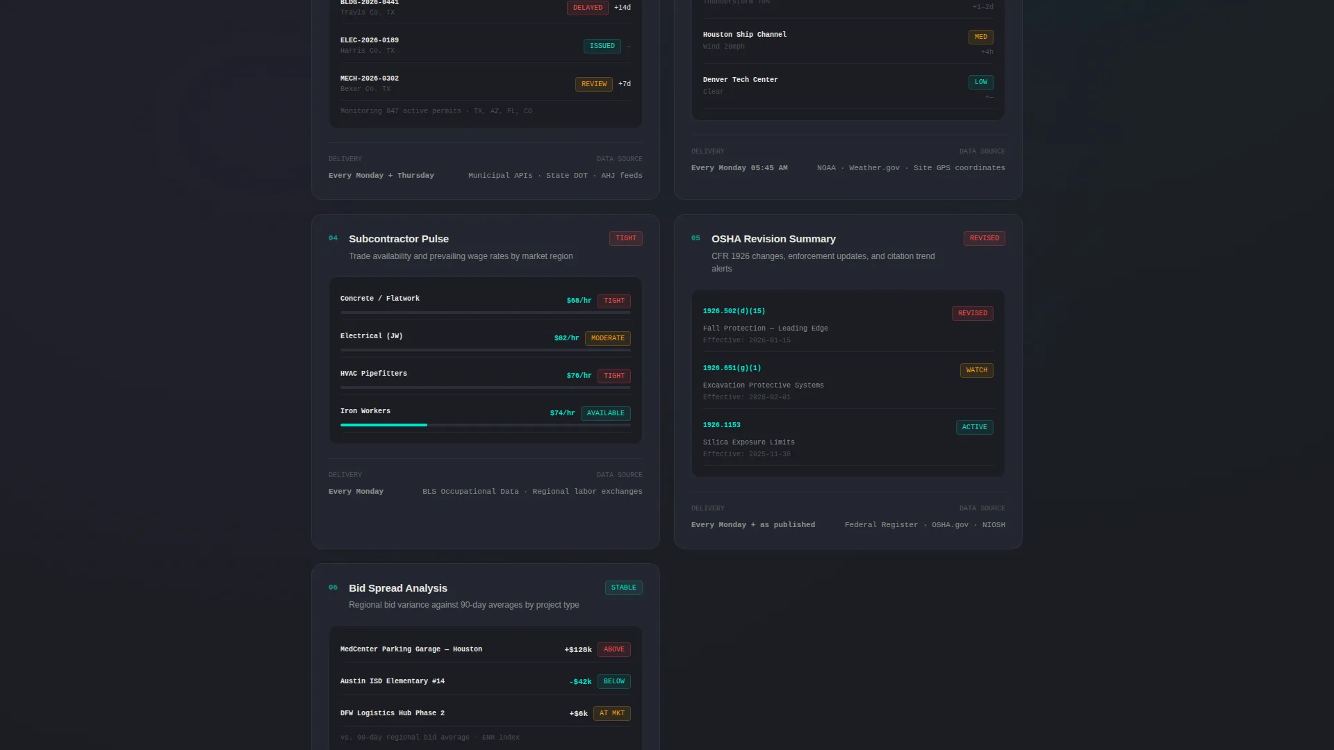
- Four modular newsletter spec cards (Material Price Tracker, Permit Radar, Weather-Delay Predictor, Subcontractor Pulse), each with sample renders, data source attribution, and delivery frequency
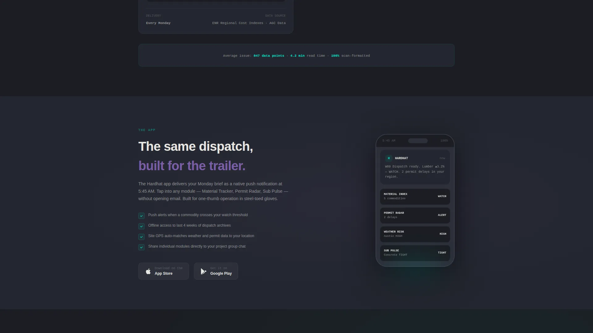
- A two-field email signup form asking only for work email and trade role, plus a dual call-to-action block with iOS and App Store download badges
Feature list
This landing page template is built from a focused set of components. Each one has a specific job within the conversion flow.
Live Code Snippet Header
The header renders a styled block of email markup in a monospaced font on the deep graphite background. It shows a real inline cost-delta element with values like lumber_index: $418/MBF and delta: ▲ 3.2%. A blinking cursor and a fade-in headline give the impression the template is being assembled in real time.
Modular Newsletter Spec Cards
Each card isolates one newsletter component and presents it the way a submittal package lists fixtures. Cards include a sample render, data source attribution, and delivery frequency. As the visitor scrolls, cards shrink and stack tighter, creating a rhythm that communicates density and urgency.
Dual Call-to-Action Block
The primary call to action reads "Get the Template in Your Inbox." A secondary button below it reads "Download the Hardhat App," accompanied by iOS and App Store download badges. This dual path appears after the third card row, positioned where content density has already made the case.
Minimal Email Signup Form
The signup form captures only two fields: work email and trade role. The trade role selector offers four options: general contractor (GC), estimator, superintendent, and safety. This low-friction form reduces abandonment while still segmenting subscribers by professional function.
Data Command Visual Theme
The iridescent color system applies deep graphite (#1B1D23) as the page base, shifting holographic violet (#7B5EA7) on hover states and active cards, and electric teal (#00E5CC) for data highlights and notification badges. Poured-concrete off-white (#E8E6E1) handles body text and card surfaces, creating an industrial-technical contrast that feels credible rather than decorative.
Page sections overview
| Section | Purpose |
|---|---|
| Code Snippet Header | Sets technical credibility with styled live markup and a fade-in headline |
| Hero Headline Block | Delivers the core value statement directly beneath the code block |
| Newsletter Spec Cards | Presents four modular newsletter components as technical specifications |
| App Download call to action | Introduces the app download path after card row three |
| Email Signup Form | Captures work email and trade role with minimal friction |
| iOS and App Store Badges | Provides direct download links for the companion app |
Design & branding system
The visual identity follows a Data Command theme. It is designed to feel like a technical dispatch viewed under fluorescent light, not a marketing brochure.
- Color palette: deep graphite (#1B1D23) base, holographic violet (#7B5EA7) for hover and active states, electric teal (#00E5CC) for data highlights and badges, and poured-concrete off-white (#E8E6E1) for text and card surfaces
- Typography uses a monospaced font in the header code block, reinforcing the technical context; body copy stays clean and scannable to match the fast-read habits of the target audience
- Iridescent accent flashes on card hover states suggest live data intelligence without relying on motion-heavy animation
Mobile & speed optimization
Construction professionals often access information from a phone in a job trailer or on-site. The layout is built to hold up in that context.
- The card grid is modular and stacks responsively, keeping spec cards readable on smaller screens without losing the density that defines the page's authority
- The two-field signup form is intentionally minimal, reducing tap friction for mobile users who want to subscribe quickly before a briefing starts
How this template helps you convert
The page is structured to let the content build conviction before asking for a commitment. Each section earns the next.
- The code snippet header creates immediate credibility with a technical audience by showing real data values instead of abstract promises, establishing trust before the first scroll.
- The modular spec cards accelerate in density as the visitor scrolls, shifting the emotional register from curiosity to a clear sense of what they are missing every Monday morning.
- The dual call-to-action block appears only after three card rows, placing the signup and app download prompt at the exact moment the visitor's motivation is highest.
Other information about this template
This template is designed for construction technology teams, newsletter operators, and trade-focused product teams launching a subscriber acquisition page. It pairs well with construction digital presence strategies targeting professionals in estimating, project management, and site safety.
- The template style is a card grid (modular) layout, making it straightforward to update card content, reorder sections, or swap data values as newsletter components evolve
- The page is category-matched to construction email newsletter templates within the construction digital presence subcategory
- The App Download landing page direction means the conversion flow is dual-purpose: it builds an email list and drives installs of the Hardhat companion app simultaneously
Theme
Data Command
Creative direction
Spec Sheet
Color system
AI Iridescent
Style
Card Grid (Modular)
Direction
App Download
Page Sections
Live Code Snippet Header Block
Modular Newsletter Spec Cards
Dual Call-to-action Block
Minimal Two-field Signup Form
Data Command Iridescent Color System
Related questions
Who is this landing page template designed for?
What fields does the email signup form collect?
Can I update the newsletter spec cards with my own content?
Where does the app download call to action appear on the page?
What makes this template different from a generic email signup page?



