Streamlined Bookkeeping Landing Page Template
Ledger is a split-screen pricing landing page built for accounting firms that need to communicate precision and trust at a glance. Featuring a live-styled metrics header, a scrollable three-tier feature matrix, and signal-green call-to-action buttons, it guides founders, CFOs, and estate attorneys toward the right plan with zero friction.
by Rocket studio
Quick summary
Ledger is a single-page pricing template for accounting firms. It opens with a metrics wall that signals credibility through numbers alone, then transitions into a scrollable feature matrix comparing three service tiers. Every design choice reinforces financial authority: monospaced figures, a dark graphite palette, and signal-green highlights that guide the eye to action.
Who this template is for
This template is built for established accounting practices that serve business clients with complex needs. It works best when the firm has multiple service tiers to communicate and wants visitors to self-select without a discovery call.
- Founders scaling past their first bookkeeper who need a clear picture of what full-service accounting looks like
- CFOs at mid-market companies managing multi-state compliance who need to evaluate advisory depth quickly
- Estate attorneys and trust administrators who need a firm to communicate accuracy and scope before engagement
What problem this template solves
Most accounting firm pricing pages either hide their prices behind a contact form or present a flat rate card with no context. Neither approach builds confidence. Prospective clients leave unsure of what they are buying.
- Visitors cannot tell which tier matches their business stage, so they delay or abandon
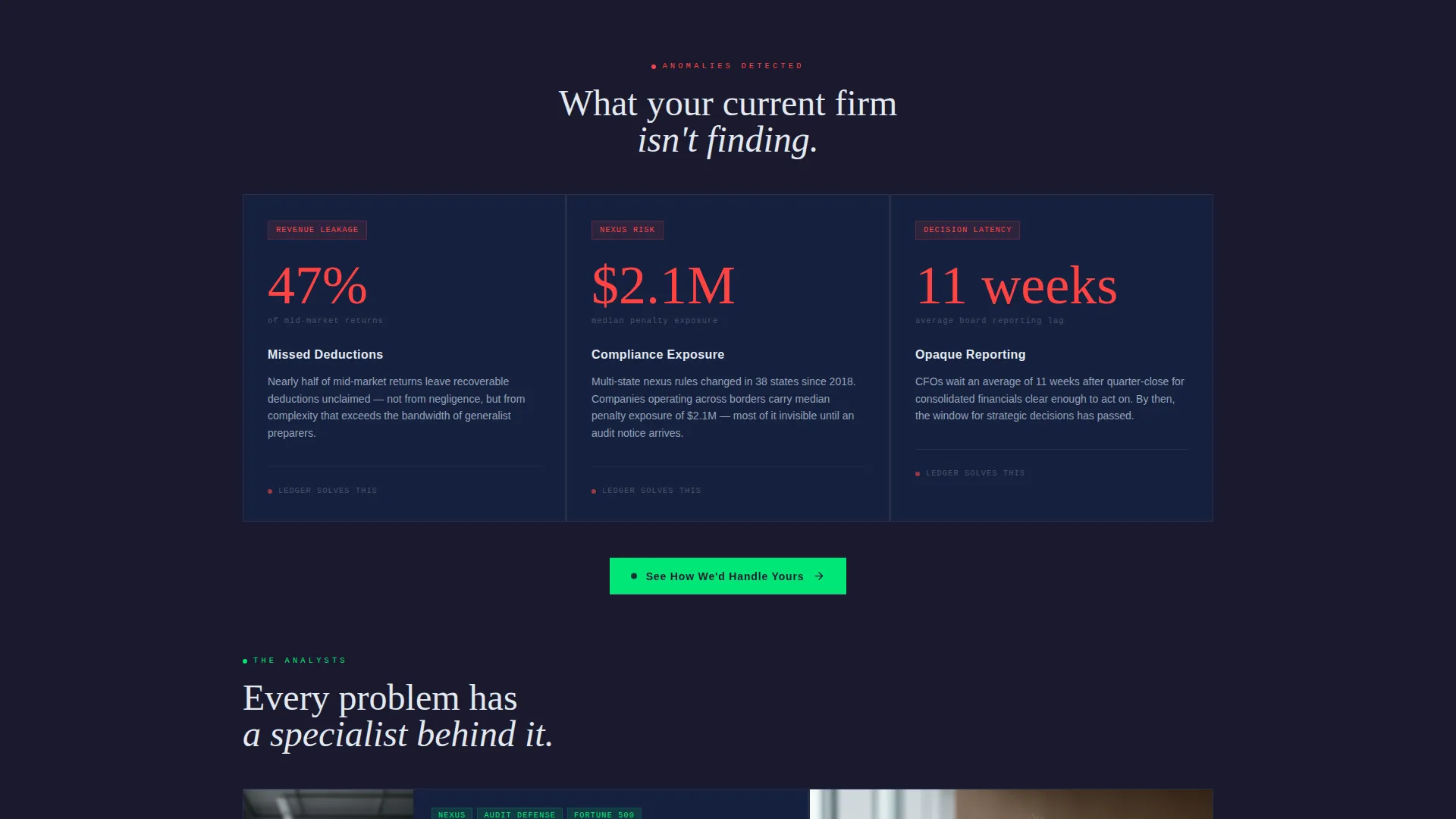
- Without visible proof of performance, a firm looks like every other practice on the block
- Pricing presented as a percentage rather than a dollar value feels vague and untrustworthy
What you get with this template
You get a fully structured, single-page pricing layout designed to move a qualified visitor from arrival to a confident plan selection. Every section is purposeful and prompt-backed.
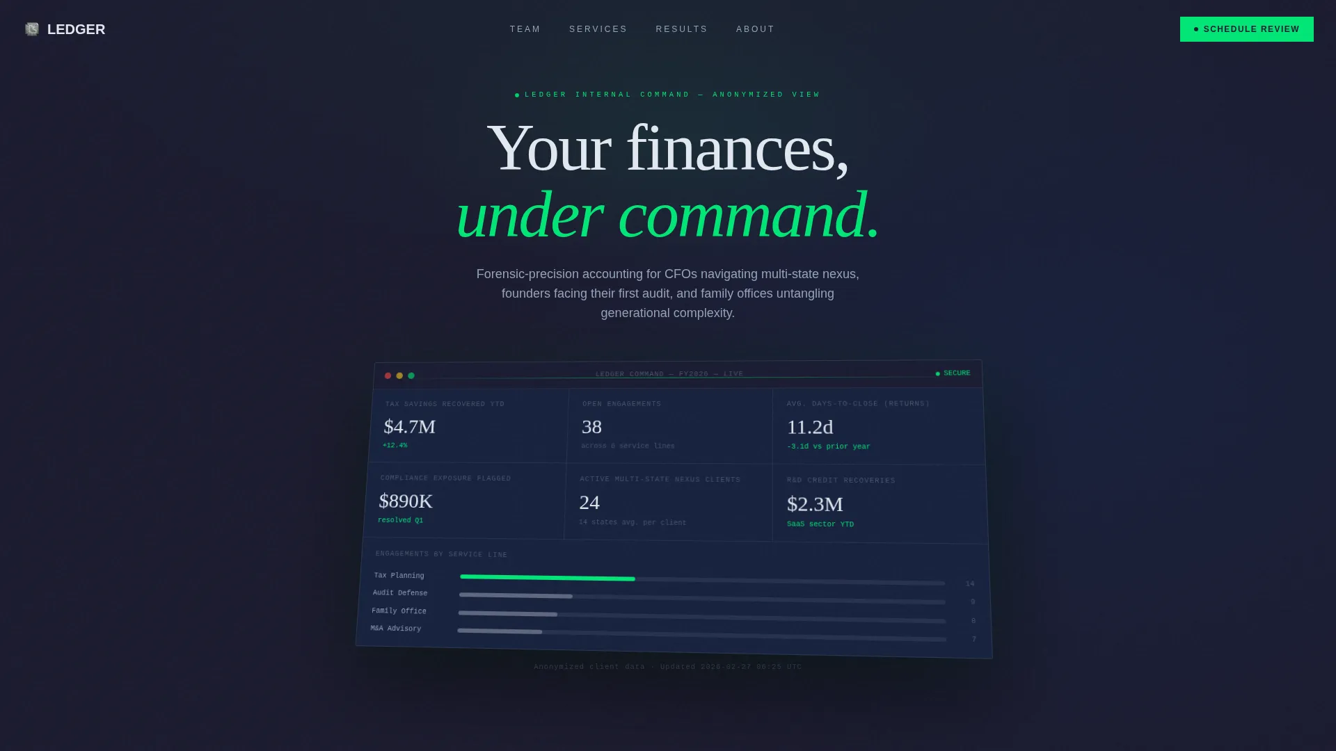
- A split-screen header pairing a live-styled metrics dashboard on the left with a bold pricing headline on the right
- A scrollable three-column feature matrix with row-by-row tier comparisons, hover tooltips, and signal-green checkmark animations
- A billing toggle at the top that switches between monthly and annual pricing and displays the annual saving as a calculated dollar amount
Feature list
This template is built around a small set of high-impact components. Each one does specific, measurable work on the page.
Stats and Metrics Header Wall
The left panel of the split-screen header displays three key performance figures: returns filed, accuracy rate, and total client tax savings. Numbers are rendered in large monospaced type with a subtle counting animation, so the first thing a visitor reads is evidence, not a tagline.
Scrollable Feature Matrix
Three pricing tiers sit side by side in a detailed comparison grid. As the visitor scrolls, features reveal row by row across tax preparation, bookkeeping, payroll, advisory hours, dedicated CPA access, and audit defense. This structure lets a visitor recognize their own business stage in the feature list and self-select accordingly.
Hover Tooltip Education Layer
Each feature row includes a one-line tooltip that appears on hover. Tooltips explain why a specific capability matters at a given growth stage, such as why a scaling company needs multi-state nexus analysis or an R&D credit study. This reduces buyer uncertainty without adding page clutter.
Billing Frequency Toggle
A toggle near the top of the page switches the displayed prices between monthly and annual billing. The annual saving is shown as a concrete dollar amount rather than a percentage, which makes the value of committing to an annual plan immediately clear.
Per-Tier Click-Through calls to action
Each pricing column carries its own primary call-to-action button reading "Lock In This Plan." Each button routes to a dedicated onboarding page for that tier. There is no form on this page. The design earns the click by making the purchase feel fully informed before the visitor ever leaves.
Signal Green Active States
The signal green accent color is reserved exclusively for active states, the selected pricing tier highlight, toggle indicators, and call-to-action buttons. This restraint keeps the accent meaningful. When something glows green, the visitor knows it is actionable or selected.
Page sections overview
| Section | Purpose |
|---|---|
| Split-Screen Header | Pairs live metrics with the pricing headline |
| Billing Frequency Toggle | Switches between monthly and annual pricing |
| Three-Tier Matrix | Compares Essential, Growth, and Enterprise plans |
| Tooltip Feature Rows | Explains why each feature matters per tier |
| Per-Tier call to action Buttons | Routes each visitor to a tier-specific onboarding page |
Design & branding system
The visual identity follows a Dashboard Pro theme with a Carbon Fiber color system. The palette is technical and deliberate, evoking a high-end financial instrument rather than a generic SaaS product.
- Deep graphite (#1A1A2E) forms the primary background, titanium mid-gray (#4A4E69) handles supporting text and unavailable feature states, and clean ledger white (#F2F2F2) is used for primary text and grid lines
- Signal green (#00C853) is reserved strictly for active states, the selected tier column, toggle indicators, and call-to-action buttons, keeping its meaning unambiguous across the page
- Typography leans on a clean sans-serif for headlines and monospaced type for all numerical figures, reinforcing the dashboard aesthetic throughout
Mobile & speed optimization
The template is designed with a layout that adapts from the split-screen desktop view to a stacked single-column flow on smaller screens. The feature matrix reflows cleanly so tier comparisons remain readable without horizontal scrolling.
- The counting animation in the metrics header is lightweight and built to run without impacting layout stability on load
- Tooltip interactions are preserved on touch devices through a tap-to-reveal pattern so mobile visitors can still access feature explanations
How this template helps you convert
The page is built around a single conversion goal: a confident, informed click on a tier-specific call-to-action. Every element supports that goal without introducing friction.
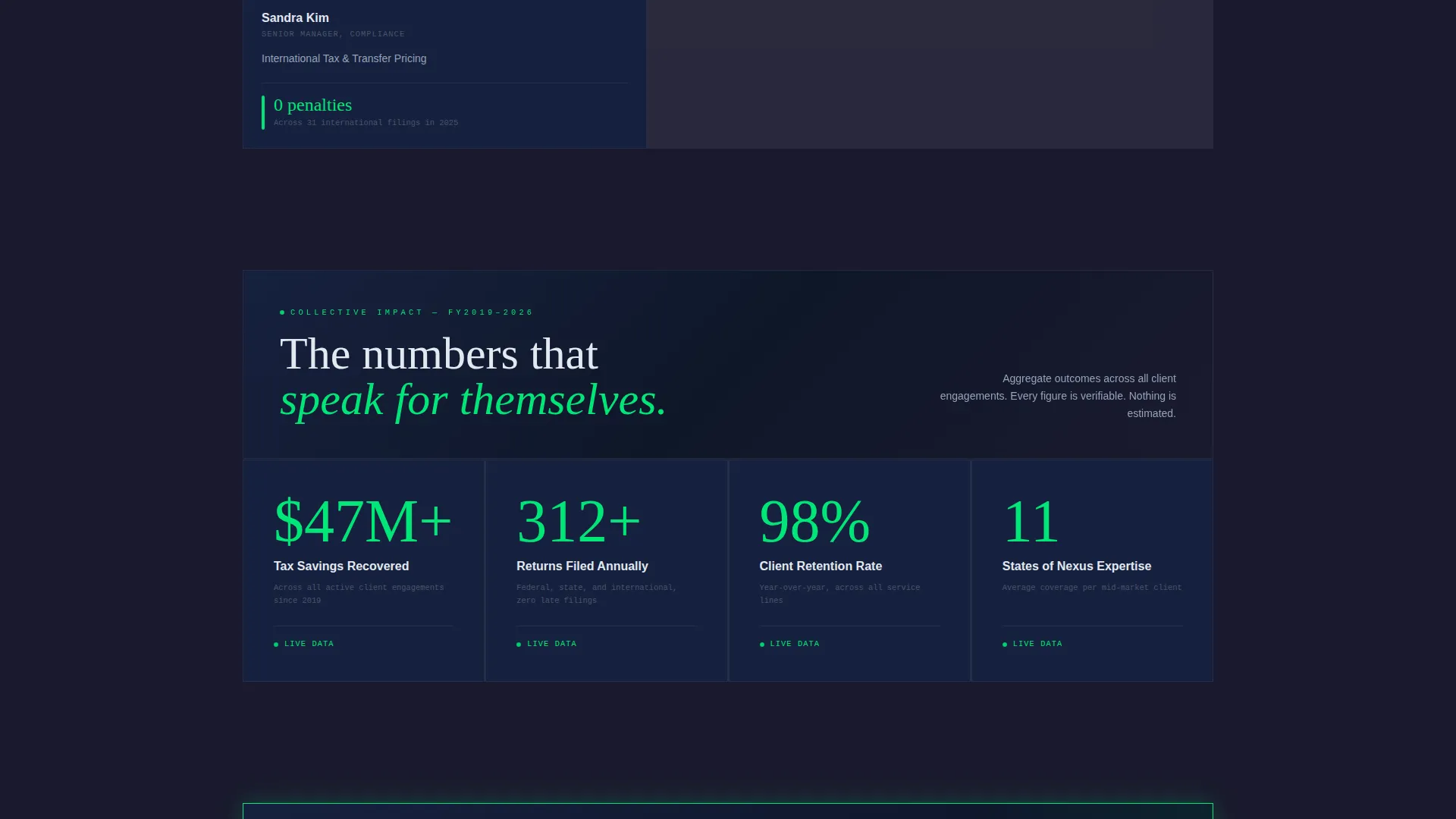
- The metrics header front-loads credibility with concrete performance figures, so visitors arrive at the pricing matrix already primed to trust the firm rather than question it.
- The feature matrix with tooltip explanations removes the need for a discovery call by giving visitors the context to self-qualify. A founder scaling past basic bookkeeping can see exactly which plan covers their next stage of complexity.
Other information about this template
This template was designed for a specific intersection of niche and presentation: an accounting firm pricing page that needs to communicate authority, scope, and value without relying on stock imagery or sales copy.
- The template fits within the broader category of accounting firm website templates and is particularly well-suited to firms positioning themselves above commodity tax preparation services
- The no-form, click-through structure is intentional for this niche. Qualified buyers in the founder and CFO audience segment are more likely to convert when the path forward is a direct click, not a callback request
- The Carbon Fiber color system and Dashboard Pro theme are a deliberate departure from the blue-and-white palette common in financial services, giving firms that use this template a distinct visual identity in a crowded category

Theme
Dashboard Pro
Creative direction
Feature Matrix
Color system
Carbon Fiber
Style
Split Screen (50/50)
Direction
Click-Through
Page Sections
Live-styled Metrics Header
Scrollable Three-tier Feature Matrix
Hover Tooltip Education Layer
Monthly and Annual Billing Toggle
Per-tier Click-through Call to Action Buttons
Signal Green Active State System
Related questions
Does this template include a contact form?
Can I edit the three pricing tiers to match my firm's actual service packages?
How does the annual billing toggle work?
Can I update the metrics in the header with my firm's real numbers?
Is this template a good fit for a solo practitioner?



