Cannabis Education Landing Page Template
Cultivar is a gallery and detail landing page template built for cannabis brand design agencies. It follows a timeline progression layout that walks visitors through Discovery, Identity, Packaging, and Launch phases. Warm parchment and rust tones, botanical illustration styling, and a sliding inquiry panel make it purpose-built for B2B client acquisition in the cannabis industry.
by Rocket studio
Quick summary
Cultivar is a single-page gallery and detail template for cannabis brand design agencies. It moves visitors through a four-phase brand build timeline, from moodboards to dispensary shelf photography. The field journal aesthetic, rust and parchment palette, and B2B inquiry panel work together to turn curious operators into qualified leads.
Who this template is for
This template is built for design studios and creative agencies that serve the cannabis industry. It speaks directly to the people who buy branding services, not the end consumers of cannabis products.
- Cannabis brand design agencies showcasing portfolio work to prospective clients
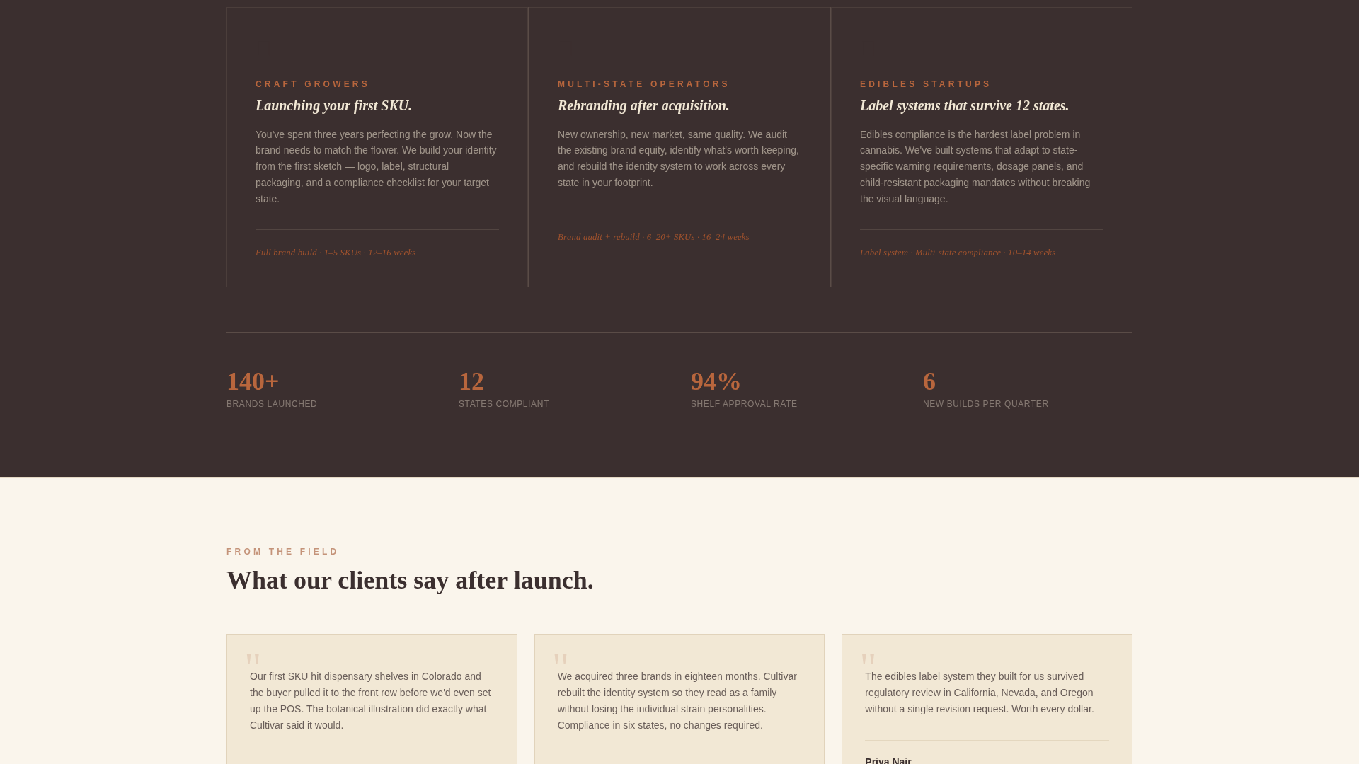
- Studios pitching to craft growers, multi-state operators, and edibles startups
- Creative businesses that need a gallery-forward landing page with a B2B inquiry flow
What problem this template solves
Most agency portfolio pages feel generic. They show work but fail to explain the process or create the sense of progression that builds trust with a skeptical B2B buyer. Cannabis operators need to see that their agency understands regulatory complexity, retail environments, and brand storytelling before they commit.
- Agencies lose leads because their portfolio has no narrative arc or momentum
- Operators in research mode leave without converting because there is no low-commitment entry point
- Craft growers and multi-state operators have different needs, and a single static page rarely speaks to both
What you get with this template
You get a fully structured single-page layout organized around a four-phase timeline. Every section is purpose-designed for a cannabis brand design agency selling B2B services to cannabis operators.
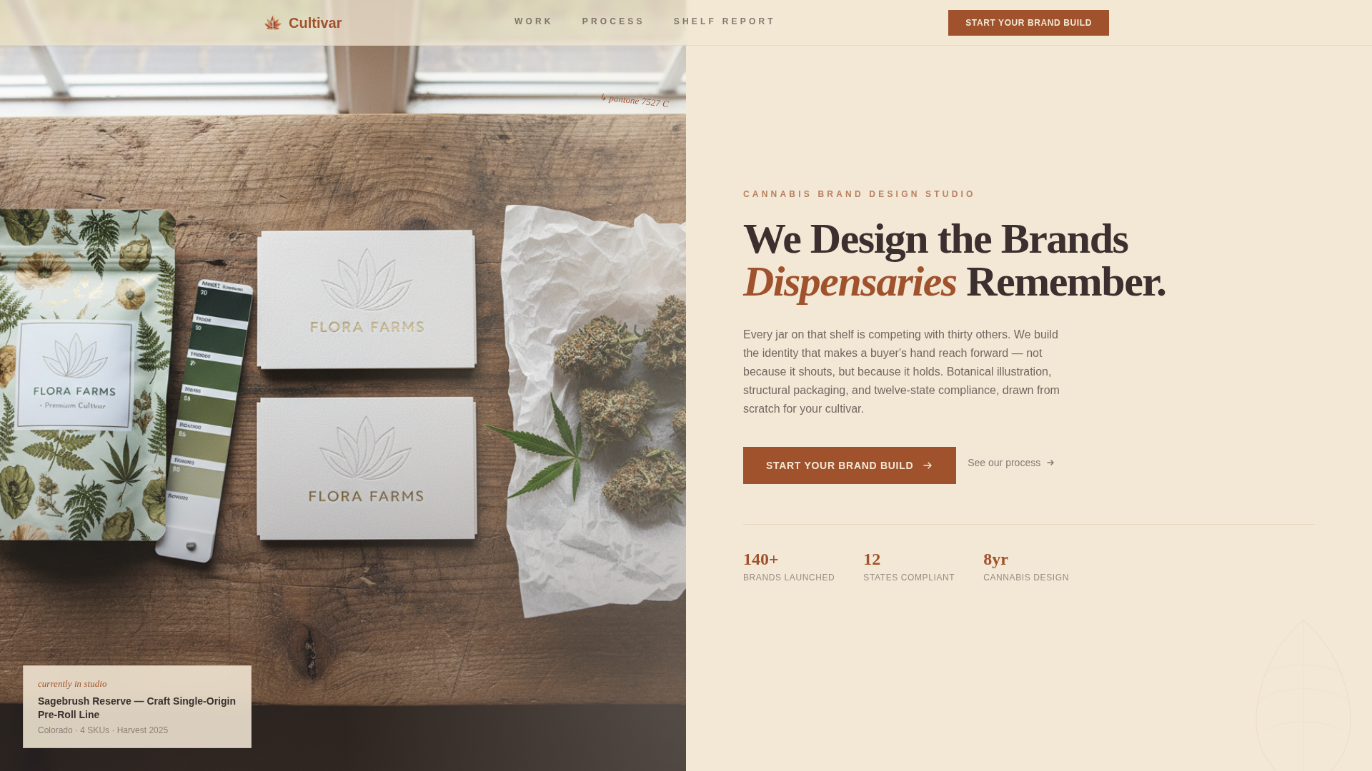
- A half-page hero with a cinematic still life photo area and tall serif headline zone
- Four expandable gallery rows covering Discovery, Identity, Packaging, and Launch phases
- A sliding inquiry panel with a multi-field form and a gated PDF secondary conversion path
Feature list
This template delivers a focused set of interactive and visual components, each built around the realities of selling creative services to cannabis businesses.
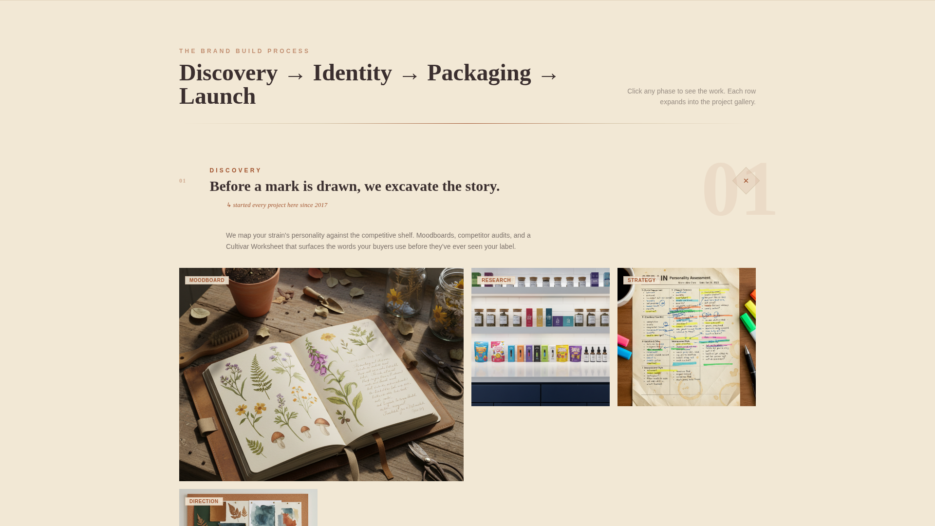
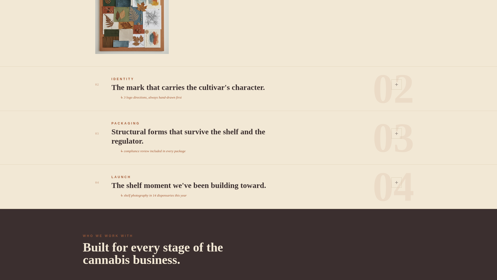
Four-Phase Timeline Gallery
The page unfolds as a brand build in progress. Each phase, Discovery, Identity, Packaging, and Launch, is presented as its own gallery row. Rows expand on click to reveal deeper project detail, creating momentum as the visitor scrolls.
Sliding Inquiry Panel
The primary call to action opens a sliding panel form rather than redirecting to a new page. The form collects company name, number of SKUs (with range options of 1 to 5, 6 to 20, or 20 or more), target launch markets via a state multi-select, and a freeform textarea labeled "Tell us about your cultivar."
Gated PDF Secondary Conversion
A secondary call to action offers a downloadable report titled "The Dispensary Shelf Report: What Packaging Wins at Retail." It is gated behind an email address and company name field. This path captures operators who are researching but not yet ready to commit to an inquiry.
Fixed Mobile Call-to-Action Bar
On mobile, a persistent bottom bar keeps the primary call to action visible at all times. Visitors never have to scroll back to find the inquiry entry point, which is important for B2B prospects browsing during trade shows or off-site.
Half-Page Hero Composition
The header splits the screen: the left side holds a moody overhead still life of branded identity materials, while the right side displays a tall serif headline and a short craftsperson-voiced paragraph. The composition sets a premium, editorial tone immediately.
Field Journal Visual System
The parchment and rust color system, paired with botanical illustration styling, gives the page a tactile, handcrafted quality. Fraunces serif headlines and DM Sans body text reinforce an editorial feel that stands apart from generic agency templates.
Page sections overview
| Section | Purpose |
|---|---|
| Hero Split Header | Introduces brand voice and primary call to action |
| Discovery Phase Gallery | Shows moodboards, audits, and strain worksheets |
| Identity Phase Gallery | Displays logo explorations and color studies |
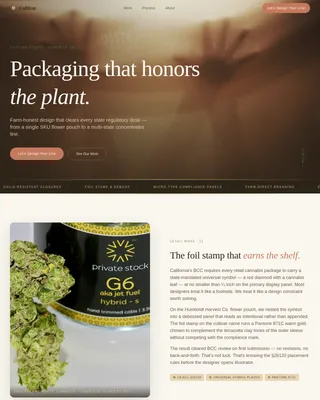
| Packaging Phase Gallery | Reveals dielines and three-dimensional mockups |
| Primary call to action Placement | Prompts inquiry after the Packaging phase |
| Launch Phase Gallery | Presents shelf photography and social templates |
| Footer Arc Split | Holds logo, tagline, and navigation links |
Design & branding system
The visual identity draws from vintage seed catalogs and field journals. Every design decision reinforces the idea of careful, handcrafted work rather than polished digital production.
- Color palette: unbleached hemp parchment (#F2E8D5) for backgrounds, dried terracotta rust (#A0522D) for headlines, deep loam brown (#3B2F2F) for body text, and oxidized copper green (#5F7161) reserved for hover states and active links
- Typography pairing: Fraunces tall serif for all headings, DM Sans for body copy and form labels
- Visual motifs include botanical line drawings, ink swatch references, textured paper surfaces, and natural window light photography direction
Mobile & speed optimization
The template is designed desktop-first, reflecting the B2B agency portfolio context where most initial discovery happens on a laptop or large screen. Mobile experience is supported through a focused set of practical decisions.
- Fixed bottom call-to-action bar on mobile keeps the inquiry entry point always accessible
- Gallery rows and the sliding panel form are structured to remain usable on smaller screens
- Image areas and scroll-reveal animations are organized to support smooth loading on desktop connections
How this template helps you convert
The page is structured around two distinct conversion paths, so it can capture both ready-to-engage clients and operators still weighing their options.
- The primary call to action, "Start Your Brand Build," appears after the Packaging phase and again as a fixed bar on mobile, catching visitors at the moment of highest intent after watching a brand come to life through three gallery phases.
- The gated PDF offer provides a low-friction second path for operators in research mode, capturing an email and company name from buyers who are not ready to fill out a full inquiry form but are still valuable future leads.
Other information about this template
This template is designed specifically for the cannabis industry services sector and carries details that reflect real regulatory and retail realities in the United States cannabis market.
- The inquiry form includes a 12-state multi-select field, reflecting the complexity of multi-state cannabis operator launches
- The page style references compliance-ready packaging and dispensary shelf context throughout, signaling industry fluency to prospective clients
- The template style is Gallery and Detail, meaning every phase section is built to hold real portfolio imagery and expand into deeper project views
- The nature-inspired theme and Partnership and B2B landing page direction are baked into the layout logic, not just the color palette
- The footer uses an Arc Browser Split pattern with logo and tagline on the left and navigation links on the right
Theme
Nature-Inspired
Creative direction
Timeline Progression
Color system
Parchment & Rust
Style
Gallery + Detail
Direction
Partnership/B2B
Page Sections
Four-phase Brand Build Timeline
Sliding B2B Inquiry Panel
Gated PDF Lead Capture
Fixed Mobile Call to Action Bar
Botanical Field Journal Visual System
Half-page Cinematic Hero
Related questions
Who is this template designed for?
What does the sliding inquiry panel collect?
What is the gated PDF offer and how does it work?
Is this template suitable for a multi-state cannabis operator's own website?
Does the template support both desktop and mobile visitors?