Harvest — Farm-To-Table Landing Page Template
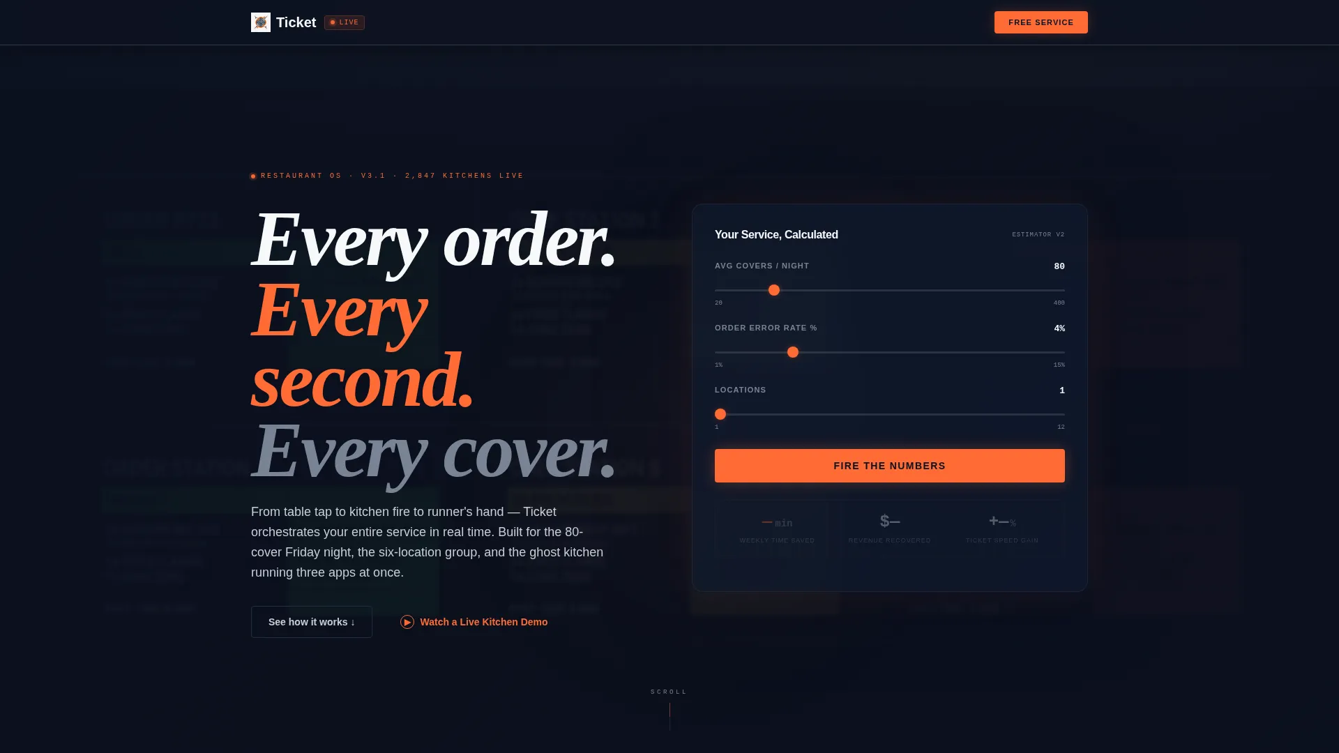
Ticket is a hub-and-spoke landing page template built for restaurant ordering apps. It opens with a live estimator that calculates time saved, revenue recovered, and ticket-speed gains based on a visitor's own covers and error rate. The result is a data-driven page that turns operator curiosity into a free trial signup in three fields.
by Rocket studio
Quick summary
Ticket is a single-page template designed for a restaurant ordering app audience. It leads with a calculator that renders personalized projections, then guides visitors through five anchor-nav sections covering orders, kitchen operations, floor management, analytics, and integrations. The layout rewards operators who want detail without demanding it from those who are ready to sign up immediately.
Who this template is for
This template is built for the people who actually run restaurants, not just market them. It speaks the language of operators who live and die by ticket times, cover counts, and comp rates.
- Independent restaurateurs managing high-volume Friday and Saturday services with limited staff
- Multi-unit operators who need to compare performance across several locations from a single view
- Ghost kitchen founders coordinating orders from multiple delivery platforms on one screen
What problem this template solves
Most restaurant technology landing pages lead with feature lists that mean nothing to a busy operator. This template leads with numbers the visitor generates themselves, making the value case immediate and personal.
- Visitors arrive skeptical; the estimator gives them a projected return before they read a single feature
- Operators juggling multiple channels struggle to see how a new tool fits their specific workflow
- High-friction signups lose operators who have thirty seconds between services to make a decision
What you get with this template
You get a complete, ready-to-customize landing page structure built around the restaurant ordering app use case. Every section is purposeful and ordered to reduce time-to-decision for a busy operator audience.
- A header estimator section that pre-fills signup fields with the visitor's own data
- Five anchor-nav spoke sections, each opening with a headline metric and expanding into a card grid of features
- A sticky conversion bar that activates after the second spoke section, plus a secondary demo path for visitors who need more proof
Feature list
This template packs a focused set of components built specifically for the restaurant ordering app conversion flow.
Live Operator Estimator
The header contains an interactive calculator where visitors enter their average covers per night, current order error rate, and number of locations. It instantly renders projected figures for weekly time saved, estimated revenue recovered from reduced comps and voids, and a ticket-speed improvement percentage. The numbers animate upward like a live point-of-sale ticker.
Anchor Navigation with Kitchen Shorthand
A navigation bar pins to the top of the page after the visitor scrolls past the header. Labels use real kitchen terminology: Orders, Kitchen, Floor, Analytics, and Integrations. Each label links directly to its corresponding spoke section, letting operators jump to the module most relevant to their pain point without scrolling through everything.
Metric-Led Spoke Sections
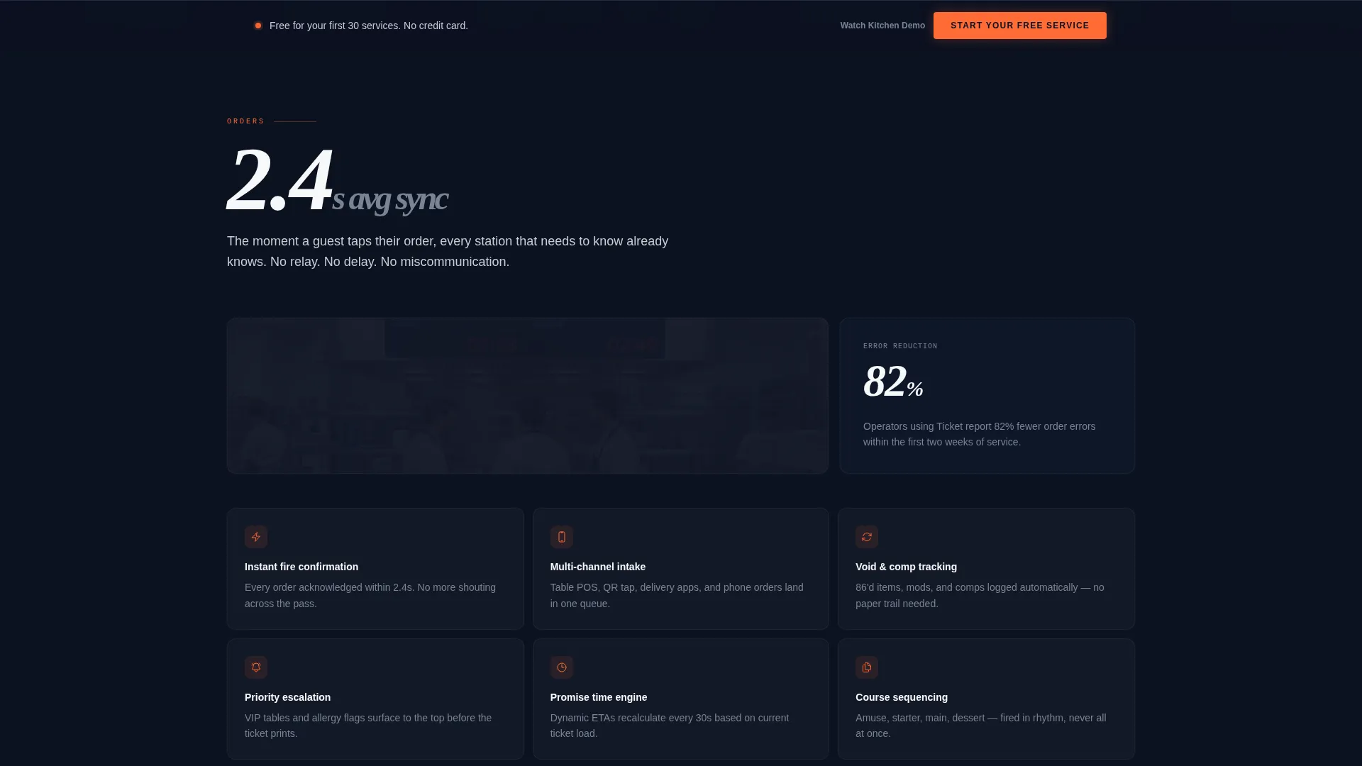
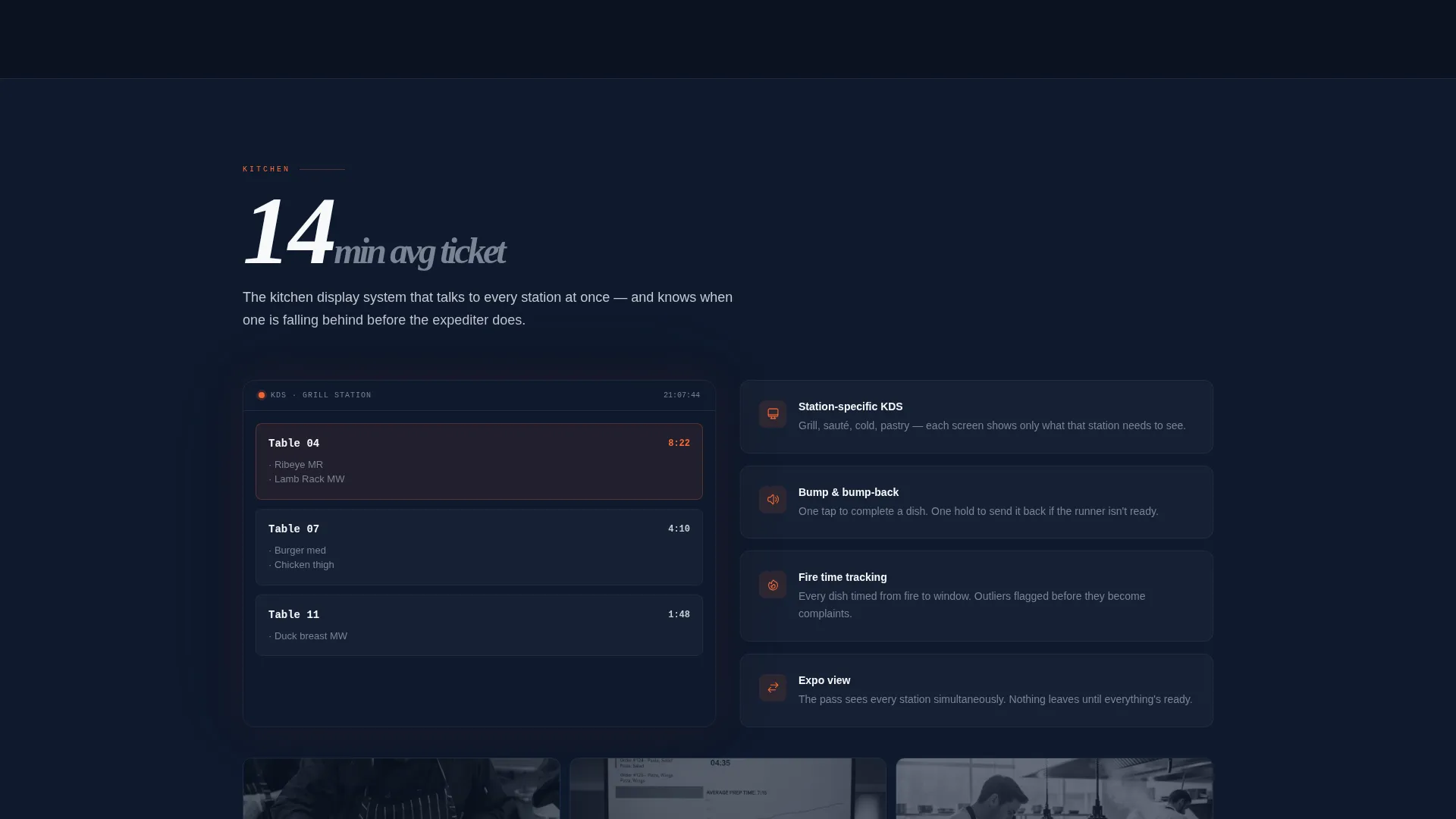
Each of the five spoke sections opens with a single oversized metric, for example "2.4s average sync time", before expanding into a tight card grid of feature details. The density increases as the visitor scrolls deeper, rewarding the thorough operator while keeping the page digestible for first-pass readers.
Freemium Signup with Pre-filled Fields
The primary call to action is "Start Your Free Service", appearing inside the estimator results and again in a sticky bar that activates mid-scroll. The signup form asks for restaurant name, average nightly covers, and email only. If the visitor used the estimator, the covers field is pre-filled automatically. No credit card is required.
Secondary Demo Path
A secondary call to action labeled "Watch a Live Kitchen Demo" links to a recorded screen capture of the app handling a real 200-cover Saturday night service. This path gives hesitant operators a low-commitment way to validate the product before committing to the free trial.
Data Command Visual System
The page uses a controlled dark-navy background palette with live-fire orange reserved exclusively for active states, notifications, and primary call-to-action elements. The visual effect mirrors the glow of a kitchen display system screen in a dark kitchen, keeping the interface calm and professional while drawing the eye precisely where action is needed.
Page sections overview
| Section | Purpose |
|---|---|
| Header Estimator | Renders personalized ROI projections and anchors the primary call to action |
| Anchor Nav Bar | Pins to top on scroll; links visitors to each spoke module by kitchen label |
| Orders Spoke | Covers real-time order tracking from table tap to kitchen fire |
| Kitchen Spoke | Highlights kitchen display and ticket-sync speed with an oversized metric opener |
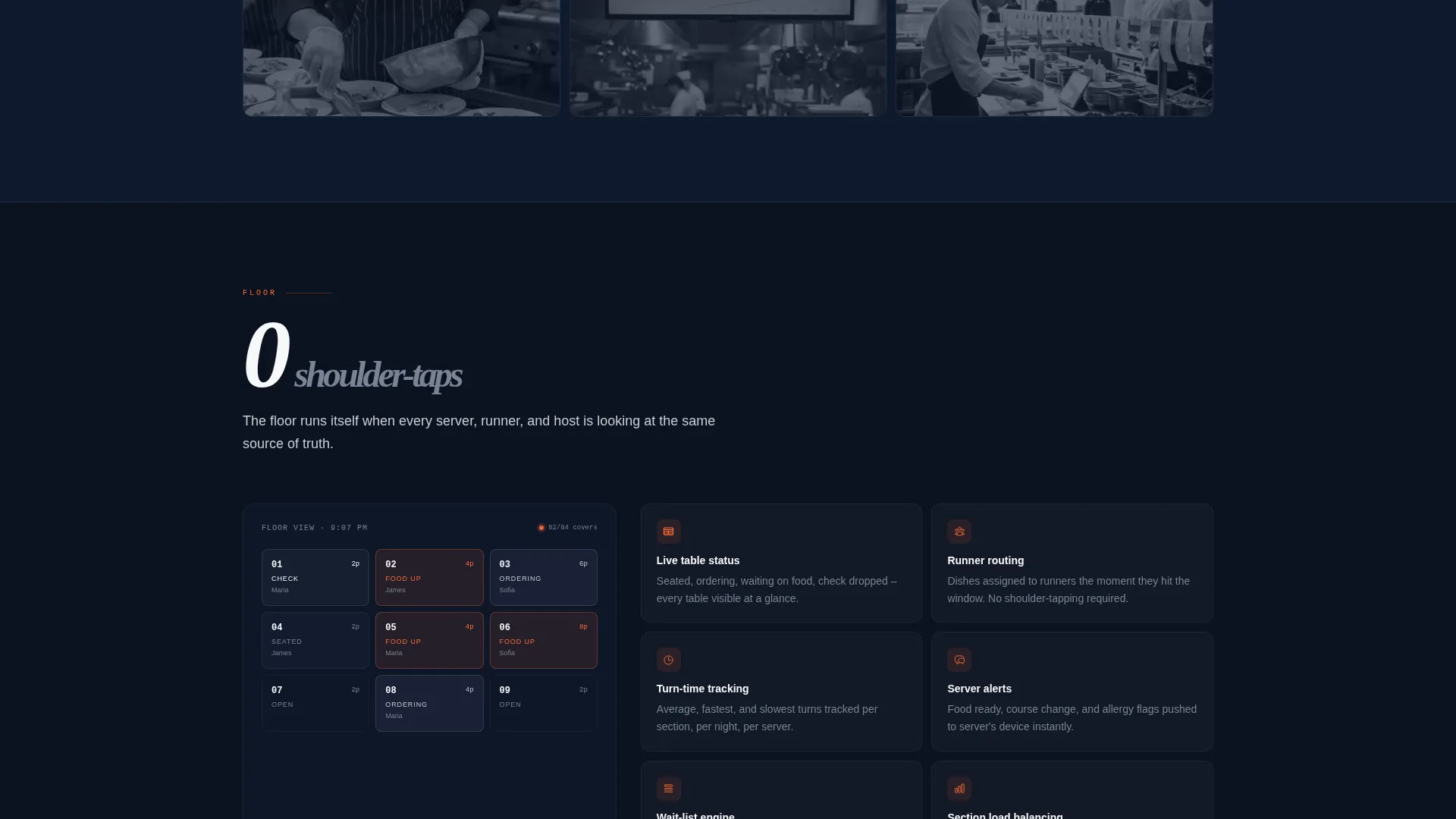
| Floor Spoke | Addresses table management and runner coordination features |
| Analytics Spoke | Shows cross-location performance comparison tools |
| Integrations Spoke | Covers multi-platform delivery channel management |
| Sticky call to action Bar | Activates after second spoke; persistent freemium signup prompt |
| Demo call to action Block | Secondary path offering the recorded 200-cover live kitchen demo |
Design & branding system
The visual identity follows a Data Command theme. The palette is built to feel like the glow of a kitchen display system screen at 9 PM: cool, controlled, and alive only where it needs to be.
- Deep terminal navy (#0B1120) dominates backgrounds and section dividers; brushed stainless (#C8CDD5) carries body text and secondary interface elements; ticket-paper white (#F7F8FA) is used sparingly for cards and data containers
- Live-fire orange (#FF6B35) is reserved exclusively for active states, notifications, and primary call-to-action buttons, making every actionable element stand out against the dark background
- The header uses a blurred dark-navy interface screenshot behind the estimator to suggest product depth without exposing every detail before signup
Mobile & speed optimization
The template is structured for operators who check their numbers on a phone between service rushes. Every section is designed to remain readable and functional at smaller screen sizes.
- The anchor navigation collapses cleanly on mobile so operators can still jump between spoke sections without losing context
- The estimator inputs and animated result display are sized for touch interaction, keeping the calculator usable on a phone screen
- Card grids in each spoke section reflow to a single column on mobile, preserving readability without sacrificing the density that desktop users expect
How this template helps you convert
The conversion architecture works in stages. Each stage reduces friction for a different type of visitor, from the fast decision-maker to the operator who needs to see everything before committing.
- The estimator makes the value case personal and immediate. Visitors see their own projected numbers before reading a single feature description, which makes the free trial feel like an obvious next step rather than a leap of faith.
- The sticky call-to-action bar activates after the second spoke section, catching visitors who are convinced mid-scroll without forcing them to return to the top of the page to sign up.
- The secondary demo path captures visitors who are not yet ready to sign up. Watching a live 200-cover service handled in real time answers operational doubts that feature descriptions alone cannot resolve.
Other information about this template
This template is built on a hub-and-spoke structure, meaning the header estimator acts as the central hub and each anchor-nav section functions as an independent spoke. Operators can enter the page at any spoke via a direct link, making the layout flexible for targeted campaigns.
- The template is categorized under Technology, specifically Industry Mobile Apps, and is designed for the restaurant ordering app niche
- The three-field signup form is intentionally minimal: restaurant name, average nightly covers, and email, with no credit card required at any stage
- The "Start Your Free Service" call to action and the "Watch a Live Kitchen Demo" secondary path are both built into the template structure as named components ready for customization
Theme
Data Command
Creative direction
Feature Matrix
Color system
Midnight Blue
Style
Hub & Spoke (Anchor Nav)
Direction
Freemium/Trial
Page Sections
Live Operator Estimator Header
Pinned Anchor Navigation
Metric-led Spoke Sections
Pre-filled Freemium Signup
Sticky Mid-scroll Call to Action Bar
Secondary Live Kitchen Demo Path
Related questions
Who is this landing page template designed for?
Does the estimator require backend setup to work?
How does the pre-filled signup form work?
Can I update the anchor navigation labels?
What is the secondary conversion path in this template?



