Harvest - Powerful Agriculture Landing Page Template
Harvest is a modular card-grid landing page template built for agriculture AI document processing platforms. It pairs a dark, data-forward visual identity with a stats-first layout that builds buyer confidence fast. The template includes a sticky lead-generation form, animated metric cards, and a side-by-side document comparison section, all ready for ag-tech teams to customize and launch.
by Rocket studio
Quick summary
Harvest is a single-page, card-grid landing page template designed for AI-powered agriculture document processing platforms. It opens with hard performance numbers inside frosted dark-glass panels, then builds trust through staggered metric cards, a document-transformation comparison, and a sticky lead capture form. The visual system feels like satellite data at dusk, dark, precise, and alive with violet light.
Who this template is for
This template is built for teams that process agricultural documents at scale. If your platform handles anything from crop reports to commodity contracts, Harvest speaks your audience's language from the first scroll.
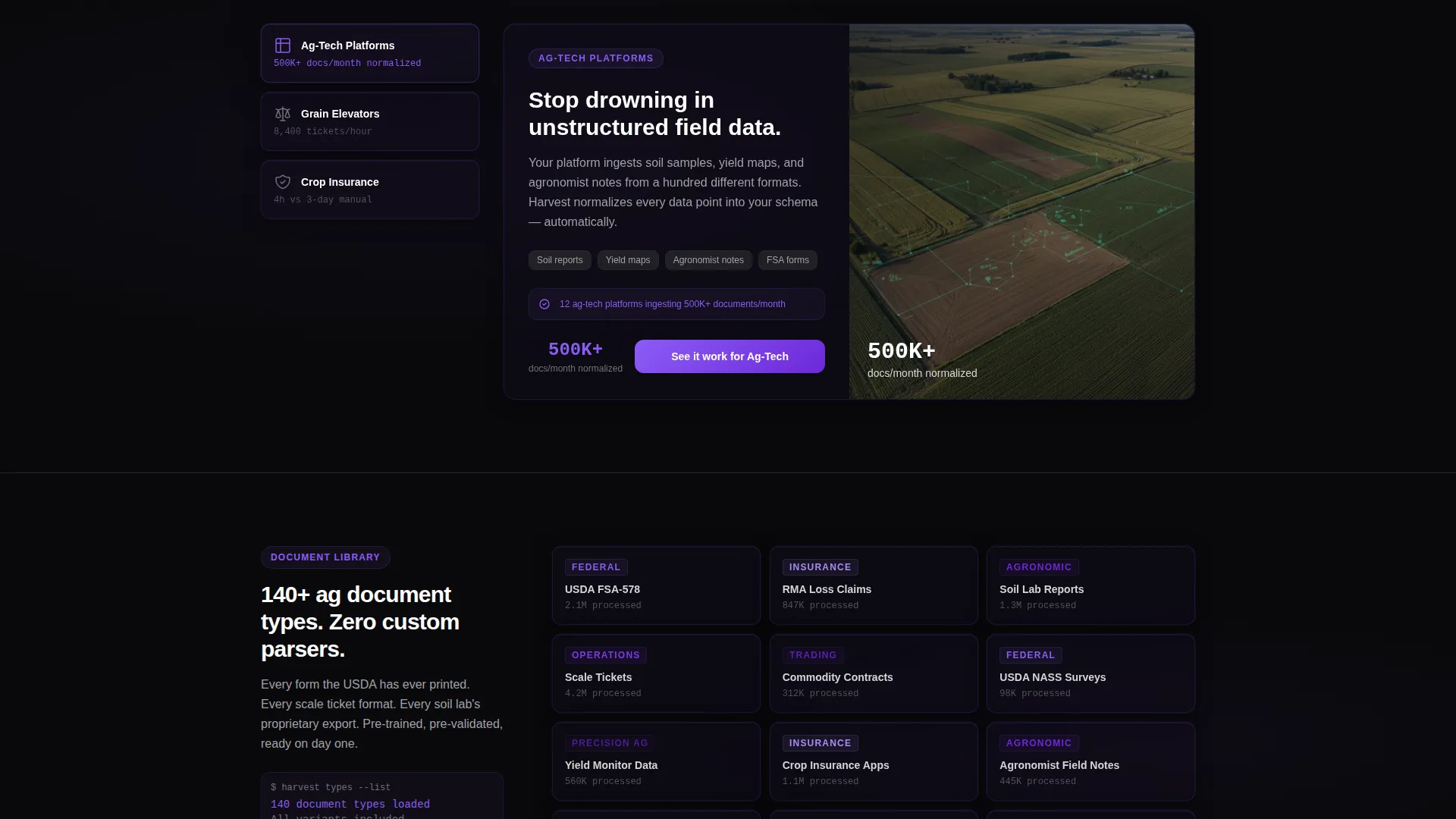
- Ag-tech platform teams managing unstructured field data at volume
- Grain elevator operators reconciling hundreds of scale tickets per harvest season
- Crop insurance adjusters who need loss claims processed before weather windows close
What problem this template solves
Most software landing pages lead with features. Harvest leads with proof. Your prospective buyers are skeptical operations teams who need hard numbers before they trust a new tool. Generic SaaS templates do not carry that weight.
- Visitors abandon pages that bury performance data below the fold
- Technical evaluators need a clear secondary path to documentation before booking a demo
- A mismatch between visual identity and industry context erodes credibility fast
What you get with this template
You get a fully structured, single-page layout that converts skeptical agriculture and ag-tech buyers into qualified leads. Every section is purpose-built for a platform that processes crop reports, soil analyses, USDA filings, and commodity contracts.
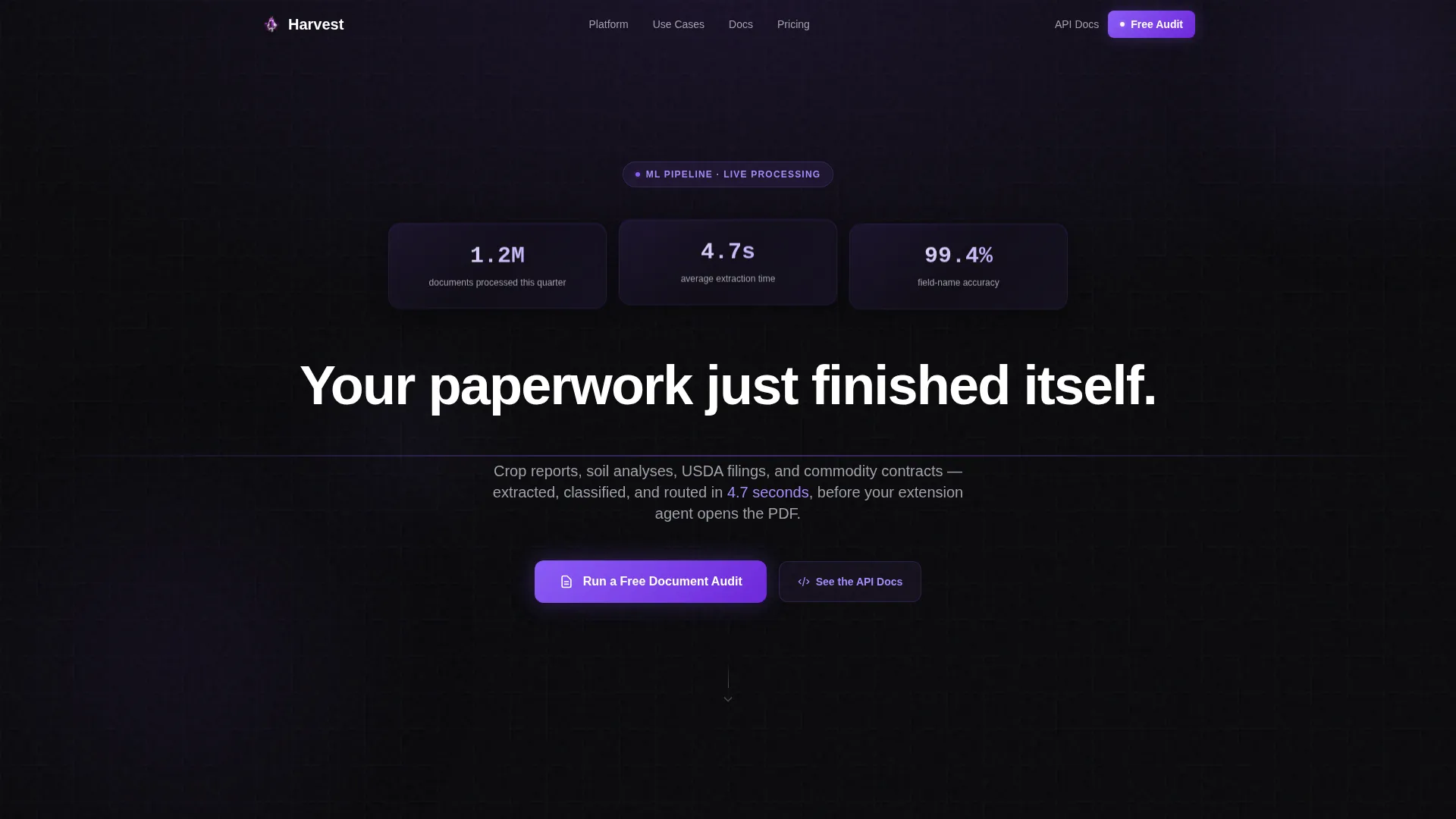
- A dark-glass header with three pre-built real-time stat panels and a self-typing headline
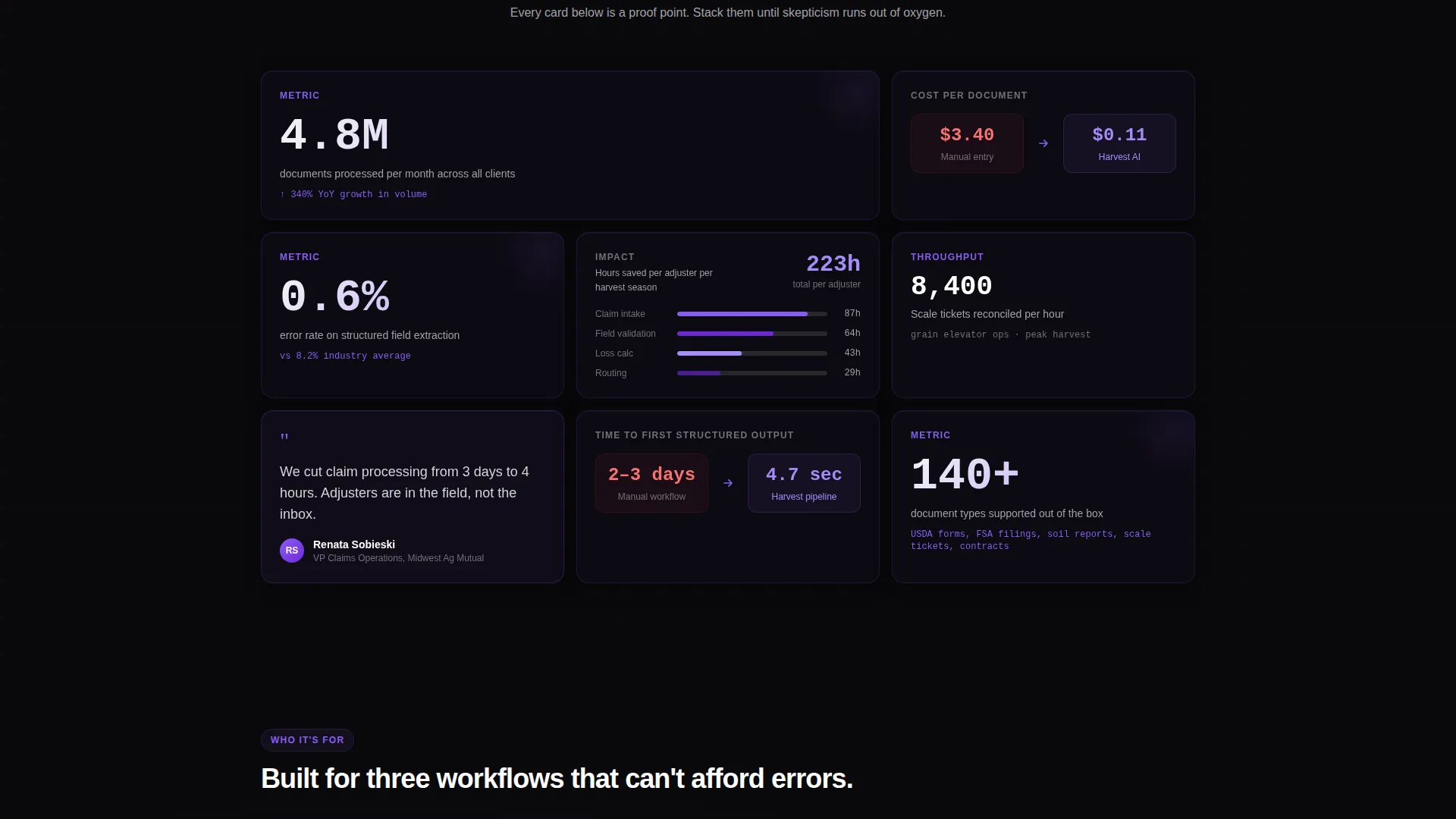
- A staggered modular card grid that presents processing volume, error-rate reduction, hours saved, and cost-per-document comparisons
- A sticky two-field lead capture form and a secondary call-to-action path for technical evaluators
Feature list
This section details every core component included in the Harvest template.
Dark Glass Panel Header
Three frosted-glass stat cards open the page above the headline. Each card displays one hard performance number, processing volume, extraction speed, or field-name accuracy. A subtle violet refraction runs along every card edge, and the headline types itself in below after a brief pause.
Staggered Metric Card Grid
Cards animate into view in a staggered sequence as the visitor scrolls. Each card is a self-contained proof point carrying a specific number: processing volume, error-rate reduction, hours saved per adjuster, or cost-per-document versus manual entry. The accumulation of evidence is the conversion mechanism.
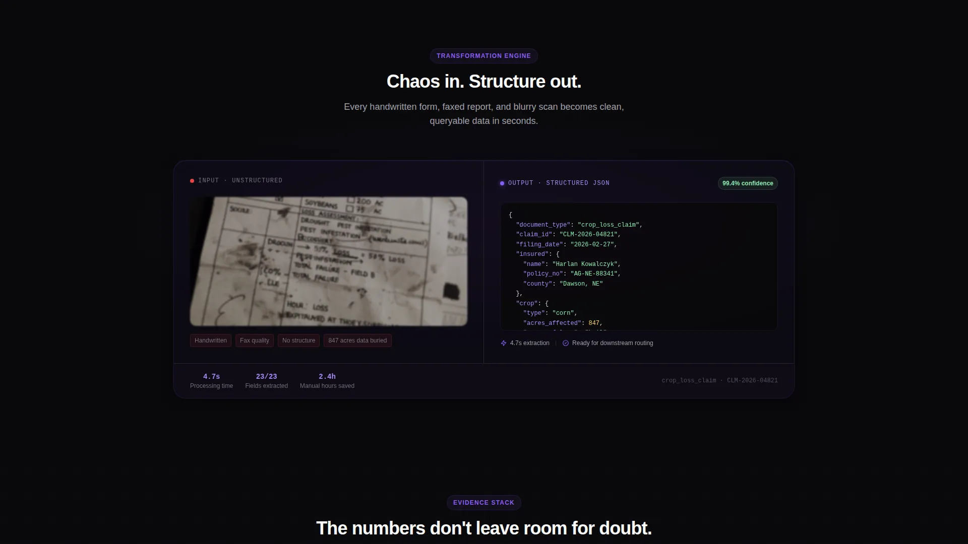
Document Transformation Comparison Card
A side-by-side comparison card sits midway through the grid. The left panel shows a blurry scan of a handwritten crop-loss form. The right panel shows its clean, structured JSON output. No copy needed, the visual contrast makes the platform's value immediate.
Sticky Lead Capture Form
A dark-glass form card pins to the bottom of the viewport after the first scroll. It asks for work email and average monthly document volume via a four-option dropdown. The form reappears at full size as the final page section, giving visitors two natural moments to convert.
Secondary API Documentation Path
A "See the API Docs" call-to-action runs alongside the primary lead form. It gives technical evaluators a clear exit ramp to specifications before they commit to a conversation, reducing friction for developer and engineering audiences.
Void and Violet Color System
Every interactive surface, live metric, and card border follows the four-token palette: absolute void black, deep plum, electric violet, and cool zinc. The system is consistent and purpose-built, so customizing brand color across the template is a single-variable change.
Page sections overview
| Section | Purpose |
|---|---|
| Dark Glass Header | Opens with three real-time stat panels and a self-typing headline |
| Staggered Metric Grid | Builds trust through scrolling accumulation of hard performance numbers |
| Comparison Card | Visualizes document-to-JSON transformation side by side |
| Sticky Lead Form | Captures work email and document volume at the bottom of the viewport |
| Final call to action Section | Repeats the lead form at full size as the page's closing conversion point |
| API Docs call to action | Offers a secondary path for technical evaluators needing specs first |
Design & branding system
The Harvest template uses a Startup Velocity theme built on the Void and Violet color system. The palette feels like satellite imagery at twilight, dark fields lit by violet data overlays, clinical and alive at the same time.
- Four-token color palette: absolute void black (#09090B), deep plum (#2D1B4E), electric violet (#8B5CF6), and cool zinc (#D4D4D8) for body text and card borders
- Frosted-glass card surfaces carry a subtle violet refraction at their edges, giving the interface depth without visual noise
- Interactive surfaces and live metric figures use electric violet consistently, so the eye is always pulled toward the most important numbers
Mobile & speed optimization
The card-grid layout is modular by design, which makes it straightforward to adapt for smaller screens. Each card is a self-contained unit with no structural dependency on adjacent cards.
- Modular card grid allows individual cards to stack vertically on narrow viewports without layout breakage
- The sticky form component is designed to remain visible and usable across viewport sizes, keeping the conversion path accessible at every scroll depth
- Staggered entrance animations are tied to scroll events, so they fire at the right moment regardless of screen height
How this template helps you convert
Harvest is built around a single conversion philosophy: stack enough specific evidence that skepticism has nowhere left to stand.
- The dark-glass stat panels hit before the headline does, so the page earns attention with proof before it asks for anything.
- The staggered card grid keeps each scroll increment delivering a new hard number, maintaining momentum through the full page length.
- The sticky form reduces friction by keeping the lead capture field present throughout the session, while the secondary API Docs path ensures technical buyers are never left without a next step.
Other information about this template
Harvest is a Framer-compatible template built on a modular card-grid structure. It is designed for teams in the agriculture AI and ag-tech space who need a credible, data-forward landing page they can customize and ship quickly.
- The template is a single-page layout, not a multi-page website, making it fast to configure and deploy
- The four-item document-volume dropdown in the lead form covers the full range from under 1,000 documents per month to over 100,000, matching the scale of real ag-tech buyers
- The "Run a Free Document Audit" primary call-to-action is pre-written and positioned to appeal to operations-focused decision makers
- The template style is Card Grid (Modular), which means sections can be reordered or removed without breaking the overall layout
- Color token values are defined in the brief and consistent throughout, so a brand color swap requires updating the four palette tokens only
Theme
Startup Velocity
Creative direction
Stats-First Impact
Color system
Void & Violet
Style
Card Grid (Modular)
Direction
Lead Generation
Page Sections
Dark Glass Panel Header
Staggered Metric Card Grid
Document Transformation Comparison
Sticky Lead Capture Form
Secondary API Docs Path
Void and Violet Color System
Related questions
Who is this landing page template designed for?
What sections are included in this template?
Can I customize the colors and copy in this template?
What does the lead capture form collect?
Is this a single page or a multi-page website?



