Micro-SaaS & Developer Tools Professional Website Template
Hashtag is a split-screen landing page template built for hashtag research tools. It pairs a dark, data-command aesthetic with a freemium conversion flow, guiding visitors from a visceral problem depiction to a live try-before-you-signup moment. Ideal for Micro-SaaS products targeting social media managers, indie creators, and agency strategists.
by Rocket studio
Quick summary
Hashtag is a single-page, split-screen landing page template designed for hashtag research and social content tools. It opens with a dramatic data-command header, walks visitors through a problem-to-solution narrative, and closes with a low-friction freemium trial entry point. The design is dark, precise, and built to feel like a professional signal-monitoring interface.
Who this template is for
This template is built for product teams and founders launching hashtag intelligence or social analytics tools. It speaks directly to users who need to show data-driven value immediately, before asking for a signup.
- Social media managers handling multiple client accounts who need a tool they can trust on first use
- Indie creators who have plateaued in follower growth and are searching for a smarter tagging approach
- Agency strategists building campaign taxonomies who need a landing page that converts on day one
What problem this template solves
Most tool landing pages describe features without demonstrating them. Visitors leave without understanding what the product actually does or why it matters. This template solves that gap with a narrative that escalates from individual post frustration to full campaign-level stakes.
- Visitors struggle to connect abstract feature claims to real content performance outcomes
- No visual proof of the problem makes it easy to dismiss the product without engaging
- Generic layouts fail to create urgency for data-driven tool categories like hashtag research
What you get with this template
You get a fully structured, single-page layout that pairs emotional problem framing with live-feeling product demonstration. Every section is purposefully split, with the left side showing the pain point and the right side showing the resolution.
- A dark glass panel header with a self-typing headline and dual call-to-action placements
- A split-screen problem-versus-solution arc covering individual posts, tag mechanics, and campaign strategy
- A sticky freemium trial bar that activates on scroll and leads into a no-signup-required first search
Feature list
This template ships with a focused set of layout and interaction features, each grounded in the brief's creative direction.
Dark Glass Panel Header Grid
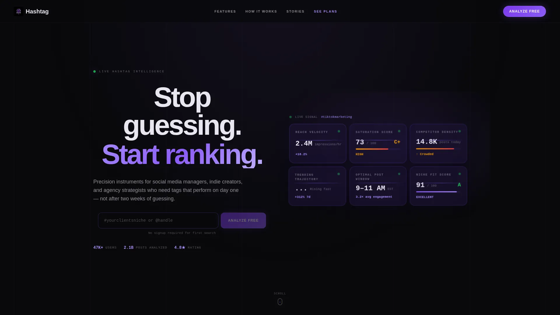
The header fills the full viewport with frosted, translucent cards arranged in a grid. Each panel displays a live-updating hashtag metric such as reach velocity, saturation score, competitor density, and trending trajectory. Panels are layered at slightly different depth levels with violet light bleeding through their edges.
Self-Typing Centered Headline
A single headline types itself into existence across the center of the header. The animation draws the eye immediately and frames the product's core value proposition before the visitor scrolls.
Split-Screen Problem versus. Solution Sections
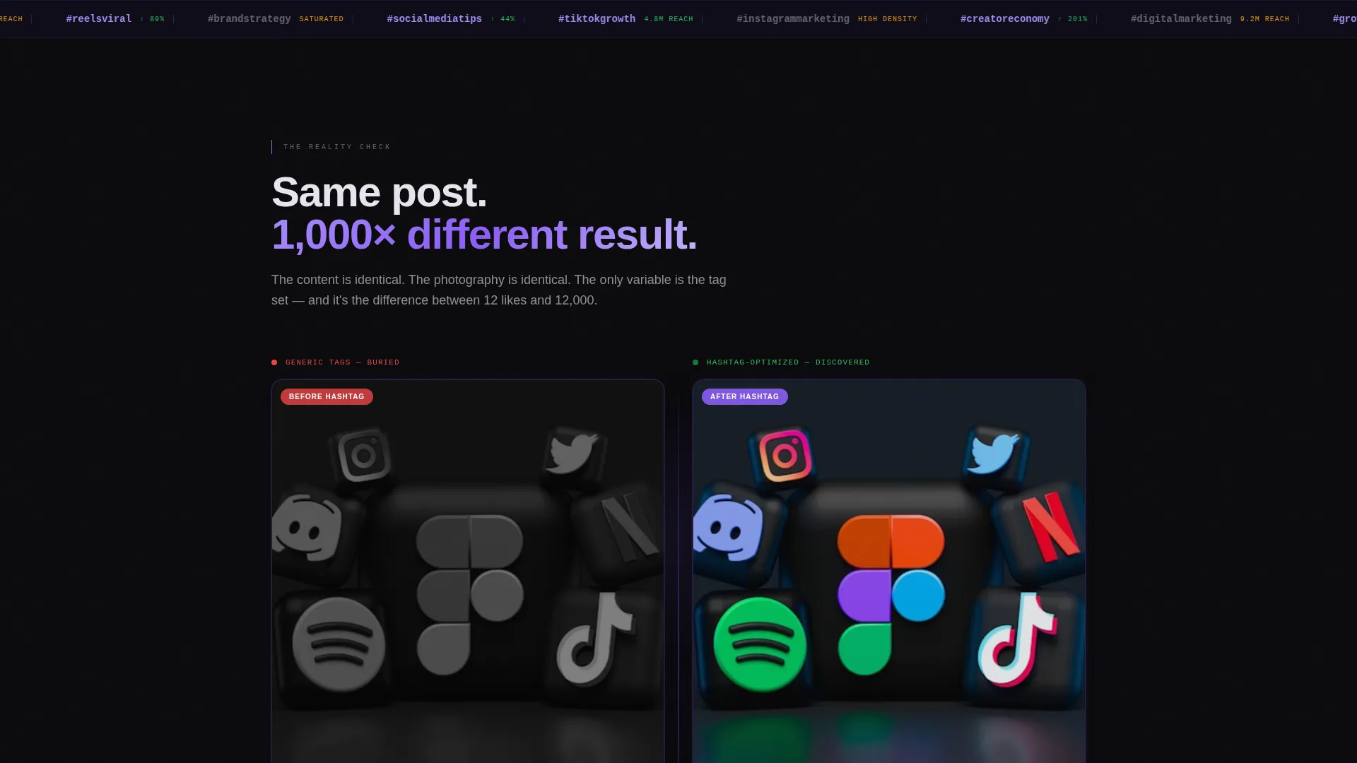
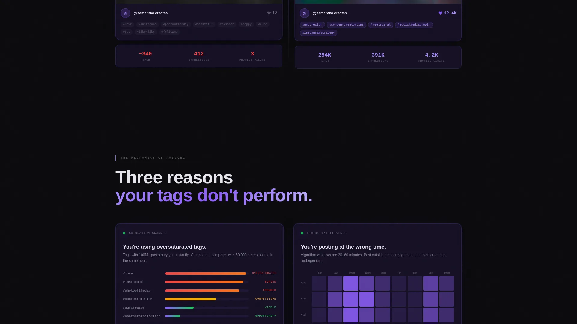
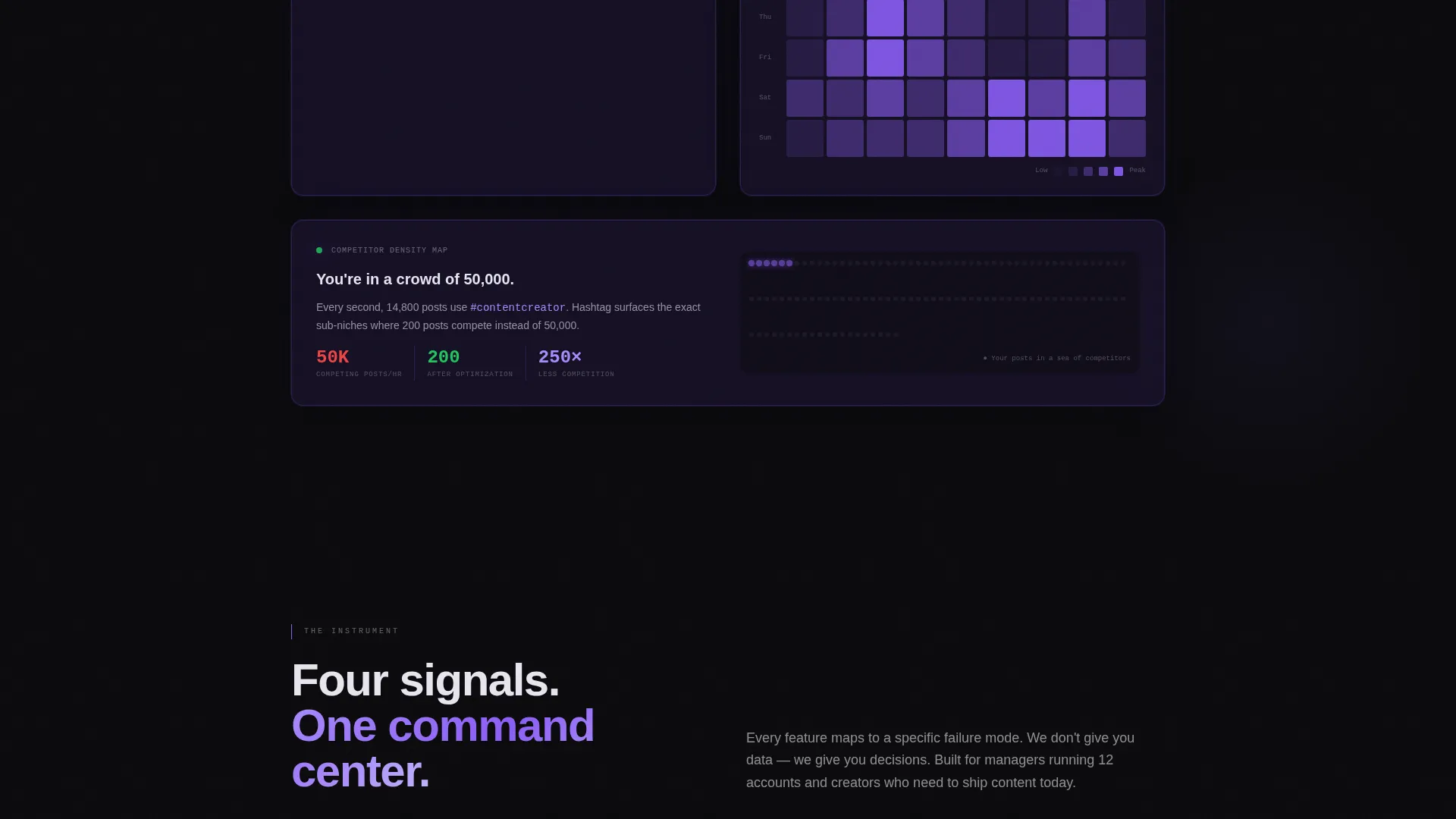
Every content section uses a strict 50/50 split. The left half visualizes the problem using raw data representations such as saturation graphs, timing heatmaps, and competition density maps. The right half shows the tool resolving each problem in real time.
Freemium Trial Entry with Sticky Bar
The primary call to action places a single hashtag or handle input field in both the header and a sticky bottom bar. The sticky bar activates after the first scroll, keeping the conversion moment always visible without interrupting the narrative.
No-Signup First Search Flow
The template is structured so the visitor can run their first hashtag analysis without creating an account. The tool returns a mini-report and then prompts for an email to unlock the full dashboard, reducing early friction dramatically.
Secondary Agency Conversion Path
A "See Plans" text link runs alongside the primary call to action for agency buyers who already understand the product's value and want to evaluate volume pricing directly.
Page sections overview
| Section | Purpose |
|---|---|
| Dark Glass Header | Introduces tool with live metric panels and dual call to action placement |
| Typing Headline Block | Frames core value proposition with animated text entry |
| Problem Split Screen | Shows a creator post with 12 likes versus. 12K with optimized tags |
| Hashtag Failure Mechanics | Explains why tags fail using saturation graphs and heatmaps |
| Feature Resolution Sections | Each pain point answered by a specific tool capability |
| Campaign Strategy Escalation | Elevates stakes from single posts to full brand strategy |
| Freemium Trial Input | Single field entry with no-signup first search and mini-report |
| Sticky Conversion Bar | Persistent call to action bar that activates after first scroll |
| Secondary Plans Link | Text link for agency buyers evaluating volume pricing |
Design & branding system
The visual identity follows a Data Command theme built on the Void and Violet color system. Every design decision reinforces a sense of precision, signal, and controlled intelligence.
- Background surfaces stay in absolute void black (#09090B) and deep space indigo (#1A1333), with cards and panels floating in indigo using subtle glass blur effects
- Electric violet (#8B5CF6) appears on every interactive element, data highlight, hover state, and live data feed pulse
- Cool ghost white (#E8E5F0) is used exclusively for typography, cutting clean and readable against every dark surface
Mobile & speed optimization
The template is designed with a layout structure that supports clean adaptation across screen sizes. The split-screen format translates to stacked sections on smaller viewports without losing narrative clarity.
- The sticky conversion bar and freemium input field remain accessible on mobile, keeping the trial entry point within reach at all times
- Glass panel depth effects and violet hover states are designed to degrade gracefully on devices that do not support advanced blur rendering
How this template helps you convert
The conversion architecture is intentional and multi-layered. Every stage of the scroll builds trust before asking for anything from the visitor.
- The no-signup first search removes the biggest barrier to trial adoption by letting visitors experience a real mini-report before committing their email address
- The sticky bottom bar ensures the primary call to action stays visible throughout the entire scroll journey, so motivated visitors never have to search for the entry point
- The secondary "See Plans" text link creates a parallel path for high-intent agency buyers, preventing them from bouncing when they are ready to evaluate pricing
Other information about this template
This template is part of the Micro-SaaS and Developer Tools subcategory within the Technology category on the platform. It is designed as a single landing page with a freemium-to-trial conversion flow.
- The template style is Split Screen (50/50), making it a strong fit for tools that benefit from direct before-and-after comparisons
- The creative direction follows a Problem to Solution Arc, which is well-suited for data products where the value is not obvious until the pain is made visible
- The header concept is Dark Glass Panels, a distinctive visual approach that positions the product itself as the hero visual with no illustration or photography required
- This template works well for hashtag research tools, social content optimization products, and any Micro-SaaS tool that benefits from a data-command visual identity
Theme
Data Command
Creative direction
Problem→Solution Arc
Color system
Void & Violet
Style
Split Screen (50/50)
Direction
Freemium/Trial
Page Sections
Dark Glass Panel Header Grid
Self-typing Centered Headline
Split-screen Problem Versus. Solution Layout
No-signup First Search Flow
Sticky Freemium Conversion Bar
Secondary Agency Conversion Path
Related questions
Does this template require a developer to customize?
Can I use this template for a product that is not a hashtag tool?
What happens if I want to skip the no-signup first search flow?
Is the dark glass panel header only suitable for dark-mode brands?
How does the sticky conversion bar work within the layout?



