Haul — Logistics Dispatch Landing Page Template
Dispatch is a dashboard-style trucking CRM landing page built for freight brokers, fleet dispatchers, and logistics managers who need one clean screen to manage loads, carriers, and lanes. It uses a dark cockpit aesthetic with electric indigo accents, live-data user interface panels, and a spec-sheet content rhythm that builds buyer confidence fast and drives signups.
by Rocket studio
Quick summary
Dispatch is a single-page, dashboard-driven landing page template built for trucking CRM platforms. It puts load boards, carrier scorecards, and lane analytics side by side in a dark cockpit interface. The design speaks to operations-heavy buyers and moves them toward a free trial with hard data, sharp visuals, and a focused single-button call to action.
Who this template is for
This template is built for software teams and founders selling into freight and logistics operations. It speaks directly to the daily pressures of dispatching and brokerage work.
- Freight brokers tracking 40 or more loads per day who need a platform that keeps pace
- Fleet dispatchers coordinating owner-operators across multiple time zones
- Logistics managers at mid-size third-party logistics companies that have outgrown legacy tools
What problem this template solves
Operators in freight and logistics waste time toggling between tabs, spreadsheets, and disconnected tools. A landing page that looks like the product they actually need closes that gap immediately.
- Too many screens open at once, with load status, carrier data, and lane margins living in different places
- Prospective buyers arrive skeptical and need proof before they commit to a trial
- Generic software landing pages fail to reflect the pace and precision that dispatching actually demands
What you get with this template
You get a fully designed, single-page landing page that puts the product front and center. Every section is built to demonstrate capability before asking for anything in return.
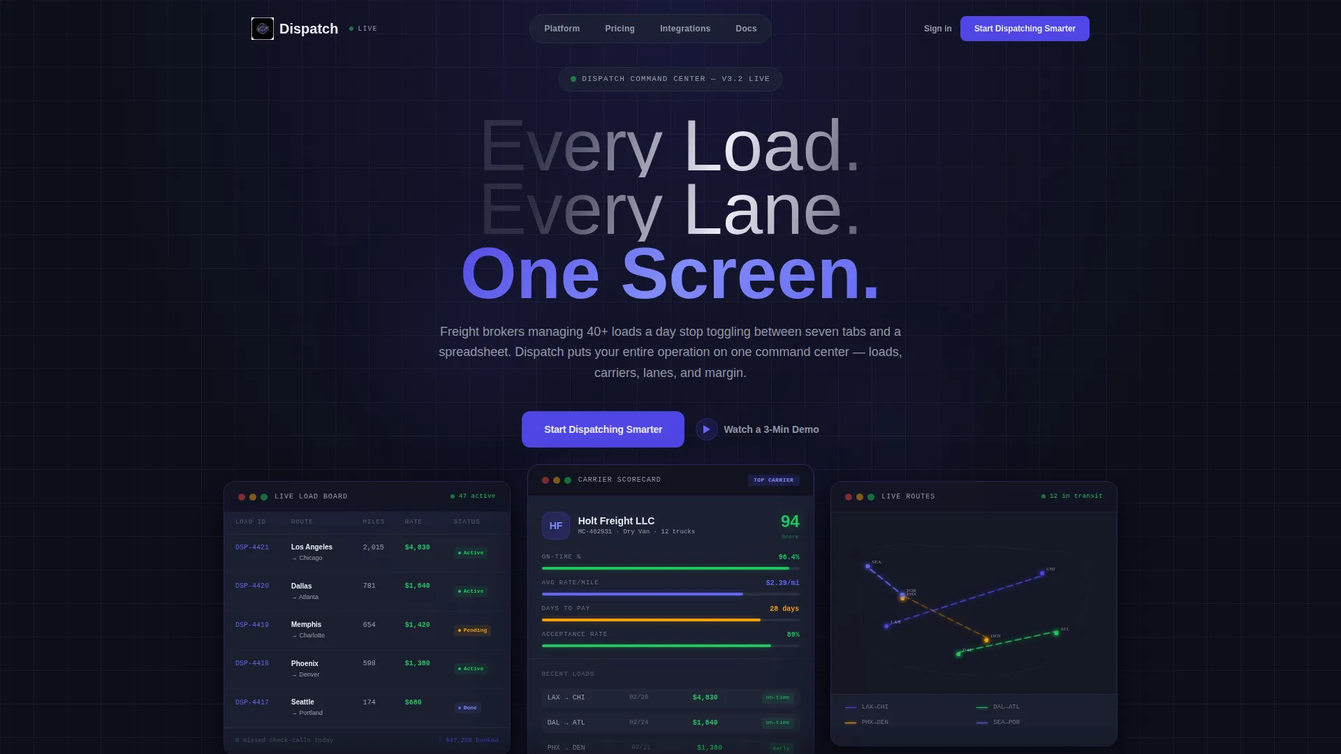
- A dark glass panel header with three frosted user interface panels showing a live load board, a carrier scorecard, and an animated route map
- Spec-sheet content sections that pair a bold claim with supporting data or a visual proof point
- A single-focus call to action structure with a primary button and a secondary demo link on every panel break
Feature list
This template includes purpose-built components that reflect how freight operations actually work. Each section earns its place by showing something specific and credible.
Dark Glass Panel Header
Three frosted-glass user interface panels float on a near-black background, angled in perspective like monitors on a dispatcher's desk. The left panel shows a live load board with green and amber status indicators. The center panel displays a carrier scorecard. The right panel holds a map with animated route lines pulsing between origin and destination pairs.
Live Load Board Display
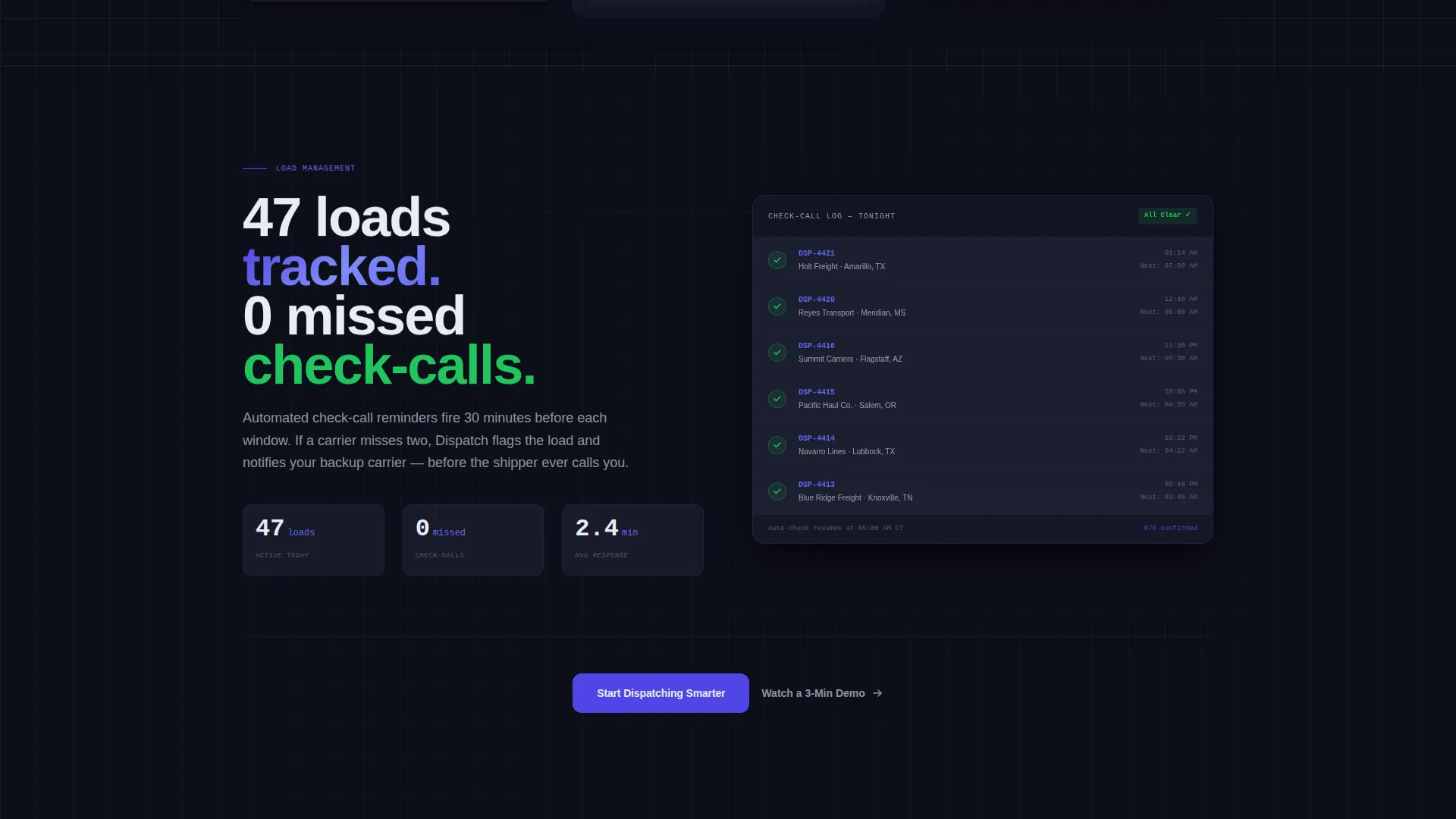
The load management section shows 47 loads tracked with zero missed check-calls as a headline data point. This kind of specificity signals to buyers that the platform is built for volume, not just demos.
Carrier Scorecard Panel
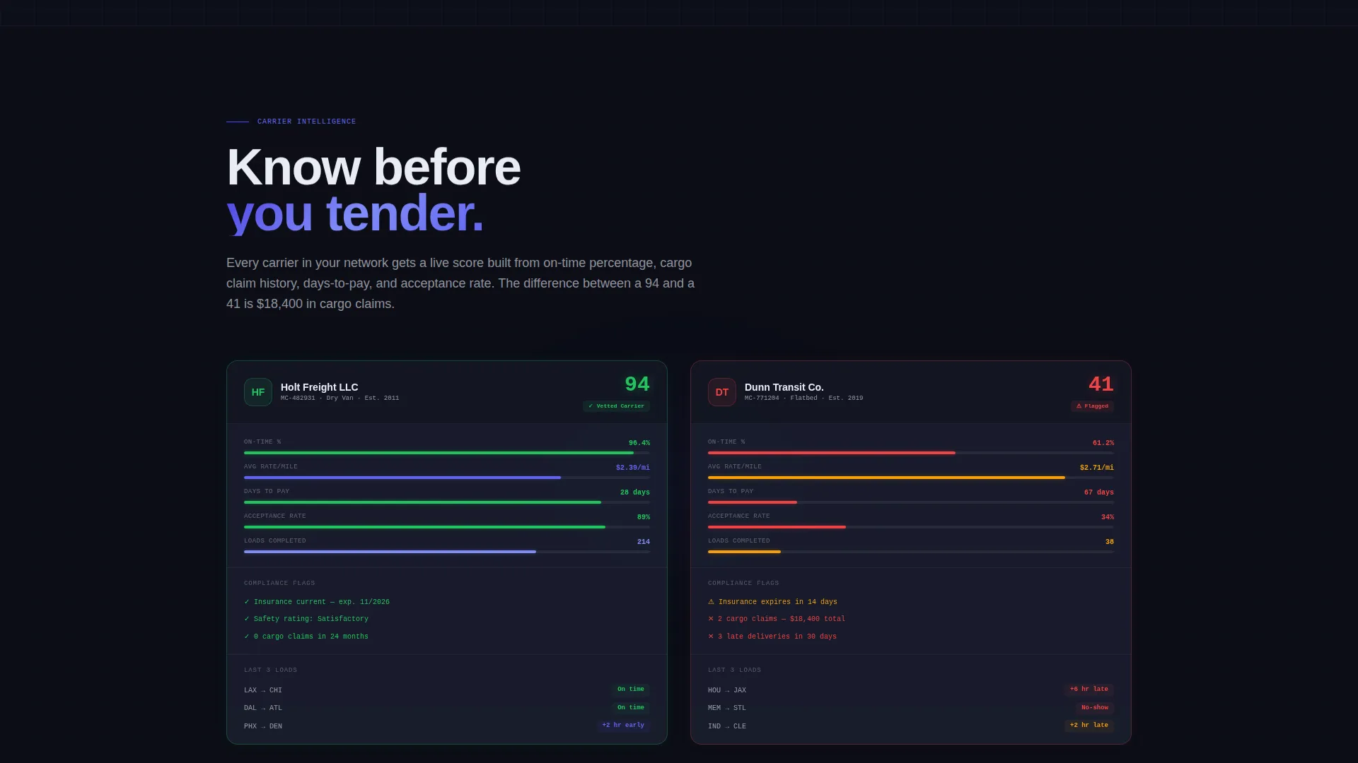
A side-by-side comparison layout shows a vetted carrier profile next to a flagged one. Each profile surfaces on-time percentage, average rate per mile, and days-to-pay at a glance.
Lane Analytics Heat Map
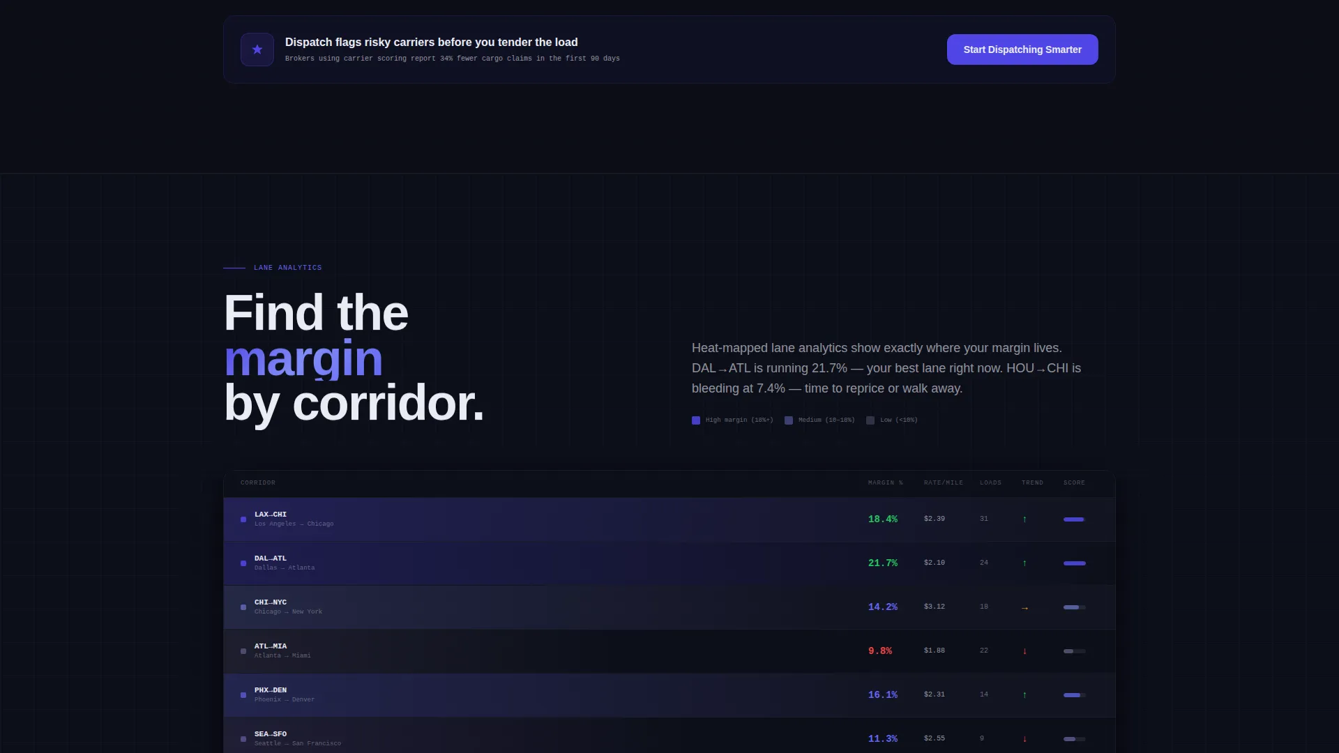
A corridor-level margin heat map visualizes profitability by lane. Buyers immediately understand that this platform helps them find and protect their best routes.
Spec-Sheet Content Rhythm
Each scroll section isolates one capability and proves it with a hard data point or visual. The claim-then-evidence pattern repeats through the page, building a cumulative case for the product.
Click-Through call to action Structure
The primary call to action, labeled "Start Dispatching Smarter," appears in electric indigo at every panel break. A secondary "Watch a 3-Min Demo" text link sits beneath it for buyers who want proof before clicking.
Page sections overview
| Section | Purpose |
|---|---|
| Dark Glass Header | Introduce the platform through three live-data user interface panels |
| Load Board Section | Show load volume tracking with a concrete zero-miss stat |
| Carrier Scorecard Section | Compare vetted versus. flagged carrier profiles side by side |
| Lane Analytics Section | Visualize margin by corridor using a heat map layout |
| call to action Panel Breaks | Drive trial signups with a primary button and demo link |
Design & branding system
The visual identity is built around an Electric Indigo color system that feels like a dispatch floor at 2 a.m. Every color choice carries operational meaning and keeps the interface readable under pressure.
- Deep cockpit black (#0D0F1A) for the background, cool slate (#1E2235) for card surfaces and panel backgrounds, and phosphor white (#EAECF5) for typography and grid lines
- Electric indigo (#4F46E5) reserved for active states, data highlights, and the primary call to action
- No lifestyle photography anywhere; the product user interface is the hero throughout the entire page
Mobile & speed optimization
The template is structured for clean rendering across screen sizes. Its dark-panel layout and data-grid composition translate naturally to narrower viewports without losing visual hierarchy.
- Frosted-glass panels and data grid components are designed to stack cleanly on smaller screens
- Typography in phosphor white on dark backgrounds maintains strong contrast and legibility at any size
How this template helps you convert
This template is engineered around a single conversion goal: getting a qualified freight or logistics buyer to click through to a free trial. Every design and content decision supports that outcome.
- The header panel trio shows the product working before a single word of body copy is read, reducing buyer skepticism from the first second on the page
- The spec-sheet rhythm of claim followed by evidence builds trust section by section, so buyers arrive at the call to action already convinced rather than still uncertain
Other information about this template
This template fits within the Dashboard Pro theme family and uses a Dashboard or Data Grid layout style. It is a strong fit for trucking vertical SaaS products that need a landing page with operational credibility rather than generic enterprise polish.
- The Electric Indigo color system and Dark Glass Panels header concept are part of the matched intersection context for this template
- The Click-Through landing page direction means no forms appear on this page; the single goal is earning the click to a signup or demo flow
- The template is categorized under Technology and specifically targets the trucking CRM platform niche within trucking vertical SaaS
Theme
Dashboard Pro
Creative direction
Spec Sheet
Color system
Electric Indigo
Style
Dashboard/Data Grid
Direction
Click-Through
Page Sections
Dark Glass Panel Header
Live Load Board with Status Indicators
Carrier Scorecard Comparison
Lane Analytics Heat Map
Spec-sheet Content Cadence
Click-through Call to Action Architecture
Related questions
Is this template designed for a single page or a multi-page website?
Can I use this template for a trucking software product other than a CRM?
Does this template include a contact form or lead capture form?
What makes the header different from a standard hero section?
Can the color system be customized for a different brand palette?



