Outdoor & Sports Discount Store Landing Page Template
Haul is a scroll-reveal landing page for budget-focused outdoor and sports retailers. It pairs a bold Dopamine Pop color system with progressive section reveals, a personalized deal-finder quiz, and a masonry-style product layout. Every scroll zone feels like discovering a new store department, keeping visitors engaged from the hero headline down to the email capture.
by Rocket studio
Quick summary
Haul is a single-page, scroll-driven landing page built for discount outdoor and sports stores. It opens with an animated device mockup showing live deal feeds and slashed prices, then unrolls product categories one scroll zone at a time. A five-question visual quiz personalizes results, and a late-page email capture catches visitors who are not yet ready to buy.
Who this template is for
This template is designed for budget-conscious outdoor retail brands that lead with price, urgency, and discovery. It fits teams that want high-energy visuals without sacrificing clarity on deals.
- Discount outdoor and sporting goods stores selling trail, water, field, and gym gear
- Pop-up or seasonal retailers running flash sales, clearance events, or end-of-season markdowns
- E-commerce brands targeting value-first shoppers, festival-goers, and family outfitters on a tight budget
What problem this template solves
Most outdoor retail pages either look too polished and expensive or too plain and untrustworthy. Haul solves the gap between those two extremes. It communicates deep discounts without looking cheap, and it builds excitement through progressive discovery rather than dumping every deal on the screen at once.
- Visitors leave before seeing the best deals because nothing on the page demands their attention
- Generic product grids fail to create urgency or reward continued scrolling
- Budget shoppers distrust a site that looks too corporate, so the warehouse-floor aesthetic builds immediate credibility
What you get with this template
Haul delivers a complete scroll-reveal landing page experience tuned specifically for sports and outdoor discount retail. Every section is purposeful, and the layout guides visitors from curiosity to action without a hard sell.
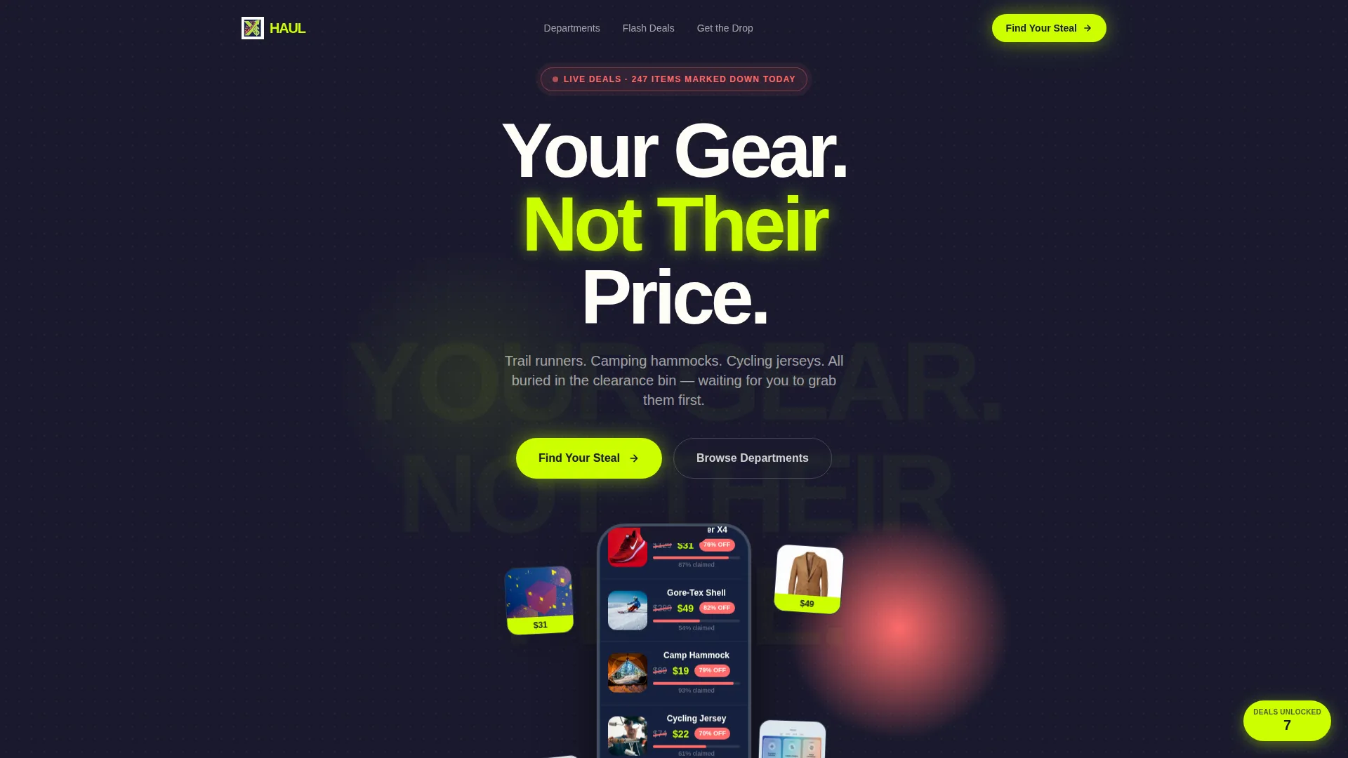
- An animated header device mockup with a live deal feed, slashed price visuals, a countdown timer, and a claimed-inventory progress bar
- A five-question visual quiz ("Find Your Steal") that outputs a personalized deal bundle with a unique discount code and a match score percentage
- A progressive scroll structure that reveals sport categories one zone at a time, with product card flip animations, sticker-peel section transitions, and a running "deals unlocked" counter
Feature list
A quick paragraph before the features: each capability below comes directly from the template's design and interaction system. Nothing here is speculative.
Scroll-Reveal Progressive Layout
The page loads product sections incrementally as visitors scroll. Each new section cascades in like fresh stock hitting store shelves. This keeps the experience feeling live and unpredictable, which encourages visitors to keep scrolling.
Five-Question Visual Deal Quiz
The primary call to action launches a guided quiz covering sport type, season, budget range (from $15 to $150), gear priority, and brand loyalty versus price sensitivity. The result is a curated deal bundle with a personalized match score and a unique discount code.
Animated Hero Device Mockup
The header centers a slightly angled phone screen showing a scrolling deal feed. Surrounding product thumbnails appear to spill outward from the device. The screen includes a countdown timer, red diagonal price strikes, and an "87% claimed" progress bar to create immediate urgency.
Sport-Category Scroll Zones
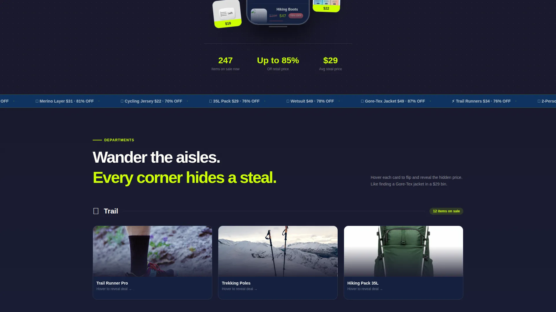
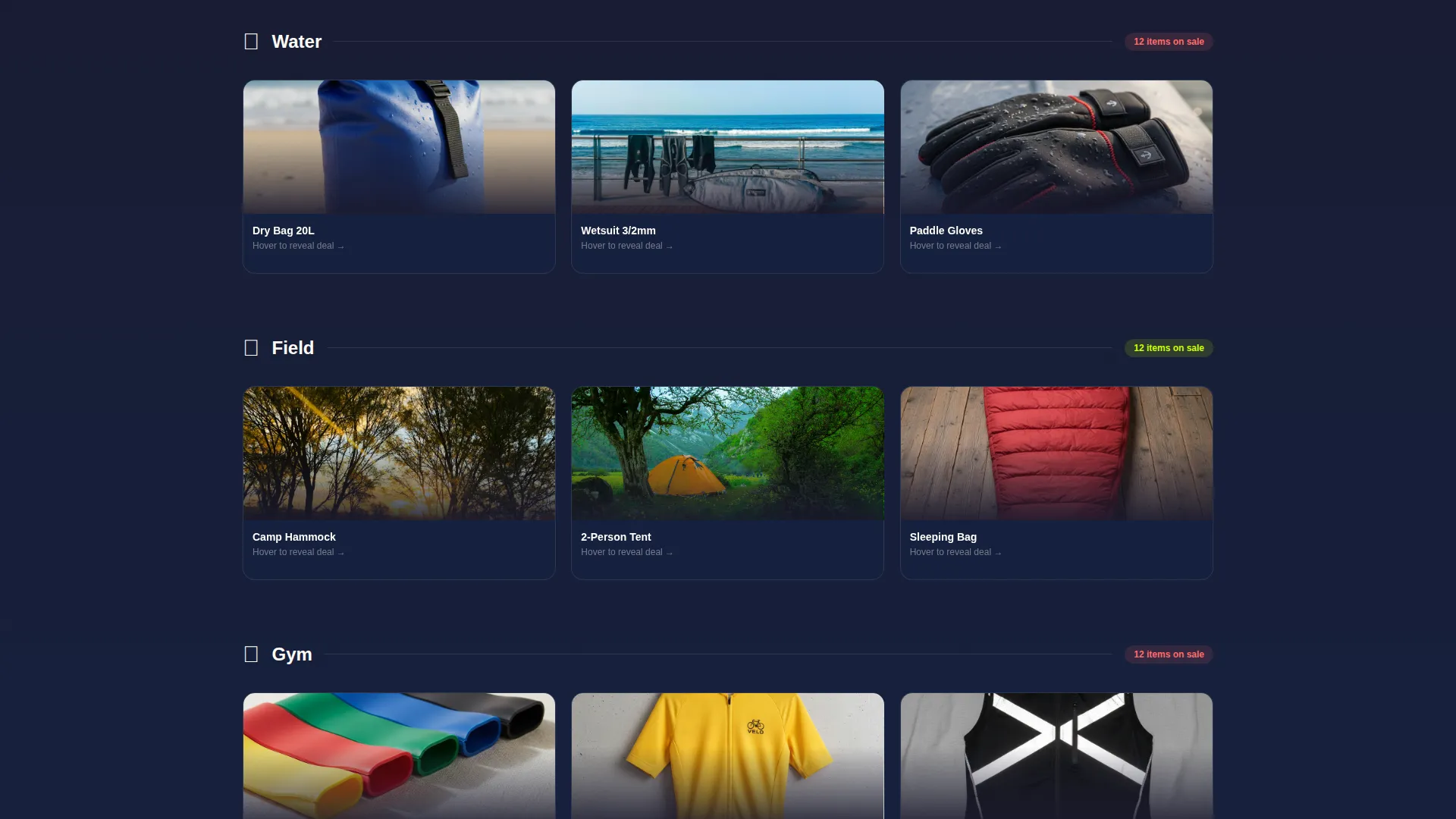
Each scroll zone shifts to a new gear department: trail, water, field, and gym. Products cascade into view as visitors enter each zone. The structure mirrors wandering through store aisles, reinforcing the warehouse discovery feeling.
Deal-Reveal Interaction System
Product cards flip on scroll to expose hidden discounts. Sections peel back like price stickers to show deeper savings underneath. A persistent "deals unlocked" counter in the corner increments with each new reveal, rewarding continued engagement.
Late-Page Email Capture
A "Get the Drop" email sign-up appears after the third scroll reveal. Placing it at this point means only genuinely engaged visitors see it, which improves the quality of subscribers and reduces early friction.
Page sections overview
| Section | Purpose |
|---|---|
| Animated Hero Header | Introduces the brand and anchors urgency with the device mockup, countdown timer, and oversized headline |
| Deal Quiz Entry | Launches the five-question "Find Your Steal" quiz as the primary conversion path |
| Trail Zone Reveal | First sport-category scroll zone featuring trail running and hiking gear cards |
| Water Zone Reveal | Second department zone for water sport and outdoor water activity products |
| Field Zone Reveal | Third zone covering field sports gear with progressive card flip reveals |
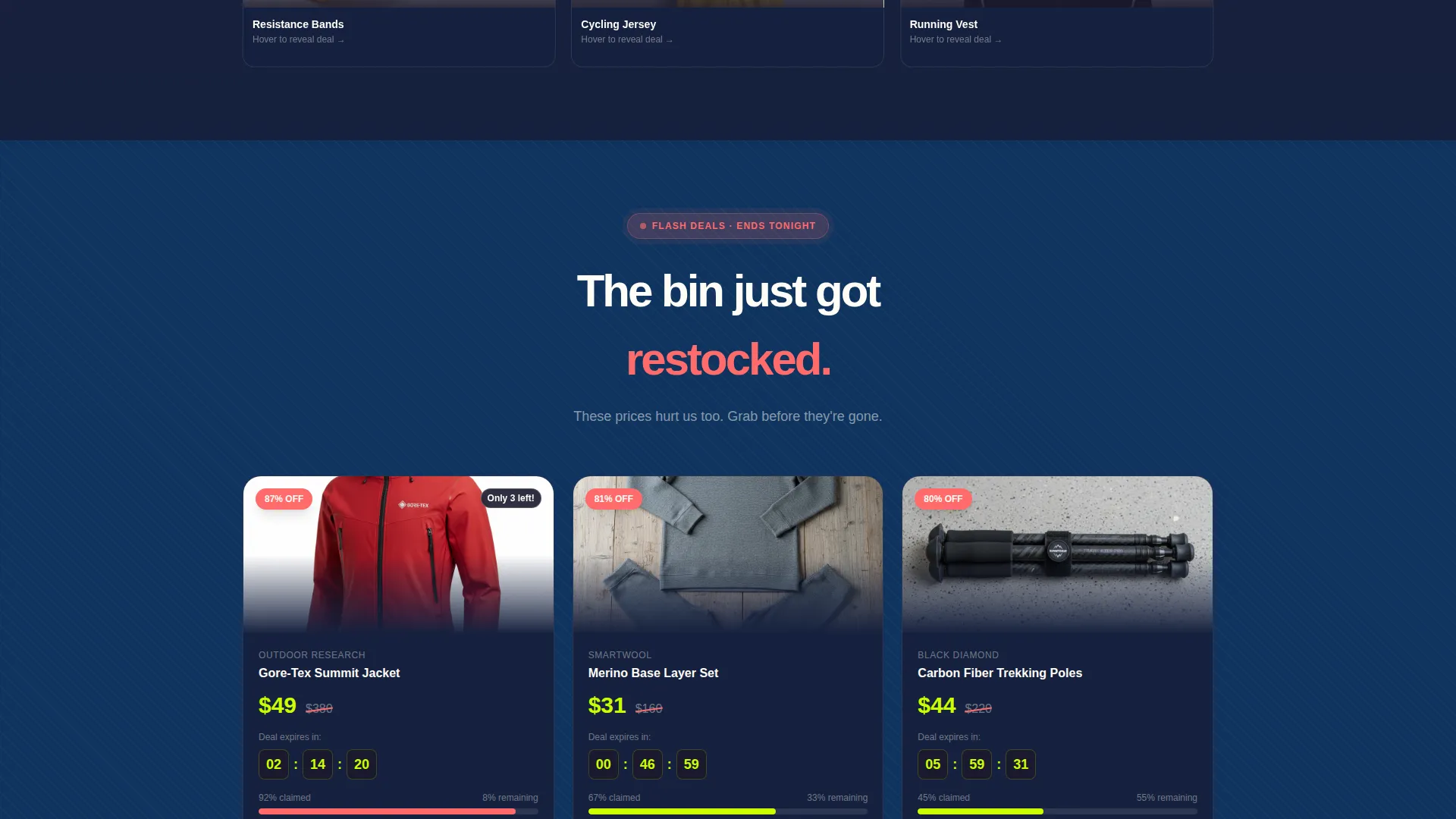
| Gym Zone Reveal | Fourth department zone for indoor and gym-oriented sporting goods |
| Deals Unlocked Counter | Persistent corner element that increments as visitors progress through reveal zones |
| Email Capture Block | "Get the Drop" sign-up for weekly markdown alerts, placed after the third scroll reveal |
| Quiz Results Display | Personalized deal bundle output with match score percentage and unique discount code |
Design & branding system
The visual identity follows a Directory and Discovery theme built on a Dopamine Pop color palette. Every color has a defined role, so the page never feels chaotic even though it is deliberately loud.
- Electric lime (#CCFF00) drives calls to action and percentage-off callouts; hot coral (#FF6B6B) marks flash deal badges and surprise reveal moments
- Deep navy (#1A1A2E) anchors background sections to give the eye a resting point between high-energy product reveals
- Price-sticker white (#FFFDF7) keeps product cards and body text readable, providing visual relief between dopamine-hit moments; a halftone texture and oversized display typography reinforce the warehouse aesthetic
Mobile & speed optimization
The template is built with a mobile-first scroll experience in mind. The progressive reveal structure means content appears in controlled bursts rather than all at once, which keeps the layout manageable on smaller screens.
- The device mockup in the header is sized and angled to read clearly on both portrait and landscape mobile viewports
- Product card grids shift to a single-column masonry layout on narrow screens so deal cards remain tap-friendly and readable
- The quiz interface uses icon grids, illustrated cards, and sliding scales that are each designed to work with a thumb, not a cursor
How this template helps you convert
The Haul template is built around progressive commitment. Each scroll zone earns a little more trust before asking for anything, so visitors arrive at the conversion points already engaged.
- The hero countdown timer and claimed-inventory progress bar create immediate urgency without relying on pop-ups or interruptions, anchoring the mood before the first scroll.
- The five-question quiz replaces generic browsing with a personalized experience. A visitor who receives a curated bundle and a unique discount code has a much stronger reason to act than one who lands on a static product grid.
- The email capture arrives at the third scroll reveal, after the visitor has already seen multiple deal zones and used the deals-unlocked counter. Asking for an email at that point feels like a natural next step rather than a premature demand.
Other information about this template
The Haul landing page sits at the intersection of sports and outdoor auction platform conventions and mainstream discount retail energy. A few additional details worth knowing before you build:
- The template style follows a masonry and Pinterest-inspired grid, so product cards of varying heights stack naturally without forced alignment
- The header concept is price-anchored, meaning the first thing visitors process is a number or a savings signal, not a brand story
- The creative direction is Surprise and Delight, which means the page is engineered to reward curiosity rather than spell everything out upfront
- The "lp_direction" context is classified as Marketplace and Multi, meaning the layout supports browsing across multiple product types and categories within a single page flow
- The quiz budget slider runs from $15 to $150, making it inclusive for casual shoppers and more committed buyers alike
- The "deals unlocked" counter and the match score percentage are two built-in gamification signals that reinforce a sense of progress and personal relevance
Theme
Directory & Discovery
Creative direction
Surprise & Delight
Color system
Dopamine Pop
Style
Masonry/Pinterest
Direction
Marketplace/Multi
Page Sections
Scroll-reveal Progressive Layout
Five-question Visual Deal Quiz
Animated Hero Device Mockup
Sport-category Scroll Zones
Deal-reveal Interaction System
Late-page Email Capture
Related questions
Can I change the sport categories in the scroll zones?
Does the quiz generate real discount codes automatically?
Is the countdown timer in the hero section editable?
Who is this landing page best suited for?
Can I reposition or remove the email capture block?



