Cloud-Native Enterprise Software Advanced Cost Calculator Website Template
Headcount is a dark-themed, dashboard-style landing page template built for cloud-native HRM platforms. It leads with an interactive Total-Cost-of-Workforce Calculator, flows into a scroll-animated feature comparison grid, and closes with a pinned progressive lead-capture form. The design uses a Carbon Fiber color system to make live data points feel urgent and trustworthy.
by Rocket studio
Quick summary
Headcount is a single-page landing page template designed for cloud-native human resource management platforms. It opens with a fully interactive workforce cost calculator, transitions into a scroll-animated comparison grid, and drives conversions through a pinned call-to-action and a two-step progressive form. The visual identity is a matte-black dashboard with electric-teal live data accents.
Who this template is for
This template is built for product and marketing teams promoting enterprise-grade HRM software. It speaks directly to buyers who already feel the pain of disconnected tools and want proof before they commit to a demo.
- VP-level People Operations leaders at 200 to 800 person SaaS companies evaluating a platform consolidation
- HR directors inheriting a fragmented tool stack after a funding round and needing a single command center
- CFOs who need credible workforce-cost modeling they can trust during board preparation
What problem this template solves
HR and People Ops buyers are drowning in spreadsheets, disconnected payroll logins, and outdated org charts. They need to see real numbers and a direct feature-by-feature comparison before they will book a demo.
- Visitors leave landing pages without engaging because generic hero images fail to prove value quickly
- Prospects cannot easily compare their current tool stack against a new platform without a structured visual guide
- Conversion rates suffer when the only call-to-action is a high-commitment demo request with no lower-friction alternative
What you get with this template
You get a complete, conversion-focused landing page layout built around three core experience stages: calculate your cost, compare your stack, and claim your migration plan. Every section is purposefully sequenced to move a skeptical enterprise buyer forward.
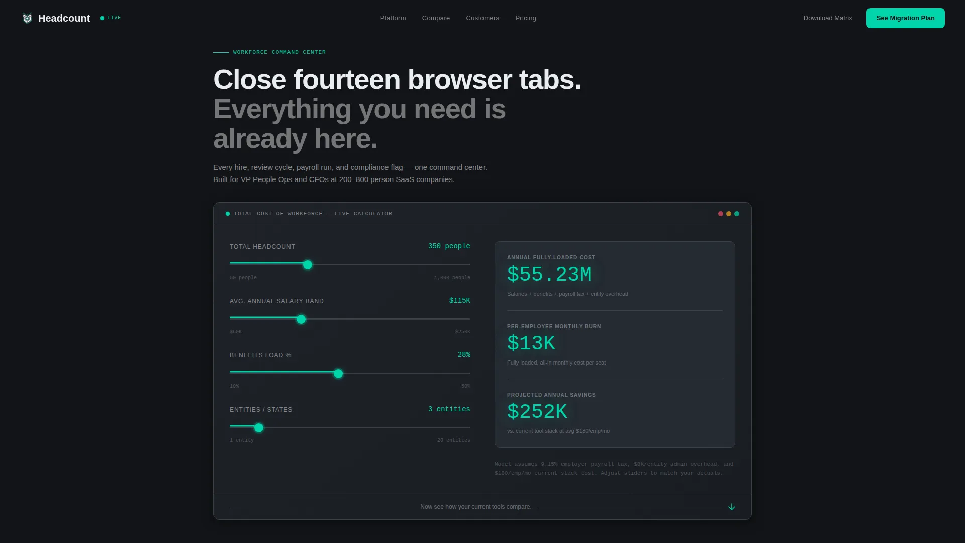
- An interactive Total-Cost-of-Workforce Calculator with four live sliders and three animated output numbers
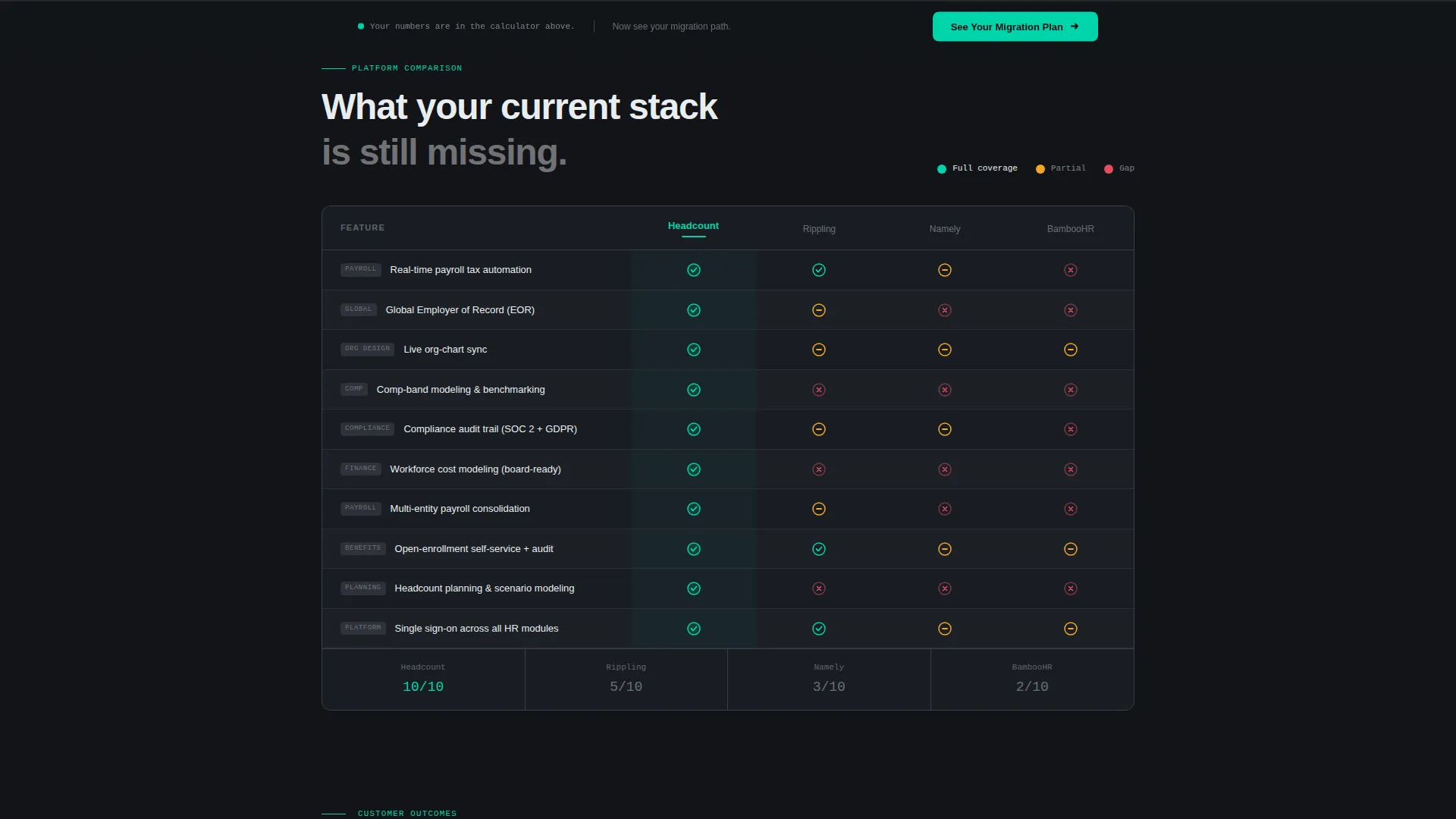
- A scroll-triggered comparison grid with teal checkmarks, muted red gaps, and amber partial-coverage indicators
- A pinned bottom call-to-action bar, a two-step progressive lead form, and a secondary email-only PDF download path
Feature list
This template is built around several purposeful interactive and visual components drawn directly from the product brief.
Interactive Workforce Cost Calculator
The page header is the product. Four sliders let visitors input headcount, average salary band, benefits load percentage, and number of entities or states. Three output numbers animate in real time: annual fully-loaded cost, per-employee monthly burn, and projected savings versus their current stack. Numbers render in electric teal against cockpit black, large enough to read from across a desk.
Scroll-Animated Comparison Grid
The comparison grid builds like a live scorecard as the visitor scrolls. Feature rows populate one by one, covering capabilities such as payroll tax automation, global employer-of-record support, real-time org-chart sync, compensation-band modeling, and compliance audit trail. Teal checkmarks, muted red gaps, and amber partial-coverage indicators make the competitive picture immediately clear.
Pinned Persistent Call-to-Action
Once the visitor scrolls past the calculator, a "See Your Migration Plan" button pins to the bottom of the viewport. It stays visible throughout the entire comparison grid section, so the prompt to act never disappears while the buyer is reading the most persuasive part of the page.
Two-Step Progressive Lead Form
Clicking the primary call-to-action opens a two-step form. Step one collects company size, current HRM tools via multi-select chips, and a work email address. Step two asks for the biggest pain point via a dropdown and a preferred demo window. Progressive disclosure reduces form anxiety and improves completion rates.
Secondary PDF Download Path
A lower-commitment conversion path lets visitors download a PDF comparison matrix by entering only their email address. This exit ramp captures leads from buyers who are not yet ready for a demo but are still deep in the evaluation process.
Case Study Micro-Cards
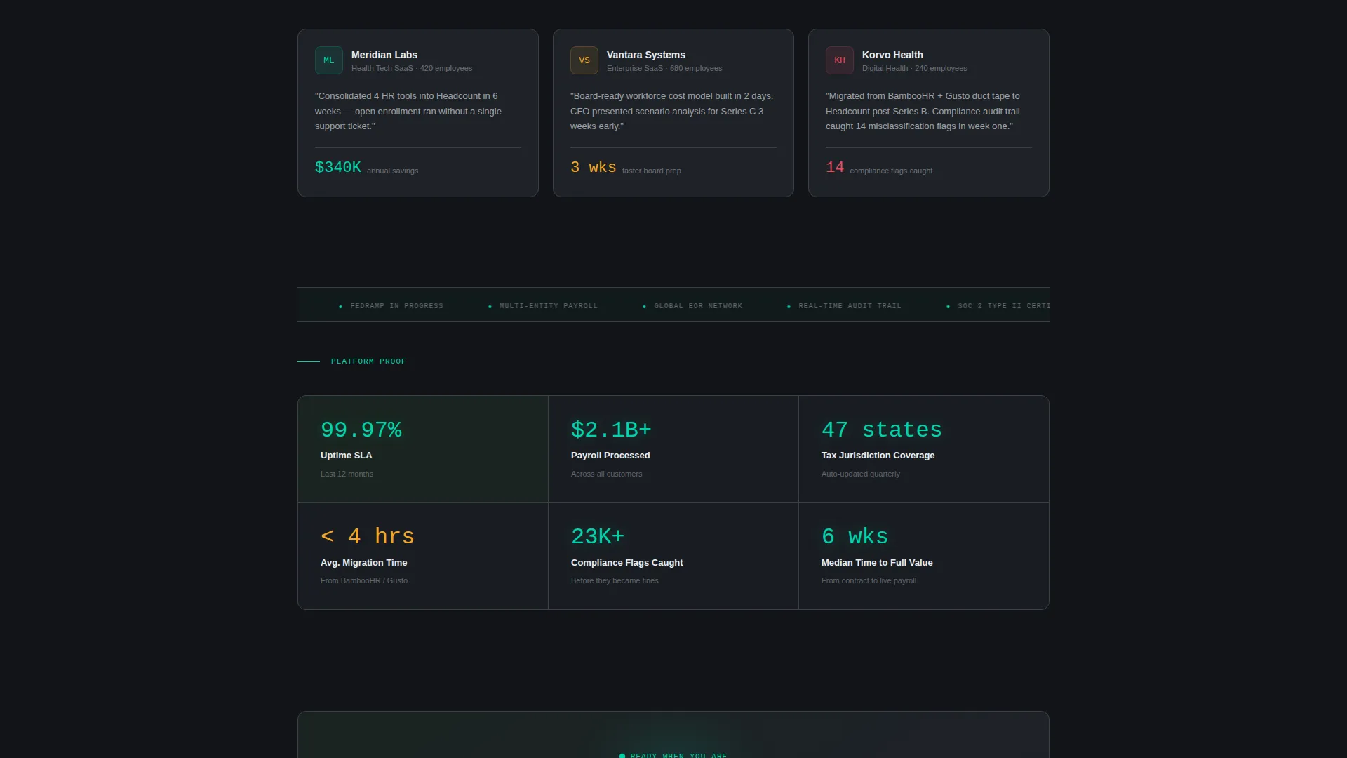
Short case-study cards slide in between comparison grid sections. Each card shows a company logo, a headcount number, and a single-sentence outcome. They deliver social proof at exactly the moment the visitor is watching the current tool stack lose row by row.
Page sections overview
| Section | Purpose |
|---|---|
| Calculator Header | Opens with live cost inputs and animated output numbers above the fold |
| Comparison Grid | Scroll-animated feature rows comparing the platform against incumbent tools |
| Case Study Cards | Proof micro-cards inserted between grid sections to reinforce outcomes |
| Pinned call to action Bar | Persistent bottom bar keeping the primary action visible throughout scroll |
| Progressive Lead Form | Two-step form capturing company context, pain point, and demo preference |
| PDF Download Ramp | Secondary email-only lead capture for lower-commitment visitors |
Design & branding system
The visual identity follows a Dashboard Pro theme built on the Carbon Fiber color system. Every surface is darkened so that live data points and interactive elements glow with purpose.
- Core palette: cockpit black (#121417) for backgrounds, gunmetal panel (#1E2228) for card surfaces, brushed-aluminum (#3A3F47) for divider lines, and interface white (#EAEDF0) for high-contrast typography
- Electric teal (#00D4AA) is used exclusively for live data numbers, toggle states, teal checkmarks, and primary buttons; it never appears as decoration
- Status colors extend the system: muted red (#E74C5F) marks feature gaps in the comparison grid, and amber (#F5A623) indicates partial coverage
Mobile & speed optimization
The template layout is structured to remain clear and functional across screen sizes. The data-heavy dashboard aesthetic translates to smaller screens through careful component hierarchy.
- The calculator card stacks vertically on mobile so sliders remain finger-friendly and output numbers stay prominent
- The comparison grid collapses to a scrollable card format on smaller viewports, preserving the row-by-row reveal animation
- The pinned call-to-action bar adjusts its height and padding for touch targets on mobile devices
How this template helps you convert
The page is engineered around a single insight: a buyer who has already seen their own cost numbers is far easier to convert than one who has only read feature bullets.
- The calculator creates personal investment before any product claim is made; visitors calculate their own fully-loaded workforce cost and projected savings, making the value tangible and specific to their situation.
- The comparison grid escalates the narrative from cost awareness to competitive clarity, with animated row-by-row reveals and inline proof cards that build the case without requiring the visitor to leave the page.
- The dual conversion architecture captures leads at two commitment levels: the two-step progressive form for buyers ready to book, and the PDF download path for buyers still evaluating, so no qualified visitor leaves empty-handed.
Other information about this template
This template is suited to any cloud-native HRM platform that competes on consolidation, cost transparency, and compliance coverage. A few additional details worth noting before you build:
- The template is designed as a single landing page with a linear scroll flow, not a multi-page site
- The Carbon Fiber color system is fully documented in the design file, making it straightforward to swap in your own brand accent color if teal does not match your identity
- The comparison grid columns are placeholder-ready; the incumbent tool labels shown in the brief are illustrative of the layout structure and can be replaced with any competitors relevant to your market
- The progressive form steps are built as separate states within a single modal overlay, keeping the visitor on the page throughout the capture flow
- This template fits naturally within a broader demand-generation funnel, sitting between paid traffic and a sales-qualified lead handoff

Theme
Dashboard Pro
Creative direction
Calculator/Tool First
Color system
Carbon Fiber
Style
Dashboard/Data Grid
Direction
Comparison/Versus
Page Sections
Interactive Workforce Cost Calculator
Scroll-animated Comparison Grid
Pinned Persistent Call to Action Bar
Two-step Progressive Lead Form
Secondary PDF Download Path
Case Study Micro-cards
Related questions
Can I replace the competitor columns in the comparison grid?
Does the calculator require a back-end integration to work?
Can I update the electric-teal accent to match my own brand color?
How does the two-step form reduce drop-off?
Is this template suitable for buyers with a shorter sales cycle?



