Headcount - Powerful Recruiting Landing Page Template
Headcount is a modular card grid landing page built for staffing and recruiting membership sites. It gives boutique firm founders, solo operators, and agency recruiters a fast, scannable page that inventories every membership deliverable. The Teal Catalyst color system and Startup Velocity theme make the page feel operational from the first scroll, driving sign-ups through a two-step opt-in flow.
by Rocket studio
Quick summary
Headcount is a single-page, card grid landing page template designed for a staffing and recruiting membership platform. It leads with a high-fidelity dashboard screenshot, organizes every membership deliverable into discrete modular cards, and drives conversions through a focused two-step opt-in form. The design feels built by recruiters who bill, not by generalist web designers.
Who this template is for
This template was built for a specific kind of operator. It speaks directly to people running small but serious recruiting businesses, not enterprise HR teams.
- Agency recruiters billing under $200,000 annually who need proven processes fast
- Boutique firm founders scaling past their first few desks and building repeatable systems
- Solo operators who left large agencies and now need back-office infrastructure immediately
What problem this template solves
Most membership site pages try to sell a feeling. Recruiters want an inventory. They need to see exactly what they are getting before they commit, and they need to see it in seconds. This template solves the credibility and clarity gap that causes high bounce rates on membership landing pages.
- Vague benefit copy fails recruiters who think in ROI terms, not emotional language
- Long scroll pages bury the actual deliverables under aspirational headlines
- Generic opt-in forms attract unqualified leads who drain sales time without converting
What you get with this template
Every section of this template is built to move a recruiting operator from skeptical visitor to qualified lead. Nothing is decorative for decoration's sake.
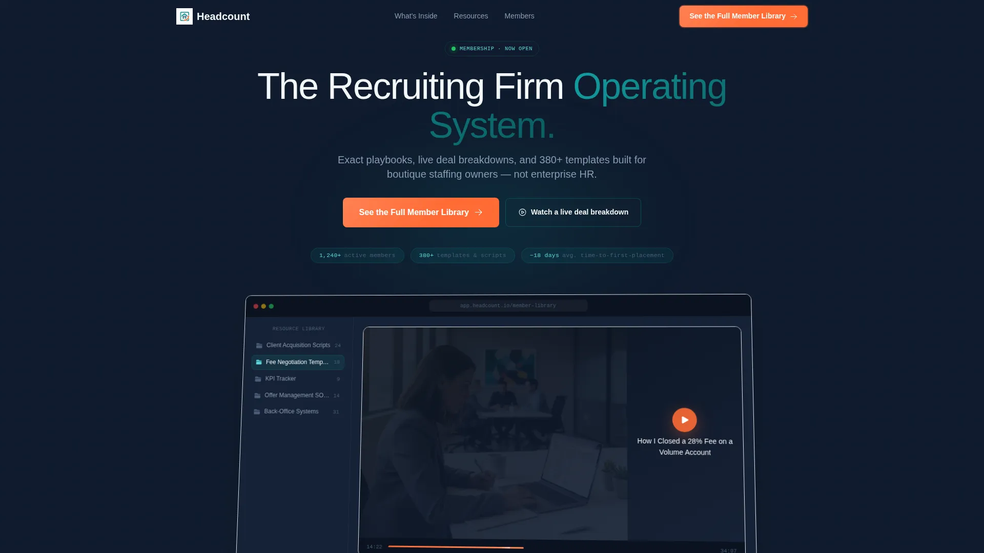
- A product screenshot header showing a real membership dashboard with labeled resource folders and a playing video
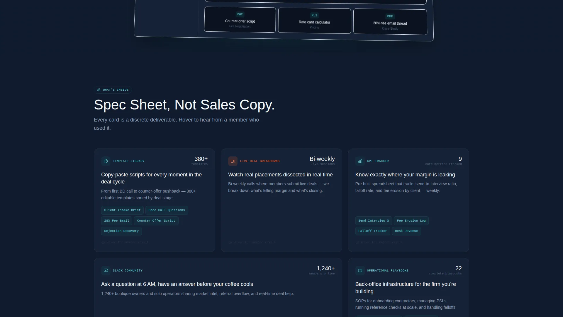
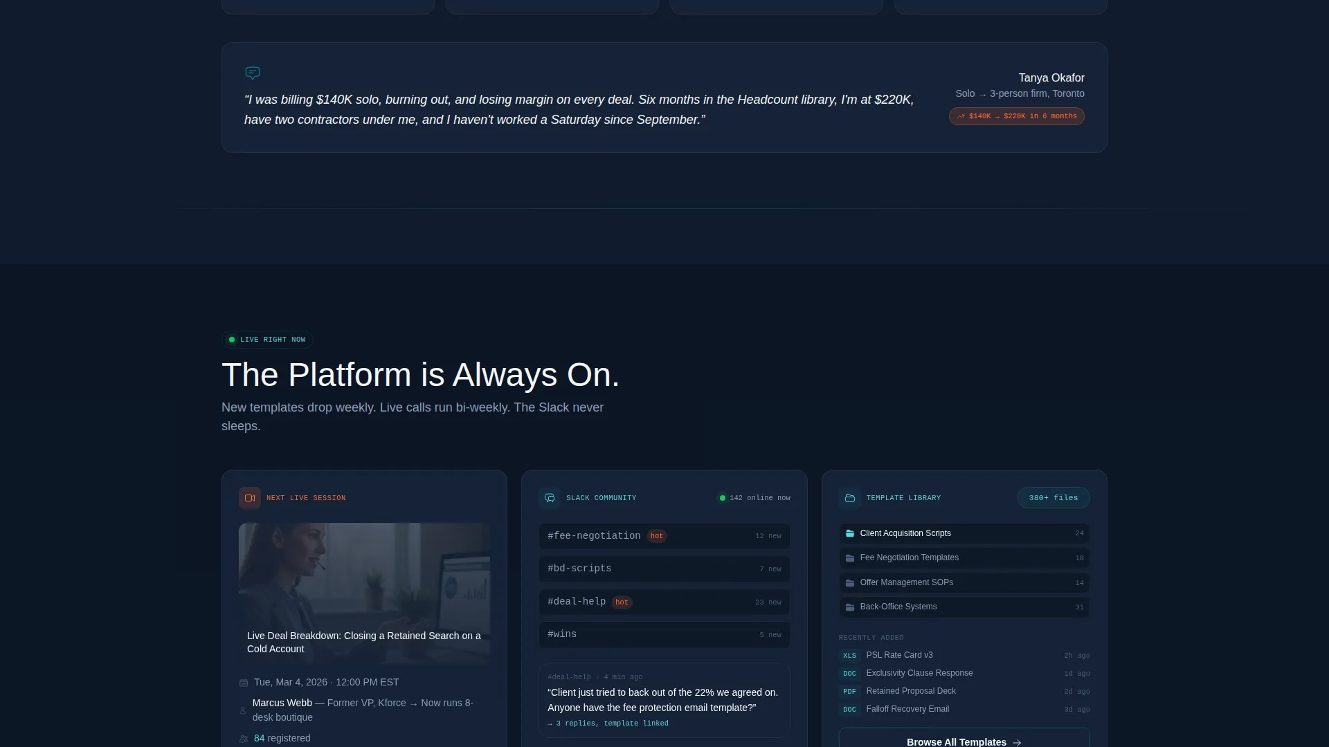
- A modular card grid where each card represents one specific membership deliverable with hover-triggered testimonials
- A two-step opt-in lightbox that qualifies leads by firm size and operational bottleneck before revealing pricing
Feature list
This template ships with a focused set of components that work together to qualify, inform, and convert.
Dashboard Screenshot Header
The header centers a high-fidelity browser mockup of the membership dashboard. The mockup sits at a slight angle on a midnight background with a soft ambient glow. It shows a resource library sidebar with labeled folders and a main panel with an in-progress video. The headline sits above it in catalyst white, and three proof metric pills float below.
Modular Deliverable Card Grid
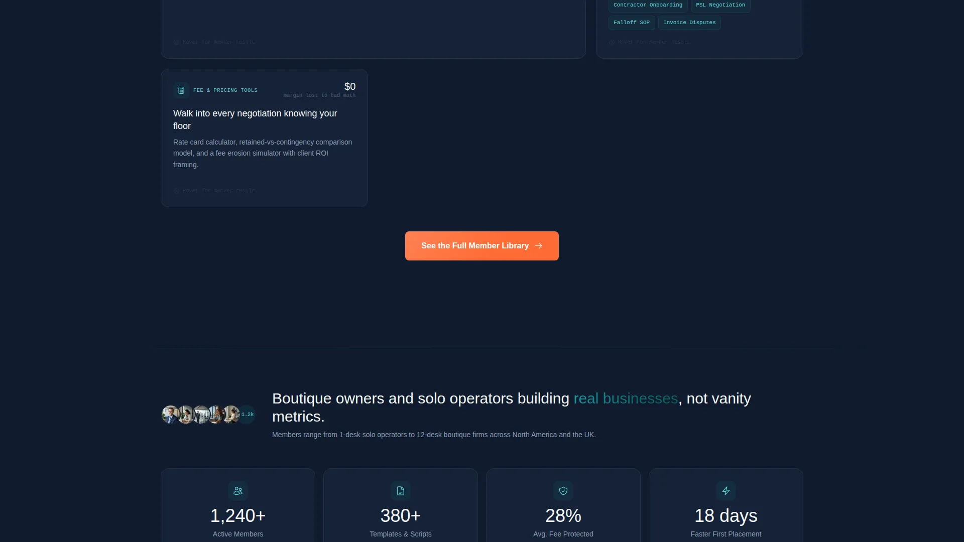
Each card in the grid represents one specific membership asset, such as the template library, live call calendar, or Slack community. Cards show a file count, a next session date, or an active member counter. On hover, each card deepens and reveals a short testimonial from a member who used that exact resource.
Two-Step Opt-In Lightbox
The primary call-to-action button opens a lightbox form rather than a full page redirect. The form collects first name, agency name, current team size, and biggest operational bottleneck via a single dropdown. No pricing appears until after submission, keeping the focus on immediate value delivery.
Repeating Conversion-Orange Call to Action
The primary call-to-action button appears in the header, floats on mobile, and repeats after every two card rows. This placement pattern keeps the next action visible at all times without interrupting the scan flow that recruiters naturally use.
Proof Metric Pills
Three small pill components float beneath the dashboard screenshot. Each pill displays a single, specific proof metric such as member count, templates available, or average first-placement speed improvement. They add credibility without expanding the header into a long block of copy.
Confirmation Page Sequence
After form submission, the confirmation page delivers a free sample template and books a walkthrough call. This mirrors the membership experience directly, giving the lead immediate value and giving the operator a qualified, size-segmented prospect.
Page sections overview
| Section | Purpose |
|---|---|
| Header with screenshot | Establish credibility and context with a dashboard mockup and headline |
| Proof metric pills | Display three specific membership metrics beneath the header |
| Primary call to action row | First conversion-orange opt-in button placement after the header |
| Deliverable card grid | Inventory each membership asset in scannable, hover-interactive cards |
| Mid-grid call to action repeat | Repeating opt-in button after the first two card rows |
| Final call to action row | Last opt-in button placement before the page footer |
| Opt-in lightbox form | Two-step qualification form triggered by any call to action button |
| Confirmation page | Sample template delivery and walkthrough call booking |
Design & branding system
The Teal Catalyst color system was chosen to feel like a SaaS operations dashboard built by practitioners. It is clinical enough to signal credibility and warm enough to invite action.
- Deep operational teal (#0D7377) anchors the primary brand identity across section accents and card borders
- Midnight dashboard (#0F1B2D) fills backgrounds and section breaks, giving cards strong visual contrast
- Conversion-orange (#FF6B35) appears exclusively on buttons and progress indicators, creating a single consistent action signal
Mobile & speed optimization
The card grid layout is fully modular, which means it reflows cleanly across screen sizes without losing the scan-first structure that makes the template work.
- The primary call-to-action button floats persistently on mobile screens so the opt-in is always one tap away
- Cards stack vertically on smaller viewports while preserving hover and tap interaction states for testimonial reveals
How this template helps you convert
The conversion path is built around the way recruiters actually make decisions: fast comparisons, ROI signals first, and no friction before value is established.
- The dashboard screenshot header immediately signals a real, built product rather than a promise, which earns the scroll before a single word of body copy is read.
- The non-linear card grid lets visitors jump directly to the deliverable they care most about, reducing the friction of linear storytelling for fast-moving operators.
- The two-step opt-in qualifies each lead by firm size and bottleneck type before pricing is shown, so the follow-up walkthrough call starts with the right conversation already framed.
Other information about this template
This template is categorized under Technology with a subcategory of Staffing and Recruiting Digital Presence. It is built on a Card Grid (Modular) template style following a Startup Velocity theme. The creative direction is a Spec Sheet approach, meaning the page reads like a product inventory rather than a persuasion sequence. The landing page direction is Lead Generation.
- The Intersection Match Score for this template is 13, indicating a high specificity alignment between the niche, style, and design system
- The template is designed for the Staffing and Recruiting Membership Site niche and is not a general-purpose marketing page
- This template can support a staffing agency website or a recruiter-focused membership landing page depending on how the confirmation sequence is configured
Theme
Startup Velocity
Creative direction
Spec Sheet
Color system
Teal Catalyst
Style
Card Grid (Modular)
Direction
Lead Generation
Page Sections
Dashboard Screenshot Header
Modular Deliverable Card Grid
Two-step Opt-in Lightbox
Repeating Conversion-orange Call to Action
Proof Metric Pills
Related questions
Who is this landing page template designed for?
Does the two-step opt-in form reveal pricing before submission?
Can I customize the card grid to match my own membership deliverables?
What happens after a visitor submits the opt-in form?
Is the call-to-action button always visible on mobile?



