Advanced Tech & AI Platforms Professional Website Template
A bold brutalist landing page built for headless content management system products targeting developers and engineering teams. The template features a modular card grid layout with six expandable capability demos, a scrolling logo bar, a live API code snippet, and a lead generation form. It is designed to convert technically minded visitors into free-instance signups.
by Rocket studio
Quick summary
This template is a single-page, card-grid layout built for headless content management system products. It pairs a bold brutalist visual identity with interactive capability demos, a scrolling logo ticker, and a developer-focused lead generation flow. Every section rewards curiosity and moves technical visitors toward one clear action: spin up a free instance.
Who this template is for
This template is purpose-built for developer-facing products that need to earn trust before asking for a signup. It speaks the language of engineers, not marketers.
- Engineering leads at SaaS companies who are rebuilding or evaluating a marketing site backend
- Agency chief technology officers managing multiple client stacks from a single content backend
- Solo developers who want a clean API-first content layer without fighting platform constraints
What problem this template solves
Most software landing pages talk at developers instead of showing them something real. A developer evaluating a headless content management system wants proof, not prose. This template solves the credibility gap by turning the page itself into a working demo environment.
- Visitors can interact with capability cards rather than just reading feature bullet points
- The lead generation form collects qualified intent signals like team size and primary framework
- The persistent call-to-action bar appears only after real engagement, reducing premature pressure
What you get with this template
You get a fully structured, single-page layout ready for a headless content management system product. Every section is designed and sequenced for a technical audience on desktop, with mobile parity built in.
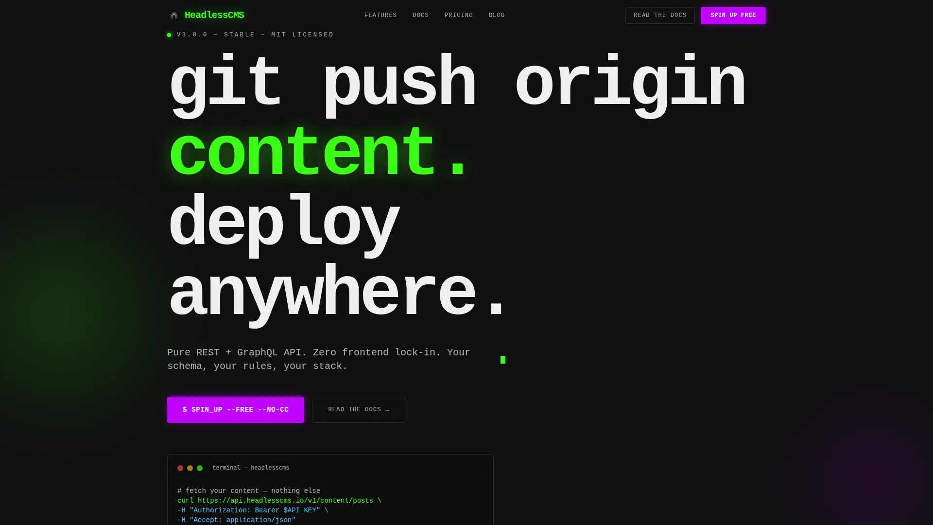
- A hero section with monospaced typography, a blinking cursor animation, a live API JSON snippet, and a horizontal logo ticker
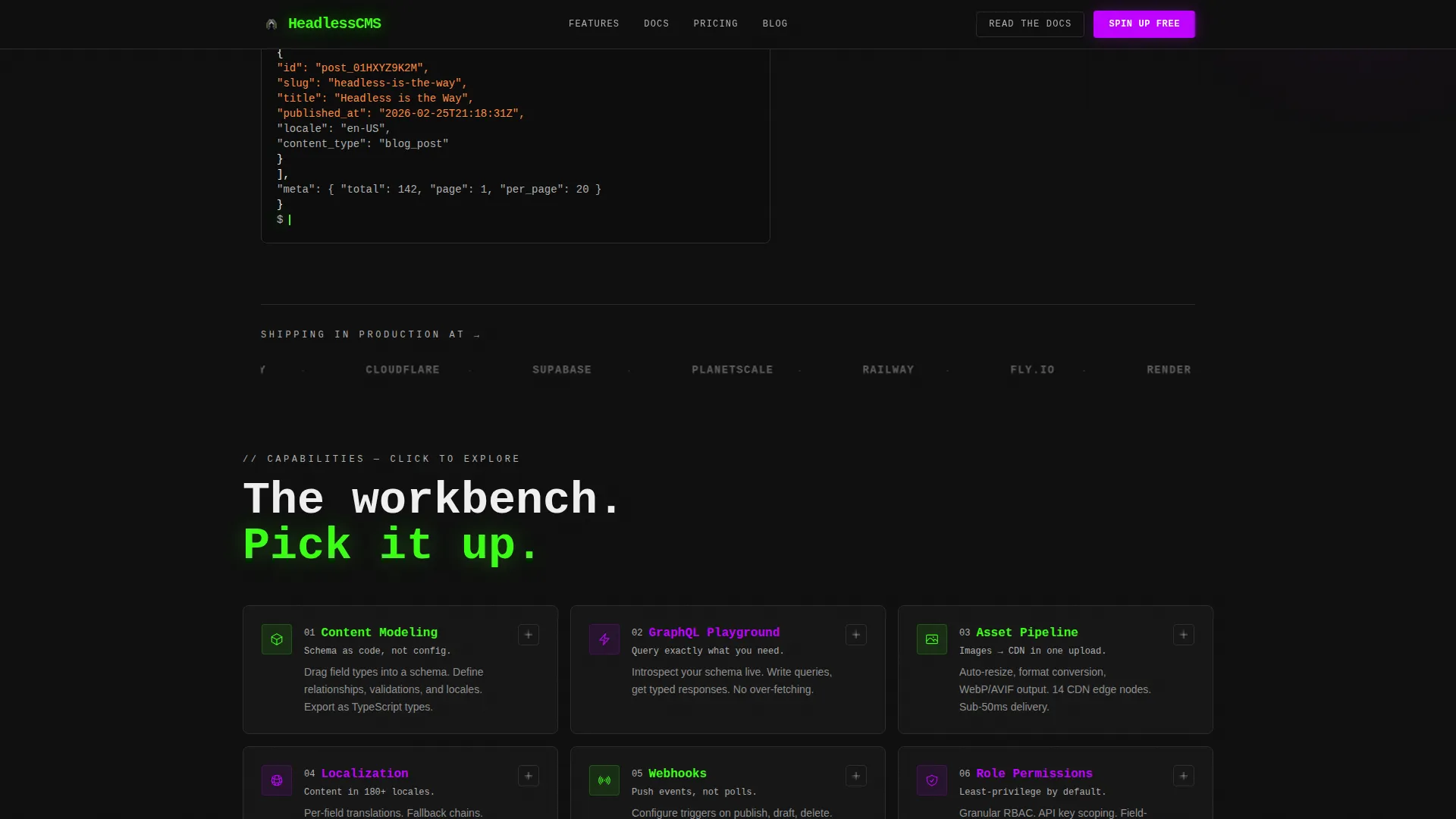
- A six-card interactive grid where each capability expands into a live, manipulable demo experience
- A lead generation section with a multi-step form and a secondary conversion path for documentation-seekers
Feature list
This template ships with a tightly scoped set of interactive and structural features. Each one is drawn directly from the project brief and serves the developer-first conversion goal.
Expandable Interactive Card Grid
Six modular capability cards cover content modeling, asset pipeline, localization, webhooks, role permissions, and a GraphQL playground. Each card expands on click into a live demo environment. The schema builder card lets visitors drag field types into a model. The GraphQL card reveals a working query editor returning mock data.
Blinking Cursor Hero with API Snippet
The hero opens with a massive monospaced headline followed by a blinking cursor animation and a visible API call returning structured JSON. No illustration, no hero image. The design communicates proof immediately and sets a terminal-style tone for the rest of the page.
Scrolling Logo Bar Header
A horizontal ticker of recognizable company logos scrolls at a slow, confident pace against a void black background. It establishes social proof at the top of the page before a visitor reads a single line of copy.
Persistent Lead Generation Bar
A bottom bar containing the primary call-to-action appears after a visitor interacts with any two capability cards. The form collects work email, team size, and primary framework preference. This trigger-based timing means the ask arrives after genuine engagement.
Stack Compatibility Strip
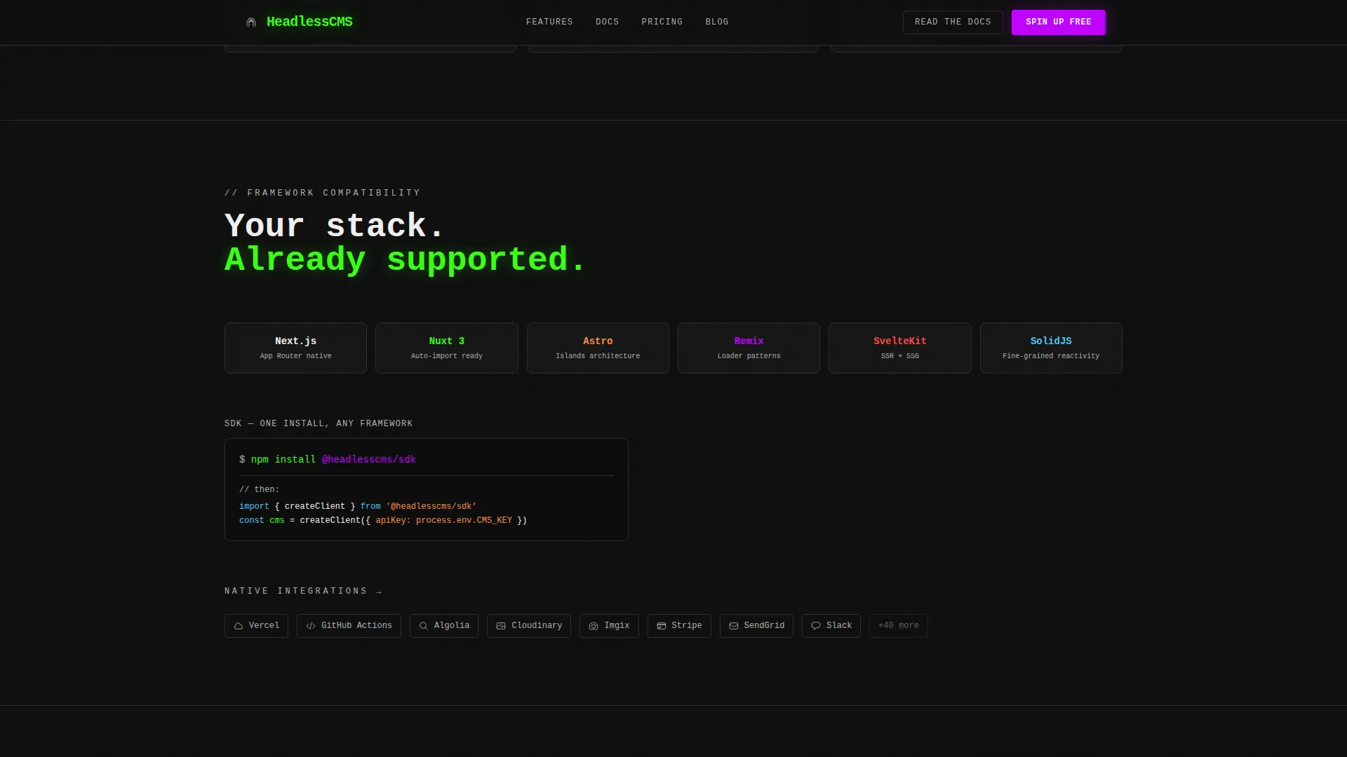
A dedicated section displays framework logos and an integration strip confirming compatibility across modern frontend stacks. It gives framework-specific developers the confidence that the content management system will work with their existing tooling.
Social Proof Terminal Strip
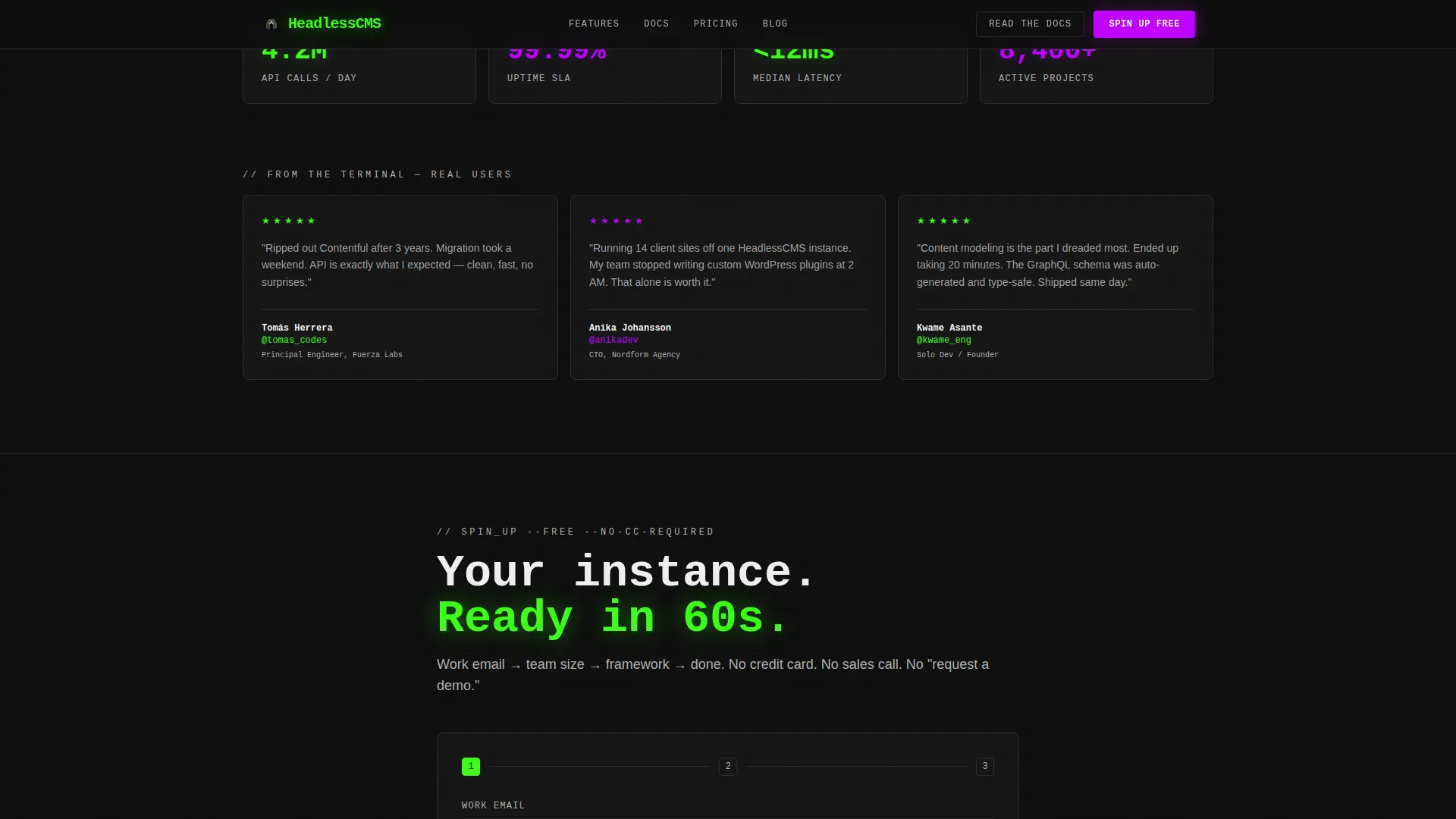
Developer testimonials are displayed in a terminal-style format alongside concrete metrics. Quotes include GitHub handles for credibility. This section reinforces trust with the exact audience that is most skeptical of marketing copy.
Page sections overview
| Section | Purpose |
|---|---|
| Hero with Logo Ticker | Establish product identity and social proof immediately |
| Interactive Card Grid | Let visitors explore six live capability demos |
| Stack Compatibility Strip | Confirm framework and integration support |
| Social Proof Terminal | Build trust with metrics and developer quotes |
| Lead Generation Form | Capture qualified signups with a three-field form |
| Persistent call to action Bar | Re-engage visitors after two card interactions |
| Minimal Developer Footer | Provide links in a clean, developer-appropriate layout |
Design & branding system
The visual identity follows a bold brutalist approach paired with an acid digital color system. Every design decision reinforces the idea that this is a tool built by engineers for engineers.
- Colors: void black (#0D0D0D) dominates all backgrounds; phosphor green (#39FF14) marks active states and code snippets; ultraviolet (#BF00FF) drives primary calls to action and hover states; concrete gray (#B0B0B0) holds card borders and secondary text
- Typography: JetBrains Mono is used for all headlines and code elements, reinforcing the terminal aesthetic; DM Sans handles body copy for readability
- Animation layer: GSAP ScrollTrigger powers scroll-based reveals; mousemove parallax, magnetic call-to-action buttons, card expand interactions, and a blinking cursor are all included
Mobile & speed optimization
The template is built desktop-first to match the primary developer audience, but every section scales down to a fully functional mobile experience. Interactive elements are preserved on smaller screens.
- Static sections use server components for fast initial render; interactive cards and animations use client components to keep the experience responsive
- Card grid reflows cleanly to a single column on mobile, preserving expand-on-tap interactions without layout breakage
- The persistent call-to-action bar and lead generation form remain fully accessible and usable on touch devices
How this template helps you convert
The conversion strategy is built into the interaction design itself. Visitors are not pushed toward a form until they have already engaged with the product.
- The interactive card grid acts as the trust engine. By the time a developer has played with the schema builder or run a mock GraphQL query, the call to action feels like a logical next step rather than an interruption.
- The persistent bottom bar appears only after two card interactions, timing the primary ask to a moment of genuine intent rather than passive scrolling.
- The secondary conversion path offering documentation access captures visitors who are not ready to commit, giving them a lower-friction next step that keeps them in the funnel.
Other information about this template
This template was designed for the headless content management system category within the advanced technology and artificial intelligence platforms subcategory. A few additional details are worth knowing before you build with it.
- The template style is a card grid (modular) layout, meaning individual sections and cards can be reordered or swapped without breaking the overall structure
- The lead generation form is structured to collect three signals: work email, team size (solo, 2 to 10, 11 to 50, or 50 and above), and primary frontend framework (Next.js, Nuxt, Astro, Remix, or Other)
- The footer follows a horizontal flow pattern that keeps navigation ultra-minimal and developer-appropriate
- Animation complexity is intentionally high, using GSAP for scroll triggers, parallax, and magnetic button effects throughout the page
- The intersection match score for this template is 13, placing it in a tightly relevant niche for developer tool and headless content management system landing pages
Theme
Bold Brutalist
Creative direction
Interactive Explorer
Color system
Acid Digital
Style
Card Grid (Modular)
Direction
Lead Generation
Page Sections
Expandable Interactive Capability Cards
Brutalist Hero with Live API Snippet
Scrolling Brand Logo Ticker
Trigger-based Persistent Call to Action Bar
Stack Compatibility Section
Terminal-style Social Proof Strip
Related questions
Who is this template designed for?
What makes the card grid different from a standard feature section?
Can I adapt the lead generation form fields?
Does this template work on mobile devices?
What animation library does this template use?



