Headless Enterprise Software Complete Professional Website Template
A split-screen landing page template built for composable supply chain management platforms. The design pairs a dark full-bleed header with a live-formatted API response card, then opens into a scrollable feature matrix. Frosted glass tiles, glowing cyan accents, and a sticky domain nav give engineering-led buyers a clear picture of every capability before a single form appears.
by Rocket studio
Quick summary
This template is a single-page, split-screen landing page for headless supply chain management platforms. It leads with a dramatic API response visual, then walks visitors through a browsable directory of capability modules. The click-through structure is built to push technical buyers toward API documentation rather than a lead form.
Who this template is for
This template speaks directly to technical decision-makers evaluating composable infrastructure. The tone and layout are tuned for people who read code before they read sales copy.
- Engineering leads at direct-to-consumer brands that have outgrown their existing fulfillment layer
- Operations architects at third-party logistics providers connecting warehouse management and transportation management feeds
- Chief Technology Officers at marketplace startups needing real-time inventory projection across many vendor nodes
What problem this template solves
Enterprise supply chain teams often face a painful gap: the platform is powerful, but the landing page looks like every other enterprise software site. Visitors who could be converted in one scroll bounce because they never see the actual capability map.
- Generic hero sections fail to communicate API-first architecture to technical buyers
- Monolithic feature grids hide composability and make it hard to mentally model integrations
- Form-gated pages add friction before trust is built, costing click-throughs to documentation
What you get with this template
You get a complete, ready-to-customize single-page layout that treats data as the hero and composability as the story. Every section is designed to build buyer confidence through specificity rather than marketing language.
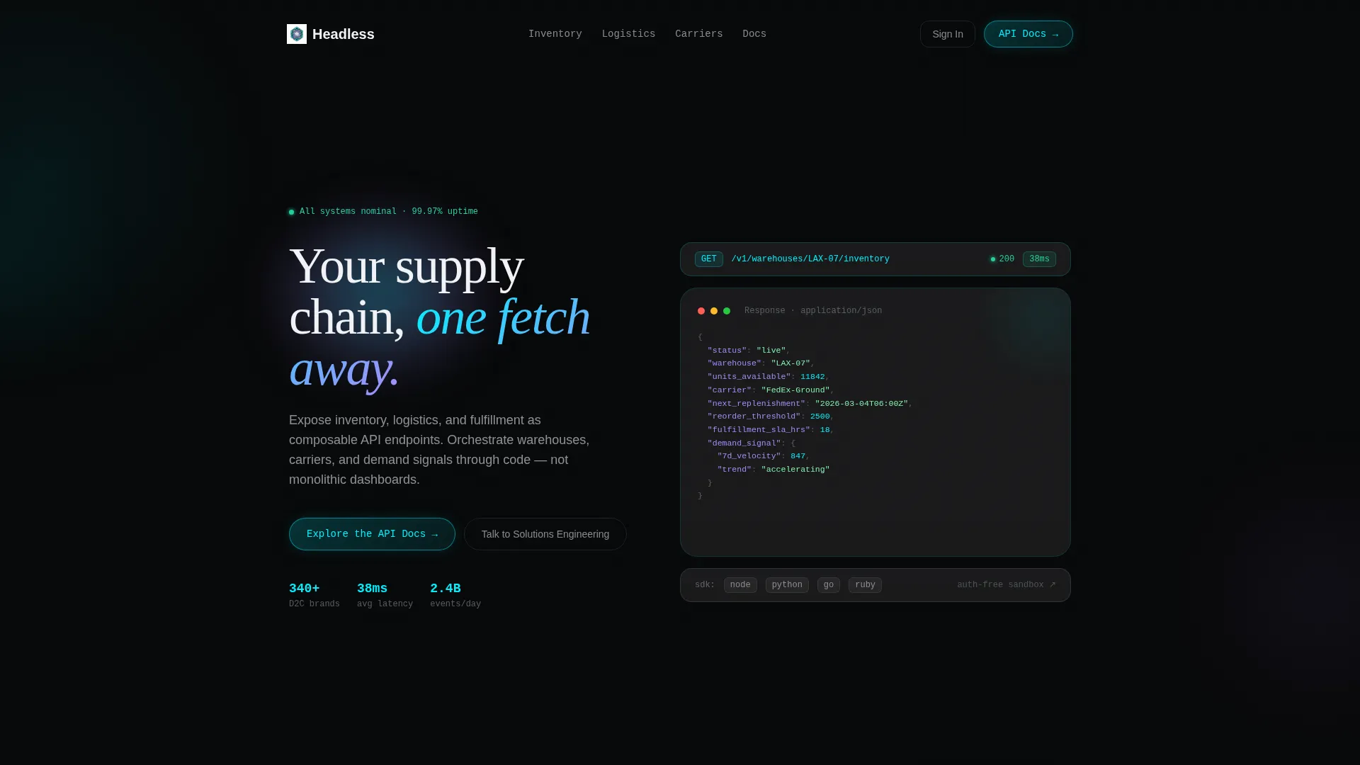
- A full-bleed dark header with a glowing mesh-gradient orb and a frosted glass card rendering a live-formatted JSON API response
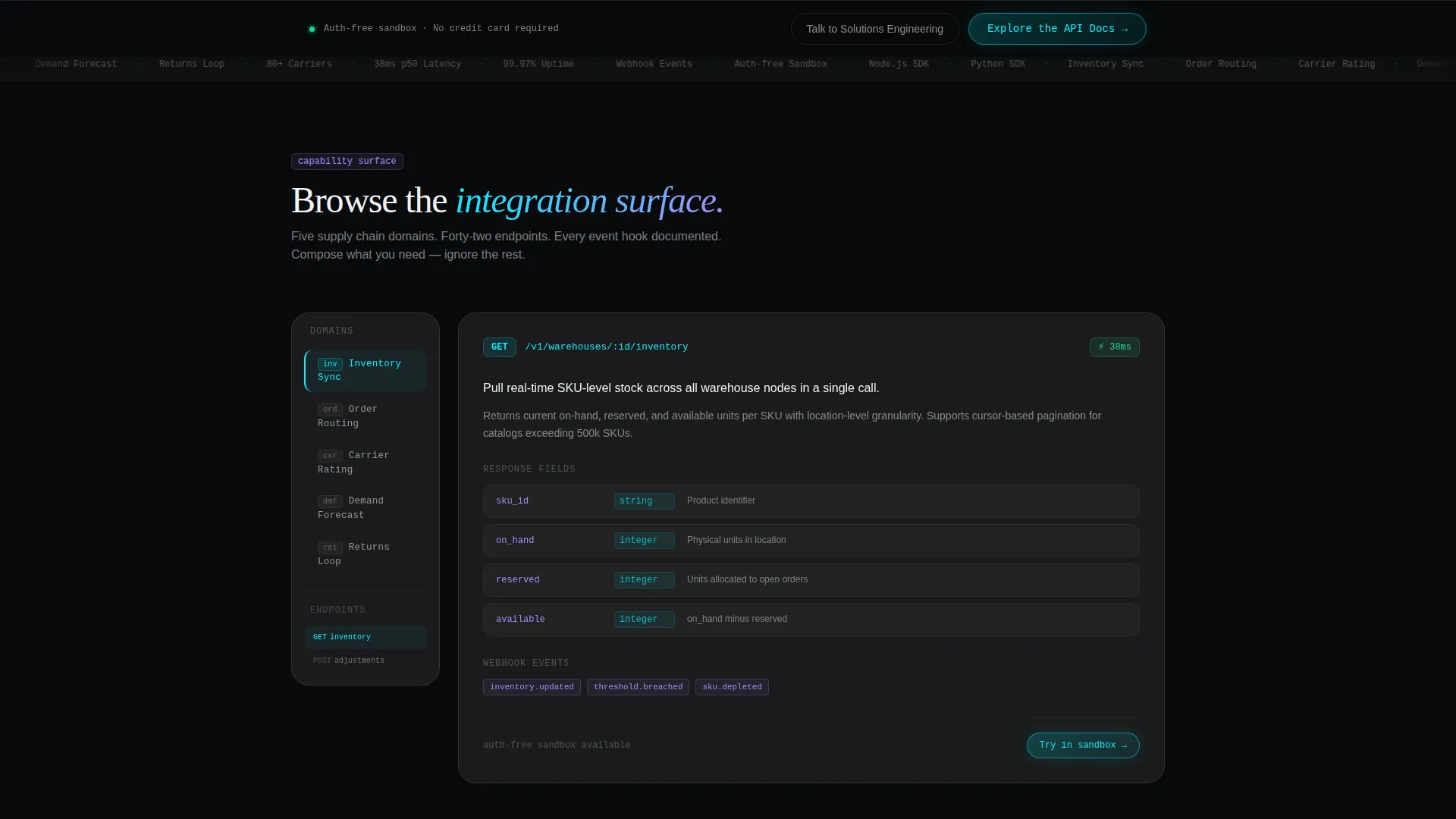
- A two-column feature matrix with a sticky vertical domain navigation panel and swappable module content cards
- Two conversion touchpoints: a primary cyan pill button inside the header card and a persistent bottom bar after the third module row
Feature list
This template is built around a focused set of visual and structural components drawn directly from the design brief.
Live API Response Hero Card
The right half of the header displays a frosted glass card showing a formatted JSON payload. Fields like warehouse identifier, available units, and next replenishment timestamp are rendered as readable data, not static copy. This stops the scroll for technical visitors immediately.
Glowing Mesh-Gradient Orb Header
The left half of the header centers a single cyan-to-lavender gradient orb that casts soft light across the dark canvas. The headline fades in over the orb. The effect communicates real-time data infrastructure without any stock photography or illustration.
Sticky Domain Navigation Panel
A vertical navigation list on the left pane stays fixed as visitors scroll through the feature matrix. Domains include Inventory Sync, Order Routing, Carrier Rating, Demand Forecast, and Returns Loop. This lets buyers jump to the capability most relevant to their stack.
Frosted Glass Module Cards
Each capability module is presented as a glassmorphic tile on the right pane. Every card shows the endpoint path, supported event hooks, a latency badge, and a one-sentence use case. The format lets buyers compare integration surfaces at a glance.
Persistent Conversion Bar
After the third module row, a fixed bottom bar carries the primary call-to-action button. This keeps the path to API documentation visible throughout the entire browse experience without interrupting the feature matrix flow.
Dual Call-to-Action Structure
The primary button reads "Explore the API Docs" and is styled as a glowing cyan pill. A secondary ghost button reads "Talk to Solutions Engineering" for enterprise buyers who prefer a guided walkthrough. No form appears anywhere on the page.
Page sections overview
| Section | Purpose |
|---|---|
| Full-Bleed Header | Introduce the platform with a live API response visual and primary call-to-action |
| Orb and Headline | Anchor brand message with a glowing gradient and fade-in headline copy |
| API Response Card | Display a formatted JSON payload to establish technical credibility immediately |
| Sticky Domain Nav | Let visitors navigate the feature matrix by capability domain |
| Module Card Grid | Present each capability as a frosted tile with endpoint, hooks, and latency |
| Persistent Bottom Bar | Keep the primary call-to-action visible after the third module row |
| Secondary call to action Block | Offer an enterprise conversation path via ghost button |
Design & branding system
The visual identity follows a Directory and Discovery theme built on a glassmorphic color system. Every surface choice reinforces the feeling of peering through layered smoked glass in a live control environment.
- Core palette: void black (#08090A) for backgrounds, frosted panel white at 12% opacity (#FFFFFF1F) for cards, phosphor cyan (#00F0FF) for live-state elements, and muted signal lavender (#A78BFA) for secondary actions and metadata labels
- Frosted glass cards float above the dark background using transparency rather than shadow to create depth
- Cyan marks active interface elements such as toggles, endpoint paths, and status indicators; lavender is reserved for secondary labels and ghost button accents
Mobile & speed optimization
The split-screen layout is structured to reflow cleanly for smaller viewports. The sticky navigation and frosted module cards are designed with touch interaction in mind.
- The 50/50 split collapses to a single-column stacked layout on mobile, keeping the API response card and module tiles fully readable
- The sticky domain navigation adapts to a horizontal scroll strip on narrow screens so the browse-and-compare flow remains intact
- No stock photography or heavy illustration assets are used; the visual impact comes from CSS-based gradients and transparency layers
How this template helps you convert
This template is built around a friction-reduction philosophy. Rather than gating content behind a form, it lets the feature matrix do the selling and routes qualified visitors directly to documentation.
- The live API response card in the header establishes technical credibility in the first second of the visit, which primes technical buyers to keep reading.
- The feature matrix lets visitors self-qualify by browsing only the capability domains relevant to their stack, which means the click to API documentation carries genuine intent.
- The persistent bottom bar ensures the primary call-to-action is always one tap away, so visitors never have to scroll back to act.
Other information about this template
This template is categorized under Headless Enterprise Software within the Technology category. It is designed specifically for the headless supply chain management niche.
- The template style is Split Screen (50/50), matching the intersection of the Directory and Discovery theme with a Feature Matrix creative direction
- The header concept is Dark Full-Bleed with a glow treatment, and the landing page direction is Click-Through
- The color system is glassmorphic, meaning depth is built from layered transparency rather than traditional drop shadows or gradients on solid backgrounds
- This template can support teams evaluating platforms that expose inventory, logistics, and fulfillment as application programming interface (API) endpoints

Theme
Directory & Discovery
Creative direction
Feature Matrix
Color system
Glassmorphic
Style
Split Screen (50/50)
Direction
Click-Through
Page Sections
Live API Response Hero Card
Glowing Mesh-gradient Orb
Sticky Domain Navigation Panel
Frosted Glass Module Cards
Persistent Conversion Bottom Bar
Dual Call-to-action Structure
Related questions
Who is this landing page template designed for?
Does this template include a lead capture form?
Can I customize the JSON payload shown in the header card?
How does the feature matrix navigation work?
Is this template suitable for a platform with multiple API domains?



