Decentralized CMS Landing Page Template
A dashboard-style landing page for a decentralized, on-chain content management system. Built for engineering leads and Web3 teams, it leads with live code output, a terminal-style header, and data-dense comparison grids. The Slate & Sky color system and Startup Velocity theme make every metric feel instrument-precise. One sticky bar drives head-to-head CMS comparisons. One primary call to action closes the deal.
by Rocket studio
Quick summary
This is a single-page dashboard landing page for a headless, decentralized content management system where every publish event is an immutable on-chain commit. The design leads with a live code snippet header and cascading terminal output. Data grids, sparklines, and a comparison-filtered sticky bar do the persuading. The visual identity is Slate & Sky: dark, instrument-dense, and built for technical buyers.
Who this template is for
This template is built for teams and builders who think in pull requests, not page builders. It speaks directly to the people who have already felt the pain of centralized infrastructure.
- Senior engineering leads evaluating decentralized infrastructure for multi-tenant SaaS platforms
- Web3 editorial teams building token-gated content pipelines that need immutable publish records
- Independent developers who have been burned by legacy CMS vulnerabilities and want a distributed alternative
What problem this template solves
Most CMS landing pages lean on marketing copy and hero illustrations. That approach does not work for a technical audience. Engineers need proof, not promises. This template answers the core objection before the visitor even scrolls.
- Legacy CMS comparison pages bury the numbers; this template leads with them in stark data grids
- Visitors have no quick way to filter comparisons to their own current stack; the sticky bar solves that in one click
- Standard landing pages lack the code-first credibility that senior engineering leads require before they consider a migration
What you get with this template
The template delivers a complete, section-led landing page with every component defined and ready to customize. Nothing is left as a placeholder concept.
- A syntax-highlighted terminal header with a streaming deploy animation and an animated metric counter
- Three data-comparison sections covering uptime, query latency, breach incidents, cost-per-publish sparkline, and migration timelines
- A sticky comparison bar with a dropdown CMS selector that dynamically filters every data grid on the page
Feature list
This template packs a focused set of high-intent components. Each one is designed to move a technical buyer from skepticism to action.
Live Terminal Header with Animated Output
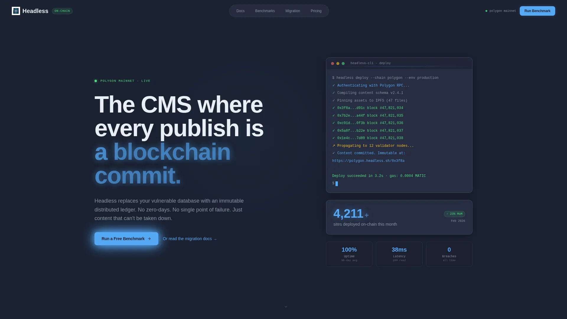
The header displays a syntax-highlighted deploy --chain polygon command against the deep graphite slate background. A streaming animation shows green success hashes cascading line by line beneath it. No stock imagery is used. The code block is the hero.
Animated Metric Counter
To the right of the terminal block, a single counter animates upward to display the number of sites deployed on-chain that month. It is the first number a visitor sees, and it sets the data-first tone for the entire page.
Three-Column Performance Data Grid
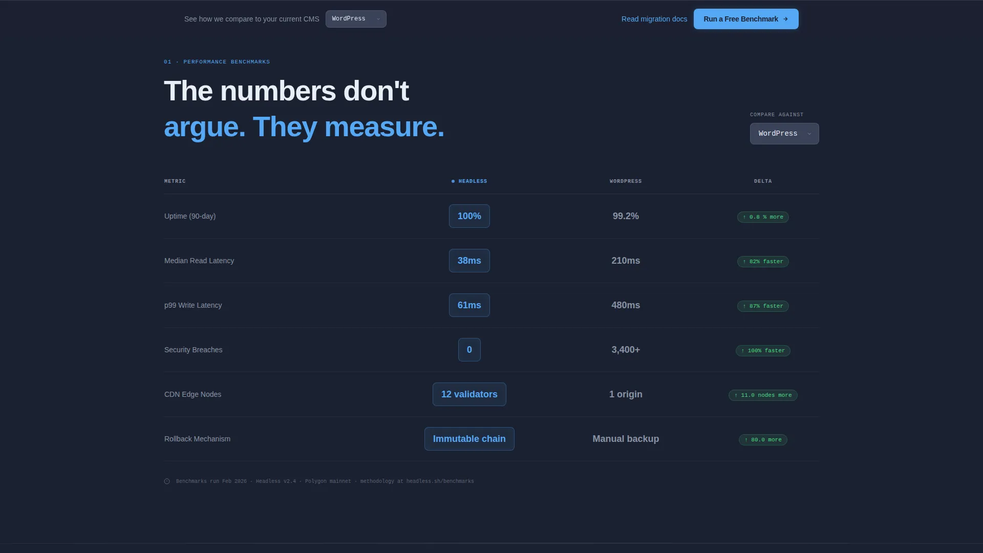
Section one presents a side-by-side comparison of uptime, median query latency, and breach incidents against two named legacy CMS platforms. The decentralized column is highlighted in atmosphere blue, making the contrast impossible to miss.
Live-Updating Cost Sparkline
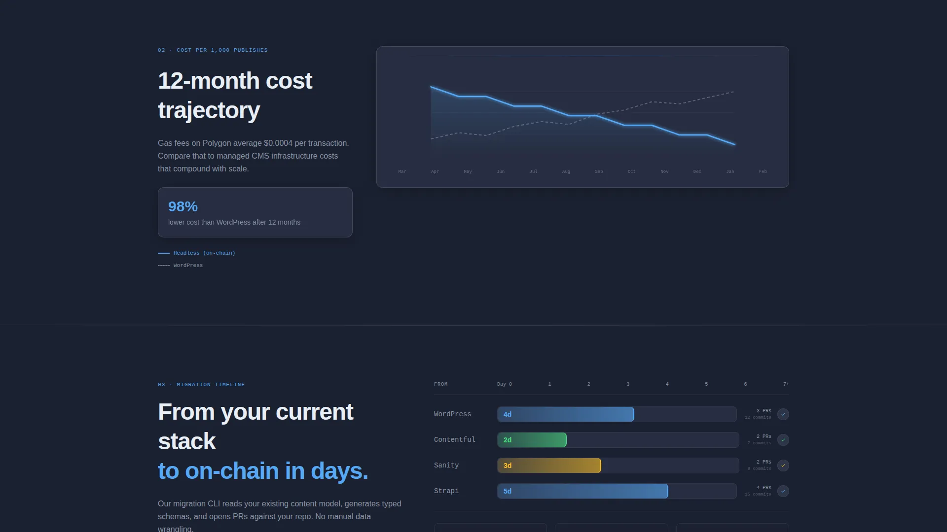
Section two renders cost-per-publish over a 12-month window as a live-updating sparkline chart. It gives engineering leads a clear visual of how costs behave over time compared to a traditional hosted CMS model.
Migration Timeline Grid
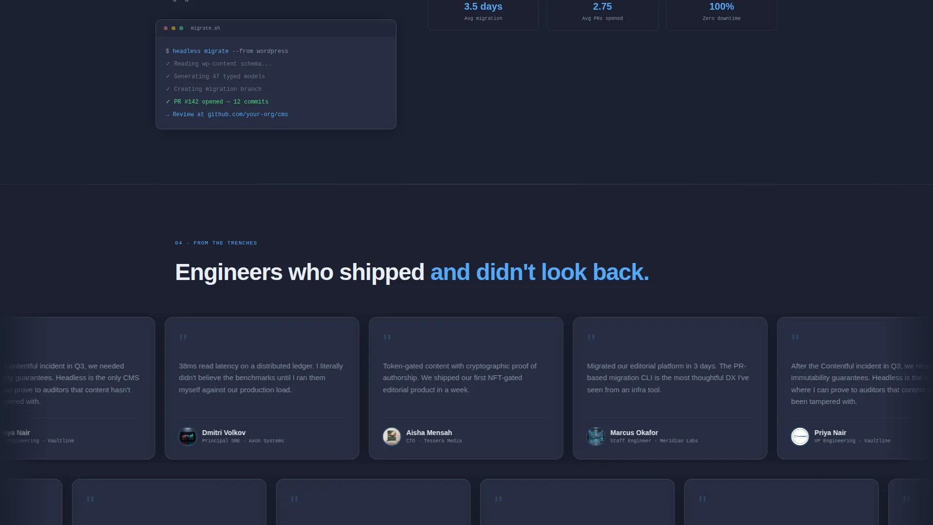
Section three shows the days required to migrate from each major legacy platform, including real pull-request counts. It transforms abstract migration anxiety into a concrete, measurable timeline.
Sticky Comparison Bar with call to action
A persistent bottom bar reads "See How We Compare to Your Current CMS" with a dropdown selector. Choosing a platform dynamically filters every data grid on the page. The primary call to action opens a two-field benchmark form. A secondary text link directs engineers to migration documentation.
Page sections overview
| Section | Purpose |
|---|---|
| Terminal Header Block | Establish code-first credibility with a live deploy animation and animated site counter |
| Performance Data Grid | Compare uptime, latency, and breach incidents against legacy CMS platforms |
| Cost Sparkline Chart | Visualize 12-month cost-per-publish trends as a live-updating line graphic |
| Migration Timeline Grid | Show days-to-switch and pull-request counts for each migration source |
| Sticky Comparison Bar | Let visitors filter all data grids to a head-to-head view by selecting their current CMS |
| Benchmark call to action Form | Capture repository URL and current CMS to initiate a free benchmark run |
Design & branding system
The Slate & Sky color system is built for instrument density. Every color is placed with intention, the way a cockpit display arranges its indicators. No decorative gradients, no hero illustrations.
- Deep graphite slate (#1B2131) is the primary page background; mid-tone steel (#3A4259) surfaces cards and secondary panels
- Atmosphere blue (#56A8F5) is the primary accent used on links, active states, data highlights, and the glowing decentralized-column values
- Pale cirrus white (#E8EEF5) handles all body text and grid borders, keeping contrast sharp against the dark background
Mobile & speed optimization
The dashboard layout is designed to remain readable and functional on smaller viewports. Dense data grids are the hardest components to adapt to mobile, and this template addresses that directly.
- Data grids are structured to scroll horizontally on narrow screens rather than collapse into illegible stacks
- The sticky comparison bar remains accessible at the bottom of the viewport across screen sizes
- The terminal header block and metric counter reflow to a single-column layout on mobile without losing the animated output
How this template helps you convert
The entire page is built around one conversion principle: measure first, argue never. Every scroll increment delivers a number before an explanation.
- The terminal header and animated counter establish instant credibility with a technical audience before a single marketing word appears, lowering the time-to-trust significantly
- The sticky comparison bar with dynamic filtering means a visitor never has to hunt for the comparison that matters to them, reducing friction at the exact moment of decision
- The two-field benchmark form keeps the primary call to action low-commitment, letting engineers validate the product against their own repository before they sign up for anything
Other information about this template
This template sits inside the Decentralized Enterprise Software category and is specifically aligned to the decentralized CMS niche. It is designed for teams evaluating on-chain infrastructure, not general-purpose website builders.
- The template theme is Startup Velocity, which means the visual language is fast, confident, and data-forward rather than polished and marketing-soft
- The creative direction is Stats-First Impact: every section leads with a metric, and explanatory copy follows the number rather than preceding it
- The header concept is a Code Snippet, making the template genuinely unusual in a category where most landing pages default to illustration or photography
- The landing-page direction is Comparison/Versus, meaning the entire persuasion architecture is built around head-to-head measurement rather than feature storytelling
- The template style is Dashboard/Data Grid, suited for audiences who read terminal output before they read product copy
Theme
Startup Velocity
Creative direction
Stats-First Impact
Color system
Slate & Sky
Style
Dashboard/Data Grid
Direction
Comparison/Versus
Page Sections
Live Terminal Header with Deploy Animation
Animated On-chain Metric Counter
Three-column Performance Data Grid
Cost-per-publish Sparkline Chart
Migration Timeline with Pull-request Data
Sticky Comparison Bar with Dynamic Filtering
Related questions
Who is this landing page template built for?
Can I change which CMS platforms appear in the comparison grids?
What is the primary call to action on this page?
Does the terminal animation require a specific framework?
Is this template suitable for a general SaaS product?



