Headless - Modern DAM Landing Page Template
A headless digital asset management landing page template built for modern content infrastructure teams. It features an interactive cost calculator header, modular versus-comparison card grids, a multi-step migration audit form, and a Tech Glass visual identity with an AI Iridescent color system. Ideal for engineering leads, creative ops managers, and CTOs who need to make the case for API-first asset delivery.
by Rocket studio
Quick summary
This template is a single-page, modular card grid landing page for a headless digital asset management platform. It opens with a live cost calculator, moves through three themed card groups, and closes with a progressive conversion form. The Tech Glass aesthetic and AI Iridescent palette make every scroll feel intentional and precise.
Who this template is for
This template speaks directly to technical and operational decision-makers who are already feeling the weight of fragmented asset workflows. It is built for people who need to show the numbers before they can move a team.
- Engineering leads at mid-market e-commerce companies dealing with asset duplication across channels
- Creative operations managers at agencies juggling multiple client digital asset management platforms with separate interfaces
- Chief Technology Officers at SaaS companies who need white-label media delivery built into their product
What problem this template solves
Managing digital assets across storefronts, mobile apps, and digital signage through browser-based media libraries creates real operational drag. Teams waste hours duplicating files, chasing broken links, and paying for redundant seat licenses. This template is designed to surface those costs visibly and turn them into a conversion argument.
- Legacy digital asset management stacks hide egress fees, force seat-based pricing, and slow delivery across channels
- Teams lose integration hours rebuilding connections every time a channel is added
- Visitors arrive with skepticism, so the template earns trust by using the visitor's own numbers to make the case
What you get with this template
You get a fully structured, single-page layout with every section defined and every interaction mapped. Nothing needs to be invented from scratch. The layout is ready to be populated with your platform's real data.
- An interactive header calculator with three input sliders and animated real-time cost comparison output
- Three modular card groups with flip animations, parallax scroll effects, and a persistent floating comparison bar
- A three-step progressive conversion form and a secondary gated PDF download path
Feature list
This template includes six distinct functional and visual systems that work together to create a high-conviction, comparison-led landing page experience.
Live Cost Calculator Header
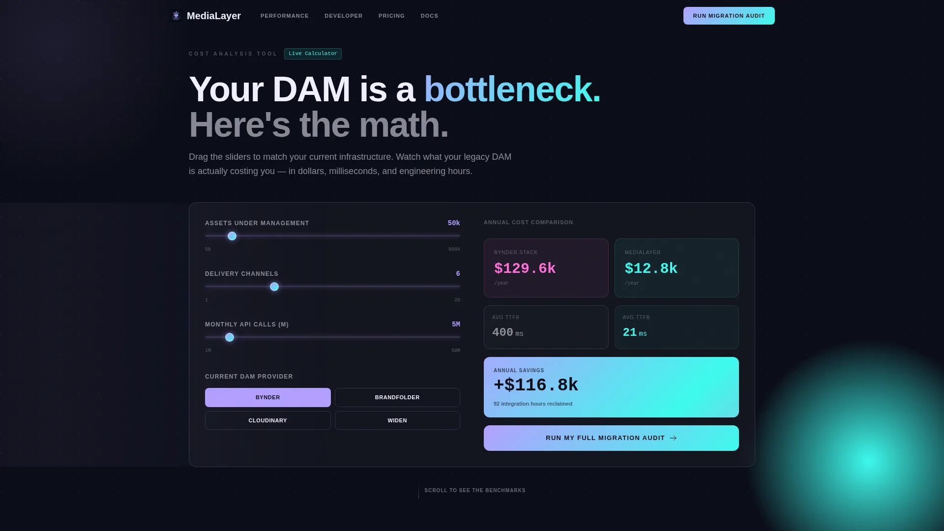
Three input sliders let visitors set their total assets under management, number of delivery channels, and monthly API calls. As they drag, two animated columns update in real time: one for their current legacy stack, one for this platform. The output shows annual cost, average delivery latency in milliseconds, and integration hours saved. Iridescent gradients pulse gently on the savings delta.
Modular Versus-Comparison Card Grid
Cards are grouped in threes across three themes: Performance, Developer Experience, and Total Cost of Ownership. Each card auto-animates into view with a micro-burst of prismatic light on scroll. Clicking any card flips it to reveal the competing platform's limitation on the reverse face. The layout is fully modular, so card groups can be reordered or extended.
Persistent Floating Comparison Bar
A sticky bar floats at the bottom of the viewport after the third card row. It carries the visitor's calculator inputs forward, keeping their specific numbers visible throughout the rest of the page. This creates a thread of personal relevance that generic feature lists cannot replicate.
Progressive Three-Step Conversion Form
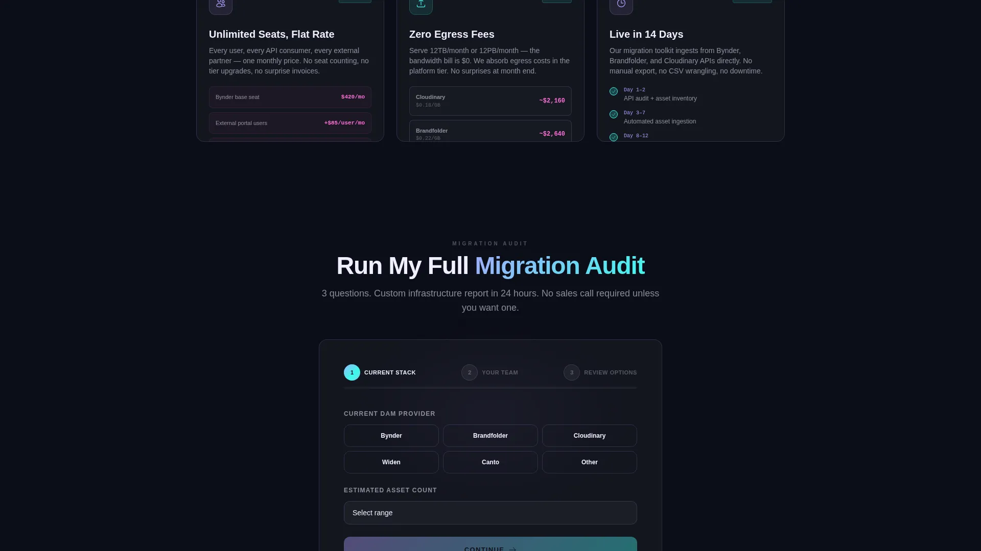
The primary call to action is "Run My Full Migration Audit." The form uses three screens: current digital asset management provider and estimated asset count, work email and primary integration target, and an optional calendar embed for a live architecture review. Data entered in the calculator pre-fills the form's first screen.
Secondary Gated Content Path
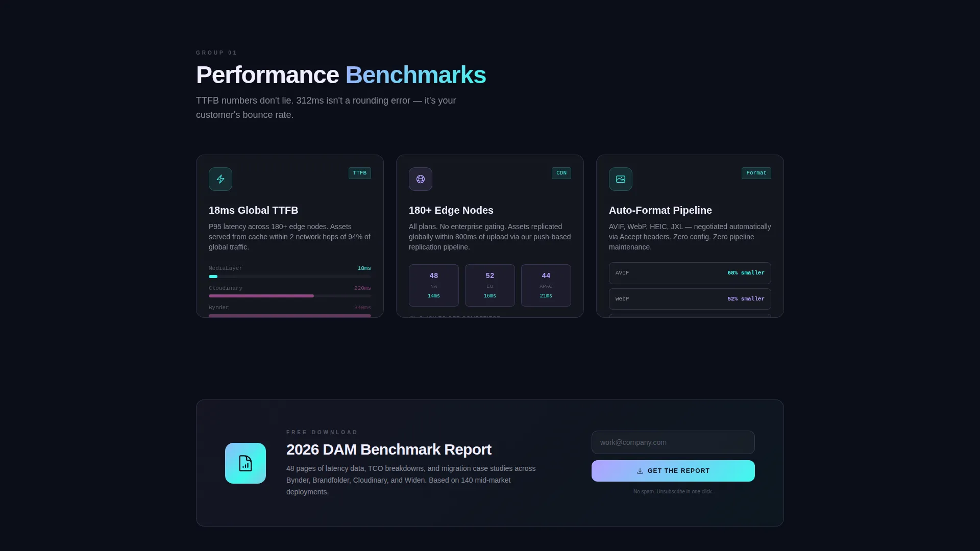
A static PDF download offer sits between card groups as a visual break. It is gated behind email only, keeping the friction minimal. This gives visitors who are not ready to book a review a lower-commitment way to stay connected.
Tech Glass Visual System
The entire page uses glassmorphic card surfaces with one-pixel rgba lilac strokes and backdrop-blur layers floating above a deep void black background. Scroll speed triggers subtle parallax on glass card layers. The palette shifts between prismatic lilac for interactive surfaces, shifting cyan for data highlights and hover states, and warm holographic pink reserved for accent gradients and active comparison toggles.
Page sections overview
| Section | Purpose |
|---|---|
| Calculator Header | Interactive cost comparison tool that anchors visitor attention with their own numbers |
| Performance Card Group | Versus cards covering time-to-first-byte benchmarks, CDN edge nodes, and auto-format delivery |
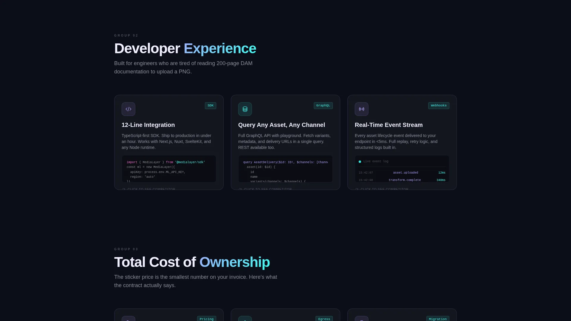
| Developer Experience Cards | Versus cards showing SDK snippets, GraphQL playground preview, and webhook logs |
| Total Cost of Ownership Cards | Versus cards exposing seat-based pricing traps, hidden egress fees, and migration timelines |
| PDF Download Banner | Secondary gated content break positioned between card groups |
| Sticky Migration Audit call to action | Persistent call-to-action bar that activates after the third card row |
| Progressive Audit Form | Three-screen form collecting provider context, contact details, and optional booking |
Design & branding system
The visual identity is built around a Tech Glass theme with an AI Iridescent color system. The palette is not decorative. Each color has a defined role and appears only in that role throughout the page.
- Deep void black (#0B0D17) is the primary background; prismatic lilac (#B4A0FF) covers primary interactive surfaces; shifting cyan (#3DFAED) marks data highlights and hover states
- Warm holographic pink (#FF6FD8) appears only on accent gradients and active comparison toggles, never as a background or primary surface color
- Cards use glassmorphic borders with one-pixel rgba lilac strokes and backdrop-blur, giving the grid the feel of a translucent control surface hovering above the infrastructure beneath it
Mobile & speed optimization
The modular card grid layout is inherently responsive. Card groups reflow into single-column stacks on smaller viewports without losing the flip interaction or the floating comparison bar.
- Parallax scroll effects are scoped to larger viewports to avoid motion conflicts on mobile devices
- The calculator header uses slider inputs that translate cleanly to touch gestures on phones and tablets
- Animated card entry effects use lightweight micro-burst transitions, keeping visual energy high without adding excessive render weight
How this template helps you convert
This template is built around a single conviction: buyers trust their own numbers more than any claim a vendor makes. Every structural decision feeds that principle.
- The calculator header puts the visitor's specific cost and latency data on screen before any marketing copy appears, creating personal investment from the first interaction.
- Flip cards keep the comparison visible throughout the scroll, so the case builds progressively rather than landing all at once in a pricing table.
- The progressive form reduces commitment friction by asking for context first and contact details second, and the pre-fill from the calculator removes repetition.
Other information about this template
This template is designed specifically for the headless digital asset management category, where buying decisions involve multiple stakeholders and long evaluation cycles. The layout accommodates that reality by providing multiple conversion paths at different commitment levels.
- The template style is Card Grid (Modular), meaning individual card groups can be replaced, duplicated, or reordered to match a specific sales narrative
- The creative direction follows a Launch Energy approach: each scroll interaction is designed to maintain momentum rather than let attention plateau
- The Comparison/Versus landing page direction means the template is structured to win against named alternatives, not just describe a product in isolation
- This template is built under the Headless Enterprise Software subcategory and is suited to platforms competing in a market where buyers are already using tools like Bynder, Brandfolder, or Cloudinary and are evaluating a migration
Theme
Tech Glass
Creative direction
Launch Energy
Color system
AI Iridescent
Style
Card Grid (Modular)
Direction
Comparison/Versus
Page Sections
Live Interactive Cost Calculator
Modular Versus-comparison Cards
Persistent Floating Comparison Bar
Progressive Multi-step Audit Form
Secondary Gated PDF Path
Tech Glass Visual Identity
Related questions
What type of buyer is this landing page template designed for?
Can I customize which competitor platforms appear in the calculator comparison?
How does the flip card interaction work in the modular grid?
What does the progressive form collect across its three screens?
Is this template suitable for a long sales cycle with multiple decision-makers?



