Headless - Powerful CMS Landing Page Template
A split-screen landing page built for headless content management system platforms. This template uses a midnight navy Data Command visual system, a three-tab Feature Tab Switcher header, and a momentum-driven scroll layout. It showcases schema building, editorial workflows, and live API delivery in one focused page. Designed to convert engineering leads, digital directors, and agency teams before they ever hit a signup form.
by Rocket studio
Quick summary
This is a single-page, split-screen landing page template built specifically for headless content management system platforms. It opens with an interactive three-tab header, flows through alternating left-right content sections, and closes with a full-width call-to-action block. The Data Command color theme and Launch Energy scroll pacing make the page feel as purposeful as the product it promotes.
Who this template is for
This template speaks directly to the teams building and selling modern content infrastructure. It is designed for technical and editorial decision-makers who need to communicate speed, flexibility, and developer confidence in a single page.
- Engineering leads at mid-market software-as-a-service companies moving away from monolithic content setups
- Digital directors at media companies publishing content to multiple platforms simultaneously
- Agency chief technology officers building white-label stacks where content authors never touch code
What problem this template solves
Most landing pages for developer tools either bury the technical proof or overwhelm non-technical buyers with jargon. This template solves both problems at once. It lets visitors interact with three core product surfaces before they reach a single call-to-action, so the page functions as a working demo rather than a sales pitch.
- Visitors leave before trusting the product because they cannot see how it actually works
- Enterprise buyers need a direct path to a human conversation, not just a sandbox button
- Content teams and engineering teams have different priorities, and most pages fail to address both
What you get with this template
You get a fully structured, single-page layout with every section already planned and sequenced. The template covers the full buyer journey, from the first tab click in the header to the closing conversion block, without requiring a form on the page.
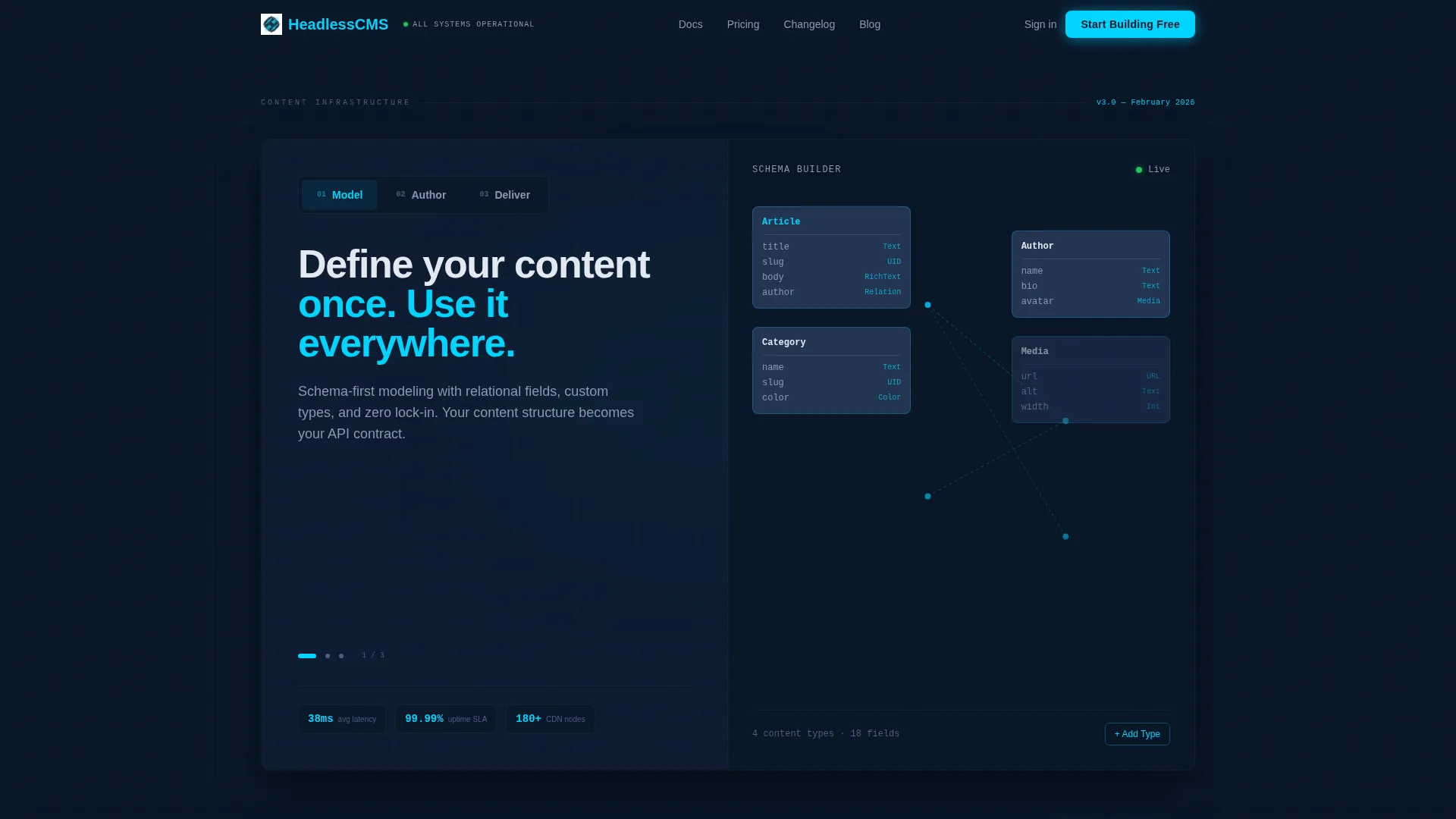
- A Feature Tab Switcher header with three panels covering schema modeling, editorial authoring, and API delivery
- Alternating split-screen scroll sections with code snippets, workflow visuals, integration logo grids, architecture diagrams, and benchmark numbers
- A sticky bottom call-to-action bar, a primary full-width closing block, and a secondary text link for enterprise inquiries
Feature list
This template ships with a structured set of interactive and visual components drawn directly from the brief. Each one serves a specific role in moving a visitor from curious to convinced.
Three-Tab Interactive Header
The header holds three clickable tabs labeled "Model," "Author," and "Deliver." Each tab swaps the right panel's content in real time, showing a schema builder, an editorial interface with localization toggles, and a terminal-style API response with a latency counter ticking at 38 milliseconds. Visitors explore three capabilities without scrolling once.
Split-Screen Alternating Sections
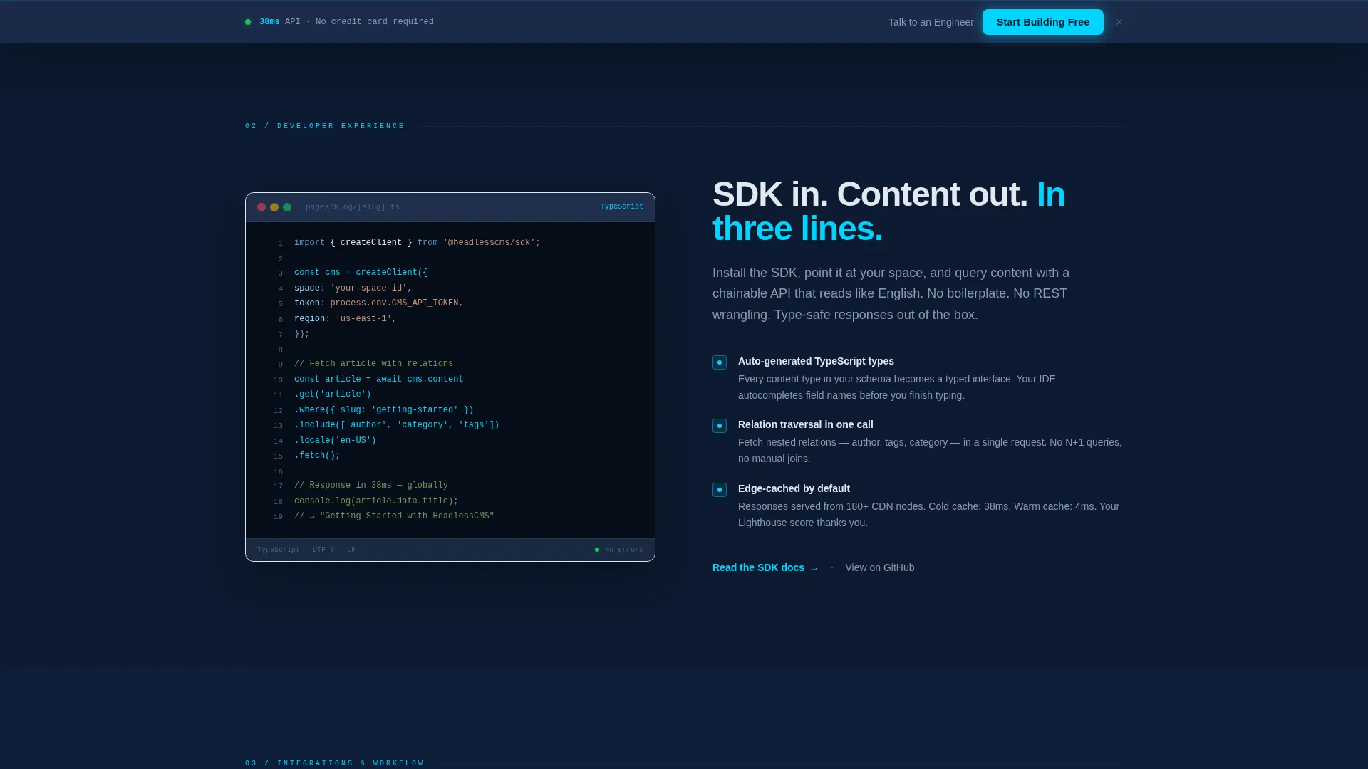
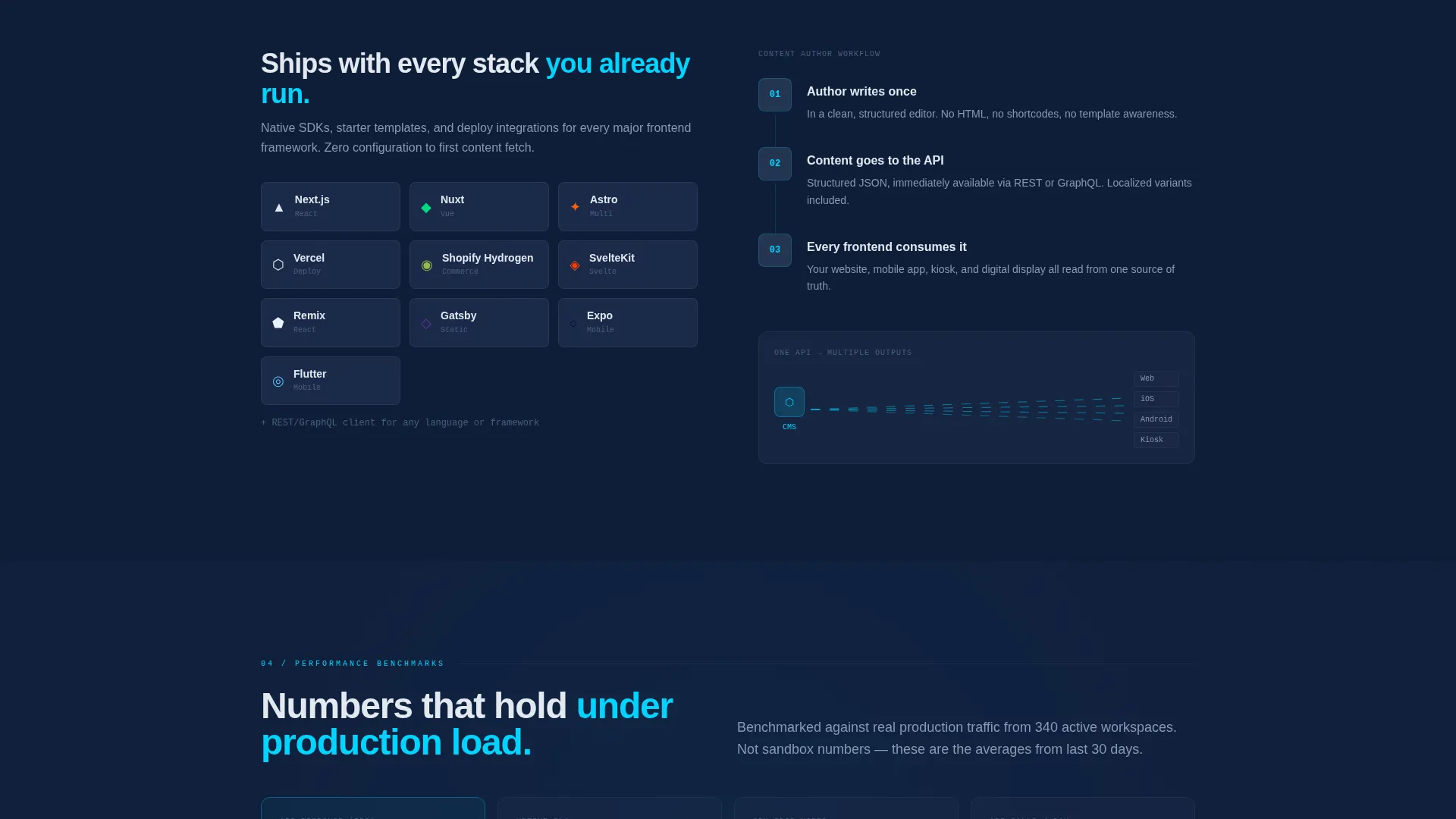
Past the header, left-right panels swap allegiance with each scroll stop. One section pins a code snippet on the left while the right narrates the developer experience. The next flips to show a content author's workflow on the right while the left displays an integration logo grid. The layout builds momentum naturally.
Live API Delivery Panel
Inside the "Deliver" tab, a terminal-style view shows an active API response, a latency counter, and endpoint addresses for both REST and GraphQL glowing in signal cyan. This gives technical visitors concrete proof of performance context without leaving the page.
Sticky Call-to-Action Bar
After the second scroll section, a sticky bottom bar appears carrying the primary "Start Building Free" button. It stays visible as visitors continue reading, reducing friction at the moment of decision without interrupting the page's visual rhythm.
Data Command Color System
The entire template is built on a four-color palette: deep terminal navy for backgrounds, tactical slate for card surfaces, cold phosphor white for body text, and signal cyan for every interactive element and accent line. Color carries information here rather than decoration.
Dual Conversion Path Design
The page closes with a full-width call-to-action block. The primary button routes to a signup flow with GitHub and Google single sign-on. A secondary text link, "Talk to an Engineer," sits beside it for enterprise buyers who need a human conversation before a sandbox.
Page sections overview
| Section | Purpose |
|---|---|
| Tab Switcher Header | Showcases Model, Author, and Deliver capabilities interactively |
| Schema Builder Panel | Demonstrates draggable content types and relational field lines |
| Editorial Interface Panel | Shows live preview pane and localization toggles for authors |
| API Delivery Terminal | Displays REST and GraphQL endpoints with live latency counter |
| Code Snippet Split | Narrates developer experience alongside a pinned code block |
| Integration Logo Grid | Displays supported frontend framework logos in a living grid |
| Architecture Diagrams | Visualizes infrastructure and content delivery structure |
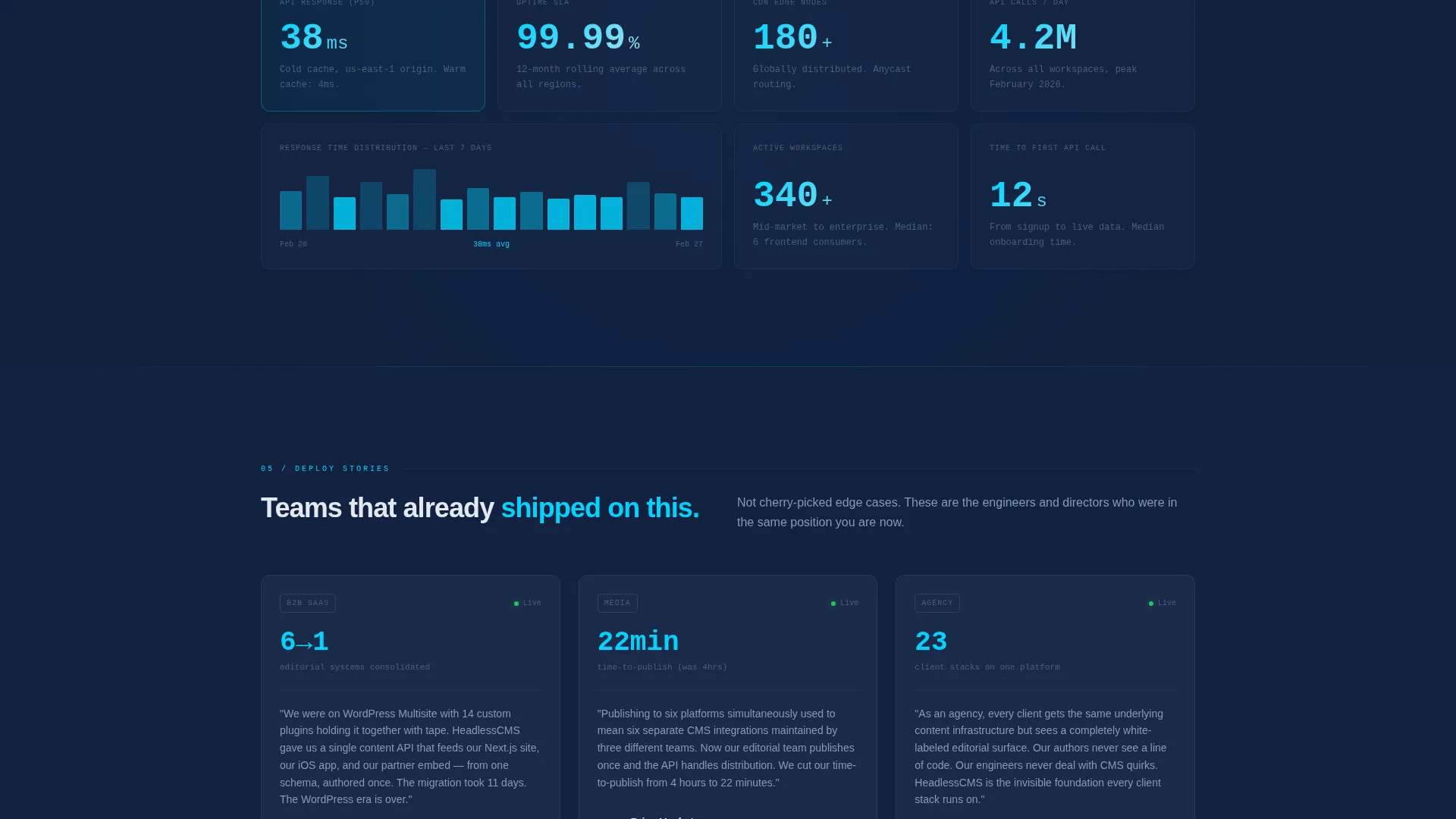
| Benchmark Numbers | Presents delivery speed and performance context data |
| Customer Deploy Stories | Builds confidence with real-world deployment narratives |
| Sticky call to action Bar | Keeps the primary action visible after the second scroll section |
| Full-Width Closing call to action | Anchors the page with a dominant conversion block and dual paths |
Design & branding system
The template uses a Data Command theme built entirely on the Midnight Blue color system. Every color decision is functional. Nothing is decorative. The palette creates the feeling of a dark operations room at 2 a.m., where every lit element signals active status.
- Deep terminal navy (#0A1628) anchors all backgrounds; tactical slate (#1B2A4A) surfaces cards and secondary panels
- Cold phosphor white (#E2E8F0) handles all body text and data labels for clear legibility against dark fields
- Signal cyan (#00D4FF) marks every interactive element, active state, call-to-action button, and accent line throughout the page
Mobile & speed optimization
The template layout is designed to remain clear and navigable across screen sizes. The split-screen structure adapts so that content stacks cleanly on smaller viewports without losing the visual hierarchy established on desktop.
- Tab switcher panels reflow so mobile visitors can still cycle through all three capability views in sequence
- Sticky call-to-action bar remains anchored at the bottom of the screen on mobile, keeping the conversion path visible at all times
- Integration logo grid and benchmark sections are structured to remain legible and uncluttered at reduced widths
How this template helps you convert
This template earns the click by turning the page itself into a product demonstration. Visitors interact before they commit, which removes the skepticism that kills conversion on most developer tool pages.
- The three-tab header lets visitors explore schema modeling, editorial authoring, and API delivery in real time, so they arrive at the call-to-action already familiar with the product's core surfaces.
- The sticky call-to-action bar and full-width closing block both offer a primary signup path and a secondary enterprise contact link, covering two distinct buyer types without creating two separate pages.
Other information about this template
This template is a strong fit for teams evaluating how to present headless content management system platforms in a competitive market. It pairs a technical visual language with a layout that works equally well for a product launch, a campaign page, or an ongoing acquisition channel.
- The Launch Energy scroll pacing progressively deepens the background navy shade with each scroll stop, giving the page a sense of forward motion toward the launchpad closing section
- The no-form page design routes all conversions through a GitHub and Google single sign-on flow, which suits developer audiences who respond poorly to lengthy lead-capture forms
- The template structure supports content teams that need to communicate to both technical and non-technical stakeholders on a single page
Theme
Data Command
Creative direction
Launch Energy
Color system
Midnight Blue
Style
Split Screen (50/50)
Direction
Click-Through
Page Sections
Three-tab Interactive Header
Alternating Split-screen Layout
Terminal API Delivery View
Sticky Bottom Call to Action Bar
Dual Conversion Path Design
Data Command Color System
Related questions
Does this template include a contact form?
Can I change the tab labels in the header?
How many call-to-action placements does this template include?
Who is this landing page template designed for?
Is the split-screen layout fixed or editable?



