Headless - Powerful HRM Landing Page Template
Headless is a comparison-table landing page built for API-first human resources management platforms. It speaks directly to engineering leaders who want payroll, onboarding, and org-chart data wired into their own stack. A live code snippet header, violet-pulsing comparison rows, and a friction-free API key signup flow make the case before the visitor scrolls past the fold.
by Rocket studio
Quick summary
Headless is a single-page landing page template for an API-first human resources management (HRM) platform. It targets engineering-led teams at early-stage startups who need payroll, onboarding, and org-chart endpoints, not another portal to log into. The page pairs a live code snippet header with a hard-hitting comparison table and closes with a one-field API key signup.
Who this template is for
This template is built for technical founders and engineering leaders who treat HR infrastructure as a software problem. It fits teams that have outgrown spreadsheets and want a programmable alternative to legacy HR platforms.
- CTOs at Series A startups managing rapid headcount growth
- DevOps leads and founding engineers who need reliable, webhook-ready HR endpoints
- Developer-tool companies launching a headless HRM product to a technical buyer audience
What problem this template solves
Most HR software landing pages are built for operations managers, not engineers. They lead with drag-and-drop interfaces and feature grids that mean nothing to someone reading API documentation at midnight.
- Engineers have no fast way to compare API capability, webhook latency, or sandbox availability across platforms
- Legacy HR portal pages bury technical specs behind sales-led demo requests
- Developer-facing products lose conversions because the signup flow asks for too much before proving value
What you get with this template
This template delivers a focused, single-page layout that earns developer trust through demonstration, not description. Every section is structured as proof.
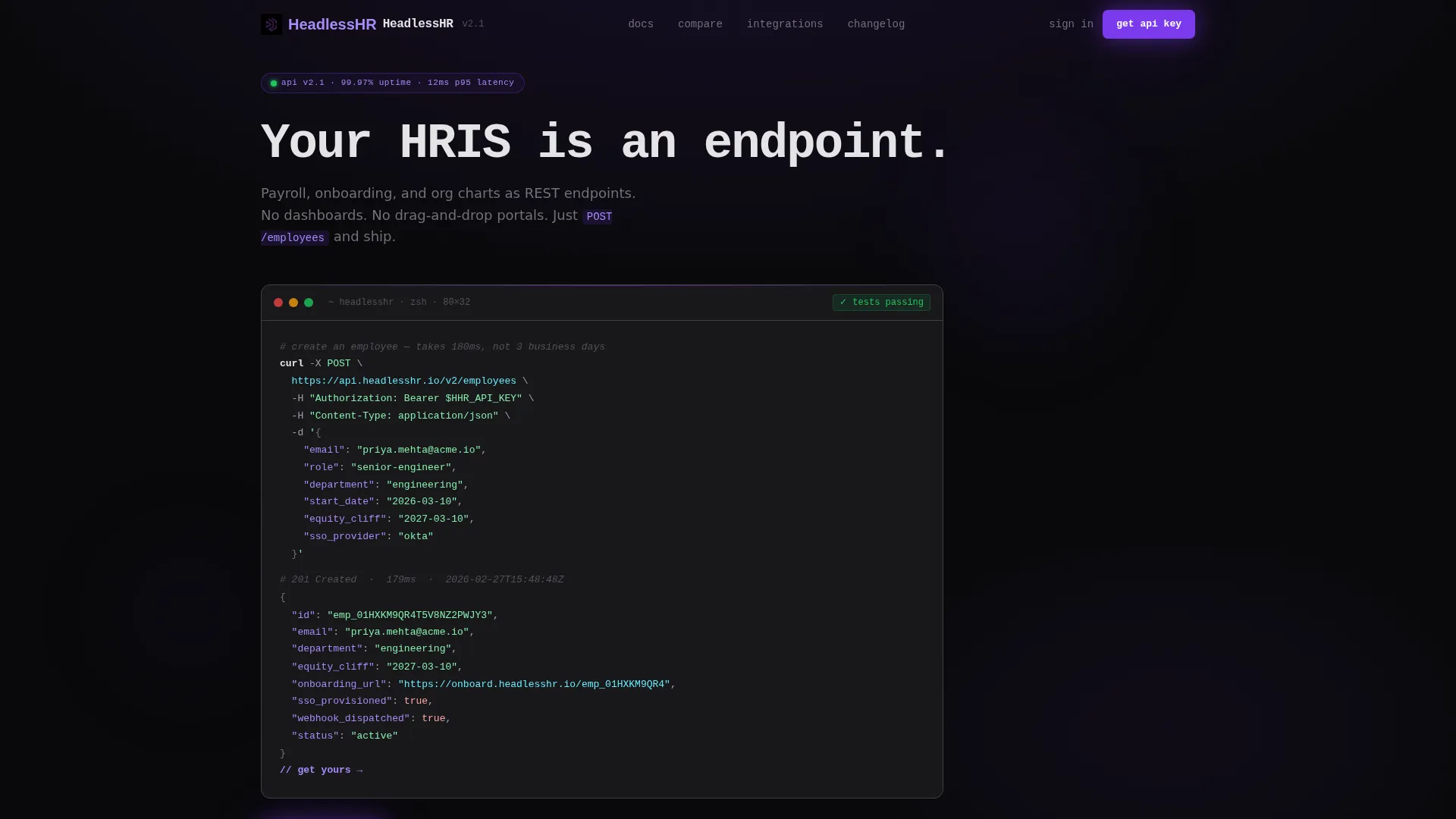
- A syntax-highlighted code snippet header showing a real curl request and JSON response, mid-scroll on load
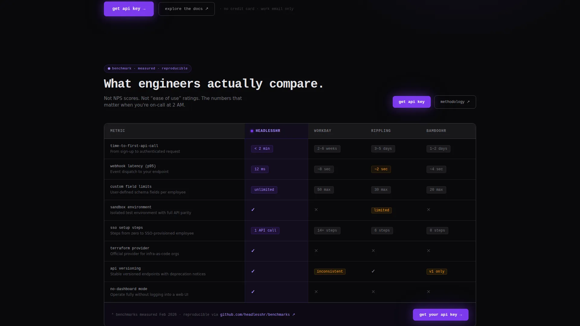
- A scroll-triggered comparison table that pits the platform against legacy alternatives across rows engineers care about
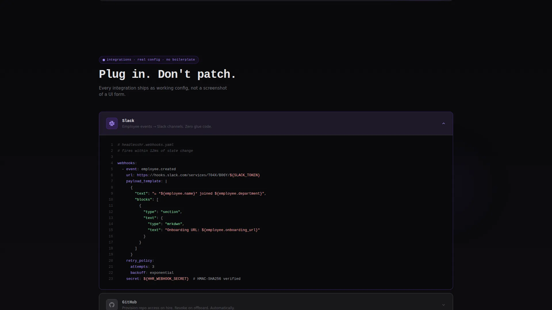
- Three expandable integration panels for Slack, GitHub, and Terraform, each revealing a real configuration block
- A pinned call to action at the table footer requesting a work email only, with a secondary link to full API reference documentation
Feature list
This section walks through the core built-in components that make Headless work as a developer-conversion landing page.
Live Code Snippet Header
The header fills two-thirds of the viewport with a syntax-highlighted curl request and its JSON response. Fields like "department": "engineering" and "equity_cliff": "2025-09-01" are rendered in violet and soft gray. A monospace headline reads: Your HRIS is an endpoint. An inline comment inside the snippet doubles as the first call to action.
Scroll-Triggered Comparison Table
The comparison table drops in hard as the visitor scrolls past the header. It stacks the platform against legacy HR tools across rows covering time-to-first-API-call, webhook latency, custom field limits, SSO setup steps, and sandbox availability. Each winning cell pulses once with violet on scroll-enter, drawing the eye without animation gimmicks.
Expandable Integration Panels
Three panels sit below the comparison table. Each one expands on click to reveal a real configuration block for its respective integration. The expand interaction keeps momentum moving without overwhelming the page with code upfront.
Friction-Free API Key Signup
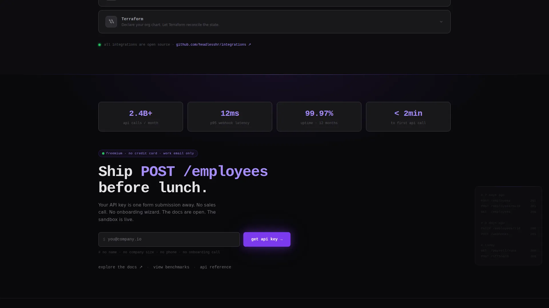
The primary call to action, labeled "Get Your API Key", appears twice: once as an inline comment in the header snippet and once pinned at the comparison table footer. The signup form asks for a work email address only. No name field, no company size dropdown, no phone number.
Secondary Documentation Path
A secondary call to action labeled "Explore the Docs" links visitors to the full API reference. It gives readers who need to verify schema details before committing a clear, low-pressure next step.
Void and Violet Design System
The visual identity uses absolute void black and deep terminal gray as backgrounds, with electric violet reserved for active elements. Violet appears on call-to-action buttons, winning comparison cells, and inline code accents. Every color choice signals information rather than decorating the page.
Page sections overview
| Section | Purpose |
|---|---|
| Code Snippet Header | Opens with a live curl request and JSON response to establish API credibility immediately |
| Comparison Table | Stacks the platform against legacy HR tools on rows engineers actually evaluate |
| Integration Panels | Expands on click to show real Slack, GitHub, and Terraform configuration blocks |
| API Key call to action | Pins a one-field signup at the table footer for immediate freemium conversion |
| Docs Secondary call to action | Offers a low-friction path to full API reference for visitors not yet ready to sign up |
Design & branding system
The template follows a Startup Velocity theme using the Void and Violet color system. The aesthetic is built around the feeling of a production terminal in a dark room, where every glow is intentional.
- Background layers use absolute void black (#09090B) and deep terminal gray (#18181B) to keep focus on content
- Electric violet (#7C3AED) marks active elements: call-to-action buttons, winning comparison checkmarks, and inline code highlights
- UV highlight (#A78BFA) handles hover states and active rows, giving interactive elements a clear visual signal
- Typography uses a monospace style throughout, reinforcing the code-native identity of the platform
Mobile & speed optimization
The layout is designed to remain readable and functional on smaller screens without sacrificing the code-snippet aesthetic that defines the page.
- The header code snippet scales down gracefully, preserving syntax highlighting and the inline call-to-action comment
- The comparison table is structured for horizontal scroll on narrow viewports so all competitor columns stay accessible
- Expandable integration panels collapse by default on mobile, keeping the initial scroll lightweight
How this template helps you convert
The page earns the click before it asks for it. By the time a visitor reaches the signup field, they have already seen the request schema, the response shape, and how the platform compares to tools they may already be running.
- The code snippet header lets an engineer validate the API design in the first few seconds, reducing the need to click away to documentation before deciding to sign up
- The comparison table removes the "I need to research this more" objection by answering the most technical evaluation questions on the page itself
- The single-field signup form eliminates form friction at the moment of highest intent, making the cost of trying the platform feel near zero
Other information about this template
This template is purpose-built for the headless HRM category and is well-suited for developer-tool product launches, API-first SaaS platforms, and infrastructure-layer startups presenting to technical buying committees.
- The template is positioned to compete in evaluations that include platforms such as Workday, Rippling, and BambooHR, which are represented as comparison columns in the table
- The freemium and free-trial conversion model is baked into the page architecture from the first visible element
- The page style draws from developer culture, referencing the feeling of pushing a clean commit and a green test suite to connect emotionally with engineering buyers
- This template works within the Headless Enterprise Software subcategory and the broader Technology category
Theme
Startup Velocity
Creative direction
Launch Energy
Color system
Void & Violet
Style
Comparison Table
Direction
Freemium/Trial
Page Sections
Live Syntax-highlighted Code Header
Scroll-triggered Comparison Table
Expandable Integration Panels
One-field API Key Signup
Secondary Docs Navigation Path
Void and Violet Visual System
Related questions
Who is this landing page template designed for?
Can I customize the comparison table rows?
Does the page require a developer to set up?
How does the inline call-to-action inside the code snippet work?
What conversion path does this template support?



