Headless Enterprise Software Specialist Cost Calculator Website Template
This headless learning management system landing page template is built for developer audiences. It leads with an interactive integration complexity estimator, moves into a twelve-dimension comparison table, and closes with a frictionless CLI install prompt. The dark Dashboard Pro aesthetic and monospace type system signal infrastructure confidence from the first scroll.
by Rocket studio
Quick summary
This is a single-page landing page template for a headless learning management system delivered as a pure API product. It opens with an interactive estimator tool, walks developers through a detailed comparison table, and drives toward a CLI install command. The visual identity is a mission-control dashboard aesthetic in deep navy and electric cyan.
Who this template is for
This template is built for technical teams and founders who are selling or evaluating API-first learning infrastructure. It speaks directly to builders, not buyers browsing feature checklists.
- Engineering leads and CTOs at mid-stage software-as-a-service companies who need to bolt a customer education portal onto an existing product
- Developer relations professionals building certification programs that live inside their own documentation sites
- Edtech founders who have outgrown hosted course platforms and want full frontend freedom without rebuilding on another all-in-one system
What problem this template solves
Most learning management system marketing pages talk to administrators and instructional designers. This template talks to the engineers actually doing the integration work. It meets them where they are: at the terminal, evaluating whether your API is worth their time.
- Developers land on a page that looks and feels like the product itself, not a marketing brochure
- The estimator tool answers the integration question before the developer even has to ask it
- The comparison table replaces vague feature lists with twelve specific, honest dimensions that justify the architectural decision
What you get with this template
The template delivers a complete, section-led landing page flow designed to earn a CLI install or sandbox session before the visitor leaves. Every section serves a functional purpose in moving a skeptical developer from curiosity to action.
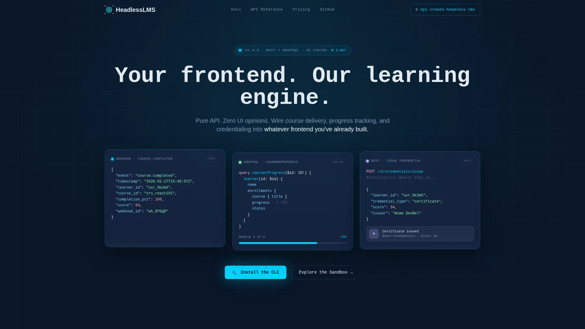
- A dark-glass header panel cluster showing live-data fragments: a webhook payload in syntax-highlighted JSON, a real-time learner progress bar from a GraphQL query, and a credential badge being assembled via API call
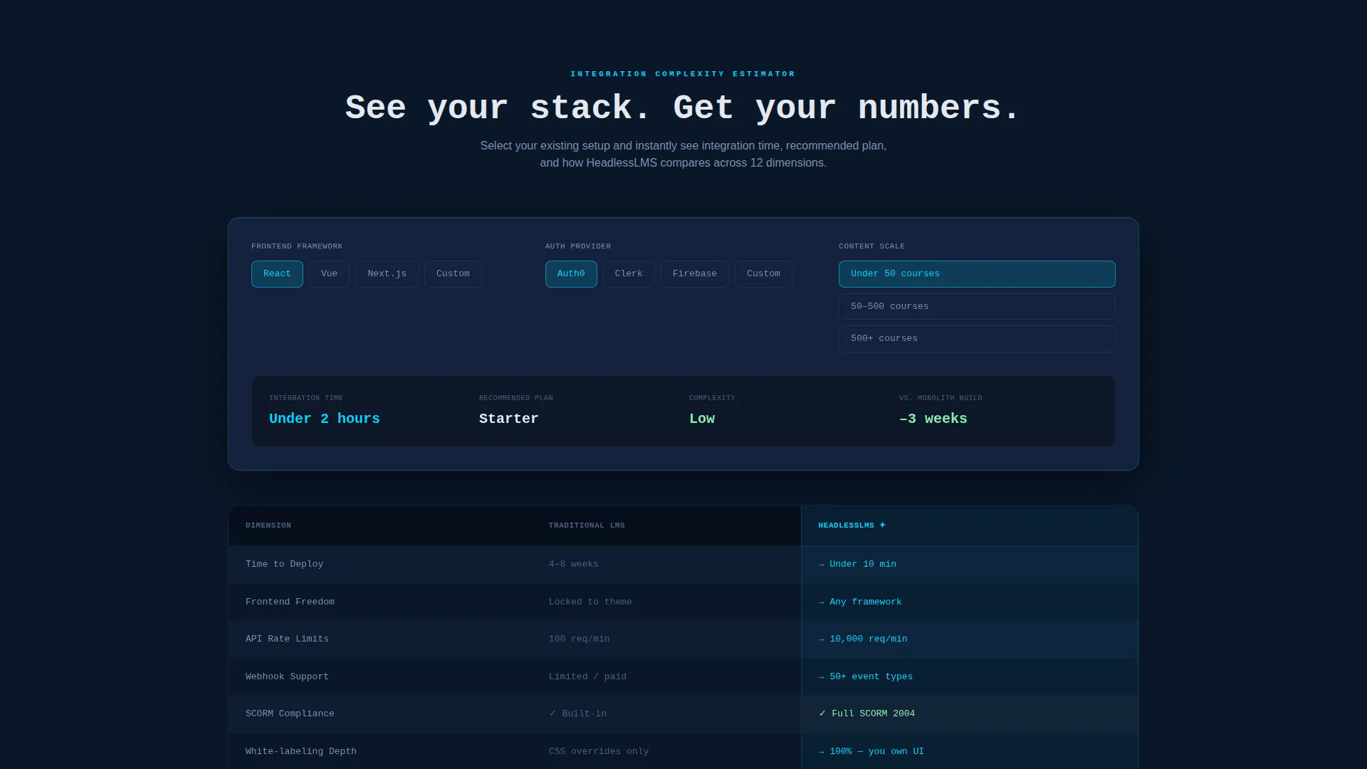
- An interactive integration complexity estimator that accepts frontend framework, authentication provider, and content scale inputs, then returns estimated integration time and a recommended API plan
- A twelve-dimension comparison table with electric cyan highlights on winning rows, architecture diagrams that animate on scroll entry, a code sandbox embed for firing real API calls, and a frictionless CLI install call to action
Feature list
This section covers the core functional components built into the template.
Interactive Integration Estimator
Visitors select their frontend framework (React, Vue, Next, or custom), their authentication provider, and their content scale. The tool instantly returns an estimated integration time and a recommended API plan. No form submission required.
Twelve-Dimension Comparison Table
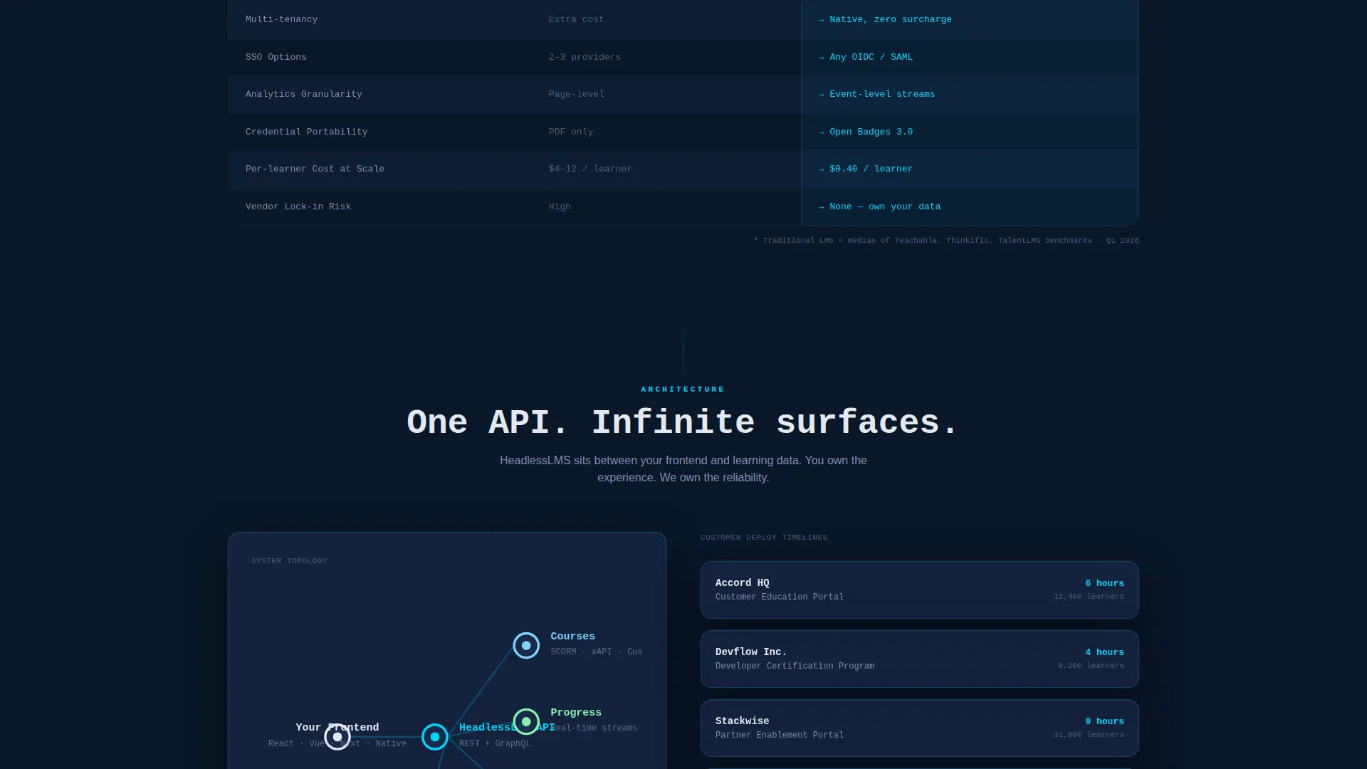
The table compares the visitor's current learning management system against headless architecture across twelve specific dimensions: time-to-deploy, frontend freedom, API rate limits, webhook support, SCORM compliance, white-labeling depth, multi-tenancy, single sign-on options, analytics granularity, credential portability, per-learner cost at scale, and vendor lock-in risk.
Dark Glass Panel Header
Three frosted, translucent cards float over the deep-navy background. Each card displays a different live-data fragment. A self-typing monospace headline reads "Your frontend. Our learning engine." above the panels.
Animated Architecture Diagrams
Diagrams animate on scroll entry as visitors move past the comparison table. They visualize how the headless API layer connects to any frontend, reinforcing the architectural story without requiring a sales call.
Code Sandbox Embed
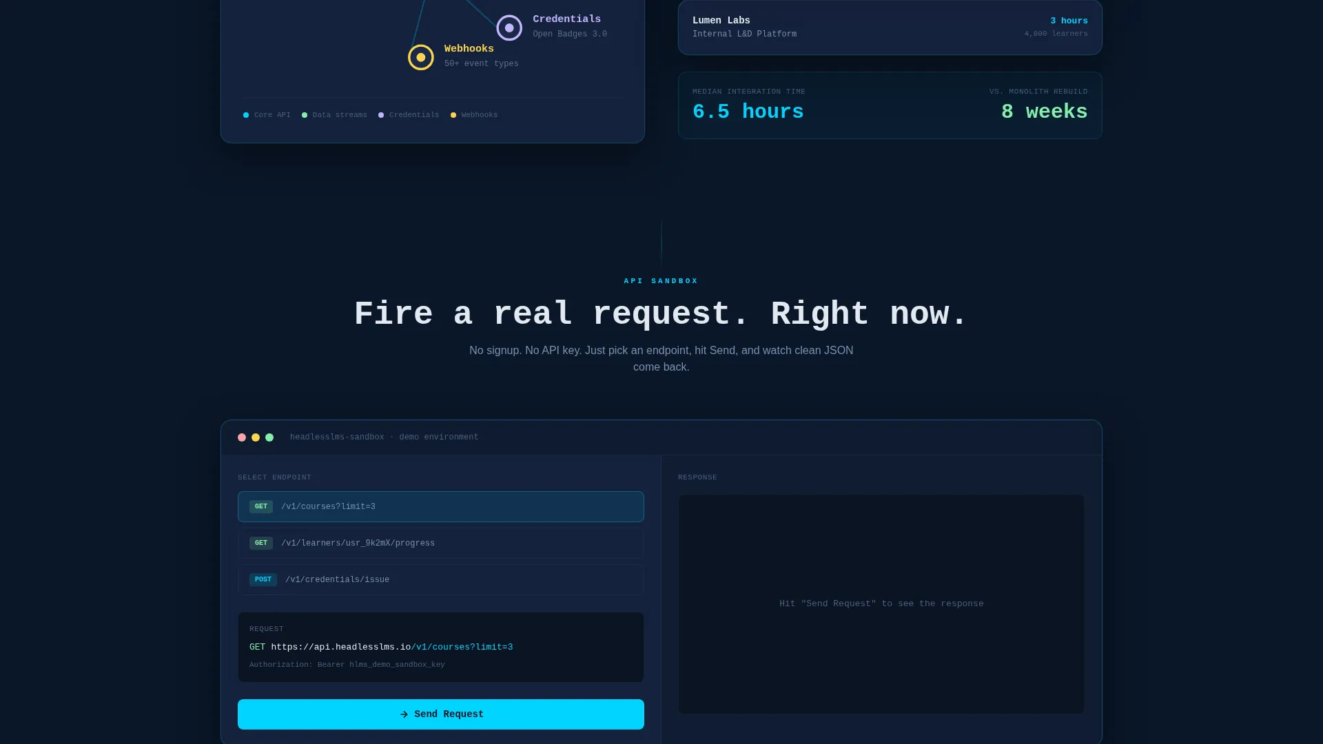
Visitors can fire a real API call directly from the page and watch the response appear. This lets developers validate the product's behavior before installing anything locally.
Frictionless CLI Install call to action
The primary call to action displays a one-click copy-to-clipboard terminal command in a monospace pill button. A secondary path offers a sandbox session. No email gate, no signup wall.
Page sections overview
| Section | Purpose |
|---|---|
| Dark Glass Header | Establish product identity with live-data panel fragments and self-typing headline |
| Integration Complexity Estimator | Let visitors configure their stack and receive an instant integration estimate |
| Comparison Table | Compare headless versus traditional learning management system across twelve dimensions |
| Architecture Diagrams | Animate on scroll to illustrate API-to-frontend connection visually |
| Deploy Timeline Examples | Show real customer integration timelines to build confidence |
| Code Sandbox Embed | Allow live API call testing directly on the page |
| CLI Install call to action | Drive the primary conversion action with a frictionless terminal command |
Design & branding system
The visual system is built around the Dashboard Pro theme using a Midnight Blue color palette. Every color choice reinforces the mission-control, infrastructure-grade feeling.
- Core palette: void-deep navy (#0A1628) as the primary background, desaturated slate (#1B2A4A) for card surfaces and table rows, cold interface white (#E2E8F0) for body typography, and electric cyan (#00D4FF) reserved exclusively for interactive states, active table column highlights, and toggle switches
- Typography runs in monospace throughout key interface elements, reinforcing the terminal aesthetic and signaling that this product is built for developers
- No stock imagery or hero illustrations appear anywhere in the template; the product's own data outputs serve as the visual content
Mobile & speed optimization
The template is designed with developer audiences in mind, many of whom will visit from desktop environments during active evaluation sessions. The layout still accommodates smaller viewports through its structured, column-based design.
- The comparison table uses a horizontally scrollable container on smaller screens so no data is hidden or collapsed by default
- The dark glass panel header uses layered card components that restack vertically on narrow viewports without losing the ambient depth effect
- The code sandbox embed and CLI copy button are touch-friendly and remain fully usable on mobile screen sizes
How this template helps you convert
The template is engineered around the principle that a developer who has already interacted with your product's logic is far more likely to install it. Conversion happens through progressive trust, not pressure.
- The estimator tool creates a personalized result tied to the visitor's own stack. By the time they see the comparison table, the data already reflects their situation, making the case for headless architecture feel earned rather than asserted.
- The code sandbox embed lets developers fire a real API call and see a real response before touching the CLI. This eliminates the biggest objection in developer-tool adoption: "I don't know what I'm actually getting."
- The CLI install call to action presents a single terminal command with a one-click copy action. No account creation, no email required. The GitHub star count ticking in real time adds social proof at exactly the right moment.
Other information about this template
This template sits at the intersection of the headless enterprise software category and the developer-tool landing page format. It is suited for teams shipping API-first products in the learning and education technology space.
- The template style is a Comparison Table layout, which is particularly effective for technical audiences who are already mid-evaluation and need structured evidence rather than emotional copy
- The creative direction is Calculator/Tool First, meaning the interactive estimator appears before any marketing copy, placing product value ahead of sales narrative
- The landing page direction is App Download, oriented toward getting developers to install the CLI package or explore the sandbox rather than filling out a lead form
- The header concept is Dark Glass Panels, a design pattern that uses frosted translucent card surfaces over a deep background to suggest live system data without relying on illustration
Theme
Dashboard Pro
Creative direction
Calculator/Tool First
Color system
Midnight Blue
Style
Comparison Table
Direction
App Download
Page Sections
Interactive Integration Complexity Estimator
Twelve-dimension Comparison Table
Dark Glass Panel Header
Live Code Sandbox Embed
Frictionless CLI Install Call to Action
Scroll-triggered Architecture Diagrams
Related questions
Who is this landing page template designed for?
Does the template include actual API or backend functionality?
Can I edit the comparison table dimensions for my own product?
What options does the integration estimator include?
Is there an email gate before the CLI install call to action?



