Headless Enterprise Software Reviews Website Template
The Headless TMS landing page template is built for logistics technology teams that need to show a pure-API transport management system in action. It leads with a live dashboard preview, walks visitors through endpoint directories and data visualizations, and closes with a progressive lead capture form, all inside a cool, systematic Slate and Sky visual identity.
by Rocket studio
Quick summary
This is a single-page lead generation template for a headless transport management system (TMS) delivered as a pure application programming interface (API). The layout opens with a working dashboard preview, moves through evidence-led scroll sections, and closes with a two-step form. The design feels like a well-ordered data terminal, precise, cool, and built for a technical audience.
Who this template is for
This template speaks directly to the people who evaluate and integrate logistics infrastructure. It is not aimed at general audiences, it is built for decision-makers who already know what an API endpoint is and why it matters.
- Chief Technology Officers (CTOs) at mid-market third-party logistics (3PL) companies tired of ripping out monolithic platforms
- Integration architects at enterprise shippers connecting warehouse management, transport management, and order management workflows
- Operations directors whose teams currently copy-paste tracking numbers between multiple browser tabs every day
What problem this template solves
Most TMS vendors lead with feature slides and sales decks. This template flips that approach. It shows the system working before asking for anything, which is exactly what a skeptical logistics engineer needs to see.
- Technical evaluators distrust marketing copy and need working proof, the dashboard preview and endpoint directory deliver that proof on scroll
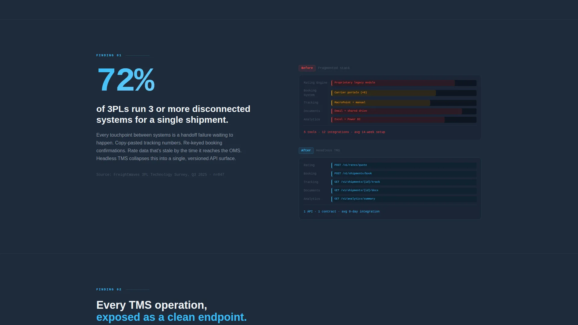
- Organizations juggling three or more disconnected systems for a single shipment need to see how a headless architecture collapses that stack
- Internal champions need a shareable artifact to build a business case, the gated integration guide download gives them exactly that
What you get with this template
You get a complete, section-led landing page structured around evidence and conversion. Every scroll section is designed to earn the next click with data rather than promises.
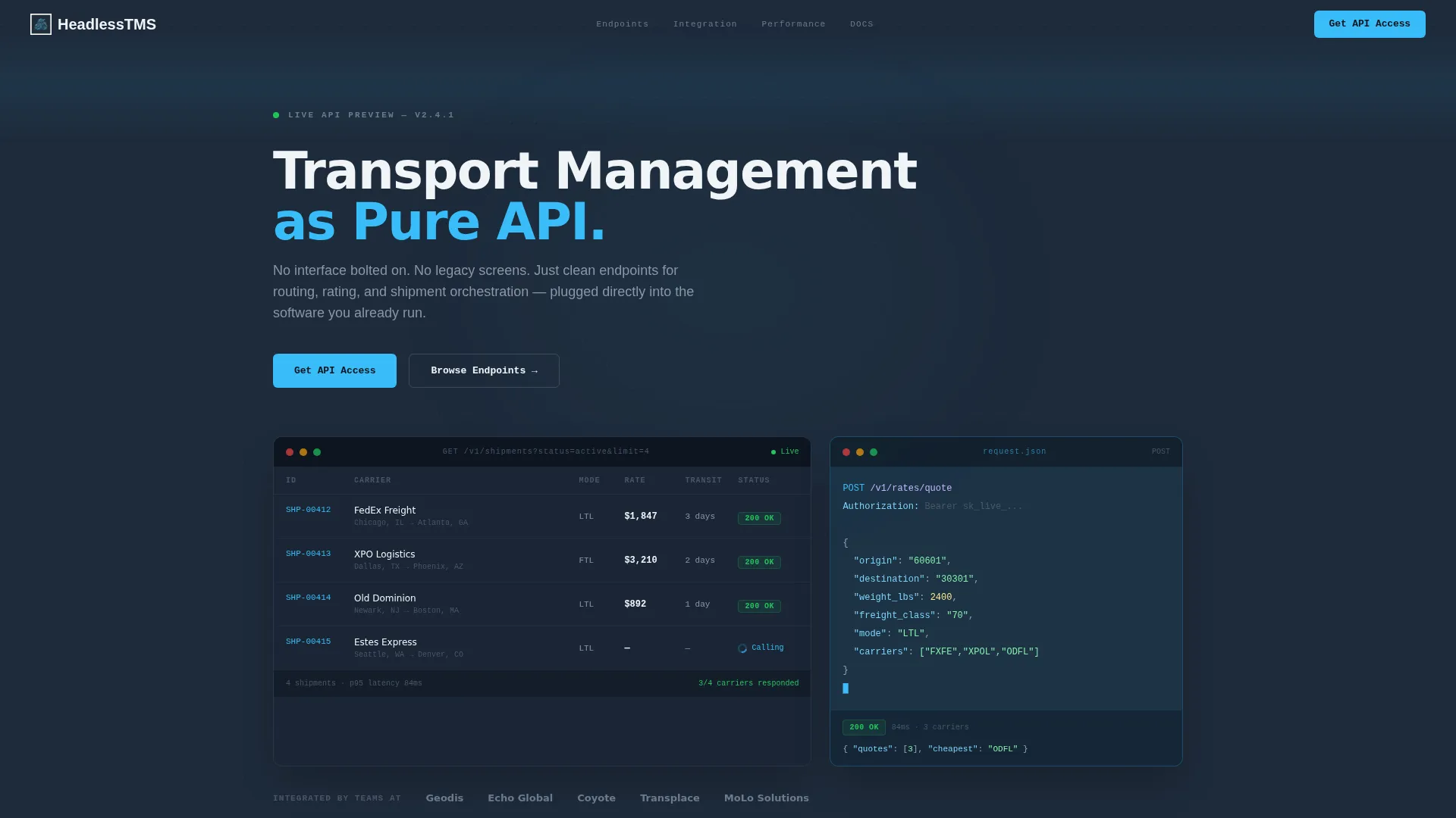
- A live dashboard preview header with a realistic shipment grid, syntax-highlighted code block, and pulsing API status indicators
- An Industry Report scroll cadence featuring a waterfall chart, an endpoint directory grid, and a latency comparison table
- A progressive two-step lead capture form plus a secondary gated PDF download path for technical evaluators
Feature list
This template includes purpose-built components drawn directly from the source brief. Each one serves a specific role in the conversion flow.
Live Dashboard Header with API Preview
The header is not a hero image, it is a functional-looking TMS interface. A shipment grid displays carrier, mode, rate, transit time, and API status columns. Three rows show green 200 responses; one row shows a pulsing sky-blue spinner mid-call. A floating code block on the right displays the actual POST request that generated the grid, syntax-highlighted across seven lines of clean JSON.
Endpoint Directory Grid
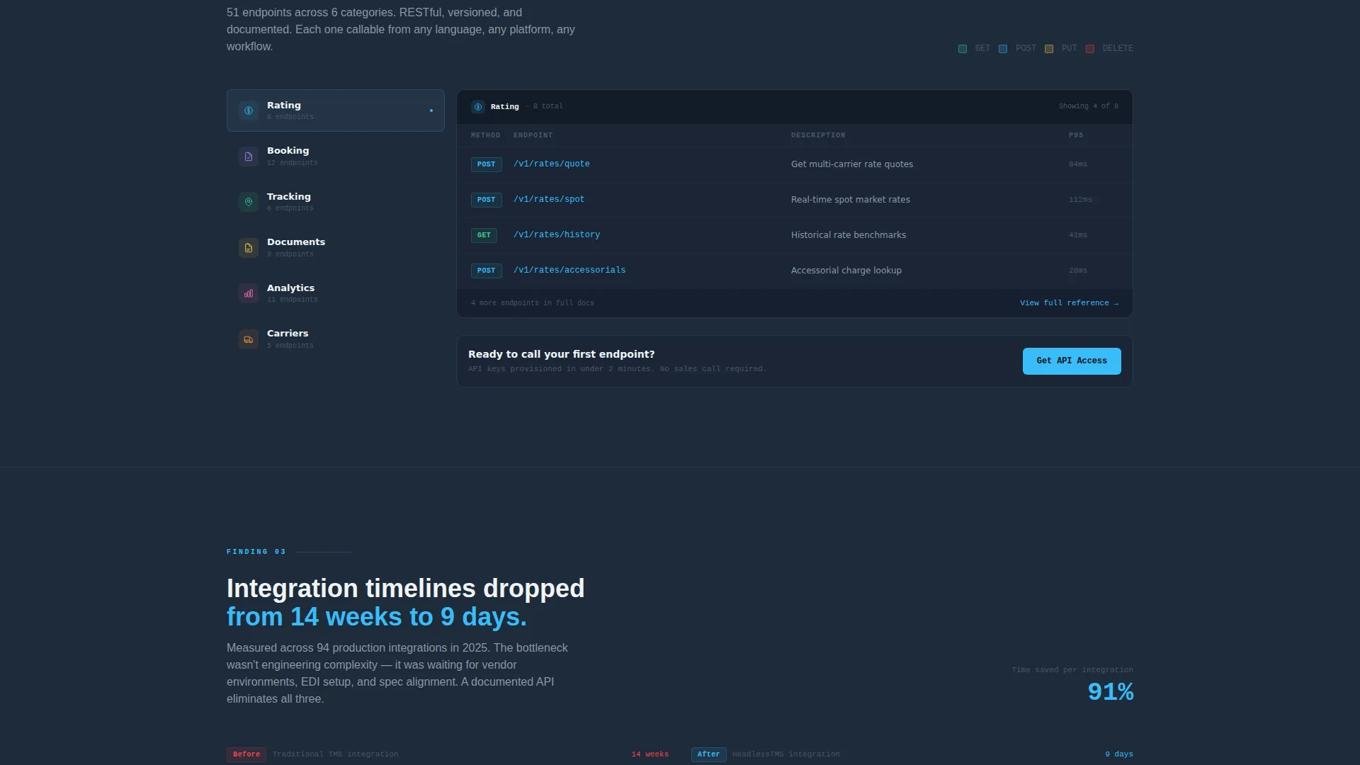
A full catalog of available API calls organized by category: rating, booking, tracking, documents, and analytics. Each entry is laid out in a scannable grid format so integration architects can assess coverage at a glance without reading prose.
Data Visualization Sections
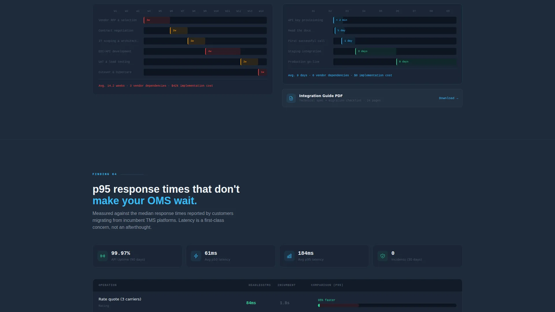
Rather than testimonials, the template uses charts and tables as proof. A waterfall chart shows integration timelines shrinking from fourteen weeks to nine days. A latency comparison table presents real 95th-percentile (p95) response times. These visuals replace marketing claims with structured evidence.
Progressive Two-Step Lead Form
The first screen captures only work email and company name to reduce friction. After submission, a second screen asks for shipment volume per month, current TMS provider, and primary integration target (warehouse management system, order management system, enterprise resource planning, or custom). This staged approach qualifies leads without front-loading commitment.
Gated Integration Guide Download
A secondary conversion path offers a downloadable PDF integration guide for visitors not ready to request API access. This captures technical evaluators who need time to build an internal case before committing to a demo or trial.
Persistent Primary Call to Action
The "Get API Access" button appears first as a persistent top-right element in the header and repeats after the endpoint directory section, positioned precisely where curiosity about the API scope peaks.
Page sections overview
| Section | Purpose |
|---|---|
| Dashboard Preview Header | Opens with a live shipment grid and floating JSON code block to establish product credibility immediately |
| Disconnected Systems Finding | Presents the 72% statistic about 3PLs running three or more systems and frames the headless architecture solution |
| Waterfall Chart Section | Visualizes integration timeline compression from fourteen weeks down to nine days |
| Endpoint Directory Grid | Catalogs every available API call by category so architects can evaluate coverage at a glance |
| Latency Comparison Table | Shows p95 response times as objective performance evidence instead of written claims |
| API Access Form | Progressive two-step form capturing work email first, then qualification details after submission |
| Integration Guide Download | Secondary gated PDF path for evaluators building an internal business case |
Design & branding system
The visual identity follows a Directory and Discovery theme built on a Slate and Sky color system. The palette is cool and systematic, it communicates infrastructure confidence rather than startup excitement.
- Deep terminal slate (#1E2A3A) dominates backgrounds and data table headers; mid-gray (#4A5568) handles secondary infrastructure tones; open-sky blue (#38BDF8) marks active states, live data indicators, and interactive accents
- Cloud-white (#F0F4F8) surfaces card backgrounds and creates breathing room between dense information blocks; a faint cyan glow (#0EA5E9 at 10% opacity) backs code snippets to visually separate them from body content
- No stock photography and no abstract gradients appear anywhere, the interface itself acts as the visual centerpiece throughout the page
Mobile & speed optimization
The template is designed to render cleanly across screen sizes without sacrificing the dense data layouts that make it credible to a technical audience.
- Data grids, endpoint directories, and latency tables are structured to reflow on smaller screens without losing column clarity
- The floating code block and dashboard preview scale responsively so the hero section remains legible on mobile devices
- The two-step form is touch-friendly by design, keeping the first screen to two fields so mobile visitors face minimal friction on entry
How this template helps you convert
The conversion strategy is built around showing the product working before asking for anything. Every section earns the next with evidence rather than assertions.
- The dashboard preview header establishes instant credibility, a logistics engineer sees familiar data formats, recognizes the use case as real, and keeps reading because the interface looks like their own Tuesday
- The endpoint directory and data visualizations build technical confidence progressively, so by the time the "Get API Access" call to action appears below the directory, the visitor already understands the scope and is ready to act
- The gated integration guide captures visitors who are not yet ready to request access, turning a near-exit into a qualified lead who can build an internal case and return later
Other information about this template
This template is built for a specific technical niche and performs best when the product it represents is genuinely API-first. The design language is intentional and opinionated.
- The Industry Report creative direction is central to the scroll experience, each section presents a finding, not a feature, which matches how CTOs and integration architects consume information
- The Dashboard and Data Grid template style means the layout is dense by design; it rewards visitors who read carefully and filters out audiences who are not serious evaluators
- The Slate and Sky color system was chosen to evoke a well-organized server environment: cool, systematic, and quietly capable rather than flashy or consumer-facing
- This template suits companies positioning a headless TMS product within the broader headless enterprise software space, where buyers are comparing API coverage, latency benchmarks, and integration flexibility side by side
Theme
Directory & Discovery
Creative direction
Industry Report
Color system
Slate & Sky
Style
Dashboard/Data Grid
Direction
Lead Generation
Page Sections
Live Dashboard Header with JSON Preview
Endpoint Directory Grid
Evidence-led Data Visualizations
Progressive Two-step Lead Form
Gated Integration Guide Download
Persistent Get API Access Call to Action
Related questions
Who is this landing page template built for?
What makes the header section different from a standard hero?
What does the two-step form capture?
Can I use the gated PDF download as a standalone conversion path?
Does this template work for products that are not fully headless?



