Live Membership Dashboard Landing Page Template
The Byline live dashboard membership platform landing page template is built for independent journalists, newsletter creators, and podcast producers ready to own their revenue. It combines an animated dashboard hero, a versus-grid comparison section, a testimonial ticker, a 90-day roadmap, and a two-step launch form into one cohesive, high-conversion landing page built on a dark editorial dashboard aesthetic.
by Rocket studio
Quick summary
The Byline live dashboard membership platform landing page template gives media creators a single, conversion-focused landing page to showcase their membership offer. The page opens on a functioning dashboard mockup, then walks visitors through a sharp comparison of fragmented tools versus one unified platform, social proof milestones, a week-by-week roadmap, and a two-step call-to-action form, all in a dark editorial style with signal-green highlights.
Who this template is for
This landing page is designed for independent media creators who already have an audience but lack a professional, revenue-focused site to convert that audience into paying members. The template speaks directly to people building a sustainable publishing business without relying on ad revenue or platform algorithms.
- Solo newsletter writers who have hit a growth ceiling on subscription platforms and want full data ownership
- Podcast producers tired of CPM (cost per thousand impressions) volatility and looking for direct membership payments
- Journalists who have left legacy newsrooms and need a clean, credible landing page to present their membership offer
What problem this template solves
Most independent creators manage their business across four or five separate services: an email tool, a podcast host, a payments processor, a paywall service, and a spreadsheet to tie them together. This fragmented stack creates gaps in data, inconsistent checkout experiences, and no single view of what the business is actually earning. This landing page is built to illustrate that problem clearly and then resolve it visually.
- Creators lose revenue clarity because subscriber data, payments, and analytics live in separate accounts with no unified dashboard
- Visitors to a generic creator site see no real proof that the platform works, because the page displays no live data or comparable numbers
- The checkout and sign-up flow on multi-tool stacks feels disjointed, which increases abandonment at the moment a visitor is ready to commit
What you get with this template
This template ships as a fully structured single landing page with five distinct content sections and a footer. Every section is purpose-built: the hero earns attention, the comparison grid earns trust, the social proof section builds urgency, the roadmap reduces hesitation, and the form captures the commitment. Using this template means you focus on your content and membership offer rather than designing a dashboard layout from scratch.
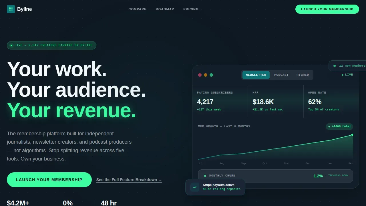
- An interactive dashboard hero with tabbed views, animated metric counters, and a live revenue graph that draws itself on scroll
- A versus-grid comparison section with row-by-row pain points, micro-animations, and a sticky call-to-action bar that persists after the visitor scrolls past the grid
- A testimonial ticker, a live payout counter, a 90-day week-by-week launch roadmap in a bento grid layout, and a two-step modal form with a subscriber-count slider
Feature list
This landing page template is dense with interactive and visual features. Each one serves a specific function in the conversion journey. Dashboards help users get a quick view of critical information at a glance, and every feature here is chosen with that principle in mind.
Interactive Dashboard Hero with Tabbed Metrics
The hero section opens on a functioning dashboard mockup embedded directly in the viewport. Visitors can toggle between Newsletter, Podcast, and Hybrid tabs and watch the displayed data shift in real time. Metric counters tick upward, a revenue graph draws itself left to right across the screen, and a toast notification slides in to display recent activity. This live dashboard preview replaces a static image or generic founder headshot with the product itself as the hero.
Versus Grid Comparison Section
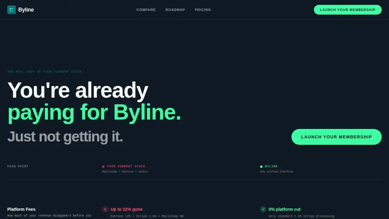
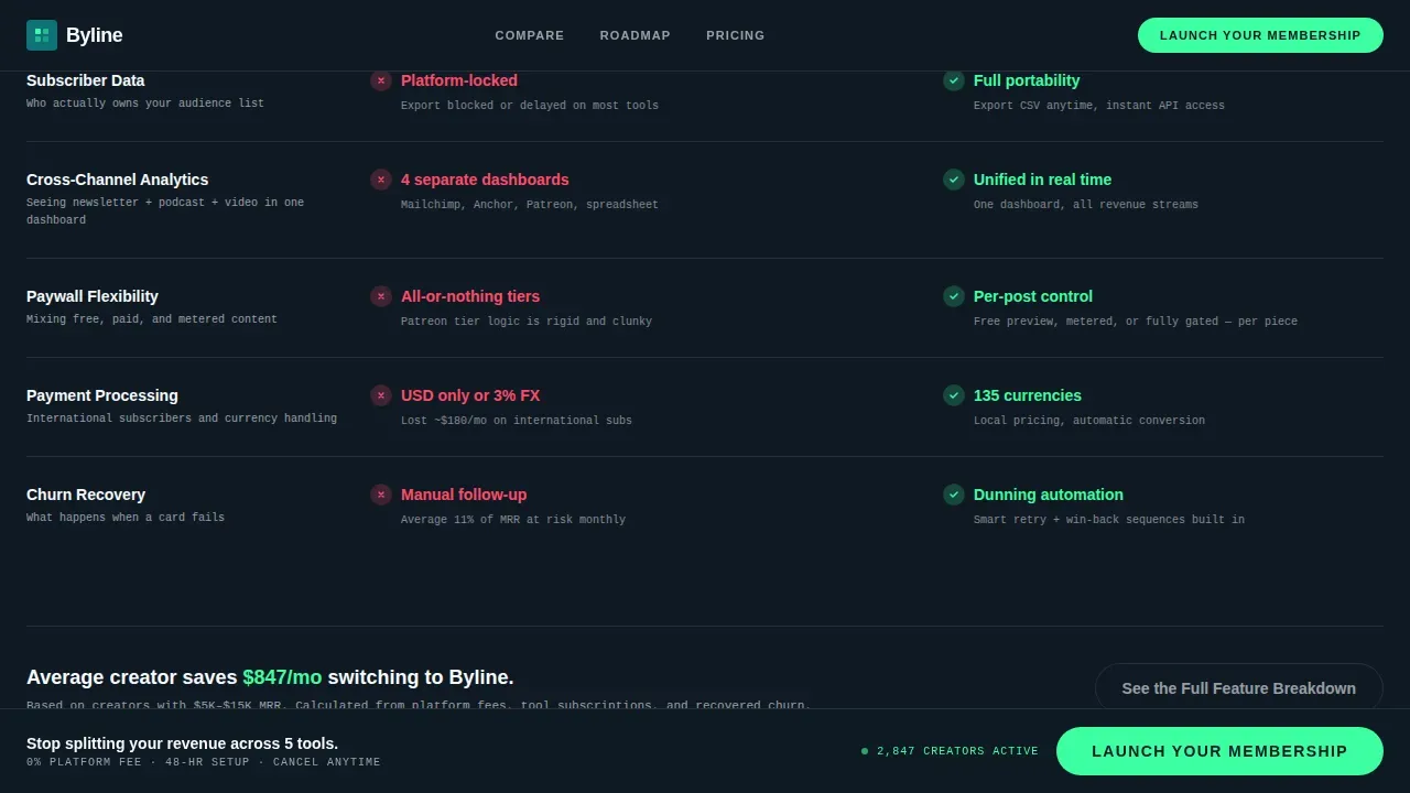
Below the dashboard hero, the page layout splits into two columns. One side shows the creator's current fragmented stack; the other shows the unified platform. Each row in the grid targets a specific pain point, payment processing fees, subscriber data ownership, cross-channel analytics, and paywall flexibility, with concrete numbers. Micro-animations fire as each row enters the viewport, so the data lands with rhythm and force rather than appearing all at once.
Testimonial Ticker and Payout Counter
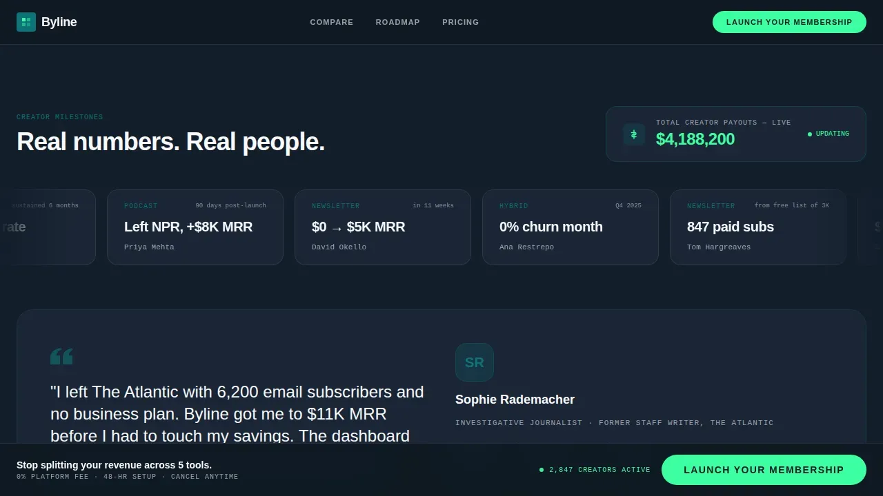
A horizontal scrolling ticker displays real creator revenue milestones across the full width of the screen. Beneath it, a live counter of total creator payouts moves like a stock ticker, creating a real-time activity feed that builds urgency and a genuine sense of momentum. Social proof like this, when formatted with specific numbers rather than vague claims, consistently increases trust among visitors who are still comparing their options.
90-Day Launch Roadmap in Bento Grid
The roadmap section converts the abstract idea of "building a membership" into a scheduled, week-by-week plan displayed in a bento grid layout. Each cell in the grid covers one phase of the launch, giving the user a clear path from sign-up to sustainable income. The roadmap reduces hesitation by making the process feel concrete and achievable rather than aspirational.
Two-Step Modal Launch Form
The primary call-to-action opens a two-step modal form. Step one asks visitors to select their content type (newsletter, podcast, video, or hybrid) and set their current subscriber count via a slider. Step two asks for an email address and preferred launch week. This structured form collects the right data without overwhelming the visitor, and the slider input adds a sense of personalization to the checkout moment.
Sticky Call-to-Action Bar
After a visitor scrolls past the versus grid, a sticky bottom bar appears and remains visible for the rest of the page. The bar displays the primary call-to-action button in signal green. This persistent display ensures the action is always one tap or click away without forcing the visitor to scroll back up to find it. The sticky bar also functions as a secondary navigation anchor that links back to the form.
Page sections overview
| Section | Purpose |
|---|---|
| Dashboard Hero Tab | Display live animated metrics and set the product as the hero above the fold |
| Versus Comparison Grid | Compare fragmented tool stacks against the unified platform row by row |
| Testimonial Ticker Strip | Scroll creator revenue milestones horizontally to build social proof and urgency |
| Live Payout Counter | Show a running total of creator payouts like a stock ticker to reinforce credibility |
| 90-Day Roadmap | Present a bento grid week-by-week launch schedule to reduce hesitation |
| Two-Step Launch Form | Capture content type, subscriber count, email, and preferred launch date |
| Developer Minimal Footer | Provide links and account access in a clean, minimal footer layout |
Design & branding system
The visual identity is built around a Teal Catalyst color palette. The design communicates sophistication and analytical precision without feeling cold. A dark editorial dashboard style grounds the entire page, and every color in the palette has a specific role. This cohesive color palette and purposeful typography are essential for establishing a clear visual hierarchy that guides the user's eye from headline to call-to-action.
- Deep editorial teal (#0D7377) anchors headers, section dividers, and sidebar elements; midnight dashboard black (#0F1923) fills the background of data-dense panels; signal green (#3DFFA2) fires exclusively on upward metrics, primary buttons, and active call-to-action elements; and clean masthead white (#F7F9FC) holds body text and card backgrounds with newsprint clarity
- Typography uses DM Sans for all display headlines and section titles, paired with JetBrains Mono for all data labels, metric counters, and formatted reports inside the dashboard panels
- Icons, counters, and progress indicators are styled to match the real-time analytics aesthetic, so every visual detail reinforces the sense that the user is looking at a live, professional media business dashboard
Mobile & speed optimization
The template is designed desktop-first to support the data density of the dashboard hero and versus grid. However, all sections are fully responsive and adapt cleanly to mobile screen sizes. Interactive elements are implemented as client components, while static sections are rendered server-side to keep load times in check. Fast-loading pages are essential for this audience; slow-loading pages lead to high abandonment rates, and a creator's first impression must be the dashboard, not a loading spinner.
- The sticky call-to-action bar is optimized for mobile display, remaining accessible at the bottom of the screen without obscuring page content on smaller devices
- The two-step form, testimonial ticker, and bento roadmap grid all reflow cleanly on a single-column mobile layout, ensuring the full landing page experience is preserved across every device
How this template helps you convert
Creating a landing page for a membership platform requires blending marketing persuasion with user experience design. This template is structured to accomplish exactly that: each section earns a specific type of agreement from the visitor before asking them to act. A high-converting layout follows a logical hierarchy to answer a visitor's immediate questions, and this page is built on that principle from top to bottom.
- The interactive dashboard hero answers "does this work?" before the visitor reads a single word of copy, by showing live metrics, open rates, and monthly revenue on screen the moment the page loads
- The versus grid earns intellectual agreement first, the testimonial ticker and payout counter convert that agreement into emotional conviction, and the 90-day roadmap converts conviction into scheduled action, so the two-step form simply catches the momentum already built by the page
Other information about this template
This template is part of the Dashboard/Data Grid template style category and sits within the Media and Publishing Digital Presence subcategory. It is built under the Startup Velocity theme with Launch Energy as the creative direction, an Interactive Preview header concept, and a Comparison/Versus landing page direction. It belongs to a site where different approaches to creator monetization are represented across individual pages, each targeting a specific niche.
- The app design follows a card-based layout for data panels, with ample white space and light backgrounds on card surfaces to contrast against the dark midnight background, giving the page clarity and visual breathing room
- The page content is localized for English-speaking creators in the United States, using USD for all payment figures, MM/DD/YYYY date formatting, and US-centric subscription services as reference points in the comparison grid
- Templates like this one enable users to save significant setup time because pre-designed layouts and components are already structured; users can customize branding, edit copy, and fill in their own metrics without starting from scratch
- The footer follows a developer-minimal pattern, providing clean links to account access, legal pages, and search functions without adding visual noise to the bottom of the landing page
- A secondary call-to-action link labeled "See the Full Feature Breakdown" anchors below the versus grid for analytical visitors who want to review every detail before they commit, giving the page two distinct conversion paths to cover different visitor mindsets
- The page does not rely on stock photography or overlay image treatments; every visual element is a data panel, chart, icon, or metric, which keeps the store of visual attention focused on the product and its outputs
- Creators who visit this landing page and interact with the dashboard mockup can move directly into the two-step form without needing to navigate to any other individual pages, keeping the entire conversion flow on a single screen
Theme
Startup Velocity
Creative direction
Launch Energy
Color system
Teal Catalyst
Style
Dashboard/Data Grid
Direction
Comparison/Versus
Page Sections
Interactive Dashboard Hero with Tabbed Views
Versus Grid with Micro-animations
Testimonial Ticker and Live Payout Counter
Day Bento Grid Roadmap
Two-step Modal Launch Form
Sticky Call-to-action Bottom Bar
Related questions
What sections does this landing page template include?
Can I customize the colors and copy in this template?
Is this template suitable for both desktop and mobile visitors?
Does the two-step form support different content categories?
What makes this landing page effective for membership conversion?



