Local Micro-SaaS & Developer Tools Comparison Website Template
Pulse is a dark-glass dashboard landing page template built for B2B survey and form builder platforms. It combines a mission-control hero with live-ticking metrics, interactive versus comparison modules, and a friction-light conversion form. The result is a single-page experience that proves product superiority through interaction rather than claims, moving potential customers from skeptical visitors to confident sign-ups.
by Rocket studio
Quick summary
Pulse is a single-page landing page template designed for survey and form builder platforms competing against legacy tools. It opens with a glassmorphic stats dashboard that ticks in real time, then walks visitors through side-by-side versus modules that let them feel the product difference before they ever sign up. Built on a void-black and electric-violet design system, the page is equal parts product demo and conversion machine.
Who this template is for
This landing page is built for product-led growth teams in the survey and form builder space. If your platform offers drag-and-drop form logic, conditional branching, or real-time response analytics, this template gives you a stage to prove it. It is equally useful for any marketing team launching a new insights platform that needs to stand apart from slower, clunkier competitors.
- Product managers running post-launch surveys who need a landing page that communicates speed and intelligence at a glance.
- HR teams and growth marketers evaluating or promoting form tools that handle 360-degree review cycles and lead capture experiments.
- Founders and growth leads who need a conversion-focused page that drives traffic and earns sign-ups without leaning on generic stock imagery or hollow feature lists.
What problem this template solves
Legacy form builders make a ten-question survey feel like configuring a database. Visitors landing on a typical competitor page read bullet points. They do not feel the difference. By the time they leave, nothing has convinced them to switch. That conversion gap is exactly what this landing page template closes.
- The "show, don't tell" problem: Most landing page templates make claims. Pulse makes the visitor interact with the proof through live comparison toggles and animated data grids.
- Missing data on user behavior: Teams running form products often lack visibility into how potential customers engage with their own marketing landing page, making it hard to define key metrics and improve conversion rates.
- Fragmented pitch, low trust: When a marketing team spreads its value proposition across multiple channels without a single, coherent landing page, potential customers bounce before the message lands.
What you get with this template
You get a fully structured, section-led landing page with every layout decision already made. The visual hierarchy, animation cues, and conversion form are all included. You customize the copy, swap in your own data numbers, and publish. No coding knowledge is required to get a production-ready page live.
- Five core page sections: Hero dashboard, two versus comparison modules, social proof bento wall, and a conversion form with a competitor dropdown, all pre-built and ready to edit.
- Interactive comparison framework: Each versus module includes a toggle interaction that animates the transformation between a legacy approach and the Pulse approach, letting the visitor experience the difference directly.
- A lightweight conversion form: Just a work email field and a single competitor dropdown, no credit card required, designed to minimize friction and improve conversion rates at the final step.
Feature list
This landing page template includes a precise set of designed and coded components. Each one serves a specific role in the visitor journey from first impression to form submission.
Mission Control Hero Dashboard
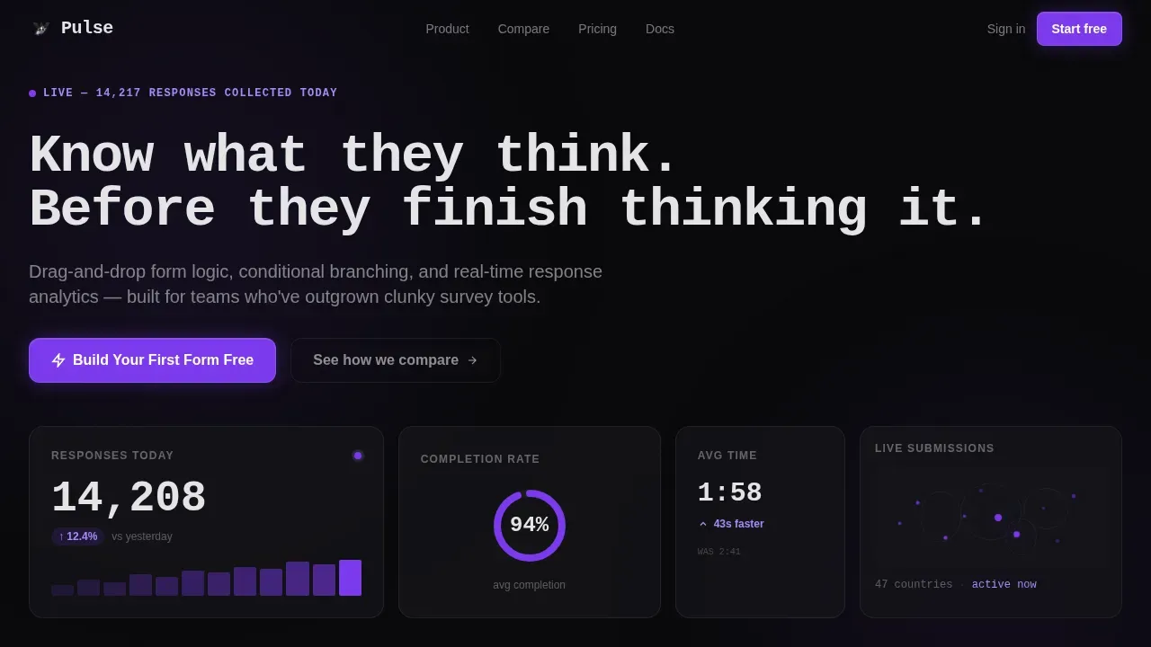
The hero section is a glassmorphic panel array rendered at actual product scale. It displays live-ticking metrics such as total responses collected, a completion-rate donut chart, average time-to-complete, and a geographic submission dot map. The headline types itself in monospace using a typewriter animation. No stock photography appears anywhere in this section. The product data IS the visual, which immediately communicates the platform's core value to any data analyst or product lead who lands on the page.
Interactive Versus Comparison Modules
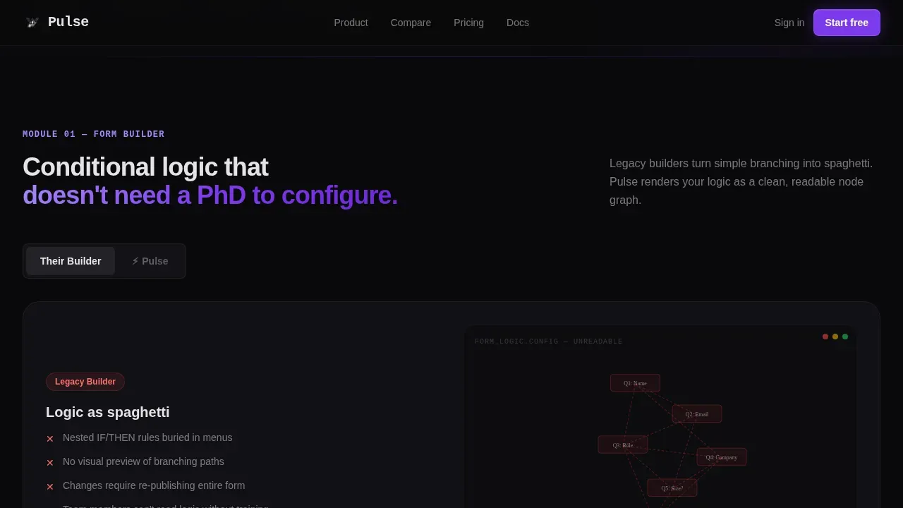
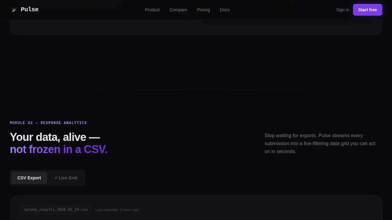
Two dedicated comparison modules let visitors toggle between a legacy builder experience and Pulse. The first module contrasts a tangled conditional flowchart with a clean node graph for form logic. The second module contrasts a static CSV export with a live-filtering data grid for response analytics. Each toggle triggers a real-time animation that transforms one view into the other. This is how the page earns the click without making raw claims. Visitors who engage with both toggles move significantly closer to submitting the conversion form.
Drag and Drop Builder Visualization
Inside the first versus module, the Pulse side renders a visual node graph that communicates how the drag and drop builder works. Each field type, from net promoter score scales to file uploads, snaps into position like a circuit component. The visualization helps visitors understand the drag and drop logic without needing a product tour or a sales call. It also reinforces the key message: building a form should feel fluid, not like configuring a data infrastructure from scratch.
Social Proof Bento Wall
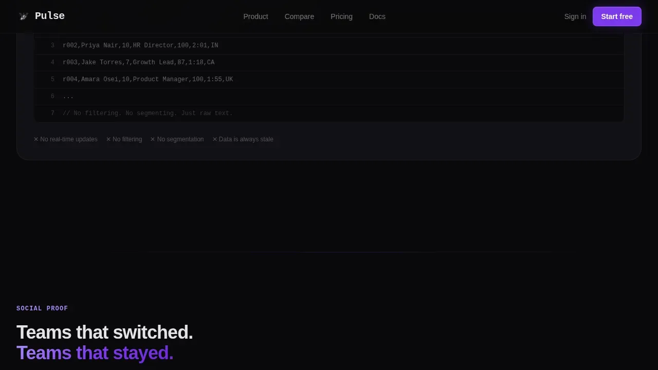
The social proof section uses an asymmetric bento grid layout to display outcome metrics, named customer testimonials, and competitor migration paths side by side. This section is designed to account for different buyer trust signals. Some visitors need numbers. Others need a voice they recognize. The bento layout serves both. Each cell can be updated with real metrics, such as lead volume growth, conversion rate improvements, or total survey responses processed.
Friction-Light Conversion Form
The conversion form collects only two pieces of information: a work email address and a single dropdown for the visitor's current tool. The dropdown options include common legacy alternatives. No credit card field appears anywhere. This approach follows a well-established principle: forms with only one to three fields convert significantly better than longer forms. Removing unnecessary mandatory fields can increase form completion rates by thirty to fifty percent. The form sits in a violet glass card that draws the eye without disrupting the page flow.
Pinned Contextual Call to Action
The primary call-to-action button, labeled "Build Your First Form Free," is pinned to the bottom of each versus module and activates after the visitor has toggled at least once. This behavior pattern ensures the call to action appears at the exact moment the visitor has experienced proof. It is a more honest and effective approach than static button placement, and it keeps the page consistent in its promise: earn the click, then ask for it.
Page sections overview
| Section | Purpose |
|---|---|
| Hero Metrics Dashboard | Opens with live data panel array and typewriter headline to establish instant credibility |
| Versus Module One | Compares branching logic between legacy flowchart and clean node graph via toggle |
| Versus Module Two | Contrasts static CSV export with live-filtering analytics data grid via toggle |
| Social Proof Bento | Displays outcome metrics, testimonials, and competitor migration paths in a grid |
| Conversion Form | Collects work email and current tool via dropdown with no credit card required |
| Linear Footer | Single-row footer with navigation links and legal copy |
Design & branding system
The visual identity is built on the Tech Glass theme with a Void and Violet color system. Every surface, panel, and card feels like a cockpit display at night: matte dark planes interrupted by electric violet telemetry glowing through smoked glass. The typography pairing of JetBrains Mono for headlines and data labels alongside DM Sans for body copy creates a strong contrast between machine precision and human readability.
- Color palette: Absolute void black (#09090B) as the page base, deep graphite (#151519) for panel backgrounds, electric violet (#7C3AED) for active states and data highlights, and frosted glass white (#E4E4E7) for text and divider lines.
- Glassmorphism details: Cards float with one-pixel violet-tinted borders, backgrounds layer transparency and blur, and hover states bloom with soft violet radiance as if the interface responds to pressure.
- Animation system: High-intensity animation throughout, including typewriter effect on the headline, count-up counters on the hero metrics, toggle transformation animations between versus states, and ping pulse effects on the geographic dot map.
Mobile & speed optimization
The template is built desktop-first, which reflects the dashboard-heavy interface and data grid components that are central to the page experience. However, a mobile fallback layout is included to ensure the page remains usable on smaller screens. This matters because every one-second delay in page load can reduce conversion rates by seven percent, and the visibility of the conversion form on load is essential for user retention in those first critical seconds.
- Performance-conscious animation: All animation is handled through GPU-accelerated transforms, with IntersectionObserver triggers so animations only fire when sections enter the viewport, keeping the page responsive on any device.
- Mobile fallback layout: The versus modules and bento wall restack vertically on smaller screens. Data panels compress without losing their core readability, and the conversion form remains fully accessible on mobile.
How this template helps you convert
This landing page does not ask visitors to trust claims. It asks them to interact with proof. That distinction matters in a crowded tools market where every landing page says the same things. Pulse earns the conversion by making the visitor feel the product difference before they reach the form.
- Interactive proof before the ask: The versus toggle modules let visitors experience the contrast between a clunky legacy tool and a clean modern builder. By the time the call-to-action button appears, the visitor has already formed a preference. This approach consistently drives better conversion rates than static testimonial sections or bullet-point feature lists.
- Low-friction entry point: The conversion form asks for only a work email and a competitor dropdown selection. This keeps the signup path clear and consistent with what landing page research confirms: fewer fields mean higher completion rates. Real-time lead routing after submission can increase conversion rates dramatically when follow-up happens within the first five minutes.
Other information about this template
This template is designed to fit within a broader product-led growth strategy. Teams that use it as a landing page can connect it to their existing data sources and marketing infrastructure. The page structure supports integration with tools that teams already use for tracking performance across multiple channels, including social media campaigns and organic traffic initiatives.
- Analytics and tracking context: The page can support connection to tools like Google Analytics for monitoring website traffic, traffic sources, and user behavior patterns after launch. Understanding which data sources drive conversions helps a marketing team make smarter decisions about where to invest next.
- Insights platform alignment: The Pulse template is conceptually aligned with how modern insights platforms work. For teams familiar with how Tableau Pulse defines and delivers metrics, the page reflects a similar philosophy: define key metrics once, surface them clearly, and let every user in the organization follow metrics relevant to their user's role. Tableau Pulse uses a centralized metrics layer so that all roles look at the same metric definitions. It delivers updates via Slack digests, email summaries, and mobile notifications, so every stakeholder stays on the same page without attending another meeting.
- Metrics philosophy: Just as Tableau Pulse automatically explains the why behind changes in data, not just the what, this landing page is designed to explain the why behind switching tools. It surfaces relevant insights at every scroll depth, helping potential customers reach informed decisions faster. Teams that work in Tableau Cloud or alongside bi tools will recognize the same pattern of surfacing context around raw numbers, rather than leaving visitors to interpret data on their own.
- Broader template ecosystem: This template sits within a larger ecosystem of landing page templates for SaaS, analytics, and form builder categories. Buyers can use it as a standalone campaign page or as the primary acquisition landing page for a product launch. It supports customization of all text, metrics, and color values without coding. Users can add text, swap testimonials, and update data figures directly in the template editor. The template is consistent with modern landing page builder standards and works within any drag and drop builder environment that supports HTML, CSS, and JavaScript.
- Supporting conversion rate research: Field-level tracking helps identify which specific questions cause drop-offs in form submissions. Real-time alerts notify the team of sudden spikes in form abandonment, so they can identify technical glitches and fix them on the fly. A pulse real-time form analytics template provides instant visibility into user interaction, turning static form data into actionable live insights. Using a pulse analytics template transforms how a marketing team reads feedback, moving from historical data in spreadsheets to live signals that inform decision making in the moment.
- Data health and integrity notes: When connecting the page form to downstream systems like customer relationship management (CRM) systems, teams should account for potential null values in the competitor dropdown field if a visitor skips the selection. Mapping each data type correctly at the point of integration prevents missing data issues from propagating into reporting. Cost metrics and daily sales figures shown as social proof on the page should be refreshed regularly to maintain credibility and reflect current performance.
- Competitive migration context: The secondary call to action, "See How We Replace [Competitor]," links to dedicated migration landing pages. These pages serve potential customers who are closer to switching and need a more detailed account of the transition process. This conversion path is especially valuable for capturing organic traffic from visitors searching for alternatives to legacy tools. Monitoring organic traffic and website traffic from those pages helps the team track performance across the full acquisition funnel and gain access to signals that inform product positioning.
Theme
Tech Glass
Creative direction
Interactive Explorer
Color system
Void & Violet
Style
Dashboard/Data Grid
Direction
Comparison/Versus
Page Sections
Mission Control Hero Dashboard
Interactive Versus Comparison Modules
Drag and Drop Builder Visualization
Social Proof Bento Metrics Wall
Friction-light Conversion Form
Pinned Contextual Call to Action
Related questions
Does this template require coding knowledge to customize?
What makes the hero section different from a standard landing page header?
Can I update the social proof metrics and testimonials with real data?
How does the versus toggle interaction work for visitors?
Is this template suitable for teams running A/B tests on their landing page?



