Home Health Franchise Upgrade Landing Page Template
Hearth is a Neo-Retro franchise landing page template built for home health franchise operators ready to upgrade their territory. It combines a Before/After slider header, stacked card sections, animated revenue figures, and urgency-driven conversion flows into one visually bold, dopamine-charged single page designed to turn upgrade hesitation into committed action.
by Rocket studio
Quick summary
Hearth is a single-page franchise upgrade template that speaks directly to existing home health franchisees. It leads with a cinematic Before/After slider, stacks layered content cards showing revenue upside, and closes with a two-step booking modal. The design feels like a retro diner menu that just got a Michelin-star kitchen, instantly familiar, noticeably upgraded.
Who this template is for
This template is built for established home health franchise owners who are already generating revenue but have not yet expanded into higher-margin service tiers. It is not a starter template for new operators looking to explain what home care is.
- Single-territory franchisees currently earning around $600K annually who are weighing a territory upgrade
- Franchise development teams running quarterly campaigns to convert existing operators into premium service tiers
- Home health brands offering skilled nursing, therapy add-ons, or Medicaid waiver contracts as upsell paths
What problem this template solves
Franchisees who already know the model often stall on upgrades because no single page shows them the full financial picture alongside a clear, low-friction next step. Generic franchise pages talk to newcomers. Hearth talks to operators who already understand the business and just need the right push.
- Existing franchise pages fail to show revenue comparison data in a compelling, visual format that motivates action
- Operators who are ready to upgrade have no dedicated path that skips the basics and goes straight to expansion economics
- Urgency and scarcity are rarely communicated well on franchise pages, leaving available upgrade slots unclaimed
What you get with this template
Hearth delivers a complete, conversion-focused franchise upgrade landing page with every major section built and ready to customize. The layout stacks card by card, building a sense of accumulating value as a visitor scrolls.
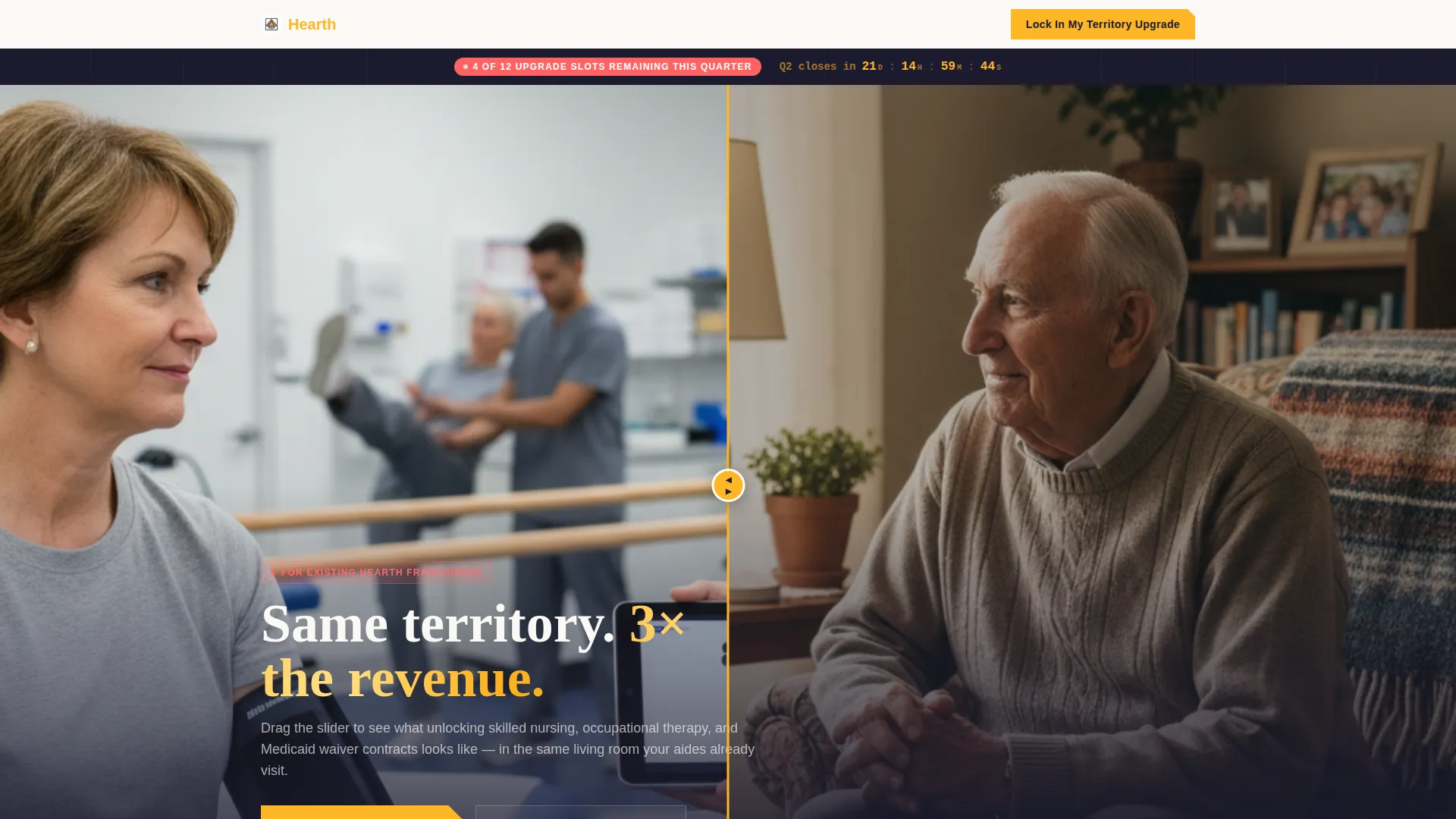
- A Before/After slider header that visually dramatizes the gap between basic companion care and a premium upgraded territory
- Four layered content cards covering revenue comparison, franchisee testimonial, exclusive services, and a protected territory map
- A two-step conversion modal with ZIP code input, revenue range dropdown, and a calendar embed for booking a franchise development call
- A secondary lead capture path offering a downloadable Upgrade Economics PDF for visitors not ready to book immediately
- A persistent floating urgency banner and a fixed mobile bottom bar repeating the primary call to action
Feature list
This template packs every persuasion layer a franchise upgrade campaign needs into one cohesive, scroll-driven page.
Before/After Slider Header
A drag-to-reveal slider splits a single living room scene. The left side shows a basic companion care visit. The right side reveals a fully upgraded territory in action, complete with a licensed nurse, a physical therapist, branded scrubs, and a second aide at work. Lighting shifts from flat and documentary to warm and cinematic as the slider moves.
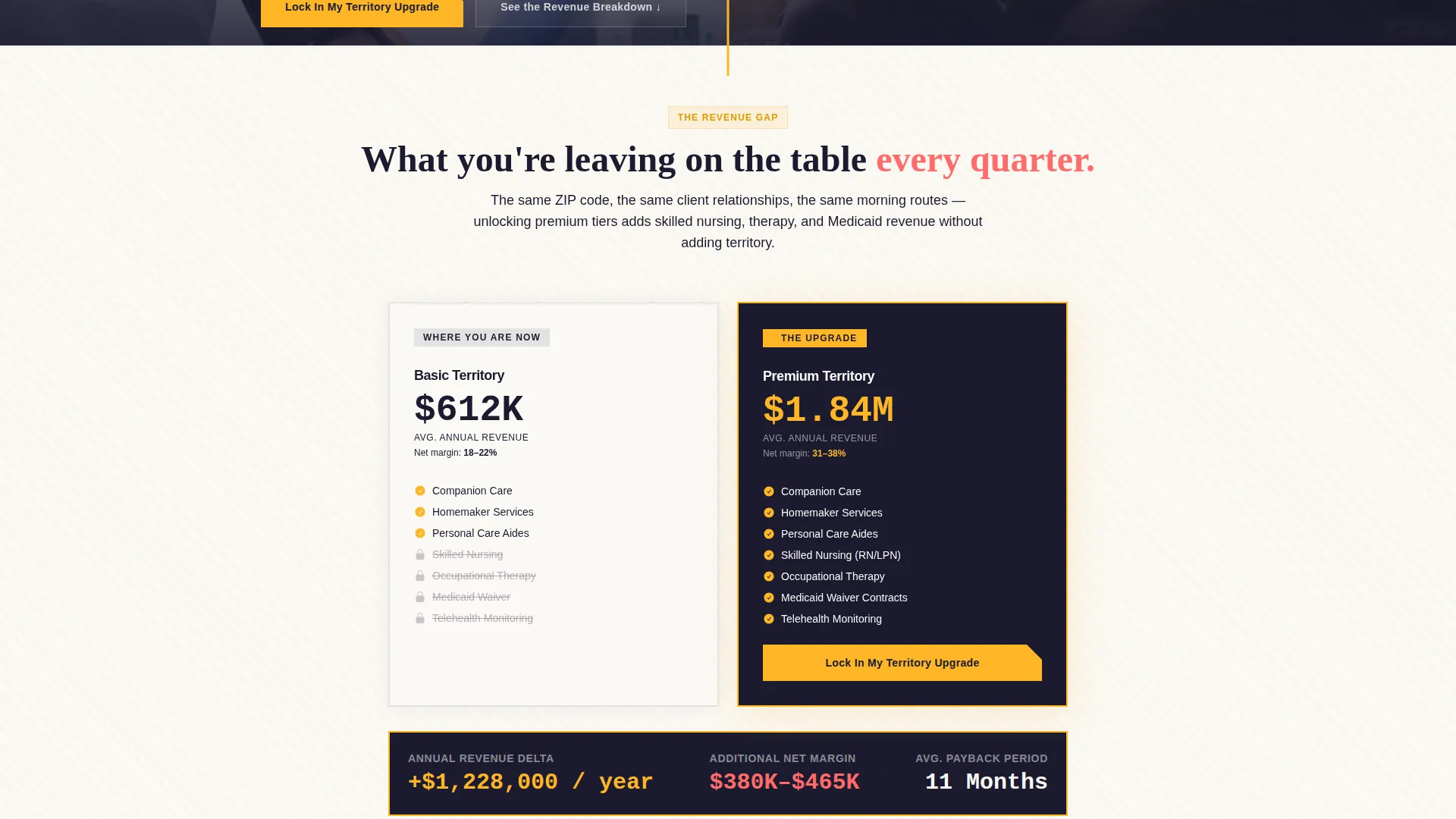
Animated Revenue Comparison Card
The first scrollable card shows animated dollar figures climbing to illustrate the income gap between basic and premium territory tiers. The visual motion draws attention to the financial upside before any written argument is made.
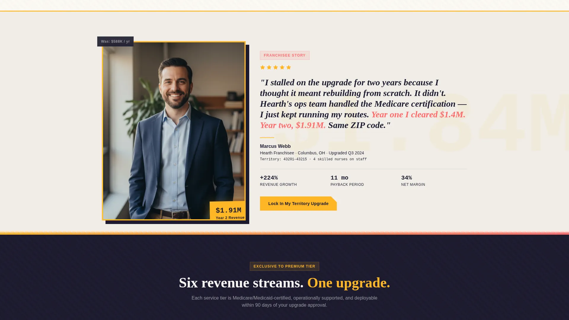
Stacked Testimonial Card
A franchisee who already upgraded appears with their face overlapping the revenue chart behind it. The layered composition makes the social proof feel physically connected to the numbers, not bolted on as an afterthought.
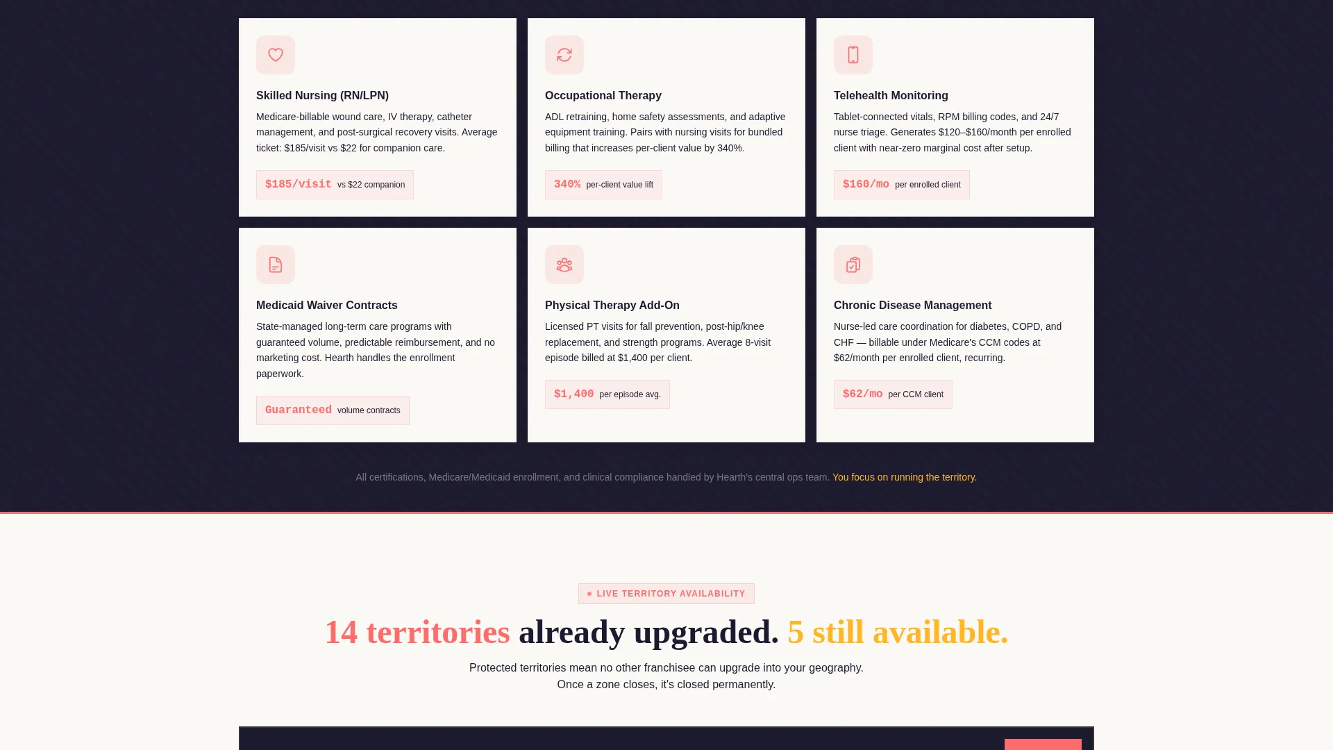
Exclusive Services Showcase Card
The third card lists the services unlocked at premium tier: skilled nursing, occupational therapy, and telehealth monitoring. Each service is represented by a coral-accented icon that pulses once on scroll entry, drawing the eye without distracting from the content.
Scarcity Territory Map Card
The fourth card displays a protected territory map with grayed-out regions already claimed. Available zones are visually distinct, making remaining slots feel genuinely limited and prompting faster decision-making.
Two-Step Upgrade Modal
Clicking the primary call-to-action opens a focused two-step modal. Step one captures the visitor's current territory ZIP code and annual revenue range via a four-bracket dropdown. Step two presents a calendar embed for booking a franchise development call directly.
Page sections overview
| Section | Purpose |
|---|---|
| Before/After Slider | Dramatize the upgrade gap visually |
| Floating Urgency Banner | Communicate remaining upgrade slots |
| Revenue Comparison Card | Show the financial case for upgrading |
| Franchisee Testimonial Card | Reinforce trust with real-operator proof |
| Exclusive Services Card | Display premium tier service offerings |
| Territory Map Card | Create visual scarcity around available zones |
| Two-Step Upgrade Modal | Capture qualified leads and book calls |
| PDF Lead Capture Path | Nurture visitors not ready to book |
| Fixed Mobile call to action Bar | Keep the primary action always visible |
Design & branding system
Hearth runs on a Dopamine Pop color system within a Neo-Retro visual theme. The overall feeling is a 1960s pharmaceutical ad redesigned by a streetwear studio: optimistic, punchy, and impossible to scroll past without noticing.
- Sunshine marigold (#FFB627) dominates section overlaps and floating stat cards, anchoring the warmth of the brand
- Candy-coat coral (#FF6B6B) fires on hover states and urgency badges, adding pulse and immediacy where action is needed
- Deep diner booth vinyl (#1B1B2F) grounds all navigation and primary typography, keeping the page readable at every scroll depth
- Clean scrub white (#FAF9F6) breathes behind layered content panels so the visual density never overwhelms the reader
Mobile & speed optimization
The page is structured to maintain full visual impact on smaller screens without losing the scarcity mechanics or conversion flow that make the template work.
- The fixed bottom bar keeps the primary call to action visible at all times on mobile, removing any need to scroll back up
- Each overlapping card section is designed to stack cleanly on narrow viewports, preserving the layered accumulation effect
- The Before/After slider and territory map components are built for touch interaction, so drag and tap gestures work as intended
How this template helps you convert
Hearth is engineered around a deliberate persuasion sequence: show the money, introduce the scarcity, then make the next step feel simple. Every design decision supports that sequence.
- The animated revenue comparison card leads the scroll journey, giving financially motivated franchisees an immediate reason to keep reading before any ask is made
- The territory map and floating countdown banner layer in urgency progressively, so scarcity feels earned rather than manufactured
- The two-step modal reduces commitment friction by splitting the conversion into a quick data entry step and a calendar booking, making the upgrade feel like scheduling a call rather than signing a contract
Other information about this template
Hearth is a strong fit for franchise development campaigns that run on a quarterly upgrade cycle, where available territory slots reset and urgency is real. The template style is Overlap/Layered, meaning each content card physically overlaps the section above it by forty pixels, giving the scroll a tactile, dealing-cards quality.
- The secondary PDF download path makes the template useful for longer sales cycles, capturing franchisees who need a few more data points before booking a call
- The Neo-Retro theme and Dopamine Pop palette are distinct enough to stand out in a category where most franchise pages default to stock-photo neutrality
- The Comparison Journey creative direction built into this template is well suited to franchise contexts where buyers already know the baseline and need to see the upgrade clearly
Theme
Neo-Retro
Creative direction
Comparison Journey
Color system
Ink & Paper
Style
Overlap/Layered
Direction
Click-Through
Page Sections
Before/after Slider Header
Animated Revenue Comparison Card
Exclusive Services Showcase Card
Scarcity Territory Map Card
Two-step Upgrade Modal
PDF Lead Capture Path
Related questions
Who is this landing page template designed for?
What does the two-step modal collect from visitors?
How does the template communicate urgency without feeling forced?
What is the secondary conversion path for visitors not ready to book?
Can this template support a different home care franchise upsell campaign?



