Solar Energy Vertical SaaS Cost Calculator Website Template
Helios is a solar energy analytics landing page template built for comparison-led conversion. It features a live KPI header, an interactive savings calculator, and a structured competitor comparison table. Designed with a Slate and Sky color system, it gives solar farm operators and commercial energy managers a focused, data-forward tool to evaluate and switch monitoring platforms with confidence.
by Rocket studio
Quick summary
Helios is a single-page solar energy analytics dashboard landing page template. It opens with animated live metrics, leads visitors into a personalized savings calculator, and builds toward a high-trust comparison table. The design channels a mission-control aesthetic with deep slate backgrounds, sky blue data accents, and crisp white card surfaces.
Who this template is for
This template is built for teams and individuals who manage solar energy portfolios and need to communicate the measurable advantage of a smarter monitoring platform.
- Solar farm operators running portfolios between 5 and 50 megawatts who need to justify platform switching costs with real numbers
- Commercial building owners tracking rooftop photovoltaic return on investment against current utility rates
- Clean energy fund managers comparing asset performance across multiple geographies and monitoring tools
What problem this template solves
Most solar monitoring platforms struggle to convert informed, research-mode buyers. Decision-makers arrive already comparing options, and a generic hero image or a features list rarely closes the gap. This template is structured to meet that skepticism head-on.
- Visitors who have already used competing tools need more than promises; the calculator gives them their own projected revenue recovery figure before the comparison table even begins
- The side-by-side table replaces tedious vendor emails with a transparent, always-visible evidence file that builds case row by row
- Two distinct conversion paths, one action-ready and one research-ready, mean no visitor leaves without a clear next step
What you get with this template
You get a fully structured, single-page landing page layout built specifically for solar energy vertical software as a service (SaaS) comparison scenarios. Every section is designed to move a technically confident visitor from curiosity to commitment.
- A live-data header with three animated KPI tiles, an interactive savings calculator with three input fields, and a twelve-row competitor comparison table
- A pinned primary call to action in the Helios column header and a secondary email-gated PDF download path for research-mode visitors
- A Slate and Sky color system with hover states, active toggle highlights, and winning-column sky blue treatments baked into the design
Feature list
This template includes purpose-built components that reflect the needs of solar energy analytics buyers. Every element is grounded in the source brief.
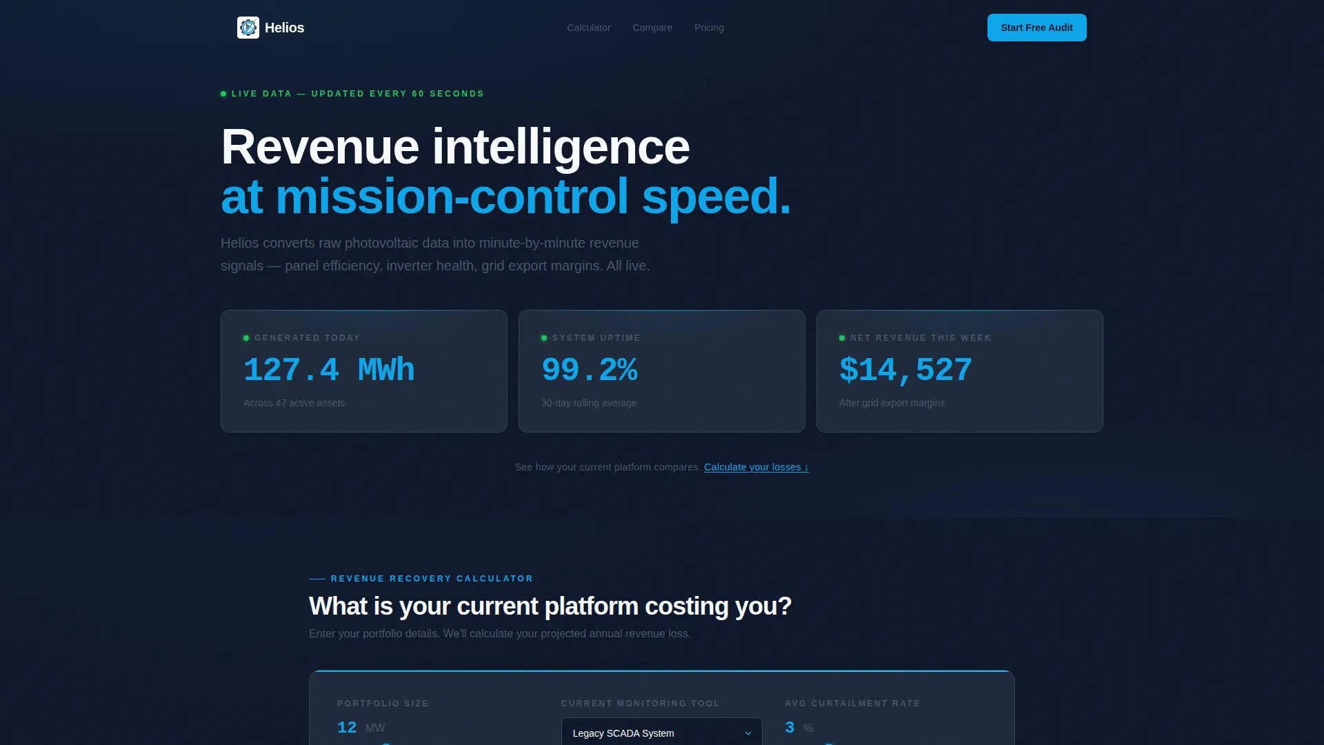
Animated Live KPI Header
Three oversized metric tiles display real figures such as megawatt-hours generated, uptime percentage, and net weekly revenue. The numbers use tabular-lining numerals in sky blue and animate with an odometer-style upward tick to reinforce the feeling that data is always moving.
Interactive Savings Calculator
Visitors enter their portfolio size in megawatts, their current monitoring vendor, and their average curtailment percentage. The tool returns a projected annual revenue recovery figure, making the value case personal before the comparison table appears.
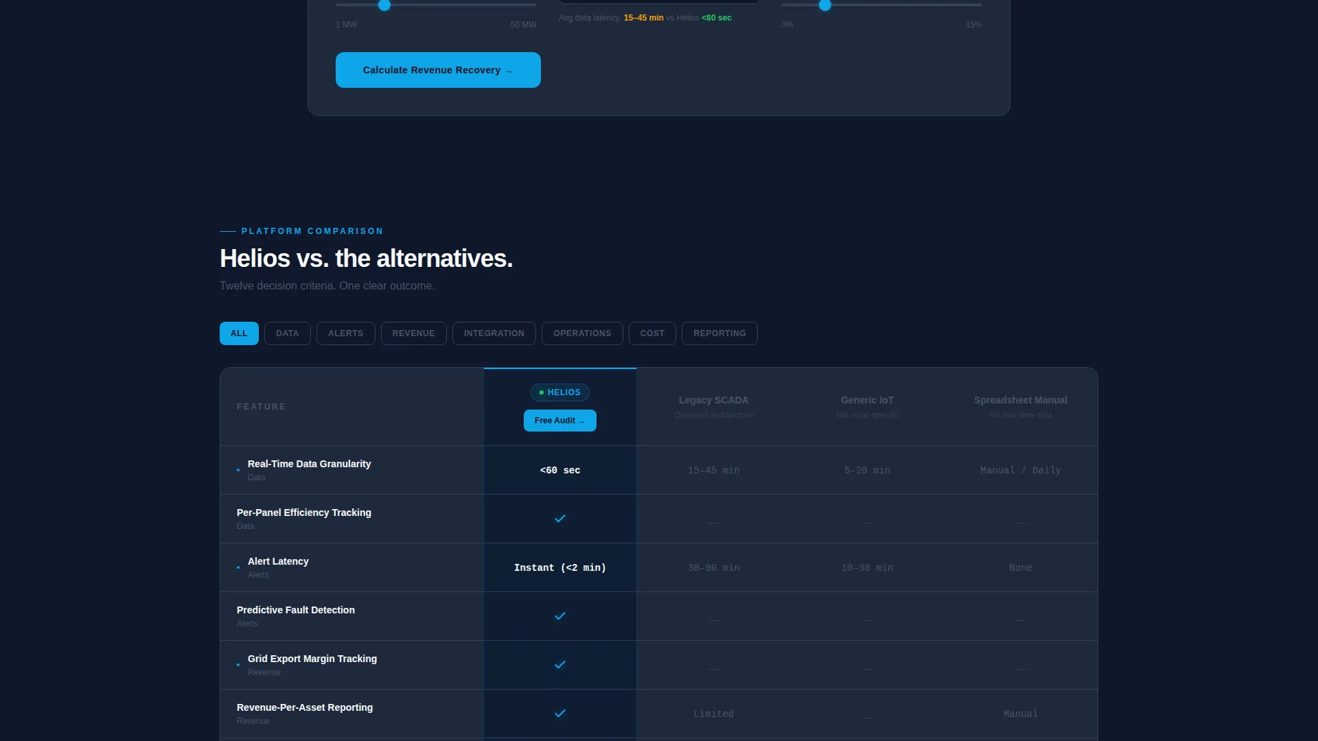
Twelve-Row Comparison Table
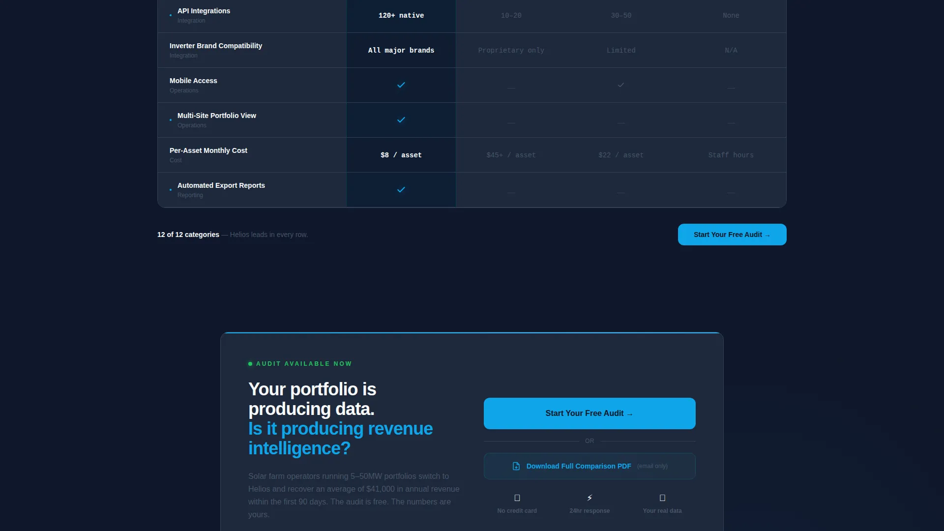
The table benchmarks the platform against three competitor archetypes: Legacy SCADA (supervisory control and data acquisition), Generic IoT (Internet of Things), and Spreadsheet Manual. Twelve rows cover criteria including real-time data granularity, alert latency, application programming interface (API) integrations, per-asset cost, mobile access, and export reporting.
Dual Conversion Path Design
The primary call to action, "Start Your Free Audit," sits pinned inside the Helios column header and repeats at the table base. A secondary path offers a downloadable full comparison PDF gated behind email-only capture for visitors still evaluating options.
Three-Field Audit Form
Clicking the primary call to action opens a compact form requesting portfolio size in megawatts, current monitoring tool selection from a dropdown, and a work email address. The form is frictionless and purpose-matched to the buyer profile.
Mission-Control Visual System
The Slate and Sky color palette uses deep mission-control slate for backgrounds and table rows, open-sky blue for live data accents and hover states, and cirrus-cloud white for card surfaces. The result is a technically calm layout that feels charged with operational intelligence.
Page sections overview
| Section | Purpose |
|---|---|
| Animated KPI Header | Display live solar revenue and uptime metrics with odometer animation |
| Savings Calculator | Personalize projected annual revenue recovery using visitor inputs |
| Comparison Table | Benchmark platform against three competitor archetypes across twelve criteria |
| Helios Column call to action | Pin primary audit sign-up action inside the winning comparison column |
| PDF Download Gate | Capture research-mode visitor emails via secondary gated content offer |
| Table Base call to action | Repeat primary call to action after full comparison evidence is presented |
| Audit Sign-Up Form | Collect portfolio size, monitoring tool, and work email in three fields |
Design & branding system
The visual identity is built on a Startup Velocity theme expressed through a Slate and Sky color system. Every color decision is functional, not decorative, guiding the eye through dense data without strain.
- Deep mission-control slate (#1E293B) dominates backgrounds and table rows; atmospheric mid-gray (#475569) handles secondary text and structural dividers
- Open-sky blue (#0EA5E9) activates on hover states, toggle interactions, and the winning Helios column highlights; cirrus-cloud white (#F8FAFC) keeps card surfaces and spacing breathable
- Typography uses tabular-lining numerals in the KPI header to ensure figures read cleanly even while animating
Mobile & speed optimization
The landing page layout is designed to remain functional and readable across screen sizes. The mission-control aesthetic does not come at the cost of usability on smaller displays.
- The comparison table is structured to support horizontal scrolling on mobile viewports so all twelve rows remain accessible without collapsing content
- The savings calculator input fields and the audit form are sized for touch interaction, reducing friction for users on phones or tablets
- The KPI header tiles restack vertically on narrow screens so animated figures remain legible and prominent
How this template helps you convert
The page is built as a Comparison and Versus conversion flow where every section moves a visitor one step closer to the primary call to action.
- The animated KPI header establishes credibility immediately by showing real operational numbers before any marketing copy appears, anchoring trust at the top of the page
- The savings calculator personalizes the value proposition using the visitor's own portfolio inputs, so by the time they reach the comparison table they are acting on their own projected numbers rather than a generic promise
- The dual call-to-action structure captures both action-ready buyers through the audit form and research-mode visitors through the gated PDF, maximizing conversion coverage across the full decision cycle
Other information about this template
This template is categorized under Technology and the Solar Energy Vertical SaaS subcategory. It is designed for the Solar Energy Analytics Dashboard niche, making it a precise fit for platforms that compete on data depth and operational transparency.
- The template style is a Comparison Table layout with a Calculator and Tool First creative direction, meaning the interactive savings tool is the first major engagement point below the header
- The header concept follows a Stats and Metrics pattern where real numerical data replaces traditional hero imagery entirely
- The landing page direction is Comparison and Versus, a format proven effective when buyers arrive mid-evaluation and need a structured evidence base to finalize a decision
- The Intersection Match Score for this template is 13, reflecting a tight alignment between the technology category, the solar energy analytics niche, and the chosen layout and conversion strategy

Theme
Startup Velocity
Creative direction
Calculator/Tool First
Color system
Slate & Sky
Style
Comparison Table
Direction
Comparison/Versus
Page Sections
Animated Live KPI Header
Interactive Savings Calculator
Twelve-row Comparison Table
Dual Conversion Path Structure
Mission-control Color System
Three-field Audit Sign-up Form
Related questions
Who is this landing page template designed for?
Can I customize the KPI numbers and comparison table rows?
What does the savings calculator actually calculate?
Does the template include both conversion paths?
Is this a single-page layout or a multi-page template?



