Marine Vertical SaaS Comparison Website Template
The Helm Marine CRM Comparison Landing Page Template is a single-page, conversion-focused layout built for yacht brokerage SaaS platforms. It uses a Feature Tab Switcher hero section, three escalating comparison table sections, and a trial call-to-action to help potential customers see exactly why a specialized marine CRM outperforms generic tools and spreadsheets.
by Rocket studio
Quick summary
Helm is a comparison landing page template designed for marine CRM platforms. It presents a disciplined, side-by-side comparison of Helm against generic CRM tools and spreadsheets. The layout guides visitors from a tabbed hero section through three escalating feature comparison rounds, ending at a focused trial sign-up. Every section is engineered to make the switch feel inevitable.
Who this template is for
This landing page template is purpose-built for marine vertical SaaS companies that need to convert informed, high-value prospects. It speaks directly to professionals who already know what generic tools cannot do for their business.
- Brokerage principals managing between fifteen and two hundred vessel listings who need a credible, polished alternative to spreadsheet chaos
- Charter managers juggling Mediterranean and Caribbean seasonal rotations who need structured comparison pages to justify switching platforms
- Sales brokers and fleet operations managers who compare every tool before they pay for it and need clear, specific claims to make a confident decision
What problem this template solves
Yacht brokerages face a common set of pain points that generic CRM tools cannot address. The common pain points are real: vessel-specific data fields, charter accounting, and AIS position tracking simply do not exist in off-the-shelf software. This landing page template makes those gaps visible at a glance.
- Visitors arrive with weak familiarity of niche CRM options and need comparison pages that explain the difference between a marine-specific solution and a generic alternative without burying them in technical jargon
- Potential customers hesitate to switch because they cannot see a fair, transparent breakdown of what they gain and what they leave behind
- Brokerage teams lose productivity when inventory data, buyer mandates, and charter bookings live in scattered tools, and the page must address those concerns directly to earn the click
What you get with this template
This template delivers a complete, single-page comparison landing page structure ready for a marine CRM product launch or competitive positioning campaign. Every section has a clear role in moving visitors toward a trial sign-up.
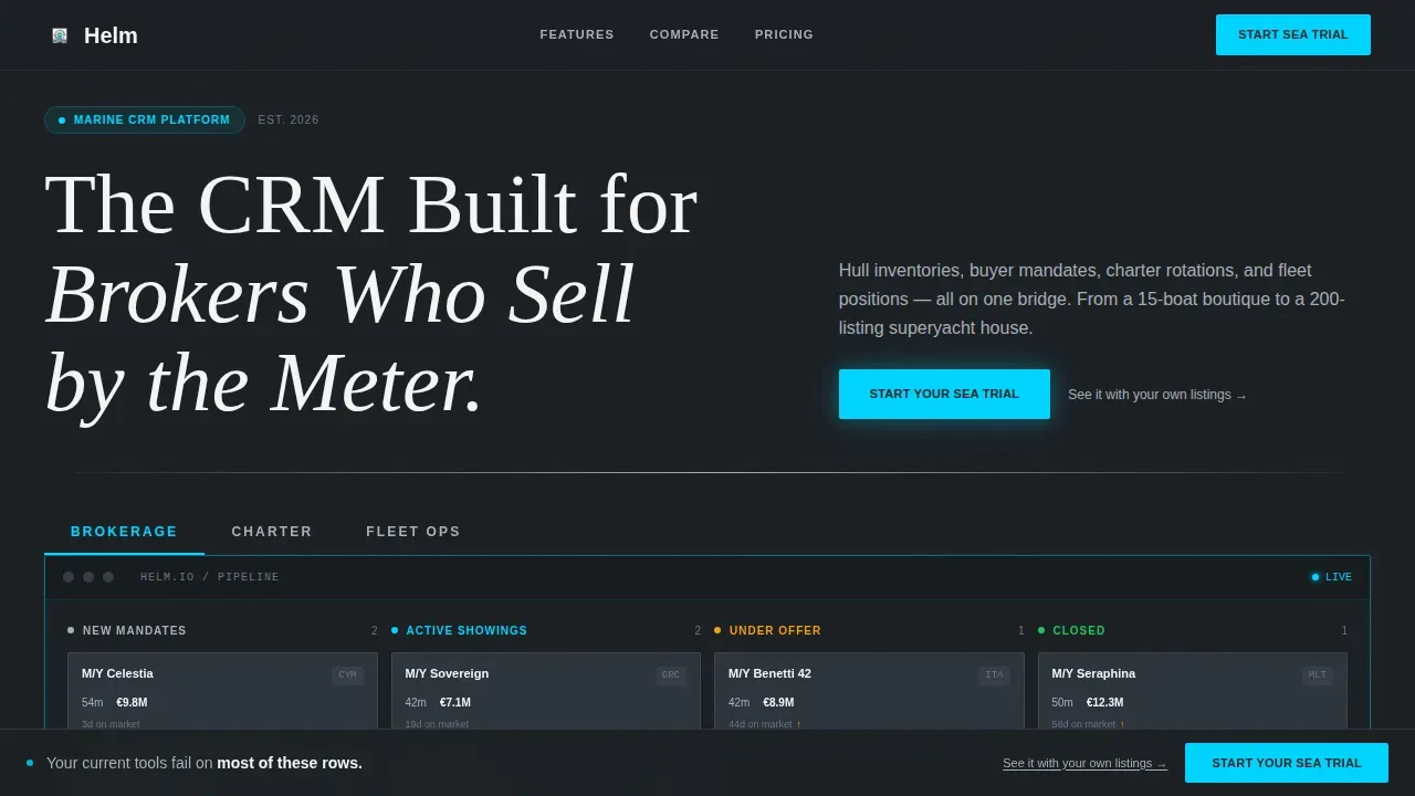
- A Feature Tab Switcher hero section with three live dashboard states: Brokerage, Charter, and Fleet Ops, each presenting a distinct user interface mockup that responds instantly on click
- Three stacked comparison table sections that escalate from basic contact management through vessel-specific fields to advanced capabilities like AIS integration, MLS syndication, and charter APA accounting
- A full-width trial call-to-action section with a minimum-friction sign-up form requiring only email, brokerage name, and fleet size range, plus a floating sticky call-to-action bar that activates after the second comparison section
Feature list
This template includes carefully structured components that work together to capture interest, present a persuasive argument, and convert visitors into trial users. The features below are grounded in what the template actually delivers.
Feature Tab Switcher Hero Section
The hero section uses three clickable tabs labeled Brokerage, Charter, and Fleet Ops. Each tab reveals a different live-rendered user interface mockup: a pipeline kanban for Brokerage, a calendar grid for Charter, and a map view with vessel position indicators for Fleet Ops. The active tab underline animates with a left-to-right wipe, and the mockup sits against a deep charcoal background with a subtle cyan border glow. Visual-heavy hero sections like this use software mockups to attract users and build immediate product credibility.
Escalating Comparison Table Layout
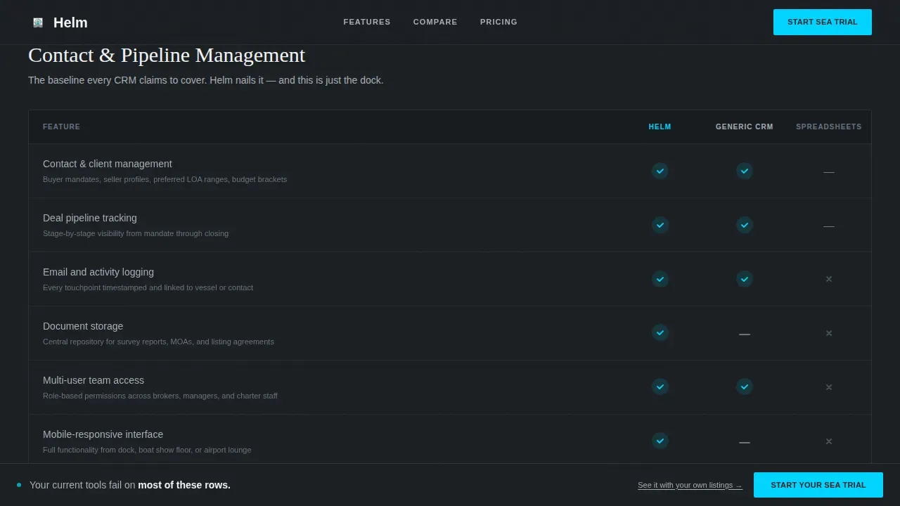
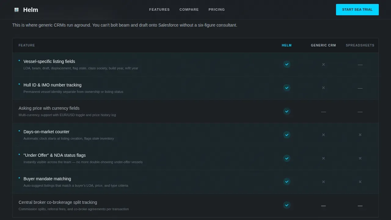
The page stacks three comparison table sections in order of increasing specificity. Each row compares Helm against a generic CRM and against spreadsheets, using cyan checkmarks, aluminum dashes, and muted charcoal X marks. Categories escalate from basic contact management through vessel-specific fields such as beam, draft, flag state, and class society, to advanced features including AIS position integration and MLS syndication to yacht listing platforms. Including a comparison table on landing pages makes the information visually appealing and easy to digest for potential customers.
Sticky Call-to-Action Bar
After the second comparison section, a sticky bar floats at the bottom of the viewport. The primary call-to-action button reads "Start Your Sea Trial" in signal white on electric cyan. A secondary text link beneath each call-to-action reads "See it with your own listings" and links to a demo booking flow. This layout keeps the conversion action visible for visitors who are deep in the comparison content and ready to act.
Inline Social Proof Callouts
Comparison rows include inline metric callouts that add specificity-driven credibility without requiring a dedicated testimonials section. Social proof woven directly into comparison data helps prospects trust the claims being made on the page. Clear trust indicators like testimonials and inline case data build credibility for marine CRM templates, especially in high-value transaction markets.
Monochrome Steel Visual Identity
The template applies a Startup Velocity theme using a Monochrome Steel color system. Deep bulkhead charcoal (#1B1F23) anchors the backgrounds. Brushed aluminum (#A8B0B8) handles secondary surfaces and divider lines. Signal white (#F4F5F7) fills card faces and data cells. Electric cyan (#00D4FF) is reserved exclusively for interactive states, active tabs, and call-to-action pulses. Typography combines DM Sans for interface elements with Fraunces serif for display headlines.
Trial Sign-Up Section with Lead Capture Form
The closing section is a full-width trial call-to-action with a sign-up form that captures just three data points: email address, brokerage name, and fleet size range. Simplified forms in marine CRM templates can use focused designs to capture complex data efficiently while keeping friction to a minimum. CRM templates that facilitate lead capture and integrate seamlessly with databases help reduce the gap between page visit and trial activation.
Page sections overview
| Section | Purpose |
|---|---|
| Feature Tab Switcher Hero | Showcase three dashboard states with tabbed user interface mockup |
| Basic Comparison Table | Compare contact management features versus. competitors |
| Advanced Comparison Table | Highlight vessel-specific fields and trigger sticky call to action |
| Expert Comparison Table | Present AIS, MLS syndication, and charter APA accounting |
| Trial Call-to-Action | Capture sign-ups with a minimum-friction three-field form |
| Developer Minimal Footer | Close the page with clean navigation and link structure |
Design & branding system
The Monochrome Steel color system gives this landing page template the cold, engineered aesthetic of a superyacht bridge at dusk. Marine templates prioritize aesthetics with nautical color palettes, and every design decision here reinforces that sense of precision and authority. A clean and modern design is essential for marine CRM landing pages to effectively showcase inventory data and business functionality.
- Colors: deep charcoal (#1B1F23) for backgrounds, brushed aluminum (#A8B0B8) for dividers, signal white (#F4F5F7) for data cells, and electric cyan (#00D4FF) for all interactive states and call-to-action elements
- Typography: DM Sans for user interface labels and data cells, Fraunces serif for display headlines, creating a contrast between engineered utility and authoritative brand voice
- Animation: high-fidelity interactions including the tab switcher wipe, sticky call-to-action reveal, scroll-triggered comparison row stagger, and hover states on every comparison row
Mobile & speed optimization
This template is desktop-first by design, built for brokerage principals reviewing options on large screens. Mobile-first responsiveness is also built in, because mobile-first design is essential for marine professionals who work from docks and on the water. The layout adapts cleanly across screen sizes without sacrificing comparison table clarity.
- Server Components handle all static sections of the landing page, keeping the initial render fast and reducing the client-side JavaScript footprint
- Client Components are scoped to interactive elements: the tab switcher, the sticky call-to-action bar, and hover states on comparison rows, so interactivity does not slow down static content
How this template helps you convert
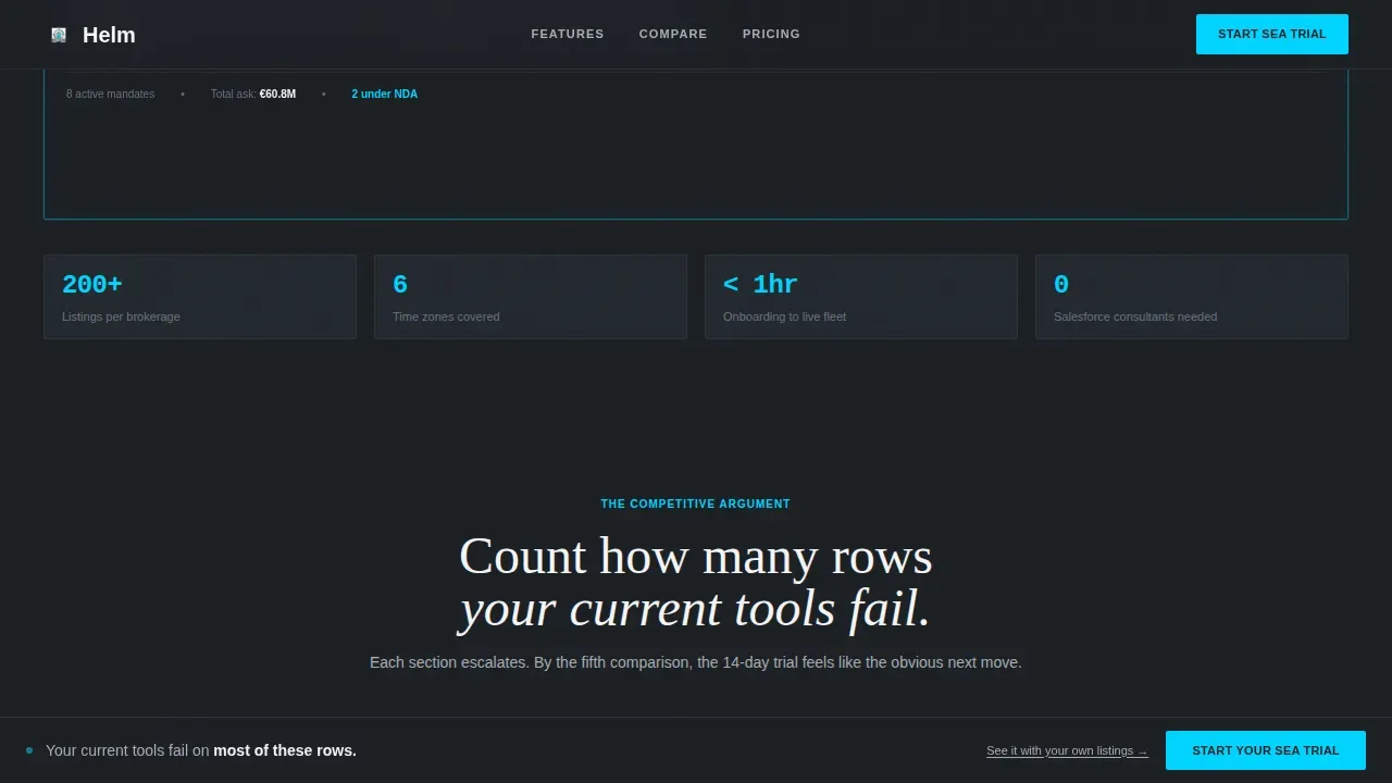
This landing page template is structured as a competitive argument that escalates from row to row. By the fifth comparison point, visitors have counted how many gaps their current tools leave open. The persuasive logic is built into the page architecture itself.
- The hero section captures interest immediately by presenting three distinct dashboard views that speak directly to brokerage, charter, and fleet operations use cases, letting each type of visitor self-identify within seconds
- The three comparison table sections progressively raise the stakes, presenting a fair side-by-side comparison that highlights the difference between a purpose-built marine solution and generic alternatives, reinforcing that Helm is the better choice for niche-specific workflows
- The sticky call-to-action bar and closing trial section turn comparison clarity into action, linking visitors directly to a 14-day free trial form and a personalized demo booking, so prospects who are ready to switch have a frictionless path forward
Other information about this template
This template draws inspiration from a broader ecosystem of marine and SaaS landing page design practices. The following context is helpful for teams evaluating templates, comparing alternatives, or planning a build around this layout.
- Marine CRM landing page template selection typically involves choosing between marine-specific templates or CRM-native builders; this template is purpose-designed for the marine niche and does not require a generic CRM platform to host it
- The Helm Marine CRM Comparison Landing Page Template is suited for teams creating multiple comparison pages targeting different competitors, since the table layout and escalating structure can be adapted for each competitive pairing
- Figma user interface kits such as the Venture CRM Dashboard and Landing Page user interface kit and Vero Modern Marketing offer 100% editable components that developers can use to extend or restyle marine branding elements within this template
- The Marina Layout Pack from Divi and modular themes from the HubSpot Marketplace such as Brightlane and Spark are examples of other marine service template ecosystems; this template sits in a similar category but is optimized specifically for comparison landing page conversion rather than general service presentation
- TemplateMonster offers specialized marine templates priced between $11 and $21, with examples like Shahid and Qabid tailored for cargo and maritime services; Helm sits in a distinct subcategory focused on SaaS brokerage CRM positioning rather than cargo or dealership display
- Framer's LanX is a high-visual-impact alternative for marine CRM themes with modern effects; teams looking for a full Framer environment may find it a useful reference point
- Drag-and-drop builders like Elementor enable code-free customization for marine templates broadly, though this template is built with a React Server and Client Component architecture aligned with the Startup Velocity theme
- Trust and authority signals such as client logos and case studies are important for high-value marine transactions; this template reserves inline comparison rows for metric callouts and customer testimonials that can be updated with real brokerage data
- HTML5 and CSS templates from TemplateMonster allow complete design control but require coding knowledge; this template is designed for teams comfortable with component-based development at a fraction of the cost of custom builds
- Marine dealership landing pages should include sections for featured inventory, and this template addresses that need through the Brokerage tab's kanban view displaying hull inventory data with length overall, asking price, and days-on-market fields
Theme
Startup Velocity
Creative direction
Feature Matrix
Color system
Monochrome Steel
Style
Comparison Table
Direction
Click-Through
Page Sections
Feature Tab Switcher Hero Section
Three Escalating Comparison Tables
Sticky Call-to-action Bar
Inline Social Proof Callouts
Minimum-friction Trial Sign-up Section
Monochrome Steel Design System
Related questions
Who is this landing page template designed for?
What sections does the template include?
Can I use this template to create multiple comparison pages for different competitors?
How does the template handle social proof?
Does this template require a specific development environment?



